Grid Gadget
Contents
Overview
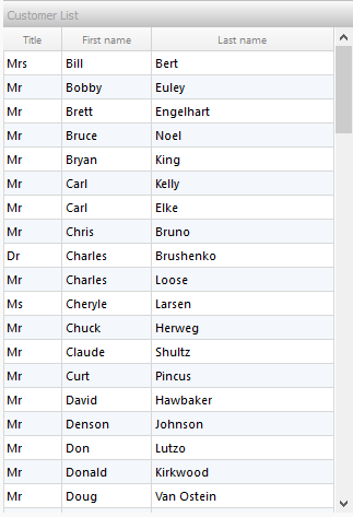
Grid Gadgets can be loaded into a Form Section. They are used for displaying and editing multiple rows of data.
You build Apps in Lianja App Builder visually using the Page Builder.
If you have not yet done so please read Understanding the Lianja Architecture and also Understanding ART to better understand this article.
An App consists of pages. Pages are made up of Sections. Form sections are made up of FormItems. We call these collectively "UI Elements" or "Visual Elements".
Setting Attributes Declaratively
You adjust the appearance and behavior of each UI Element in the Attributes Tab of the App Inspector.

The attributes available consist of some common ones as well as some specific to the UI Element being inspected.
Getting and Setting Attributes Programmatically
The setAttribute(name, value) method can be used to set the value of an Attribute:
Lianja.get("pageid.sectionid.fieldid").setAttribute("caption","Formitem1")
Note: on the desktop, the shortened form setAttr(name,value) is also available.
The getAttribute(name) method can be used to get the value of an Attribute:
cTitle = Lianja.get("pageid.sectionid.fieldid").getAttribute("caption")
Note: on the desktop, the shortened form getAttr(name) is also available.
See Also
Demo Apps (included in the Lianja App Builder distribution):
- GridGadget App (example_gridgadget)
Attributes
Details
| Attribute | Description | Name | Type |
|---|---|---|---|
| Name | The name for this gadget (unique to the section) | id | Character |
| Full name | The full name for this gadget including its parent page and section, e.g. page1.section1.field1 | fullid | Character |
| Alias name | The alias name for this gadget | aliasid | Character |
| App Doc | The App Doc file for this gadget. This will be included in the App Doc when it is generated. | appdoc | Character |
| Tag | The tag for this gadget | tag | Character |
| Meta types | A comma separated list of metatype names | metatypes | Character |
| Custom Props | A ';' separated list of custom prop key pairs, e.g. name=barry;company=lianja From v5.3. |
customprops | Character |
| Type | The type of control: Gadget (readonly) | type | Character |
| Gadget type | The type of gadget: grid (readonly) | gadgetType | Character |
| Margin | Margin size around the gadget | gadgetMargin | Int |
| Fixed width | Fixed gadget width in pixels | gadgetFixedWidth | Int |
| Fixed height | Fixed gadget height in pixels | gadgetFixedHeight | Int |
| Inline | Render the gadget inline rather than it its own column (True | False) | gadgetInline | Boolean |
| Stretch width | Auto stretch the width of the gadget into the width of the section (True | False) | gadgetStretchWidth | Boolean |
| Desktop Margin Top | Adjust the top margin when laying out an inline gadget to line it up with others horizontally in desktop Apps. From v5.3. | gadgetpaddingtop | Int |
| Web Margin Top | Adjust the top margin when laying out an inline gadget to line it up with others horizontally in Web/Mobile Apps. From v5.3. | gadgetpaddingtopweb | Int |
Geometry
| Attribute | Description | Name | Type |
|---|---|---|---|
| Absolute | Enable or disable absolute positioning (True | False) | absolutePosition | Boolean |
| Top | Top position in pixels | absolutePositionY | Int |
| Left | Left position in pixels | absolutePositionX | Int |
| Width | Width in pixels | absolutePositionWidth | Int |
| Height | Height in pixels | absolutePositionHeight | Int |
| CSS style | CSS style (separate attributes with ; or use app:/filename.css) | cssStyle | Character |
Caption
| Attribute | Description | Name | Type |
|---|---|---|---|
| Caption | The caption for the gadget | caption | Character |
| Caption CSS style | The gadget caption CSS style (separate attributes with ';' or use app:/filename.css or specify CSS classes separated by spaces). | captionCSSstyle | Character |
| Background color | The background color for the caption | backColor | Character |
| Foreground color | The foreground color for the caption | foreColor | Character |
| Font | The font for the caption | captionFont | Character |
| Icon | The image for the caption (png | jpg | gif). Use app:/imagename.ext for app specific images. |
captionIcon | Character |
| Border width | The caption border width | captionBorderWidth | Int |
| Border color | The caption border color | captionBorderColor | Character |
| Transparency | Specify a transparency percentage from 0 to 100 | transparency | Int |
| Gradient colors | Render the caption color as a gradient (True | False) | captionGradient | Boolean |
| Gradient type | Specify the gradient type | captionGradientType | Int |
| Gradient start color | Gradient start color | captionFromColor | Character |
| Gradient end color | Gradient end color | captionToColor | Character |
Data
| Attribute | Description | Name | Type |
|---|---|---|---|
| Data source | The table or SQL SELECT statement to display in the grid. | controlSource | Character |
| Editable | Data is editable (True | False) | editable | Boolean |
| Hide OK/Cancel Buttons | Hide the OK/Cancel buttons (True | False) | gridHideOkCancelButtons | Boolean |
| Hide the action bar | Hide the action bar (True | False) | gridHideActionbar | Boolean |
| Filter | The filter expression that restricts the records that will be included in the grid | filter | Character |
| Refresh section when row changes | Refresh other fields in the section when row changes (True | False) | refreshOnGridClick | Boolean |
| CSS style | CSS style for the gadget (separate attributes with ; or use app:/filename.css) | gadgetCssStyle | Character |
| Pagination | Grid is always rendered using pagination (for large data sets)(True | False) | pagination | Boolean |
| Automatic pagination | Grid is rendered using pagination if the number of records exceeds below amount (True | False) | autoPagination | Boolean |
| Automatic pagination size | Grid is rendered using pagination if Automatic pagination is true and the number of records exceeds this amount | autoPaginationSize | Int |
| Grid row height | Height of the grid rows | gridRowHeight | Int |
| Background color | The background color for the gadget | gadgetBackColor | Character |
| Foreground color | The foreground color for the gadget | gadgetForeColor | Character |
Other Options
| Attribute | Description | Name | Type |
|---|---|---|---|
| Hide header | Hide gadget header at runtime (True | False) | gadgetHideHeader | Boolean |
Custom Delegates
| Attribute | Description | Name | Type |
|---|---|---|---|
| Init | The delegate for the Init event | initAction | Character |
| Load | The delegate for the Load event | loadAction | Character |
| Ready | The delegate for the Ready event | readyAction | Character |
| Activate | The delegate for the Activate event | activateAction | Character |
| Deactivate | The delegate for the Deactivate event | deactivateAction | Character |
| Change | The delegate for the Change event | changedAction | Character |
| Before Data Create | The delegate for the BeforeCreate event | beforeCreateAction | Character |
| After Data Create | The delegate for the AfterCreate event | afterCreateAction | Character |
| After Data Changed | The delegate for the dataChanged event (after data is read) | dataChangedAction | Character |
| Before Data Update | The delegate for the BeforeUpdate event | beforeUpdateAction | Character |
| After Data Update | The delegate for the AfterUpdate event | afterUpdateAction | Character |
| Before Data Delete | The delegate for the BeforeDelete event | beforeDeleteAction | Character |
| After Data Delete | The delegate for the AfterDelete event | afterDeleteAction | Character |
| Refresh | The delegate for the Refresh event | refreshAction | Character |
| Parent data changed | The delegate for the ParentDataChanged event | parentDataChangedAction | Character |
| Click | The delegate for the item Clicked event. | ClickAction | Character |
| Double click | The delegate for the dblClick event | dblClickAction | Character |
| Sort | The delegate for the column Sort event fired when the header is clicked. This is called with two arguments: nColumn, nDirection | sortAction | Character |
| Timer | The delegate for the Timer event | timerAction | Character |
| Timer interval | The timer interval in seconds that the Timer event will be called at runtime | refreshInterval | Int |
Permissions and Roles
| Attribute | Description | Name | Type |
|---|---|---|---|
| Read roles | A comma separated list of roles that can read (and view) the data. | permRead | Character |
| Update roles | A comma separated list of roles that can perform update operations on the data. | permUpdate | Character |
UI Presentation Rules
| Attribute | Description | Name | Type |
|---|---|---|---|
| Desktop | Include this gadget in a Desktop client (True | False). | desktopUI | Boolean |
| Web | Include this gadget in a Web client (True | False). | webUI | Boolean |
| Tablet | Include this gadget in a Tablet client (True | False). | tabletUI | Boolean |
| Phone | Include this gadget in a Phone client (True | False). | mobileUI | Boolean |
| UI States | UI states that affect this gadget. Specify multiple states as a comma separated list. | state | Character |
| Initial UI state | The initial UI state for this gadget. | uiStateInit | Character |
| Readonly when | Gadget is readonly at runtime if specified expression evaluates to true. | readonlyWhen | Character |
| Visible when | Gadget is visible at runtime if specified expression evaluates to true. | visibleWhen | Character |
| Hidden at runtime | Hide this formitem at runtime (True | False). | hiddenAtRuntime | Boolean |
| Display orientation | Display depending on mobile device orientation for Tablets and Phones. (Always | Portrait | Landscape) | displayOrientation | Character |
| Apply rules on change | Apply UI presentation rules (Visible when and Readonly when) when data is changed interactively or when navigating records (True | False). | applyRulesOnChange | Boolean |
| Responsive UI width breakpoint | The responsive UI visibility width breakpoint in Web/Mobile Apps. From v5.4. | responsivewidthvisibility | Int |
| Responsive UI height breakpoint | The responsive UI visibility height breakpoint in Web/Mobile Apps. From v5.4. | responsiveheightvisibility | Int |
| Responsive UI minimum width | The responsive UI minimum width in Web/Mobile Apps. From v5.4. | responsiveminwidth | Int |