Difference between revisions of "Grid Appearance"
Yvonne.milne (Talk | contribs) (→Split grid) |
Barrymavin (Talk | contribs) (→Split grid component list) |
||
| Line 174: | Line 174: | ||
==Split grid component list== | ==Split grid component list== | ||
| − | List of components to be included in [[#Split grid|split grid]] form edit. This is a comma separated list, e.g. component:/mylib.mycomp1( | + | List of components to be included in [[#Split grid|split grid]] form edit. This is a comma separated list, e.g. component:/mylib.mycomp1(‘prop=value;...’j:caption1,component:/mylib.mycomp2(‘prop=value;...’j:caption2. From v6.0. |
==Stretch last column== | ==Stretch last column== | ||
Revision as of 21:05, 22 March 2021
Contents
- 1 See Also
- 2 Grid Section
- 2.1 Alternating row colors
- 2.2 Automatic pagination
- 2.3 Automatic pagination size
- 2.4 Autoresize columns
- 2.5 Background color
- 2.6 CSS style
- 2.7 Desktop grid row height
- 2.8 Enable inline cell editing
- 2.9 Edit memo/varchar editors
- 2.10 Edit memo/varchar list
- 2.11 Foreground color
- 2.12 Gradient colors
- 2.13 Gradient end color
- 2.14 Gradient start color
- 2.15 Gradient type
- 2.16 Grid background color
- 2.17 Grid foreground color
- 2.18 Grid header background color
- 2.19 Grid header foreground color
- 2.20 Header custom color
- 2.21 Infinitely scrollable
- 2.22 Inline effect
- 2.23 Inline height
- 2.24 Inline width
- 2.25 Map Return to Down Arrow
- 2.26 Map Return to Tab
- 2.27 MultiSelect rows
- 2.28 MultiSelect rows expression
- 2.29 Pagination
- 2.30 Phone grid row height
- 2.31 Record mark expression
- 2.32 Record mark tooltip
- 2.33 Row dynamic background
- 2.34 Row dynamic foreground
- 2.35 Scrollbar
- 2.36 Show actionbar
- 2.37 Show grid lines
- 2.38 Show images inline
- 2.39 Show logicals as CheckBoxes
- 2.40 Show memo/object panel
- 2.41 Show memo/varchar inline
- 2.42 Show record mark
- 2.43 Show split edit
- 2.44 Split grid
- 2.45 Split grid component list
- 2.46 Stretch last column
- 2.47 Tablet grid row height
- 2.48 Transparency
- 2.49 View Image list
- 2.50 Web grid row height
- 3 Grid Column
- 3.1 Alternating row colors
- 3.2 Background color
- 3.3 Button
- 3.4 Button caption
- 3.5 Cell dynamic background
- 3.6 Cell dynamic foreground
- 3.7 Column width
- 3.8 Custom cell display
- 3.9 Custom cell editor
- 3.10 Custom cell padding
- 3.11 Fixed column width
- 3.12 Only visible when editing
- 3.13 Summary column
- 3.14 Summary format
- 3.15 Text Alignment
- 3.16 Total expression
- 3.17 Total format
- 3.18 Total this column
See Also
Attachments Section Attributes, Colors, CSS, Data Attributes, Gradients, Grid Column Attributes, Grid Section Attributes, Section Appearance, Shading and Transparency
Grid Section
Alternating row colors
Display alternating row colors (True | False)
- See Colors.
Automatic pagination
Grid is rendered using pagination if the number of records exceeds below amount (True | False)
Automatic pagination size
Grid is rendered using pagination if Automatic pagination is true and the number of records exceeds this amount
Autoresize columns
Autoresize grid columns to fit data (True | False)
Background color
Section background color.
- See Colors.
CSS style
CSS style (separate attributes with ; or use app:/filename.css).
- See CSS.
Desktop grid row height
Height of the grid rows on desktop
Enable inline cell editing
Enable inline cell editing in web/mobile (True | False). If False (default), cell contents are edited in the pull-left dialog panel. From v5.0.
- See this forum post
Edit memo/varchar editors
List of editors to be used in split grid form edit for memo/varchar fields. This is a comma separated list, e.g. html,text. From v6.0.
Edit memo/varchar list
List of memo/varchar fields to be included in split grid form edit. This is a comma separated list, e.g. notes:caption1,notes2:caption2. From v6.0.
Foreground color
Section background color.
- See Colors.
Gradient colors
Render the background color as a gradient (True | False).
- See Gradients.
Gradient end color
Gradient end color.
- See Gradients.
Gradient start color
Gradient start color.
- See Gradients.
Gradient type
Specify the gradient type.
- See Gradients.
Grid background color
Grid background color.
- See Colors.
Grid foreground color
Grid foreground color.
- See Colors.
Grid header background color
Grid header background color. Header custom color must be set to true.
- See Colors.
Grid header foreground color
Grid header foreground color. Header custom color must be set to true.
- See Colors.
Header custom color
Render the section header with custom colors (True | False). The custom colors are set in Grid header background color and Grid header foreground color.
Infinitely scrollable
Grid is always rendered using infinite scroll for large data sets (mousewheel on desktop/web, flick up and down on mobile) (True | False).
Inline effect
The display effect for inline images and memos (None | Dropshadow | Raisedshadow).
Inline height
The display size height for inline images and memos.
Inline width
The display size width for inline images and memos.
Map Return to Down Arrow
Maps the Return key to the Down key when cell editing in web/mobile (True | False). From v5.0.
- See this forum post
Map Return to Tab
Maps the Return key to a Tab when cell editing in web/mobile (True | False). From v5.0.
- See this forum post
MultiSelect rows
Enable multi selection of grid rows. The SelectionChanged delegate is called as rows are selected or deselected (True | False)
MultiSelect rows expression
The expression to evaluate when a multi select row operation is performed. These are passed as a comma separated list to the SelectionChanged delegate.
Pagination
Grid is always rendered using pagination (for large data sets) (True | False)
Phone grid row height
Height of the grid rows on phone
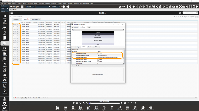
Record mark expression
The record mark. Can include {} macros. From v5.2.
The Show record mark attribute must be True for the expression to be displayed.
The record mark column is displayed in place when the Grid Section is scrolled horizontally.
Record mark tooltip
The record mark tooltip. Can include {} macros. From v5.2.
The Show record mark attribute must be True for the tooltip to be displayed.
See screenshot above.
Row dynamic background
The expression or function that provides dynamic row color formatting. e.g. iif(amount<0,'red',)
Row dynamic foreground
The expression or function that provides dynamic row color formatting. e.g. iif(amount<0,'white',)
Scrollbar
Section displays the grid vertical scrollbar (True | False)
Show actionbar
Show the actionbar (True | False)
Show grid lines
Show grid lines (True | False)
Show images inline
Show image columns as inline images (True | False).
Show logicals as CheckBoxes
Display logical/Boolean values as CheckBoxes (True | False)
Show memo/object panel
Show memo/object panel in splitbar mode (True | False)
Show memo/varchar inline
Show memo/varchar columns as inline text (True | False).
Show record mark
Show the record mark (True | False). From v5.2.
If True, the Record mark expression and Record mark tooltip will be displayed if specified. If no Record mark expression is specified, the record number will be displayed.
See screenshot above.
Show split edit
Display grid in split/form edit mode when displayed (True | False)
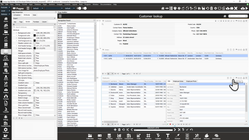
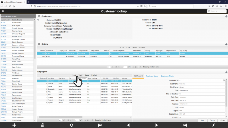
Split grid
Split the grid into a grid and a form (True | False)
From Lianja v6.0, Split grid is also supported in web Apps:
Split grid component list
List of components to be included in split grid form edit. This is a comma separated list, e.g. component:/mylib.mycomp1(‘prop=value;...’j:caption1,component:/mylib.mycomp2(‘prop=value;...’j:caption2. From v6.0.
Stretch last column
Stretch last grid column (True | False)
Tablet grid row height
Height of the grid rows on tablet
Transparency
Specify a transparency percentage from 0 to 100.
View Image list
List of image fields to be included in split grid form edit. This is a comma separated list, e.g. photo1:caption1,photo2:caption2. From v6.0.
Web grid row height
Height of the grid rows on web
Grid Column
Alternating row colors
Whether this column should have alternating row colors if the grid does (True | False).
Background color
The background color of the column
- See Colors
Button
Display as a button (True | False).
Button caption
The (optional) button caption.
Cell dynamic background
The expression or function that provides dynamic cell color formatting, e.g. iif({}<0,"red",""). Note the use of {}, substituted with the current cell value.
Cell dynamic foreground
The expression or function that provides dynamic cell color formatting, e.g. iif({}<0,"red",""). Note the use of {}, substituted with the current cell value.
Column width
Specify the fixed width in pixels of this column (0 is autosized).
Custom cell display
The name of a procedure/function that will return the display text for the cell.
- See Custom Renderers and Custom Editors and the 'Example smart grid' App (example_smartgrid) included in the distribution.
Custom cell editor
The name of a procedure/function that will return a custom editor for the cell. This may be a container with multiple controls.
- See Custom Renderers and Custom Editors and the 'Example smart grid' App (example_smartgrid) included in the distribution.
Custom cell padding
The padding (pixel) for custom display and editor cells.
- See Custom Renderers and Custom Editors and the 'Example smart grid' App (example_smartgrid) included in the distribution.
Fixed column width
Should this column be a fixed width (True | False).
Only visible when editing
Only show this column when editing. Hidden otherwise at runtime (True | False). From v6.0.
Summary column
Include this column in the summary panel (True | False). Prior to v6.0 this was named Total this column. Minimum, Maximum and Average column values can now also be displayed along with the column Total.
- See Section Summary
Summary format
Specify an expression to format the Section Summary values, e.g. currency({}). Prior to v6.0 this was named Total format. Minimum, Maximum and Average column values can now also be displayed and formatted along with the column Total.
- See Section Summary
Text Alignment
Text alignment (Auto | Left | Center | Right).
Total expression
Specify an expression to calculate the column total, e.g. calc_column("{}"). Note that {} will be substituted with the data controlsource.
- See Section Summary
Total format
Specify an expression to format the column total, e.g. currency({}). From v6.0 this is renamed Summary format as Minimum, Maximum and Average column values can now also be displayed and formatted along with the column Total.
- See Section Summary
Total this column
Include this column in the summary totals (True | False). From v6.0 this is renamed Summary column as Minimum, Maximum and Average column values can now also be displayed along with the column Total.
- See Section Summary


