UI States
You declare the UI states that a UI Element is affected by (Page,Section,FormItem,GridColumn) in the "Attributes" Tab of the App Inspector.
You manage UI states using the UI State Editor.
State changes can be used effectively to control UI workflow by setting various attributes based on actions or conditions that occur.
Contents
See Also
Custom Delegates, Lianja system object, SHOWDOCUMENT(), UI Presentation Rules, Using the showdocument() function and Lianja.showDocument() method
Overview
At the core of Lianja is the concept of ART Actions, Rules and Transitions.
UI states allow you to control how your App reacts as users enter data or as they navigate through your data and interact with different UI elements.
You typically change to different UI states in Custom Delegates.
Each action such as a click of a button or change of data in the UI can transition to a new UI state (a rule) that can alter the UI view of multiple elements from a single action.
UI States App

The 'UI States App' (example_uistates) example App is included in the Lianja App Builder distribution to demonstrate the use of UI States.


To see the effect of UI states, switch to the Desktop App View.
Clicking the Show Orders and Hide Orders buttons shows and hides the Orders grid section.
As we will see, the 'visible' property of the Orders grid section is being set based on a change of UI state.
The UI state is being set in the 'click' event of the buttons.
Setting a UI State
UI states can be changed using the showdocument() function or the Lianja system object showDocument() method.
The <statelist> is a comma-separated list of UI state names.
showdocument("changestate:<statelist>")
Lianja.showDocument("changestate:<statelist>")
To cause all UI components to revert back to their default attributes (no UI state set), use:
showdocument("resetstate")
Lianja.showDocument("resetstate")
Note that in Lianja 9.1 UI states are stacked. You can use the following new Lianja system methods in desktop, web and mobile apps.
Lianja.changeState("<statelist>")
Lianja.resetState()
Lianja.popState()
Lianja.resetState() with no argument specified will revert all UI components to their “Initial UI State”. If none is specified then the “false” properties (if specified) of all the UI states specified for the UI component are applied to it.
Lianja.popState() will call Lianja.resetState() on the last UI state pushed onto the stack then remove it and call Lianja.changeState() on the UI state on the top of the stack.
When Lianja.changeState() is called this will result in the statechanged delegate being called providing the nescessary hooks to transition between the UI states of a workflow that hides and shows pages, sections, formitems and tabs of a tabview etc.

Back in the UI States App (in Development View), open up the Field Attributes for the buttons.
These use the Inline Delegate version of the showdocument() function.
The 'Show Orders' button changes the UI State to 'state1'.
?changestate:state1

and the 'Hide Orders' button changes the UI state to 'state2'.
?changestate:state2
The 'state1' and 'state2' states are defined in the UI States Editor.
UI States Editor

The UI States Editor is accessed from its headerbar toolbutton and is where you define the names and behavior of UI states.
The UI state definitions are written to a table called
<app-name>_uistates
here 'example_uistates_uistates'.
Note: When you first open the UI States Editor, you will be prompted to allow the table to be created if it does not already exist.

Here's the UI States Editor with the states 'state1' and 'state2'.
The 'state2' UI state is selected here and has one row of 'property-name=value' entries (in the bottom section) for when the UI State is active (true) and not active (false).
Note: A UI state can have multiple rows or entries.
When 'state2' is active, affected UI components will have their 'visible' property set to 0 (false)
visible=0
and when 'state2' is not active (i.e. the default state), affected UI components will have their 'visible' property set to 1 (true)
visible=1
Make sure you set the default state in this way so that when you are in Development View, which uses the default state, you can see and manipulate all your UI components.

Here's 'state1' - the UI state activated when the 'Show Orders' button is clicked - it makes affected UI components visible when it is active
visible=1
and also when the default state is active
visible=1
Attributes
Two attributes control whether a component is affected by a particular UI State and what the starting UI state is:
UI States

The UI States attribute specifies the UI states that affect the container/control. Multiple states are specified as a comma separated list.
If you open the Section Attributes for the Orders grid section, you will see that it has the entry:
UI States: state1,state2
Initial UI state

The Initial UI state attribute specifies the starting UI state for the container/control.
In the UI States App, this is set in the App Settings as follows:
Initial UI state: state2
This means that when the App is first loaded (in runtime), the Orders grid section is not visible.
UI states table
When you use the UI States Editor, the UI states table name will be automatically added to your App Settings.
If you want to use an existing UI States table instead of creating a new one, just specify its name in the Ui states table attribute in the App Settings (screenshot above).
Notes on Client Support
| Attribute | Notes |
|---|---|
| UI States | UI States are supported on all clients from v9.1. Previously supported on the Desktop client only. |
| Initial UI State | The Initial UI State is supported supported on all clients from v9.1. Previously supported on the Desktop client only. |
State Changed Delegate
The State Changed delegate is called whenever a UI State is changed. It is called with one argument, the name of the UI state.
When a UI state is reset, the name of the UI state is passed with a '-' prefix, e.g. '-state2'.
For example, you can specify code in the statechanged delegate to navigate between pages and tabs in tabviews or conditionally change attributes for pages, sections, formitems and grid columns dynamically.
Web/Mobile demo App
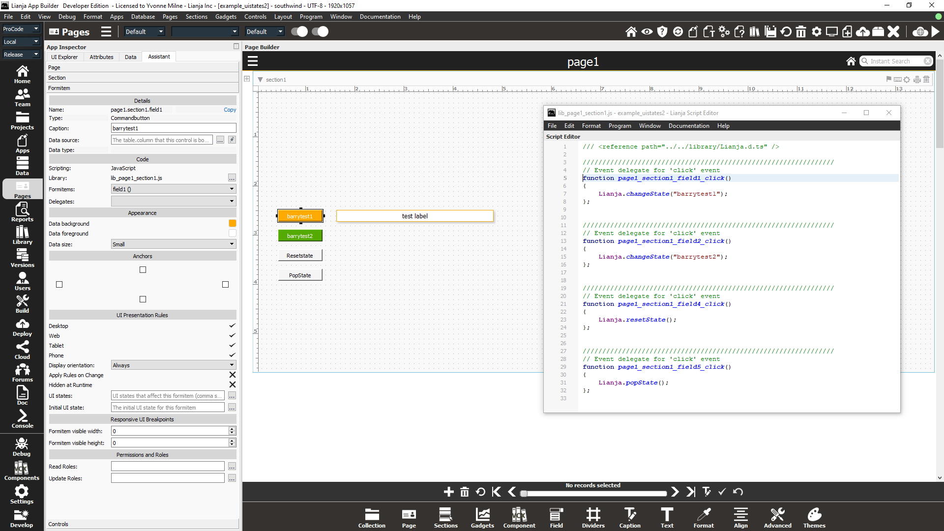
From v9.1 the example_uistates2 App is included in the App Builder distribution to demonstrate UI States functionality for Web/Mobile and desktop clients.

The 'test label' (page1.section1.field3) has an initial state set:
initstate
and is affected by the following states:
barrytest1,barrytest2,barrytest3
The initstate, barrytest1 and barrytest2 states are defined in the UI States Editor to define the label's colors and position - try defining barrytest3.

The four command buttons each have a click() event delegate defined to alter the current UI State using the three available Lianja system object methods:
- Lianja.changeState()
- Lianja.resetState()
- Lianja.popState()
If you have defined the barrytest3 state, add a new button to change to that state:
Lianja.changeState("barrytest3")
And here is the example_uistates2 App running in the browser, just after clicking the second button and so changing the state to 'barrytest2':

Remember that to see the effect of UI states for a desktop App, switch to the Desktop App View in the App Builder.