Customizing Section Appearance
Contents
Overview
You build Apps in Lianja App Builder visually using the Page Builder.
If you have not yet done so please read Understanding the Lianja Architecture and also Understanding ART to better understand this article.
An App consists of pages. Pages are made up of Sections. Form sections are made up of FormItems. We call these collectively "UI Elements" or "Visual Elements".
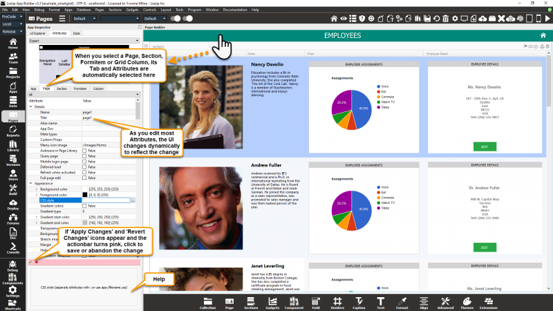
You adjust the appearance and behavior of each UI Element in the Attributes Tab of the App Inspector.
Select the "Pages" workspace if it is not already selected.
Select the "Attributes" Tab in the App Inspector if it is not already selected.
Filter the attributes by category from the combobox at the top of the Attributes Tab.
Click on the second column to edit the attribute.
Alternatively type the name of the attribute and it will be selected in the grid.
Clicking on a Page, Section or FormItem in the page will switch to the corresponding Attributes Tab and refresh its attributes.
Double click any of the Tabs in the App Inspector to detach it into its own floating window.
You can then drag it around the screen into a suitable position and use it without needing to select the Tab in the App Inspector.
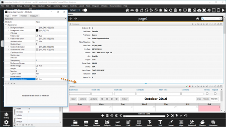
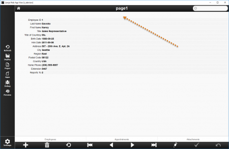
Add spacer at bottom
Add spacer at bottom of section (True | False).
With Add spacer at bottom checked.
For example, if the section below has Hide header checked, using Add spacer at bottom gives a more spacious layout.
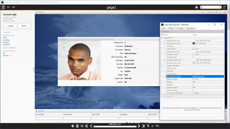
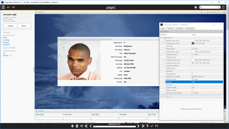
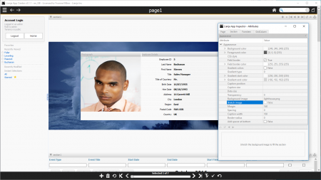
Background image
The background image for the section (png | jpg | gif).
Here, a Background image has been specified and a wide Margin set (160 pixels).
Border-radius
Border radius of items in the section.
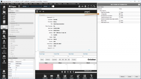
Collapsable
The section is collapsible at runtime (True | False).
- See also Collapsed Delegate
- See also Expanded Delegate
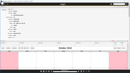
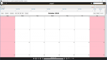
Collapsable attribute.
Click the section header to collapse the section.
Click the section header to expand the section.
The Collapsable attribute determines whether a Section can be collapsed or whether it is always expanded. This is overridden in these cases:
- The last Section on a Page with the 'Stretch last section' attribute set to True cannot be collapsed (Desktop).
- The last Section on a Page cannot be collapsed (Web/Mobile).
- Sections with the 'Hide header' attribute set to True cannot be collapsed.
Field border
Display border around fields (caption and data) (True | False).
- Supported by Form Sections.
Field border color
Field border color
- Supported by Form Sections.
- See also Colors.
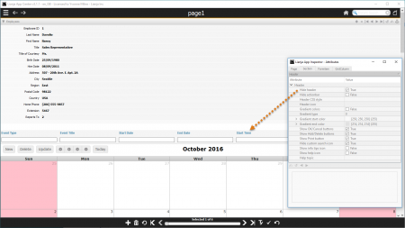
Hide TabBar at runtime
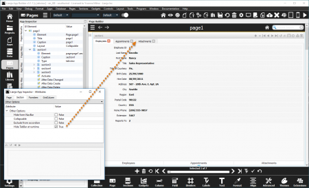
Hide the Tab Bar at runtime so tab pages are used as a stack of sections that can be selected programmatically (True | False).
- Supported by TabView Sections.
By default, the TabBar of a TabView Section is displayed, allowing its individual sections to be selected by clicking on their tab.
With Hide TabBar at runtime checked, the TabBar is hidden so that access to the tabs is developer controlled in the App code.
Note: the TabBar is still displayed in Development view in the Lianja App Builder.
Here in Web App View, the TabBar is hidden.
A Footer Custom menu has been specified and runs the Custom footer menu delegate code below to access the sections in the TabView Section.
Note: This section also has the Hide header attribute checked.
////////////////////////////////////////////////////////////////
// Event delegate for 'custommenu' event
function page1_section1_custommenu(arg)
{
	Lianja.showDocument("section:section1?action=select&text="+arg);
};
Margin
Margin size around the section.
Here, a Background image has been specified and a wide Margin set (160 pixels).
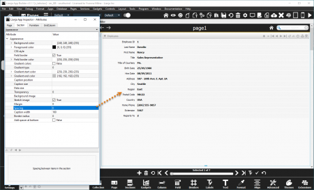
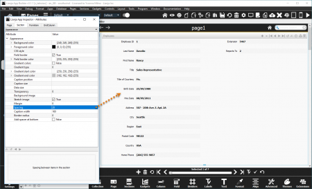
Spacing
Spacing between items in the section.
Default section Spacing.
Here the section Spacing has been set to 20 (pixels).
Rounded UI
Render the UI controls with a rounded UI for this section (True | False). From v9.4.22.
- Supported by Canvas Sections.
- See the sample example_cavascss App included in the distribution for an demonstration of this.
Stretch image
Stretch the background image to fill the section (True | False).
Here, Stretch image is unchecked (False).
Compare this with the screenshot above, where Stretch image is checked (True), which is the default.
