Customizing Page Appearance
Contents
- 1 Overview
- 2 See Also
- 3 Page Attributes
- 3.1 Background image
- 3.2 Stretch image
- 3.3 Margin
- 3.4 Hide page from menu
- 3.5 Stretch last section
- 3.6 Auto layout sections
- 3.7 Last section min height
- 3.8 Last section fixed height
- 3.9 Hide actionbar
- 3.10 Hide navigation bar slider
- 3.11 Hide navigation bar buttons
- 3.12 Sync actionbar buttons
- 3.13 Show settings icon
- 3.14 Custom settings menu
- 3.15 Show options icon
- 3.16 Custom options menu
- 3.17 Show scrollbar
- 3.18 Show scrollbar height
- 4 App Settings: Page defaults
Overview
You build Apps in Lianja App Builder visually using the Page Builder.
If you have not yet done so please read Understanding the Lianja Architecture and also Understanding ART to better understand this article.
An App consists of pages. Pages are made up of Sections. Form sections are made up of FormItems. We call these collectively "UI Elements" or "Visual Elements".
You adjust the appearance and behavior of each UI Element in the Attributes Tab of the App Inspector.
Select the "Pages" workspace if it is not already selected.
Select the "Attributes" Tab in the App Inspector if it's not already selected.
Filter the attributes by category from the combobox at the top of the Attributes Tab.
Click on the second column to edit the attribute.
Alternatively type the name of the attribute and it will be selected in the grid.
Clicking on a Page, Section or FormItem in the page will switch to the corresponding Attributes Tab and refresh its attributes.

Double click any of the Tabs in the App Inspector to detach it into its own floating window.
You can then drag it around the screen into a suitable position and use it without needing to select the Tab in the App Inspector.
See Also
Accordion Behavior, Colors, CSS, Gradients, Lianja 3 App Inspector (Video), Page Attributes, Section Attributes, Shading and Transparency
Page Attributes
Background image
The background image for the page (png | jpg | gif).
Use app:/imagename.ext for app specific images.
- Currently ignored.
Stretch image
Stretch the background image to fill the page (True | False).
- See Background image.
Margin
Margin size around the page.

Here, the Margin attribute has been set to 20 (pixels) revealing the orange Background color.
Hide page from menu at runtime.

Here, the 'Customer Orders' page has the Hide page from menu attribute checked (true).
- Note: in Web/Mobile Apps, if the first page in the App has Hide page from menu set, it will be hidden from the menu, but will still be displayed when the App is first loaded. If this is not the desired behavior, specify the page to display in the Initial page App Setting.
- See also Page Menu.
Stretch last section
Stretch last section to bottom of page.

Here, the Stretch last section attribute has been checked (true).

And here is the same page with the Stretch last section attribute unchecked (false).
Auto layout sections
Auto layout sections by section percentage.

Here, the Auto layout sections attribute has been checked (true).
Like Stretch last section the sections fill the page. Here though, the section heights are based on the percentage values specified in the section Auto layout percent attribute.

The 'Employee Information' section has an Auto layout percent of 50 and the other sections have it set to 25.
Last section min height
If the last section is less than this height, then set it to this height and show page vertical scrollbar.
- Currently ignored.
Last section fixed height
The last section is set to this fixed height and the previous section expanded to fill the space.

This works in conjunction with Stretch last section.
Here, the Last section fixed height attribute has been set to 150.
The last section, 'Employees Documents', has a fixed height of 150 pixels and the height of the section above, 'Employee Notes' is adjusted to fill the page.
Hide actionbar
Hide the actionbar.

Hide actionbar is checked (true). Compare this to the screenshot above.
Hide the navigation bar slider.

Hide navigation bar slider is checked (true). Compare this to the screenshot above.
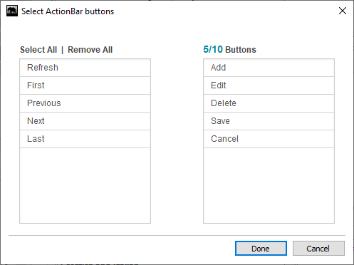
Hide specific navigation bar buttons.
This comma-separated list specifies the buttons to be hidden in the Page actionbar. Valid buttons are:
- add
- delete
- refresh
- first
- previous
- next
- last
- edit
- save
- cancel
In the Page Builder Assistant, click the [...] button next to Page -> Layout -> Hide ActionBar Icons to display a button selector:
The corresponding Page methods are also available:
- hideActionBarButtons()
- showActionBarButtons()
Sync actionbar buttons
Keep the actionbar buttons in sync with the current data position. Turn this off to improve performance with large amounts of data.
Show settings icon
Show the settings menu icon in the actionbar.
- Clicking on the settings icon calls the Custom settings menu delegate.
- If the Custom settings menu is specified, the menu of options will be displayed and the text of the selected option passed to the delegate.
The settings icon is also supported in the web/mobile client:
Custom settings menu (comma separated list of values).
If specified, the values will be displayed as a menu when the settings icon is clicked.
When a menu option is selected, the Custom options settings delegate is called. The selected menu option value is passed as a parameter to the delegate procedure or function.
Show options icon
Show the options menu icon in the actionbar.
- Clicking on the options icon calls the Custom options menu delegate.
- If the Custom options menu is specified, the menu of options will be displayed and the text of the selected option passed to the delegate.
The options icon is also supported in the web/mobile client:
Custom options menu (comma separated list of values).
If specified, the values will be displayed as a menu when the options icon is clicked.
When a menu option is selected, the Custom options menu delegate is called. The selected menu option value is passed as a parameter to the delegate procedure or function.
Show scrollbar
Show a vertical scrollbar for the page. Supported on the desktop only.

Show scrollbar is checked (true).
Show scrollbar height
Show vertical scrollbar on low resolution displays less than this height. Supported on the desktop only.

Show scrollbar is unchecked (false), but Show scrollbar height is set to 1200.
On screen resolutions below 1200, as it is here, the scrollbar is shown.
App Settings: Page defaults
Click the Settings icon in the ModeBar to open up the App Settings dialog. These setting apply to all Pages in the App.

Choose the appearance of the data navigation bar to use in this App: 'flat' color (default) or 'gradient' background.
Custom navigation bar CSS.
- Supported on the desktop client only.
- See CSS.