Understanding UI Navigation
Contents
- 1 Overview
- 2 The Basics
- 3 Setting up users and their roles
- 4 The Lianja Login Page
- 5 The App Center
- 6 The Page Center
- 7 The Pages Menu
- 8 Navigation Panels
- 9 Section Header and Footer Menus
- 10 Dialog Panels
- 11 Hiding and showing collapsible sections
- 12 How do I build a page that displays accordion sections?
- 13 Coding actions
- 13.1 Hiding and showing accordion sections
- 13.2 Hiding and showing Accordion Stack sections
- 13.3 Switching between pages
- 13.4 Switching between Tab Panels
- 13.5 Switching between Apps
- 13.6 Sharing variables and other state information between Apps
- 13.7 Switching to the App Center
- 13.8 Logging out
- 13.9 Getting information about the logged in user
Overview
When building Apps in Lianja there are a variety of ways to handle navigating between the various UI elements that you design into your App.
In this article I will discuss the various ways to accomplish UI navigation and highlight which ones are better for cross device UI navigation i.e. Desktop, Web or Mobile.
The Basics
The Lianja platform has been designed in such a way to minimize coding and let you concentrate on the visual appearance of your applications and leverage your domain knowledge to rapidly develop and deploy Apps that can run on Desktop PCs, Web browsers and mobile devices.
In order to accomplish this Lianja lays down some best practices and guidelines so that it can 'understand' the overall UI structure of your application.
If Lianja was just a free form 'Let's code everything' environment then there would be no way to be able to generate device independent Apps.
It is this 'level of abstraction' that provides the basis on which Lianja can generate and run Apps across multiple platforms, devices and form factors. This may seem foreign and strange to some of you but without a well defined abstraction layer you would need to re-code everything for each platform. Not an ideal situation.
So, without further ado, let's look at UI Navigation Techniques in Lianja and see what they look like on various devices.
As many of you should know by now, Lianja breaks an Application down into smaller discrete Apps which are built out of pages. Pages are then built out of sections. There are a large number of pre-built sections available.
Presenting the complete 'Application' to end users can be accomplished through the Lianja App Center which is the focal point for running Apps that make up an 'Application'. The Lianja App Center is only relevant to desktop and web applications. Mobile apps are required to be self contained individual apps so that they can be submitted to the various app stores.
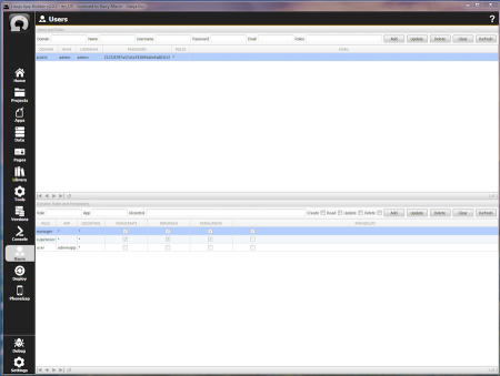
Lianja Apps and their visual elements (pages, sections, fields and gadgets) can each have permissions that control (CRUD) create, read, update and delete operations. These permissions are enabled based on the roles assigned to users who authenticate through the Lianja login page. Users and their roles are set up in the Users workspace.
Setting up users and their roles
The Lianja Login Page
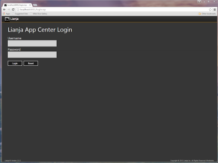
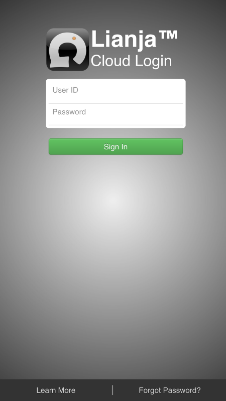
The first thing a user sees when they try and access Lianja Apps is the login page. This is an important part of the process of selecting and running Apps as it controls what each user can see and do in each of the Apps that you make available for them. You can bypass login and authentication (in the App Settings) but by doing so you lose all of the power and capabilities of Lianja Roles and Permissions.
Desktop login page
Web login page
Mobile login page
The App Center
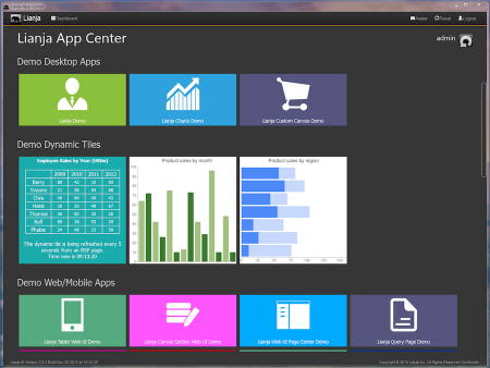
For desktop and web users, after the user authenticates, the Apps that the user has read permission for are displayed in the App Center as tiles grouped by App category. Web and Mobile apps display the Initial page of the App after successful authentication. You can find these attributes and many more in the App Settings.
After selecting an App from the App Center by clicking or touching on a tile, there are several different ways in which the UI can be displayed to the end user. Note also that some apps can have dynamic content in their tiles displayed at regular intervals. This provides a nice way to provide notifications to a user without the user needing to open an app to look manually.
Tip: As a security measure, you can specify an inactive delegate that is called after a period of inactivity and in that delegate automatically switch to the App Center or log the user out. You can read about how to do this later on in this document.
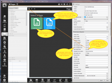
You can optionally specify the initial page to display and whether page navigation should be via the Page Center or the Pages Menu. These are specified in the App Settings. This is relevant to all types of apps; Desktop, Web and Mobile.
The Page Center
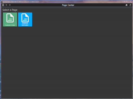
The Page Center is displayed in the same format as the App Center. Clicking or touching a tile causes the requested page to be displayed. Note that at any time you can click or touch the Home icon (the house) to return to the App Center.
Notice also the Navigation history icons on the top left. Clicking these allows the user to navigate backwards and forwards in the page history.
The Pages Menu
Using a Pages Menu is the best way to provide page navigation to a user. The Pages Menu is only made visible when the Hamburger icon is clicked or touched so it does not occupy any screen space until required. This works well across Desktop, Web and Mobile apps. It is animated into view by sliding in from the left of the viewport.
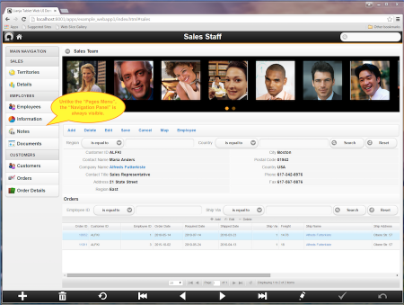
Unlike the pages menu, navigation panels are always visible on a page. Navigation panels provide a means of navigating between the pages and the sections of pages that have stacked accordion sections. It is important to realize that section relationships are always actively being handled automatically for you as you navigate between the various pages and sections of an App. You do not have to think about this or perform any special coding. Navigation panels are more suitable for desktop, web and tablet apps. For phone apps the Pages Menu is a best practice.
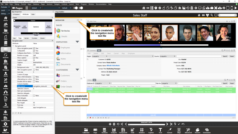
The name of a text file should be specified in the page Navigation panel 'Data source' attribute in the App Inspector Attributes tab (or the Attributes dialog if the App Inspector is closed). To create a new file, click the [...] button and it will automatically generate a filename for you and open the file in the Script Editor. If a file is already specified, clicking the [...] button will open that file in the Script Editor
From v5.3, if the page Navigation panel 'Show caption' attribute is 'True', you can also click the keyboard icon to create or open the source file.
The navigation_menu.txt file contains lines of text that determine how the navigation panel is displayed and what pages and/or sections should be displayed when menu items are clicked or touched.
Let's look at the format of this text file line by line.
Line 1 !SALES#GRAY
This denotes a non collapsible list with a subheading SALES with a bold gray foreground color for the text. A non collapsible subheading is prefixed with a ! Character. Color names in uppercase denote bold colors. Color names can be uppercase (bold), lowercase or a hexadecimal numeric color code e.g. 0f0f0f. An optional background color for a subheading can also be specified by appending #color to this definition.
Line 4 ^EMPLOYEES#GRAY
This denotes a collapsible list with a subheading EMPLOYEES with a bold gray foreground. A collapsible subheading is prefixed with a ^ character.
Line 9 ^CUSTOMERS#GRAY
This denotes another collapsible list with the subheading CUSTOMERS.
Lines 2,3,5,6,7,8,10,11,12
Each of these lines of text consists of three items separated by # characters.
Item 1: The caption to be displayed in the list beneath the subheading.
Item 2: The path to the icon to be displayed (optional). This can reference png files using app:/ or lib:/ path.
Item 3: The target page or page.section id to be displayed when the text is clicked or touched.
Tip: You can specify a CSS file to skin the appearance of the navigation panel. See the example App example_webapp1 for an example of how this is accomplished.
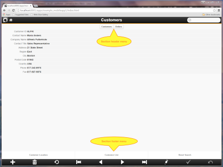
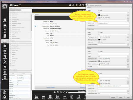
Double click the section header to slide in the section attributes then scroll down to the attributes for the header menu and footer menu respectively.
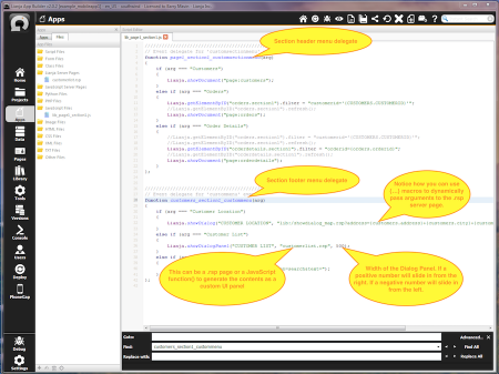
Double click the section header to slide in the section attributes then scroll down to the Custom Delegates.
Now let's look at the delegates for these section menus.
Dialog Panels
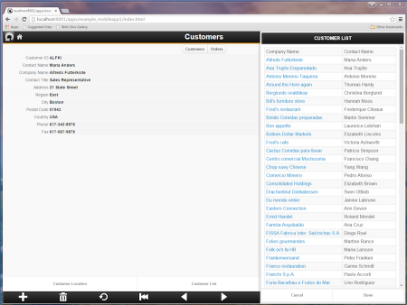
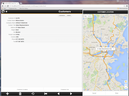
Dialog Panels provide a clean and consistent UI for presenting additional information to your users that does not appear by default on the page. Dialog Panels animate into view from either the left or the right. On Mobile phones they slide over the viewport and occupy all of it to make best use of the available space. Closing a Dialog Panel causes it to animate back out from where it came from. Use Dialog Panels whenever you can as they are responsive and work on Desktop, Web and Mobile Apps.
When used in conjunction with {...} macros, Dialog Panels can display dynamic context sensitive content. This is the code used to display a Google map for the customer currently being displayed in the form. It is called by clicking or touching on the "Customer Location" button in the footer menu:
Lianja.showDialogPanel("CUSTOMER LOCATION",
    "lib:/showdialog_map.rsp?address={customers.address}
                +{customers.city}+{customers.country}", 500);
Hiding and showing collapsible sections
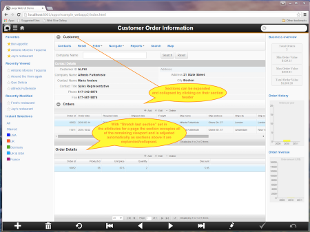
A page is built out of sections. The sections can be displayed one on top of each other and can be collapsed and expanded individually by clicking or touching on the section header.
One important page attribute is the Stretch last section attribute which causes the last section on a page that does not have a fixed height to be automatically expanded to occupy all of the space in the viewport. If the last section has a fixed height then the first section that does not have a fixed height above it is stretched into the available space.
Tip: v2.0 introduced the ability to automatically adjust a section height to a percentage of the viewport height making it much easier to render a responsive UI.
How do I build a page that displays accordion sections?
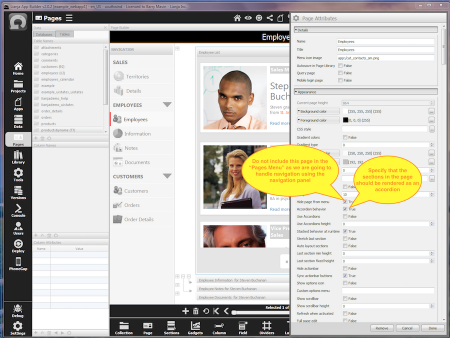
Double click the page header to edit the Page Attributes.
Coding actions
Hiding and showing accordion sections
The Lianja system object has a method showDocument() that you can use to perform a variety of operations on the UI. To switch between different accordion sections just issue a select action on the section:
Lianja.showDocument("page:mypagename.mysection?action=select")
Hiding and showing Accordion Stack sections
An accordion stack is a group of sections where only one section from the accordion is visible at a time but no headers are visible. Check the Stacked behavior at runtime page attribute to specify that the sections should be displayed as an accordion stack. This is typically used in conjunction with a navigation panel but may be used independently to provide you with the ability to switch between the sections contained within a page arranged as an accordion.
Lianja.showDocument("page:mypagename.mysection?action=select")
Switching between pages
To switch pages just do this:
Lianja.showDocument("page:mypagename")
This will cause the page named mypagename to be made visible in the viewport.
Switching between Tab Panels
Supposing we have a TabView section called mytvsection. We can change the selected tab programmatically using the Caption attribute of the tabbed section, here orders, like this:
Lianja.showDocument("page:mypagename.mytvsection?action=select&text=orders")
Note that in the TabView section you can also Hide TabBar at runtime in the TabView Section Attributes. This provides us with a stack of related panels that can be selected programmatically in any of our delegates. This is useful for creating a wizard-style of forms to guide users through a series of data entry steps.
Switching between Apps
Switching between different Apps in Desktop and Web Apps is as simple as this:
Lianja.openApp("myappname")
This will cause the App named myappname to be loaded.
Sharing variables and other state information between Apps
You can use sessionstorage to share data between each App you load:
Lianja.sessionStorage.setItem("customer", "Barry")
Lianja.sessionStorage.setItem("caller", Lianja.application)
Lianja.openApp("viewcustomer")

// inside the ready delegate of the viewcustomer app
if Lianja.isRuntimeMode( )
    customer = Lianja.sessionStorage.getItem("customer")
    // lookup the customer and display information
    // You can return the originating app in a menu item delegate
    Lianja.openApp(Lianja.sessionStorage.getItem("caller"))
endif
Hint: to share large objects between Apps use json_encode() and json_decode() of an object.
Switching to the App Center
This will return to the App Center:
Lianja.home()
Logging out
This will exit the App and return to the Login page:
Lianja.logout()
Getting information about the logged in user
Use any of the following functions:
