Canvas Designer
Contents
Overview
Canvas Sections allow highly customized layouts with a wide range of advanced containers and controls.
The Canvas Designer is a drag-and-drop editor providing pixel-perfect positioning of UI Controls In a Canvas Section.
Using the Canvas Designer you can drag-and-drop table columns to create UI Controls that are automatically data-bound.
Select the "Pages" workspace.
Select the "Pages Files" in the App Inspector.
Select the "Tables" tab.
Click on its name to select a table from the Table Names panel.
Drag a column from the Column Names tab and drop it where you want it to be positioned in the Canvas Section.
Customize its appearance by editing its "Attributes" in the Attributes Tab.
Customize its behavior by editing its "Custom Delegates" in the "Attributes" Tab.
Adding a Canvas Section
To add a Canvas Section to a Page, select Canvas from the Sections menu in the Form Tools. If the Use wizards/builders App Setting is checked true, the Section Wizard will be displayed.

Drag on the blue handle at the bottom of the section to resize it.
To make your Canvas Section fill the whole Page, set the Page Stretch last section attribute to true.
Drag and Drop Table
From v8.0 a table can be dragged from the Data tab and dropped onto a Canvas Section and will be given a default layout that can then be adjusted as required.

Drag and Drop Columns
Add automatically data-bound UI controls to your Canvas Section using drag and drop.
Select a table by clicking on its name, then just drag a column from the Column Names tab and drop it where you want it to be positioned in the Canvas Section.
You can adjust the position of a UI control by selecting it and pressing the left, up, right, or down cursor keys
You can adjust the height of a UI control by selecting it and pressing the Shift+Up or Shift+Down cursor keys
You can adjust the width of a UI control by selecting it and pressing the Shift+Left or Shift+Right cursor keys
Select multiple controls by pressing the shift key while clicking on them

Select a control then drag it to reposition it aided by the crosshairs, rulers and tooltip showing x, y coordinates, width x height and anchor values.

From v9.1.11, specify the UI control anchors using the Anchor Builder in the Page Builder Assistant
Click the top left corner of the Canvas Section to toggle the display of the grid lines.

To edit the control's attributes, select the Attributes tab in the App Inspector (if the App Inspector is closed, double-click on the control's caption to open the Attributes dialog).
Canvas Sections have the following attributes (in the 'Other Options' category):
- Snap objects to grid: When adding objects to the canvas, snap to grid when drop.
- Snap objects to grid size: Number of pixels to snap to grid when drop.
Advanced Canvas Controls
Advanced Canvas Controls from the Advanced menu in the Form Tools can also be added to Canvas Sections. They can be data-bound by setting their Data source attribute.
Click on a control in the Advanced menu to add it to the selected Canvas Section, then click on the control's border and drag it to reposition it as with the drag and drop fields above.

| Control | Description |
|---|---|
| ActiveX | Control for embedded ActiveX component (Windows desktop) |
| Chart | Control for WebView based chart. From v8.0. |
| CheckBox | Control for boolean state - True (checked) or False (unchecked) |
| ComboBox | Control combining a TextBox and a ListBox |
| CommandButton | Button control |
| Container | Control for transparent container panel. From v8.0. |
| Date TextBox | Control combining a date TextBox and a popup calendar |
| DateTime TextBox | Control combining a date/time TextBox and a popup calendar |
| EditBox | Editor control |
| Groupbox | Control for titled transparent groupbox panel. From v8.0. |
| Hyperlink | Hyperlink label control |
| Image | Control for displaying images |
| Label | Textual label control |
| LCDnumber | Numeric label control with LCD-like digits |
| ListBox | Control with a single column list |
| Numeric TextBox | Textbox control for numeric values |
| OptionButton | Control to select/deselect an option |
| OptionGroup | Container used to group OptionButtons |
| Progress Bar | Bar control for minimum, current (%) and maximum numeric values |
| Rich Text Editor | Rich text editor control |
| Separator | Separator label control |
| Slider | Vertical or horizontal numeric slider with minimum and maximum values |
| Spinner | Numeric TextBox control with increment/decrement controls |
| Subtitle | Subtitle label control |
| TextBox | Textbox control |
| TreeGrid | Tree grid control |
| WebView | Embedded WebKit Control |
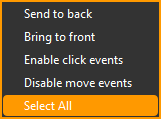
Options
| Option | Description |
|---|---|
| Send to back | Send the selected control(s) to the back (for overlapping controls). |
| Bring to front | Bring the selected control(s) to the front (for overlapping controls). |
| Enable/Disable click events | See below. |
| Enable/Disable move events | See below. |
| Select All | Select all controls in the section. From v8.0. |
To delete a Canvas Section control, click on the control's border to select it then press the Delete key
Text
The Text menu in the Form Tools allows you to change the Caption text size of Advanced Controls.
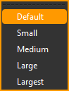
Select a control, or select multiple controls by pressing the Shift key while selecting, then choose the size.
You can select multiple controls by pressing the Shift key while clicking on their border.
From v8.0, all controls can be selected using the Select All option from the Advanced options submenu.
Format
The Format menu in the Form Tools allows you to change various appearance attributes of Advanced Controls.
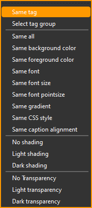
For 'Same ...' options, select multiple controls by pressing the Shift key while selecting then choose an option to match the attribute(s) of all the selected controls to that of the first selected control.
For 'shading' options, select one or more controls, then choose the option.
'Transparency' options do not apply to Canvas Section controls.
Align
The Align menu in the Form Tools allows you to change the geometry attributes and data text alignment of Advanced Controls.
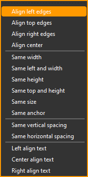
Select multiple controls by pressing the Shift key while selecting then choose an option to align or match the attribute(s) of all the selected controls to that of the first selected control.
Disable Click Events
To make it easier to click on Advanced Canvas Controls to select them, particularly for CommandButtons, the Headerbar has a toggle to enable and disable click events. Click events are enabled in the Page Builder by default. Click the toggle to disable them so they do not fire when you click on a control. Click the toggle again to re-enable them.

Disable Move Events
To make it easier to click on Advanced Canvas Controls to select them, particularly when shift-selecting multiple controls, the Headerbar has a toggle to enable and disable move events. Move events are enabled in the Page Builder by default. Click the toggle to disable them so you do not accidentally move a control when you click on it. Click the toggle again to re-enable them.

See Also
Advanced Canvas Control Attributes, Advanced Canvas Control Custom Delegates, Canvas Section Attributes