Calendar Section
Contents
Overview
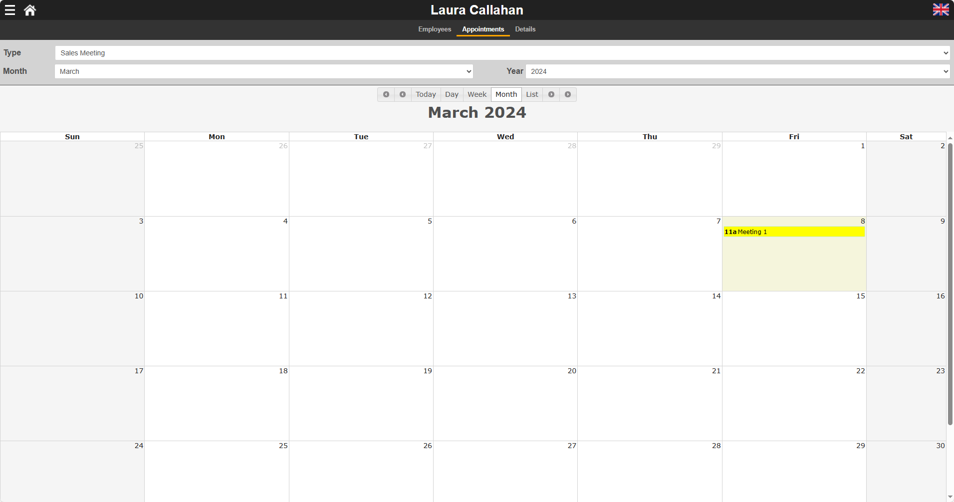
Calendar Sections provide a calendar interface to allow for the creation, display, update and deletion of appointments and other time planner events.
You build Apps in Lianja App Builder visually using the Page Builder.
If you have not yet done so please read Understanding the Lianja Architecture and also Understanding ART to better understand this article.
An App consists of pages. Pages are made up of Sections. Form sections are made up of FormItems. We call these collectively "UI Elements" or "Visual Elements".
Setting Attributes Declaratively
You adjust the appearance and behavior of each UI Element in the Attributes Tab of the App Inspector.

The attributes available consist of some common ones as well as some specific to the UI Element being inspected.
Getting and Setting Attributes Programmatically
The setAttribute(name, value) method can be used to set the value of an Attribute:
Lianja.get("pageid.sectionid").setAttribute("title","Section1")
Note: on the desktop, the shortened form setAttr(name,value) is also available.
The getAttribute(name) method can be used to get the value of an Attribute:
cTitle = Lianja.get("pageid.sectionid").getAttribute("title")
Note: on the desktop, the shortened form getAttr(name) is also available.
See Also
Demo Apps (included in the Lianja App Builder distribution):
- Lianja Demo (lianjademo)
- Lianja Web UI Calendar Demo (example_webapp4)
Attributes
Details
| Attribute | Description | Name | Type |
|---|---|---|---|
| Name | The name for this section (unique to the page) | id | Character |
| Full name | The full name for this section including its parent page, e.g. page1.section1 | fullid | Character |
| Alias name | The alias name for this section | aliasid | Character |
| Dashboard group | The dashboard section that this section belongs to. From v5.2. | horizontalgroup | Character |
| Horizontal stretch | The horizontal % stretch factor that this section should occupy. From v5.2. | horizontalgroupstretchfactor | Character |
| Vertical stretch | The vertical % stretch factor that this section should occupy. From v5.2. | verticalgroupstretchfactor | Character |
| App Doc | The App Doc file for this section. This will be included in the App Doc when it is generated. | appdoc | Character |
| MetaData version | The MetaData version number. You can set this in the setupUI hook to prevent MetaData being applied multiple times. | metaDataVersion | Int |
| Meta types | A comma separated list of metatype names | metatypes | Character |
| Custom Props | A ';' separated list of custom prop key pairs, e.g. name=barry;company=lianja From v5.3. |
customprops | Character |
| Type | The type of section: calendar (readonly) | type | Character |
| Caption | The section caption displayed in the section header | title | Character |
| Database | The database for this section | database | Character |
| Table | The table for this section | table | Character |
| Height | The section height | height | Character |
| Fixed height | Fix the section height (True | False) | fixedHeight | Boolean |
| Auto layout percent | Auto layout percentage of page size. If set to 0, then all sections on a page are resized to an equal height. | autoLayoutPercentage | Int |
| Readonly | Section is readonly (True | False) | readOnly | Boolean |
Appearance
| Attribute | Description | Name | Type |
|---|---|---|---|
| Margin | Margin size around the section | margin | Int |
| Add spacer at bottom | Add spacer at bottom of section (True | False) | spacerVisible | Boolean |
Header
| Attribute | Description | Name | Type |
|---|---|---|---|
| Hide header | Hide section header at runtime(True | False) | hideHeaderAtRuntime | Boolean |
| Hide actionbar | Hide actionbar when stacked section is activated at runtime (True | False) |
hideActionBarAtRuntime | Boolean |
| Header CSS style | CSS style (separate attributes with ; or use app:/filename.css) | headerCssStyle | Character |
| Header icon | The image for the Header (png | jpg | gif). Use app:/imagename.ext for app specific images. |
headerIcon | Character |
| Gradient colors | Render the Header background color as a gradient (True | False) | headerGradient | Boolean |
| Gradient type | Specify the gradient type | headerGradientType | Int |
| Gradient start color | Gradient start color | headerFromColor | Character |
| Gradient end color | Gradient end color | headerToColor | Character |
| Show OK/Cancel buttons | Show OK/Cancel buttons in the section header (True | False) | showOkCancelButtons | Boolean |
| Show Add/Delete buttons | Show Add/Delete buttons in the section header (True | False) | showAddDeleteButtons | Boolean |
| Show Print button | Show Print button in the section header (True | False) | showPrintButton | Boolean |
| Show Edit button | Show Edit button in the section header (True | False) | showEditButton | Boolean |
| Hide custom search icon | Hide the custom search icon (True | False) | hideCustomSearchIcon | Boolean |
| Show Custom search dialog | Show custom search dialog when custom search icon clicked (True | False) | showcustomsearchdialog | Boolean |
| Show custom search dialog panel | Show custom search dialog panel when custom search icon clicked (True | False) |
showcustomsearchdialogpanel | Boolean |
| Show info tips icon | Show the info tips icon in the section header (True | False) | showInfoTipsIcon | Boolean |
| Show help icon | Show the help icon in the section header (True | False) | showHelpIcon | Boolean |
| Help topic | Help topic to display when the help icon is clicked in the section header | helpTopic | Character |
Custom Header Style
| Attribute | Description | Name | Type |
|---|---|---|---|
| Use custom header style | Use a custom header style (True | False) | headercustomstyle | Boolean |
| Header background color | Header background color | headerbackcolor | Character |
| Header foreground color | Header foreground color | headerforecolor | Character |
| Header bottom border | Display the header bottom border (True | False) | headerbottomborder | Boolean |
| Header bottom border height | Height (in pixels) of the header bottom border (if displayed) | headerbottomborderheight | Int |
| Header bottom border color | Header bottom border color | headerbottombordercolor | Character |
| Show record count badge | Show the record count badge in the section header (True | False). | showreccount | Boolean |
Visual Component Details
| Attribute | Description | Name | Type |
|---|---|---|---|
| Component library | This specifies the Component library where the component will be saved. | componentlib | Character |
| Component name | Save as this component name whenever the section is saved. | componentname | Character |
| Component author | The author of this component. | componentauthor | Character |
| Component version | The version of this component. | componentversion | Character |
| Component description | The description of this component. | componentdescription | Character |
| Component permissions | The permissions required for this component in Lianja Cloud App Builder. | componentpermissions | Character |
| Component width | The width of this component when activated as a Form. | componentwidth | Int |
| Component height | The height of this component when activated as a Form. | componentheight | Int |
Calendar Options
| Attribute | Description | Name | Type |
|---|---|---|---|
| Default view | The default view to be displayed (Month | Week | Day) | calendarUrlType | Character |
| Event resource column | The (character) event resource column from the table for the events in the calendar. From v8.0. | calendarEventResourceColumn | Character |
| Event resource caption | The caption header for the event resource choices for the events in the calendar. From v8.0. | calendarEventResourceCaption | Character |
| Event resource choices | The event resource choices for the events in the calendar. This can be a comma separated list or a SQL statement. From v8.0. | calendarEventResourceChoices | Character |
| Event resource width | The event resource panel width in pixels (default 0 = 120 pixels). From v8.0. | calendarEventResourcePanelWidth | Int |
| Event type column | The (character) event type column from the table for the events in the calendar. | calendarEventTypeColumn | Character |
| Event type caption | The caption header for the event type choices for the events in the calendar. From v8.0. | calendarEventTypeChoices | Character |
| Event type choices | The event type choices for the events in the calendar. This can be a comma separated list or a SQL statement. | calendarEventTypeChoices | Character |
| Event title column | The (character) event title column from the table. | calendarTitleColumn | Character |
| Event notes column | The (memo/varchar) event notes column from the table. From v9.5. | calendarnotescolumn | Character |
| Event start column | The (datetime) event start column from the table. | calendarStartDatetimeColumn | Character |
| Event end column | The (datetime) event end column from the table. | calendarEndDatetimeColumn | Character |
| Event repeat column | The (int) event repeating flag column from the table. | calendarRepeatingColumn | Character |
| Event allday column | The (logical) event allday flag column from the table. | calendarAllDayColumn | Character |
| Event key column | The key expression for events in the calendar. | calendarKeyExpr | Character |
| Event type value | The event type for this calendar, e.g. meeting, vacation, appointment. Calendar contents will be filtered on this. | calendarEventTypeColumnValue | Character |
| Autosize | Autosize the calendar into the viewport (True | False) | calendarAutosize | Boolean |
| Other options | Other calendar options | calendarOtherOptions | Character |
| Click delegate | Delegate to call when a calendar event is clicked | calendarDelegate | Character |
| Dynamic day backcolor | Delegate to return the background colors and dates. You should return this as a comma separated list. The delegate is called with one parameter: 'dates' or 'colors'. The currently selected cursor contains the selected records. | calendarDayBackColorDelegate | Character |
| Dynamic event backcolor | Delegate to return the background color of the event for the specified event type, which is passed as a parameter. | calendarEventBackolorDelegate | Character |
| Dynamic event forecolor | Delegate to return the foreground color of the event for the specified event type, which is passed as a parameter. | calendarEventForeColorDelegate | Character |
| Custom delegate library | Custom library containing the day and event dynamic color delegates. | calendarCustomLibrary | Character |
| Filter | The filter expression that restricts which events will be included in the calendar. | calendarFilter | Character |
Related Data
| Attribute | Description | Name | Type |
|---|---|---|---|
| Parent section name | Name of related parent section | parentid | Character |
| Automatically relate | Automatically relate the child section (True | False). If this is unchecked then you need to manually relate it in the parentdatachanged delegate. | autoRelateChildSection | Boolean |
| Parent key | Parent key | parentKeyExpr | Character |
| Child key | Child key | childKeyExpr | Character |
Menu
| Attribute | Description | Name | Type |
|---|---|---|---|
| Visible | Section menu visible (True | False) | sectionMenuVisible | Boolean |
| Height | Section menu height | sectionMenuHeight | Int |
| Background color | Section menu background color | sectionMenuBackColor | Character |
| Foreground color | Section menu foreground color | sectionMenuForeColor | Character |
| Custom menu panel | The .rsp or .jssp page used to create the custom menu panel. This page should generate dynamic HTML5/JavaScript. | customSectionMenuPanel | Character |
| Custom menu | Section menu contents | customSectionMenu | Character |
| Custom action | Action to perform when a menu item is selected | sectionMenuAction | Character |
Search Panel
| Attribute | Description | Name | Type |
|---|---|---|---|
| Visible | Section search panel visible (True | False) | searchPanelVisible | Boolean |
| Height | Section search panel height | searchPanelHeight | Int |
| Background color | Section search panel background color | searchPanelBackColor | Character |
| Foreground color | Section search panel foreground color | searchPanelForeColor | Character |
| Auto create | Automatically create search panel for all Section search fields | searchPanelAutoCreate | Boolean |
| Custom search panel | The delegate used to create the custom search panel | searchPanelAction | Character |
Subtitle
| Attribute | Description | Name | Type |
|---|---|---|---|
| Visible | Section subtitle visible (True | False) | subtitleVisible | Boolean |
| Caption | Section subtitle caption | subtitleCaption | Character |
| Height | Section subtitle height | subtitleHeight | Int |
| Background color | Section subtitle background color | subtitleBackColor | Character |
| Foreground color | Section subtitle foreground color | subtitleForeColor | Character |
| Font | Section subtitle font | subtitleFont | Int |
| CSS style | CSS style | subtitleCssStyle | Character |
| Attribute | Description | Name | Type |
|---|---|---|---|
| Visible | Section footer visible (True | False) | footerVisible | Boolean |
| Caption | Section footer caption | footerText | Character |
| Height | Section footer height | footerHeight | Int |
| Background color | Section footer background color | footerBackColor | Character |
| Foreground color | Section footer foreground color | footerForeColor | Character |
| CSS style | CSS style (separate attributes with ; or use app:/filename.css or specify CSS classes separated by spaces). | footercssstyle | Character |
| Custom menu | Section footer menu contents | customOptionsMenu | Character |
| Custom action | Action to perform when a footer menu item is selected | customOptionsMenuAction | Character |
| Footer button CSS | Footer button CSS style | footerButtonCss | Character |
| Footer button width | Footer button width | footerButtonWidth | Int |
Other Options
| Attribute | Description | Name | Type |
|---|---|---|---|
| Hide form NavBar | Hide form Navigation Bar at runtime if this section is in an Accordion Stack (True | False) | hideFormNavBar | Boolean |
| Hide SearchBox | Hide the Page Header Instant Search box when this section is selected in an Accordion Stack (True | False). From v5.4. | hidesearchbox | Boolean |
| Collapsable | The section is collapsible at runtime (True | False) | collapsableAtRuntime | Boolean |
| Exclude from accordion | The section is excluded from accordion behavior at runtime (True | False) | excludeAccordionAtRuntime | Boolean |
Custom Delegates
| Attribute | Description | Name | Type |
|---|---|---|---|
| Scripting language | The default scripting language for custom code in this section (Inherit | Recital | Visual FoxPro | Python | JavaScript | PHP) | scriptingLanguage | Character |
| Custom library | The filename of the library containing code for event handlers and custom procedures/functions | customLibrary | Character |
| The delegate for the Print event. This is called when you click the 'Print' icon. |
printAction | Character | |
| Expanded | The delegate for the Expanded event | expandedAction | Character |
| Collapsed | The delegate for the Collapsed event | collapsedAction | Character |
| Hotkey | The delegate for the Hotkey event. | hotkeyAction | Character |
| Parent data changed | The delegate for the ParentDataChanged event | parentDataChangedAction | Character |
| Data Producer | The delegate for the DataProducer (used in Web Components). From v6.1. |
dataproduceraction | Character |
| Timer | The delegate for the Timer event | timerAction | Character |
| Timer interval | The timer interval in seconds that the Timer event will be called at runtime | timerInterval | Int |
| State Changed | The delegate for the Statechanged event. | stateChangedAction | Character |
| Custom footer menu | The delegate for the footer menu event | customMenuAction | Character |
| Custom search command | The delegate for the search event | customSearch | Character |
| Custom section menu | The delegate for the section menu event | customSectionMenuAction | Character |
Permissions and Roles
| Attribute | Description | Name | Type |
|---|---|---|---|
| Create roles | A comma separated list of roles that can perform create operations on data in the section. | permcreate | Character |
| Read roles | A comma separated list of roles that can read (and view) the section. | permRead | Character |
| Update roles | A comma separated list of roles that can perform update operations on data in the section. | permUpdate | Character |
| Delete roles | A comma separated list of roles that can perform delete operations on data in the section. | permDelete | Character |
UI Presentation Rules
| Attribute | Description | Name | Type |
|---|---|---|---|
| Desktop | Include this section in a Desktop client (True | False). | desktopUI | Boolean |
| Web | Include this section in a Web client (True | False). | webUI | Boolean |
| Tablet | Include this section in a Tablet client (True | False). | tabletUI | Boolean |
| Phone | Include this section in a Phone client (True | False). | mobileUI | Boolean |
| UI States | UI states that affect this section. Specify multiple states as a comma separated list. | state | Character |
| Initial UI state | The initial UI state for this section. This will be applied to the section and all its fields and gadgets. | uiStateInit | Character |
| Readonly when | Section is readonly at runtime if specified expression evaluates to true. | readonlyWhen | Character |
| Visible when | Section is visible at runtime if specified expression evaluates to true. | visibleWhen | Character |
| Display orientation | Display depending on mobile device orientation for Tablets and Phones. (Always | Portrait | Landscape) | displayOrientation | Character |
| Apply rules on change | Apply UI presentation rules (Visible when and Readonly when) when data is changed interactively or when navigating records (True | False). | applyRulesOnChange | Boolean |
| Apply rules on parent change | Apply section UI presentation rules (Visible when and Readonly when) when parent data is changed by navigating records (True | False) | applyRulesOnParentChange | Boolean |
| Search Panel Responsive UI width breakpoint | The Search Panel responsive UI width breakpoint in Web/Mobile Apps. | searchpanelresponsivevisibility | Int |
| Menu Responsive UI width breakpoint | The Menu responsive UI width breakpoint in Web/Mobile Apps. | responsivemenuwidth | Int |
| Responsive UI width breakpoint | The section responsive UI visibility width breakpoint in Web/Mobile Apps. | responsivewidthvisibility | Int |
| Responsive UI height breakpoint | The section responsive UI visibility height breakpoint in Web/Mobile Apps. | responsiveheightvisibility | Int |