Calendar Options
Contents
- 1 See Also
- 2 Overview
- 3 Additional Demo Apps
- 4 Calendar Table
- 5 Using a Calendar Section
- 6 Calendar Section Attributes
- 6.1 Default view
- 6.2 Event resource column
- 6.3 Event resource caption
- 6.4 Event resource choices
- 6.5 Event resource width
- 6.6 Event type column
- 6.7 Event type caption
- 6.8 Event type choices
- 6.9 Event title column
- 6.10 Event notes column
- 6.11 Event start column
- 6.12 Event end column
- 6.13 Event repeat column
- 6.14 Event allday column
- 6.15 Event key column
- 6.16 Event type value
- 6.17 Autosize
- 6.18 Other options
- 6.19 Click delegate
- 6.20 Dynamic day backcolor
- 6.21 Dynamic event backcolor
- 6.22 Dynamic event forecolor
- 6.23 Custom delegate library
- 6.24 Filter
- 7 Further Customization
See Also
Overview
Calendar Sections provide a calendar interface to allow for the creation, display, update and deletion of appointments and other time planner events.
From Lianja v8.0, event resources such as rooms can also be included.
From Lianja v9.5 the following functionality is included:
- Event Notes
- Querying events by resource/date/type
- List
The 'Employee Calendar' App (example_webapp4) is included in the Lianja App Builder distribution to demonstrate the use of a Calendar Section.
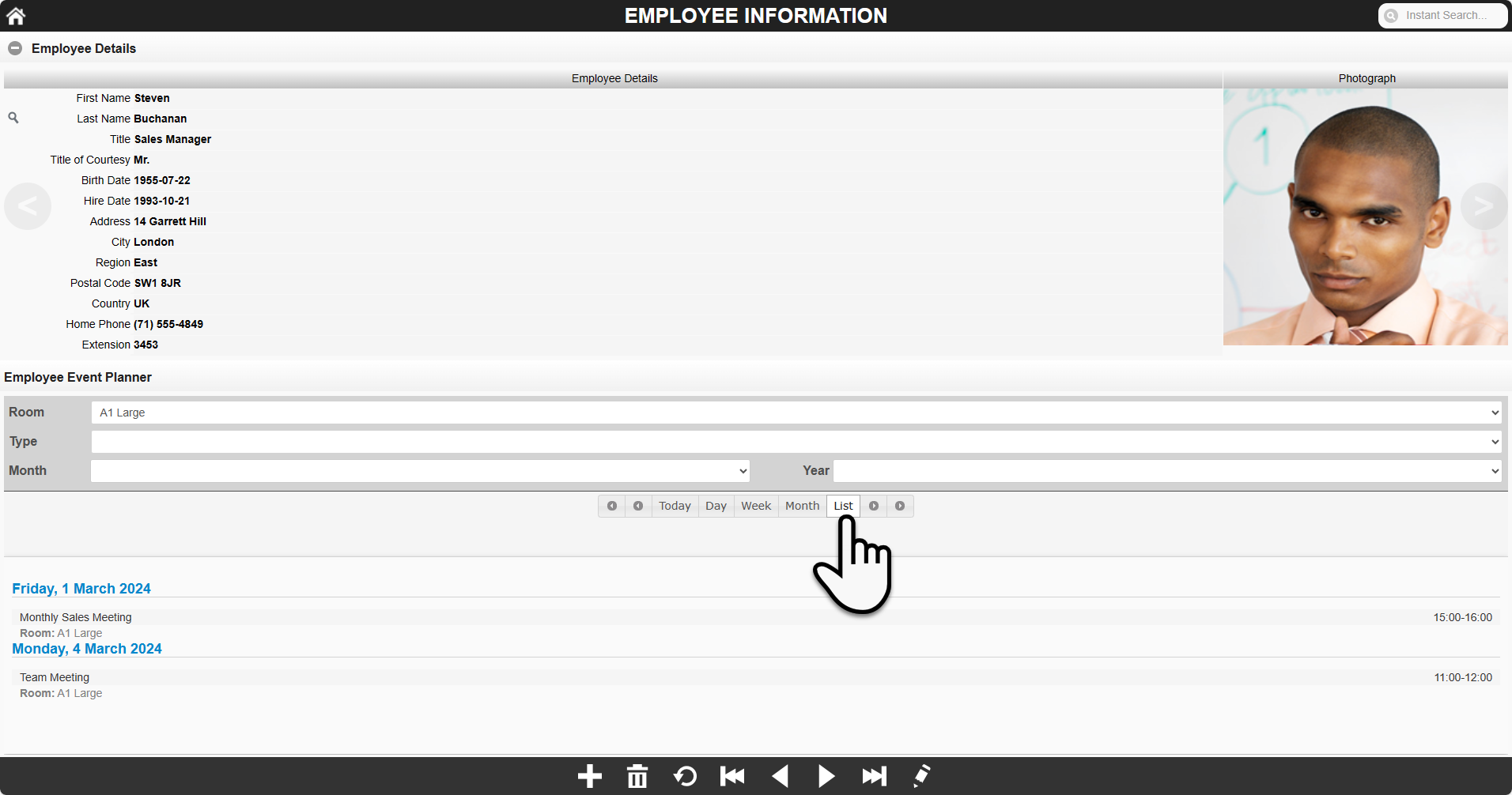
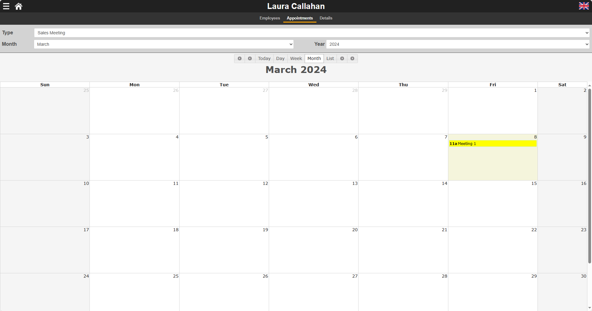
'Employee Calendar' is a single Page App with a main Form Section for the southwind!employees table and a related Calendar Section for that employee's appointments using the southwind!employees_calendar table.
In 'Month' calendar view:

In 'List' view with a query by room (resource):
Additional Demo Apps
Calendar Sections are also included in the following Apps:
- 'Tabbed Form' (form2)
- 'Mobile Demo1' (lianja_mobiledemo)
- 'Page Center' (example_pagecenter)
The 'Tabbed Form' App, here showing the Event Editor, including the event notes field (from v9.5):

The 'Mobile Demo1' App showing the use of the query comboboxes to filter the display (from v9.5):
The 'Page Center' App in 'Week' calendar view:

Calendar Table
The example_webapp4 App uses the southwind!employees_calendar table. Its structure is listed below. Your table can have different field names and additional fields, but the data type of the fields used by the Calendar Section should match those shown here. The width of the character fields can be altered as required.
| Field | Field Name | Type | Width | Notes |
|---|---|---|---|---|
| 1 | LASTNAME | Character | 20 | Related key field. A numeric related field can also be used. Not required if no related parent Section. |
| 2 | EVENTTITLE | Character | 80 | The title for the event that will be displayed in the calendar. |
| 3 | EVENTSTART | DateTime | 8 | The start date and time of the event. |
| 4 | EVENTEND | DateTime | 8 | The end date and time of the event. |
| 5 | EVENTREPEAT | Integer | 11 | Non 0 value flags the event as a repeating event. Repeating events are repeated monthly to the end of the event year. |
| 6 | EVENTALLDAY | Logical | 1 | Whether the event lasts all day. |
| 7 | EVENTTYPE | Character | 40 | The category type for the event. |
| 8 | EVENTRESOURCE | Character | 40 | The resource for the event. From v8.0. |
| 8 | EVENTNOTES | Varchar | 8 | The notes for the event. From v9.5. |
Using a Calendar Section
From v9.5, the Event Editor overlay is used to enter the details for an event. Click a date/time slot or event in the calendar view or the date of an event item in the list view to open the Event Editor:
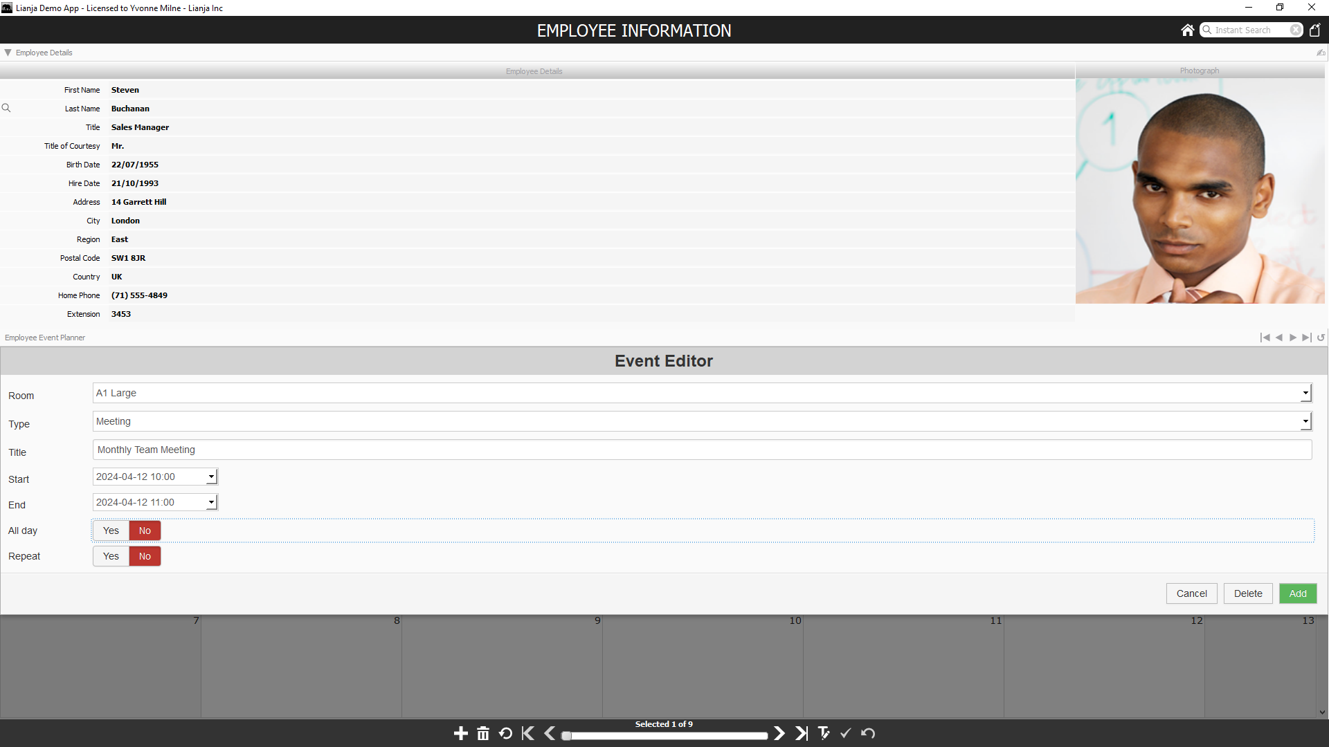
If the Event notes column is specified, the notes editbox will also be displayed, as in the screenshot of the 'Tabbed Form App' above.
Prior to v9.5, the controls at the top of the Calendar Section are used to enter details about an event. Clicking on an event in the main calendar loads the event's details into the controls.

| Control | Description |
|---|---|
| Event Resource | Combobox with event resources. Displayed when the 'Event resource choices' Section attribute is defined. From v8.0. |
| Event Type | Combobox with event types. Displayed when the 'Event type choices' Section attribute is defined. |
| Event Title | Textbox to enter the title for the event. |
| Start Date | Date picker to select the start date for the event. |
| End Date | Date picker to select the end date for the event. |
| Start Time | Time picker to select the start time for the event. |
| End Time | Time picker to select the end time for the event. |
| All Day | Checkbox to flag whether the event lasts all day. |
| Repeat | Checkbox to flag whether the event is a repeating event. |
The Event Resource Panel displays available event resources when the 'Event resource choices' attribute is populated. Event resources are displayed as buttons. Clicking a button filters the calendar display baseed on the selected resource. From v8.0.

The buttons below the controls, handle data and display operations.

| Button | Description |
|---|---|
| New | Populates the controls with the current date and default times. |
| Delete | Deletes the event currently displayed in the controls. |
| Update | Saves the event currently displayed in the controls. |
| < | Calendar display goes back one year. Not available on mobile. |
| < | Calendar display goes back one month, one week or one day depending on the current view (Month, Week, Day). |
| > | Calendar display goes forward one month, one week or one day depending on the current view (Month, Week, Day). |
| > | Calendar display goes forward one year. Not available on mobile. |
| Today | Calendar display goes to Today. |
| Day | Calendar display goes to Day view. |
| Week | Calendar display goes to Week view. |
| Month | Calendar display goes to Month view. |

On the Lianja Mobile Client, the event detail controls are displayed in an overlay along with the buttons for Cancel, Delete and Add or Update, depending on the operation.
Calendar Section Attributes
From Lianja v8.0, the Page Builder Assistant has been integrated into the App Inspector and expanded to give speedy access to attributes and event delegates.

Or, the attributes can be accessed in the App Inspector Attributes tab for the section:

Or, if the App Inspector is closed, double-click the section header to display the attributes dialog:

Alternatively, as a webview based section, click the keyboard icon in the Calendar section header to access the Custom Web Component Parameters Editor to set the attributes:

Double-click the Section header or click the cog icon to access the Section Attributes.
The database and table attributes determine the data binding.
The Calendar Section options are described here.
Default view
The starting view for the calendar. 'Month', 'Week' or 'Day' can be selected, the default is 'Month'. e.g.
Month
Event resource column
From v8.0. Optional. The name of a character column. It corresponds to the 'Event Resource' control. The control is a combobox based on Event resource choices. The calendar can also be filtered by the event resource, by clicking on an Event Resource button. e.g.
eventresource
Event resource caption
From v8.0. Optional. A character string for the 'Event Resource' header caption. If not specified, the default is 'Resource'. Only displayed when an Event resource column is specified. e.g.
Room
Event resource choices
From v8.0. Required when Event resource column is specified, otherwise optional. A comma separated list or a SQL statement. e.g.
,Booking:#3788d8:white,Sales Meeting:yellow:black,Meeting,
Vacation:gray:lightgreen,Sick:red:yellow,Appointment:green:white,Other
Event resource width
From v8.0. Optional. The width of the 'Event Resource' panel in pixels. If 0, defaults to 120 pixels. e.g.
200
Event type column
Required. The name of a character column. It corresponds to the 'Event Type' control. The control is a free-entry textbox unless the Event type choices is populated, in which case it is a combobox and a choice must be made from the list. The calendar can also be filtered by the event type, by specifying a valid event type in the Event type value attribute. e.g.
eventtype
Event type caption
From v8.0. Optional. A character string for the 'Event Type' header caption. If not specified, the default is 'Type'. e.g.
Category
Event type choices
Optional. These are choices for the Event type column and should be specified as a list of comma-separated character strings postfixed with optional background and foreground colors in the format :background:foreground. The colors are character strings and can be any of the standard web colors e.g. "pink", "lightgreen" or an HTML/CSS style color code e.g. "#cfcfcf". Events will be displayed in the calendar body using their event type's colors.
Note that if the list starts with a comma, a blank event type will be displayed until the combobox is expanded. e.g.
,Sales Meeting:yellow:black,Meeting,Vacation,Sick:red:yellow,Appointment:green:white,Other
Event title column
Required. The name of a character column. It corresponds to the 'Event Title' control, a free-entry textbox. e.g.
eventtitle
Event notes column
From v9.5. Optional. The name of a memo/varchar column. If specified, a free-entry editbox control is displayed when adding/editing events. e.g.
eventnotes
Event start column
Required. The name of a datetime column. It corresponds to the 'Start Date' and 'Start Time' date and time picker controls. e.g.
eventstart
Event end column
Required. The name of a datetime column. It corresponds to the 'End Date' and 'End Time' date and time picker controls. e.g.
eventend
Event repeat column
Required. The name of an integer or numeric column. It corresponds to the 'Repeat' checkbox control. e.g.
eventrepeat
Event allday column
Required. The name of a logical column. It corresponds to the 'All Day' checkbox control. e.g.
eventallday
Event key column
Optional.
Event type value
Optional. If specified, it should be a character string and correspond to a valid Event Type. Only events with a matching Event Type will be displayed in the calendar. e.g.
Vacation
Autosize
If checked to True, the height of the calendar cells will be autosized to fit the Section size. e.g.
True
Other options
Optional. User defined options can be specified as name=value comma-separated pairs. These will be passed as parameters to the calendar_view.rsp script. e.g.
region=US,timezone=EST
Click delegate
Optional. The name of a delegate script to be called when a cell in the calendar is clicked. Data is passed to the click delegate in JSON format. e.g.
calendar_click
function calendar_click(data)
{
	// You can handle a custom calendar cell click event here
	Lianja.writeLog(data);
};
{"database":"southwind","table":"employees_calendar","columns":"eventtitle,eventstart,eventend,eventrepeat,eventallday,eventtype",
"keyvalue":"Buchanan","keyexpr":"lastname","title":"Meeting","start_date":"2015-09-08","end_date":"2015-09-08","start_time":"09:00",
"end_time":"17:00","allDay":"true","repeat":"false","rowid":"42","id":0,"action":"eventclick","sectionid":"section2",
"eventtype":"eventtype","eventtypevalue":"Sales Meeting"}
Dynamic day backcolor
Optional. The name of a function in the Custom delegate library that returns dates and their associated background colors, allowing specific dates to be highlighted. e.g.
getdatecolors
The function should accept a parameter which will have one of two values: 'dates' or 'colors'.
If the parameter is 'dates', the function should return a string containing comma-separated ISO format character string dates. These can contain a single '*' to indicate either all years, all months or all days. The strings 'sunday' and 'saturday' are also recognized.
If the parameter is 'colors', the function should return a string containing comma-separated color strings (e.g. 'red' or '#FF0000'), one for each date in the dates string. The colors will be applied to the dates in order. e.g.
function getdatecolors(para1)
	if para1 = "dates"
		return ['2015-*-28','sunday','&(strftime("%F",dtoc(date())))','*-09-01']
	else
		return ['purple','yellow','blue','#FF0000']
	endif
endfunc
In the example above, the 28th of every month in 2015 will have a purple background, all Sundays will have a yellow background, the current date will have a blue background and September 1st every year will have a red background.
Dynamic event backcolor
Optional. The name of a function in the Custom delegate library that returns a color string (e.g. 'red' or '#FF0000') to be used as the background color for a specific event type. e.g.
geteventback
The event type is passed as a parameter to the function. e.g.
function geteventback(para1)
	do case
	case para1 = "UK Bank Holiday"
		return 'red'
	case para1 = "US Public Holiday"
		return 'pink'
	otherwise // all other event types
		return 'white'
	endcase
endfunc
Note that event type / color pairs can also be specified in the Event type choices as described above.
Dynamic event forecolor
Optional. The name of a function in the Custom delegate library that returns a color string (e.g. 'red' or '#FF0000') to be used as the foreground color for a specific event type. e.g.
geteventfore
The event type is passed as a parameter to the function. e.g.
function geteventfore(para1)
	do case
	case para1 = "UK Bank Holiday"
		return 'pink'
	case para1 = "US Public Holiday"
		return 'white'
	otherwise // all other event types
		return 'black'
	endcase
endfunc
Note that event type / color pairs can also be specified in the Event type choices as described above.
Custom delegate library
Optional, required if the Dynamic day and even color functions are specified. The name of a custom library file (Lianja/VFP prg) containing the day and event dynamic color delegates. Clicking the [...] button will create a file in the App and open it in the Script Editor in the Apps workspace. e.g.
libcal_page1_section2.prg
Filter
Optional. A valid filter expression that will be used in a SQL SELECT statement to restrict the records displayed in the calendar. e.g.
eventtitle="US Public Holiday" or eventtitle='UK Bank Holiday'
Further Customization
The Calendar Section is a WebViewWidget and uses the scripts 'calendar_view.rsp' and 'calendar_controller.prg'. These can be found in the Lianja Library sub-directories:
| Client | Location |
|---|---|
| App Builder | \lianja\library\ |
| App Center | \lianja\cloudserver\tenants\public\library |
| Web/Mobile Clients | \lianja\cloudserver\tenants\public\wwwroot\library |
So, for example, if you want to pass Other options to your calendar, you can add additional parameter checks at the start of calendar_view.rsp and handle them accordingly. Or you could put additional patterns into calendar_view.rsp's date background color handling.