Grid Column Attributes
From Lianjapedia
Contents
Overview
Setting Attributes Declaratively
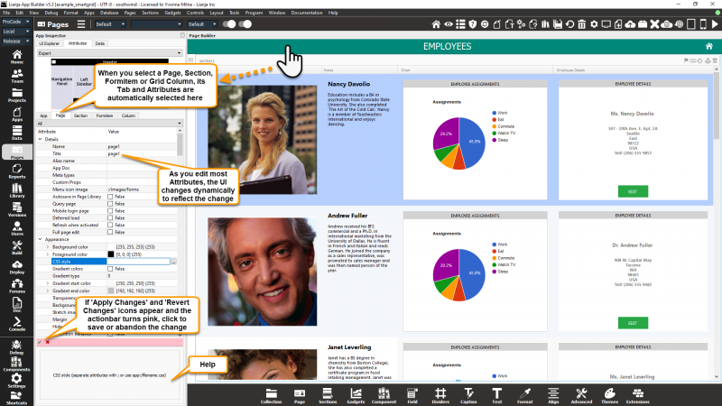
You adjust the appearance and behavior of each UI Element in the Attributes Tab of the App Inspector.
The attributes available consist of some common ones as well as some specific to the UI Element being inspected.
Additional Help
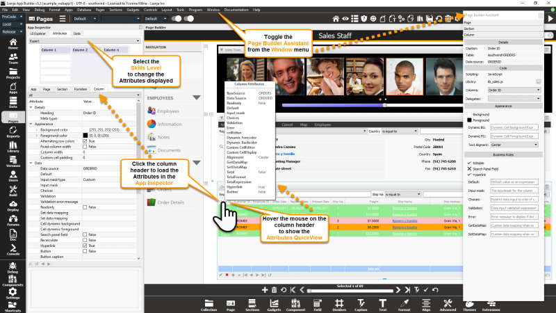
- Select the Skills Level to change the attributes displayed.
- Toggle the Page Builder Assistant from the Window menu in the App Builder MenuBar to display and edit key attributes.
- Hover the mouse over the header of a column to show the Attributes Quickview for that column (from v5.3).
See Also
Demo Apps (included in the Lianja App Builder distribution):
- lianjademo
- example_webapp1
- example_mobileapp1
and many more
Attributes
Details
| Attribute | Description |
|---|---|
| Heading | The column heading |
| Meta types | A comma separated list of metatype names. Not currently implemented. |
Appearance
| Attribute | Description |
|---|---|
| Background color | The background color of the column |
| Foreground color | The foreground color of the column |
| Alternating row colors | Should this column have alternating row colors if the grid does (True | False) |
| Only visible when editing | Only show this column when editing. Hidden otherwise at runtime (True | False). From v6.0. |
| Fixed column width | Should this column be a fixed width |
| Column width | Specify the fixed width of this column (0 is autosized) |
| Custom cell padding | Specify the padding for custom display and editor cells |
Data
| Attribute | Description |
|---|---|
| Data source | The table and column that this grid column is bound to |
| Default | Default value as an expression, e.g. date(), 0.0, space(10) |
| Input mask type | The inputmask type (Custom | Currency | Date | Email Address | Number | Text | Time | Alphabetic | Upper Case | Upper Case Alphabetic) |
| Input mask | The inputmask for the field, e.g. @c2, @c4, @!, @^, 999,999.99 or ?regularexpression |
| Choices | Restrict data input to a list of choices, e.g. Static list of choices: Apples,Oranges,Bananas Dynamic list of choices from a table: @tablename,expression Dynamic list of choices from a table (SQL SELECT): select expression from tablename |
| Validation | Data input validation expression. Note the use of {}, which is substituted with the current data entered, e.g. Contained in a list: inlist("{}","Apples","Oranges","Bananas") Lookup the value entered in a table: rlookup("{}",customers,"custnames") |
| Validation error message | The error message to display if data input validation fails |
| Readonly | Column is readonly (True|False) |
| Get data mapping | Custom data mapping when reading data. Specify this as an expression. |
| Set data mapping | Custom data mapping when writing data. Specify this as an expression. |
| Cell dynamic background | The expression or function that provides dynamic cell color formatting. e.g. iif({}<0,"red","") Note the use of {}, substituted with the current cell value. |
| Cell dynamic foreground | The expression or function that provides dynamic cell color formatting. e.g. iif({}<0,"red","") Note the use of {}, substituted with the current cell value. |
| Search panel field | Include this column in an auto created Section search panel (True | False) |
| Recalculate | Recalculate readonly and calculated fields when data is changed interactively (True | False) |
| Hyperlink | Display as a hyperlink (True | False) |
| Button | Display as a button (True | False) |
| Button caption | The (optional) button caption |
| Text alignment | Text alignment (Auto | Left | Center | Right) |
| Summary column | Include this column in the Section Summary panel (True | False). Note: prior to v6.0 this was named Total this column. Minimum, Maximum and Average column values can now also be displayed. |
| Total expression | Specify an expression to calculate the Section Summary column total, e.g. calc_column("{}"). Note that {} will be substituted with the data controlsource. |
| Summary format | Specify an expression to format the Section Summary values, e.g. currency({}). Note: prior to v6.0 this was named Total format. Minimum, Maximum and Average column values can now also be displayed and formatted along with the column Total. |
| Cell editor type | The cell editor type (Text | Html | Stringlist). From v5.3. |
| StringList | A comma-separated list of strings that are available in the StringList Editor. This can be specified as a SQL Select statement or a {macro()} procedure call that generate the list dynamically. The StringList Editor is available for editing varchar/memo fields when the Cell editor type is specified as 'Stringlist'. From v5.3. |
| Dynamic badge color | Specify an expression to format the column as a colored badge, e.g. icase('{}'='available','lightgreen','{}'='occupied',pink,''). From v6.3.1. |
| Spark line expression | Specify an expression to determine the maximum spark line value, e.g. limit. From v6.3.1. |
| Dynamic Sparkline color | Specify an expression to define the dynamic background color of the Sparkline, e.g. icase({}>100,"red:white",{}<50,"pink","lightgreen"). From v6.3.1. |
| Rating max value | Specify the maximum rating value. If the column is bound to a numeric source and the 'Rating max value' is greater than 0, the data is displayed as a rating. From v6.3.2. |
Delegates
| Attribute | Description |
|---|---|
| Custom cell editor | The name of a procedure/function that will return a custom editor for the cell. This may be a container with multiple controls. |
| Custom cell display | The name of a procedure/function that will return the display text for the cell. |
UI Presentation Rules
| Attribute | Description |
|---|---|
| Desktop | Include this column in a Desktop client (True | False). |
| Web | Include this column in a Web client (True | False). |
| Tablet | Include this column in a Tablet client (True | False). |
| Phone | Include this column in a Phone client (True | False). |
| UI States | UI states that affect this column. Specify multiple states as a comma separated list. |
| Readonly when | Column is readonly at runtime if specified expression evaluates to true. |
| Visible when | Column is visible at runtime if specified expression evaluates to true. |
| Hidden at runtime | Hide this column at runtime (True | False). |
| Only visible when editing | Only show this column when editing. Hidden otherwise (True | False). |
| Display orientation | Display depending on mobile device orientation for Tablets and Phones. (Always | Portrait | Landscape) |

