Difference between revisions of "Attachments Section Attributes"
Yvonne.milne (Talk | contribs) |
Yvonne.milne (Talk | contribs) (→Other Options) |
||
| (97 intermediate revisions by 3 users not shown) | |||
| Line 1: | Line 1: | ||
| − | = | + | =Overview= |
| − | + | Attachments Sections are grids used for data-bound document and image storage and retrieval. | |
| + | {{DISPLAYTITLE:Attachments Section}} | ||
| + | [[File:Attachment_section.png|middle|758px|link=]] | ||
| + | You build Apps in Lianja App Builder visually using the [[:Category:Page_Builder|Page Builder]]. | ||
| + | |||
| + | If you have not yet done so please read [[Understanding_the_Lianja_App_Architecture|Understanding the Lianja Architecture]] and also [[Lianja_is_all_about_ART|Understanding ART]] to better understand this article. | ||
| + | |||
| + | An App consists of pages. Pages are made up of Sections. Form sections are made up of FormItems. We call these collectively "UI Elements" or "Visual Elements". | ||
| + | |||
| + | ==Setting Attributes Declaratively== | ||
| + | |||
| + | You adjust the appearance and behavior of each UI Element in the '''Attributes''' Tab of the [[:Category:App_Inspector|App Inspector]]. | ||
| + | |||
| + | [[{{ns:file}}:bm-attributes.png|800px|left|border|link={{filepath:bm-attributes.png}}|Attributes]] | ||
| + | <br clear=all> | ||
| + | |||
| + | The attributes available consist of some common ones as well as some specific to the UI Element being inspected. | ||
| + | |||
| + | ==Getting and Setting Attributes Programmatically== | ||
| + | The '''setAttribute(name, value)''' method can be used to set the value of an Attribute: | ||
| + | |||
| + | <pre>Lianja.get("pageid.sectionid").setAttribute("title","Section1")</pre> | ||
| + | |||
| + | Note: on the desktop, the shortened form '''setAttr(name,value)''' is also available. | ||
| + | |||
| + | The '''getAttribute(name)''' method can be used to get the value of an Attribute: | ||
| + | |||
| + | <pre>cTitle = Lianja.get("pageid.sectionid").getAttribute("title")</pre> | ||
| + | |||
| + | Note: on the desktop, the shortened form '''getAttr(name)''' is also available. | ||
| + | |||
| + | =See Also= | ||
| + | [[Attachments Options]], [[DocumentView Options]], [[DocumentView Section Attributes]] | ||
| + | |||
| + | Demo Apps (included in the Lianja App Builder distribution): | ||
| + | * Lianja Demo (lianjademo) | ||
| + | * Lianja Web UI Demo (example_webapp2) | ||
| + | |||
| + | =Attributes= | ||
==Details== | ==Details== | ||
{| class="wikitable" width="100%" | {| class="wikitable" width="100%" | ||
!width="20%"|Attribute | !width="20%"|Attribute | ||
| − | !width=" | + | !width="45%"|Description |
| + | !width="25%"|Name | ||
| + | !width="10%"|Type | ||
|- | |- | ||
|valign="top"|[[Details Attributes#Name|Name]]||The name for this section (unique to the page) | |valign="top"|[[Details Attributes#Name|Name]]||The name for this section (unique to the page) | ||
| + | |valign="top"|id||valign="top"|Character | ||
| + | |- | ||
| + | |valign="top"|[[Details Attributes#Full name|Full name]]||The full name for this section including its parent page, e.g. page1.section1 | ||
| + | |valign="top"|fullid||valign="top"|Character | ||
| + | |- | ||
| + | |valign="top"|[[Details Attributes#Alias name|Alias name]]||The alias name for this section | ||
| + | |valign="top"|aliasid||Character | ||
| + | |- | ||
| + | |valign="top"|[[Dashboard Sections|Dashboard group]]||The dashboard section that this section belongs to. From v5.2. | ||
| + | |valign="top"|horizontalgroup||valign="top"|Character | ||
| + | |- | ||
| + | |valign="top"|[[Dashboard Sections|Horizontal stretch]]||The horizontal % stretch factor that this section should occupy. From v5.2. | ||
| + | |valign="top"|horizontalgroupstretchfactor||valign="top"|Character | ||
| + | |- | ||
| + | |valign="top"|[[Dashboard Sections|Vertical stretch]]||The vertical % stretch factor that this section should occupy. From v5.2. | ||
| + | |valign="top"|verticalgroupstretchfactor||valign="top"|Character | ||
| + | |- | ||
| + | |valign="top"|[[Details Attributes#App Doc|App Doc]]||The App Doc file for this section. This will be included in the [[App Doc]] when it is generated. | ||
| + | |valign="top"|appdoc||valign="top"|Character | ||
| + | |- | ||
| + | |valign="top"|[[Details Attributes#MetaData version|MetaData version]]||The MetaData version number. You can set this in the setupUI hook to prevent MetaData being applied multiple times. | ||
| + | |valign="top"|metaDataVersion||valign="top"|Int | ||
|- | |- | ||
|valign="top"|[[MetaTypes|Meta types]]||A comma separated list of metatype names | |valign="top"|[[MetaTypes|Meta types]]||A comma separated list of metatype names | ||
| + | |valign="top"|metatypes||valign="top"|Character | ||
| + | |- | ||
| + | |valign="top"|[[Details Attributes#Custom Props|Custom Props]]||A ';' separated list of custom prop key pairs, e.g. name=barry;company=lianja<br>From v5.3. | ||
| + | |valign="top"|customprops||valign="top"|Character | ||
|- | |- | ||
|valign="top"|[[Details Attributes#Type|Type]]||The type of section: attachments (readonly) | |valign="top"|[[Details Attributes#Type|Type]]||The type of section: attachments (readonly) | ||
| + | |valign="top"|type||valign="top"|Character | ||
|- | |- | ||
|valign="top"|[[Details Attributes#Caption|Caption]]||The section caption displayed in the section header | |valign="top"|[[Details Attributes#Caption|Caption]]||The section caption displayed in the section header | ||
| + | |valign="top"|title||valign="top"|Character | ||
|- | |- | ||
|valign="top"|[[Details Attributes#Database|Database]]||The database for this section | |valign="top"|[[Details Attributes#Database|Database]]||The database for this section | ||
| + | |valign="top"|database||valign="top"|Character | ||
|- | |- | ||
|valign="top"|[[Details Attributes#Table|Table]]||The table for this section | |valign="top"|[[Details Attributes#Table|Table]]||The table for this section | ||
| + | |valign="top"|table||valign="top"|Character | ||
| + | |- | ||
| + | |valign="top"|[[Details Attributes#OrderBy|OrderBy]]||Optionally specify an order for non-child sections. (From v4.1) | ||
| + | |valign="top"|orderby||valign="top"|Character | ||
|- | |- | ||
|valign="top"|[[Details Attributes#SQL statement|SQL statement]]||The SQL statement used to populate a Virtual Table. Use {} macros in the WHERE condition to relate parent-->child sections and ORDER BY to order the display of records. This is native SQL for the target SQL database and may call stored procedures as well as SQL Select. | |valign="top"|[[Details Attributes#SQL statement|SQL statement]]||The SQL statement used to populate a Virtual Table. Use {} macros in the WHERE condition to relate parent-->child sections and ORDER BY to order the display of records. This is native SQL for the target SQL database and may call stored procedures as well as SQL Select. | ||
| + | |valign="top"|sql||valign="top"|Character | ||
|- | |- | ||
|valign="top"|[[Details Attributes#Timelines enabled|Timelines enabled]]||Enable database timelines for this section | |valign="top"|[[Details Attributes#Timelines enabled|Timelines enabled]]||Enable database timelines for this section | ||
| + | |valign="top"|timelinesEnabled||valign="top"|Boolean | ||
|- | |- | ||
|valign="top"|[[Details Attributes#Filter|Filter]]||The filter expression that restricts the records that will be included in the data | |valign="top"|[[Details Attributes#Filter|Filter]]||The filter expression that restricts the records that will be included in the data | ||
| + | |valign="top"|filter||valign="top"|Character | ||
|- | |- | ||
|valign="top"|[[Details Attributes#Where condition|Where condition]]||The dynamic WHERE condition for a Virtual Table that restricts which records will be retrieved | |valign="top"|[[Details Attributes#Where condition|Where condition]]||The dynamic WHERE condition for a Virtual Table that restricts which records will be retrieved | ||
| − | + | |valign="top"|wherecond||valign="top"|Character | |
| − | |valign="top"| | + | |
| − | + | ||
| − | |valign="top"| | + | |
| − | + | ||
| − | + | ||
| − | + | ||
| − | + | ||
| − | + | ||
| − | + | ||
|- | |- | ||
|valign="top"|[[Details Attributes#Height|Height]]||The section height | |valign="top"|[[Details Attributes#Height|Height]]||The section height | ||
| + | |valign="top"|height||valign="top"|Int | ||
|- | |- | ||
|valign="top"|[[Details Attributes#Fixed height|Fixed height]]||Fix the section height (True | False) | |valign="top"|[[Details Attributes#Fixed height|Fixed height]]||Fix the section height (True | False) | ||
| + | |valign="top"|fixedHeight||valign="top"|Boolean | ||
|- | |- | ||
|valign="top"|[[Details Attributes#Auto layout percent|Auto layout percent]]||Auto layout percentage of page size. If set to 0, then all sections on a page are resized to an equal height | |valign="top"|[[Details Attributes#Auto layout percent|Auto layout percent]]||Auto layout percentage of page size. If set to 0, then all sections on a page are resized to an equal height | ||
| + | |valign="top"|autoLayoutPercentage||valign="top"|Int | ||
|- | |- | ||
|valign="top"|[[Details Attributes#Readonly|Readonly]]||Section is readonly (True | False) | |valign="top"|[[Details Attributes#Readonly|Readonly]]||Section is readonly (True | False) | ||
| + | |valign="top"|readOnly||valign="top"|Boolean | ||
|- | |- | ||
|valign="top"|[[Details Attributes#Sortable|Sortable]]||Section is sortable by clicking on the column headers (True | False) | |valign="top"|[[Details Attributes#Sortable|Sortable]]||Section is sortable by clicking on the column headers (True | False) | ||
| + | |valign="top"|sortable||valign="top"|Boolean | ||
|- | |- | ||
|valign="top"|[[Details Attributes#Double click to edit|Double click to edit]]||Double click grid rows to edit data (True | False) | |valign="top"|[[Details Attributes#Double click to edit|Double click to edit]]||Double click grid rows to edit data (True | False) | ||
| + | |valign="top"|doubleClickToEdit||valign="top"|Boolean | ||
|- | |- | ||
|} | |} | ||
| Line 54: | Line 127: | ||
{| class="wikitable" width="100%" | {| class="wikitable" width="100%" | ||
!width="20%"|Attribute | !width="20%"|Attribute | ||
| − | !width=" | + | !width="45%"|Description |
| + | !width="25%"|Name | ||
| + | !width="10%"|Type | ||
|- | |- | ||
|valign="top"|[[Colors|Background color]]||Section background color | |valign="top"|[[Colors|Background color]]||Section background color | ||
| + | |valign="top"|backColor||valign="top"|Character | ||
|- | |- | ||
|valign="top"|[[Colors|Foreground color]]||Section foreground color | |valign="top"|[[Colors|Foreground color]]||Section foreground color | ||
| + | |valign="top"|foreColor||valign="top"|Character | ||
|- | |- | ||
|valign="top"|[[Colors|Grid background color]]||Grid background color | |valign="top"|[[Colors|Grid background color]]||Grid background color | ||
| + | |valign="top"|gridBackColor||valign="top"|Character | ||
|- | |- | ||
|valign="top"|[[Colors|Grid foreground color]]||Grid foreground color | |valign="top"|[[Colors|Grid foreground color]]||Grid foreground color | ||
| + | |valign="top"|gridForeColor||valign="top"|Character | ||
| + | |- | ||
| + | |valign="top"|[[Grid Appearance#Row dynamic background|Row dynamic background]]||The expression or function that provides dynamic row color formatting. e.g. iif(amount<0,'red','') | ||
| + | |valign="top"|gridRowDynamicBackColor||valign="top"|Character | ||
| + | |- | ||
| + | |valign="top"|[[Grid Appearance#Row dynamic foreground|Row dynamic foreground]]||The expression or function that provides dynamic row color formatting. e.g. iif(amount<0,'white','') | ||
| + | |valign="top"|gridRowDynamicForeColor||valign="top"|Character | ||
|- | |- | ||
|valign="top"|[[CSS|CSS style]]||CSS style (separate attributes with ; or use app:/filename.css) | |valign="top"|[[CSS|CSS style]]||CSS style (separate attributes with ; or use app:/filename.css) | ||
| + | |valign="top"|cssStyle||valign="top"|Character | ||
|- | |- | ||
|valign="top"|[[Gradients#Gradient colors|Gradient colors]]||Render the background color as a gradient (True | False) | |valign="top"|[[Gradients#Gradient colors|Gradient colors]]||Render the background color as a gradient (True | False) | ||
| + | |valign="top"|sectionGradient||valign="top"|Boolean | ||
|- | |- | ||
|valign="top"|[[Gradients#Gradient type|Gradient type]]||Specify the gradient type | |valign="top"|[[Gradients#Gradient type|Gradient type]]||Specify the gradient type | ||
| + | |valign="top"|sectionGradientType||valign="top"|Int | ||
|- | |- | ||
|valign="top"|[[Gradients#Gradient start color|Gradient start color]]||Gradient start color | |valign="top"|[[Gradients#Gradient start color|Gradient start color]]||Gradient start color | ||
| + | |valign="top"|sectionFromColor||valign="top"|Character | ||
|- | |- | ||
|valign="top"|[[Gradients#Gradient end color|Gradient end color]]||Gradient end color | |valign="top"|[[Gradients#Gradient end color|Gradient end color]]||Gradient end color | ||
| + | |valign="top"|sectionToColor||valign="top"|Character | ||
|- | |- | ||
|valign="top"|[[Shading and Transparency|Transparency]]||Specify a transparency percentage from 0 to 100 | |valign="top"|[[Shading and Transparency|Transparency]]||Specify a transparency percentage from 0 to 100 | ||
| + | |valign="top"|transparency||valign="top"|Int | ||
|- | |- | ||
|valign="top"|[[Section Appearance#Background image|Background image]]||The background image for the section (png | jpg | gif).<br>Use app:/imagename.ext for app specific images. | |valign="top"|[[Section Appearance#Background image|Background image]]||The background image for the section (png | jpg | gif).<br>Use app:/imagename.ext for app specific images. | ||
| + | |valign="top"|picture||valign="top"|Character | ||
|- | |- | ||
|valign="top"|[[Section Appearance#Stretch image|Stretch image]]||Stretch the background image to fill the section (True | False) | |valign="top"|[[Section Appearance#Stretch image|Stretch image]]||Stretch the background image to fill the section (True | False) | ||
| + | |valign="top"|stretch||valign="top"|Boolean | ||
|- | |- | ||
|valign="top"|[[Section Appearance#Margin|Margin]]||Margin size around the section | |valign="top"|[[Section Appearance#Margin|Margin]]||Margin size around the section | ||
| + | |valign="top"|margin||valign="top"|Int | ||
|- | |- | ||
|valign="top"|[[Section Appearance#Add spacer at bottom|Add spacer at bottom]]||Add spacer at bottom of section (True | False) | |valign="top"|[[Section Appearance#Add spacer at bottom|Add spacer at bottom]]||Add spacer at bottom of section (True | False) | ||
| + | |valign="top"|spacerVisible||valign="top"|Boolean | ||
|- | |- | ||
|valign="top"|[[Grid Appearance#Show actionbar|Show actionbar]]||Show the actionbar (True | False) | |valign="top"|[[Grid Appearance#Show actionbar|Show actionbar]]||Show the actionbar (True | False) | ||
| + | |valign="top"|showGridActionbar||valign="top"|Boolean | ||
| + | |- | ||
| + | |valign="top"|[[Grid Appearance#Hide column headers|Hide column headers]]||Hide column headers at runtime (True | False). From v4.1. | ||
| + | |valign="top"|gridhideheaders||valign="top"|Boolean | ||
|- | |- | ||
|valign="top"|[[Grid Appearance#Show grid lines|Show grid lines]]||Show grid lines (True | False) | |valign="top"|[[Grid Appearance#Show grid lines|Show grid lines]]||Show grid lines (True | False) | ||
| + | |valign="top"|showGrid||valign="top"|Boolean | ||
| + | |- | ||
| + | |valign="top"|[[Grid Appearance#Show images inline|Show images inline]]||Show image columns as inline images (True | False). From v4.1. | ||
| + | |valign="top"|gridinlineimages||valign="top"|Boolean | ||
| + | |- | ||
| + | |valign="top"|[[Grid Appearance#Show memo/varchar inline|Show memo/varchar inline]]||Show memo/varchar columns as inline text (True | False). From v4.1. | ||
| + | |valign="top"|gridinlinememos||valign="top"|Boolean | ||
| + | |- | ||
| + | |valign="top"|[[Grid Appearance#Inline width|Inline width]]||The display size width for inline images and memos. From v4.1. | ||
| + | |valign="top"|gridinlineimagewidth||valign="top"|Int | ||
| + | |- | ||
| + | |valign="top"|[[Grid Appearance#Inline height|Inline height]]||The display size height for inline images and memos. From v4.1. | ||
| + | |valign="top"|gridinlineimageheight||valign="top"|Int | ||
| + | |- | ||
| + | |valign="top"|[[Grid Appearance#Inline effect|Inline effect]]||The display effect for inline images and memos (None | Dropshadow | Raisedshadow). From v4.1. | ||
| + | |valign="top"|gridinlineeffect||valign="top"|Character | ||
| + | |- | ||
| + | |valign="top"|[[Grid Appearance#Show logicals as CheckBoxes|Show logicals as CheckBoxes]]||valign="top"|Display logical/Boolean values as CheckBoxes (True | False) | ||
| + | |valign="top"|showGridCheckBox||valign="top"|Boolean | ||
|- | |- | ||
|valign="top"|[[Grid Appearance#Alternating row colors|Alternating row colors]]||Display alternating row colors (True | False) | |valign="top"|[[Grid Appearance#Alternating row colors|Alternating row colors]]||Display alternating row colors (True | False) | ||
| + | |valign="top"|showGridAlternatingColors||valign="top"|Boolean | ||
|- | |- | ||
|valign="top"|[[Grid Appearance#Grid row height|Grid row height]]||Height of the grid rows | |valign="top"|[[Grid Appearance#Grid row height|Grid row height]]||Height of the grid rows | ||
| + | |valign="top"|gridRowHeight||valign="top"|Int | ||
|- | |- | ||
|valign="top"|[[Grid Appearance#Autoresize columns|Autoresize columns]]||Autoresize grid columns to fit data (True | False) | |valign="top"|[[Grid Appearance#Autoresize columns|Autoresize columns]]||Autoresize grid columns to fit data (True | False) | ||
| + | |valign="top"|autoResizeGridColumns||valign="top"|Boolean | ||
|- | |- | ||
|valign="top"|[[Grid Appearance#Stretch last column|Stretch last column]]||Stretch last grid column (True | False) | |valign="top"|[[Grid Appearance#Stretch last column|Stretch last column]]||Stretch last grid column (True | False) | ||
| + | |valign="top"|autoStretchGridColumns||valign="top"|Boolean | ||
|- | |- | ||
|valign="top"|[[Grid Appearance#Split grid|Split grid]]||Split the grid into a grid and a form (True | False) | |valign="top"|[[Grid Appearance#Split grid|Split grid]]||Split the grid into a grid and a form (True | False) | ||
| + | |valign="top"|splitbar||valign="top"|Boolean | ||
|- | |- | ||
|valign="top"|[[Grid Appearance#Show split edit|Show split edit]]||Display grid in split/form edit mode when displayed (True | False) | |valign="top"|[[Grid Appearance#Show split edit|Show split edit]]||Display grid in split/form edit mode when displayed (True | False) | ||
| + | |valign="top"|showSplitEdit||valign="top"|Boolean | ||
|- | |- | ||
|valign="top"|[[Grid Appearance#Show memo.2object panel|Show memo/object panel]]||Show memo/object panel in splitbar mode (True | False) | |valign="top"|[[Grid Appearance#Show memo.2object panel|Show memo/object panel]]||Show memo/object panel in splitbar mode (True | False) | ||
| + | |valign="top"|showGridMemos||valign="top"|Boolean | ||
|- | |- | ||
|valign="top"|[[Grid Appearance#Scrollbar|Scrollbar]]||Section displays the grid vertical scrollbar (True | False) | |valign="top"|[[Grid Appearance#Scrollbar|Scrollbar]]||Section displays the grid vertical scrollbar (True | False) | ||
| + | |valign="top"|scrollbar||valign="top"|Boolean | ||
|- | |- | ||
| − | |valign="top"|[[Grid Appearance# | + | |valign="top"|[[Grid Appearance#MultiSelect rows|MultiSelect rows]]||Enable multi selection of grid rows. The SelectionChanged delegate is called as rows are selected or deselected (True | False) |
| + | |valign="top"|multiSelectGridRows||valign="top"|Boolean | ||
| + | |- | ||
| + | |valign="top"|[[Grid Appearance#MultiSelect rows expression|MultiSelect rows expression]]||The expression to evaluate when a multi select row operation is performed. These are passed as a comma separated list to the SelectionChanged delegate. | ||
| + | |valign="top"|multiSelectGridRowsExpression||valign="top"|Boolean | ||
| + | |- | ||
| + | |valign="top"|[[Grid Appearance#Infinitely scrollable|Infinitely scrollable]]||Grid is always rendered using infinite scroll for large data sets (mousewheel on desktop/web, flick up and down on mobile) (True | False). From v4.1. | ||
| + | |valign="top"|infinitescroll||valign="top"|Boolean | ||
|- | |- | ||
|valign="top"|[[Grid Appearance#Pagination|Pagination]]||Grid is always rendered using pagination (for large data sets)(True | False) | |valign="top"|[[Grid Appearance#Pagination|Pagination]]||Grid is always rendered using pagination (for large data sets)(True | False) | ||
| + | |valign="top"|pagination||valign="top"|Boolean | ||
|- | |- | ||
|valign="top"|[[Grid Appearance#Automatic pagination|Automatic pagination]]||Grid is rendered using pagination if the number of records exceeds below amount (True | False) | |valign="top"|[[Grid Appearance#Automatic pagination|Automatic pagination]]||Grid is rendered using pagination if the number of records exceeds below amount (True | False) | ||
| + | |valign="top"|autoPagination||valign="top"|Boolean | ||
|- | |- | ||
|valign="top"|[[Grid Appearance#Automatic pagination size|Automatic pagination size]]||Grid is rendered using pagination if Automatic pagination is true and the number of records exceeds this amount | |valign="top"|[[Grid Appearance#Automatic pagination size|Automatic pagination size]]||Grid is rendered using pagination if Automatic pagination is true and the number of records exceeds this amount | ||
| + | |valign="top"|autoPaginationSize||valign="top"|Int | ||
|- | |- | ||
|} | |} | ||
| Line 117: | Line 253: | ||
{| class="wikitable" width="100%" | {| class="wikitable" width="100%" | ||
!width="20%"|Attribute | !width="20%"|Attribute | ||
| − | !width=" | + | !width="45%"|Description |
| + | !width="25%"|Name | ||
| + | !width="10%"|Type | ||
|- | |- | ||
| − | |valign="top"|[[Section Header#Hide header|Hide header]]||Hide section header at runtime(True | False) | + | |valign="top"|[[Section Header#Hide header|Hide header]]||Hide section header at runtime (True | False) |
| + | |valign="top"|hideHeaderAtRuntime||valign="top"|Boolean | ||
|- | |- | ||
| − | |valign="top"|[[Section Header#Hide actionbar|Hide actionbar]]||Hide actionbar | + | |valign="top"|[[Section Header#Hide actionbar|Hide actionbar]]||Hide actionbar when stacked section is activated at runtime<br>(True | False) |
| + | |valign="top"|hideActionBarAtRuntime||valign="top"|Boolean | ||
| + | |- | ||
| + | |valign="top"|[[Section Header#Show record count badge|Show record count badge]]||Show the record count badge in the section header (True | False). From v5.2. | ||
| + | |valign="top"|showreccount||valign="top"|Boolean | ||
|- | |- | ||
|valign="top"|[[Section Header#Header CSS style|Header CSS style]]||CSS style (separate attributes with ; or use app:/filename.css) | |valign="top"|[[Section Header#Header CSS style|Header CSS style]]||CSS style (separate attributes with ; or use app:/filename.css) | ||
| + | |valign="top"|headerCssStyle||valign="top"|Character | ||
|- | |- | ||
|valign="top"|[[Section Header#Header icon|Header icon]]||The image for the Header (png | jpg | gif).<br>Use app:/imagename.ext for app specific images. | |valign="top"|[[Section Header#Header icon|Header icon]]||The image for the Header (png | jpg | gif).<br>Use app:/imagename.ext for app specific images. | ||
| + | |valign="top"|headerIcon||valign="top"|Character | ||
|- | |- | ||
|valign="top"|[[Gradients#Gradient colors|Gradient colors]]||Render the Header background color as a gradient (True | False) | |valign="top"|[[Gradients#Gradient colors|Gradient colors]]||Render the Header background color as a gradient (True | False) | ||
| + | |valign="top"|headerGradient||valign="top"|Boolean | ||
|- | |- | ||
|valign="top"|[[Gradients#Gradient type|Gradient type]]||Specify the gradient type | |valign="top"|[[Gradients#Gradient type|Gradient type]]||Specify the gradient type | ||
| + | |valign="top"|headerGradientType||valign="top"|Int | ||
|- | |- | ||
|valign="top"|[[Gradients#Gradient start color|Gradient start color]]||Gradient start color | |valign="top"|[[Gradients#Gradient start color|Gradient start color]]||Gradient start color | ||
| + | |valign="top"|headerFromColor||valign="top"|Character | ||
|- | |- | ||
|valign="top"|[[Gradients#Gradient end color|Gradient end color]]||Gradient end color | |valign="top"|[[Gradients#Gradient end color|Gradient end color]]||Gradient end color | ||
| + | |valign="top"|headerToColor||valign="top"|Character | ||
|- | |- | ||
|valign="top"|[[Section Header#Show OK/Cancel buttons|Show OK/Cancel buttons]]||Show OK/Cancel buttons in the section header (True | False) | |valign="top"|[[Section Header#Show OK/Cancel buttons|Show OK/Cancel buttons]]||Show OK/Cancel buttons in the section header (True | False) | ||
| + | |valign="top"|showOkCancelButtons||valign="top"|Boolean | ||
|- | |- | ||
|valign="top"|[[Section Header#Show Add/Delete buttons|Show Add/Delete buttons]]||Show Add/Delete buttons in the section header (True | False) | |valign="top"|[[Section Header#Show Add/Delete buttons|Show Add/Delete buttons]]||Show Add/Delete buttons in the section header (True | False) | ||
| + | |valign="top"|showAddDeleteButtons||valign="top"|Boolean | ||
|- | |- | ||
|valign="top"|[[Section Header#Show Print button|Show Print button]]||Show Print button in the section header (True | False) | |valign="top"|[[Section Header#Show Print button|Show Print button]]||Show Print button in the section header (True | False) | ||
| + | |valign="top"|showPrintButton||valign="top"|Boolean | ||
| + | |- | ||
| + | |valign="top"|[[Section Header#Show Edit button|Show Edit button]]||Show Edit button in the section header (True | False) | ||
| + | |valign="top"|showEditButton||valign="top"|Boolean | ||
|- | |- | ||
|valign="top"|[[Section Header#Hide custom search icon|Hide custom search icon]]||Hide the custom search icon (True | False) | |valign="top"|[[Section Header#Hide custom search icon|Hide custom search icon]]||Hide the custom search icon (True | False) | ||
| + | |valign="top"|hideCustomSearchIcon||valign="top"|Boolean | ||
| + | |- | ||
| + | |valign="top"|[[Section Header#Show Custom search dialog|Show Custom search dialog]]||Show custom search dialog when custom search icon clicked (True | False) | ||
| + | |valign="top"|showcustomsearchdialog||valign="top"|Boolean | ||
| + | |- | ||
| + | |valign="top"|[[Section Header#Show custom search dialog panel|Show custom search dialog panel]]||Show custom search dialog panel when custom search icon clicked<br>(True | False) | ||
| + | |valign="top"|showcustomsearchdialogpanel||valign="top"|Boolean | ||
|- | |- | ||
|valign="top"|[[Section Header#Show info tips icon|Show info tips icon]]||Show the info tips icon in the section header (True | False) | |valign="top"|[[Section Header#Show info tips icon|Show info tips icon]]||Show the info tips icon in the section header (True | False) | ||
| + | |valign="top"|showInfoTipsIcon||valign="top"|Boolean | ||
|- | |- | ||
|valign="top"|[[Section Header#Show help icon|Show help icon]]||Show the help icon in the section header (True | False) | |valign="top"|[[Section Header#Show help icon|Show help icon]]||Show the help icon in the section header (True | False) | ||
| + | |valign="top"|showHelpIcon||valign="top"|Boolean | ||
|- | |- | ||
|valign="top"|[[Section Header#Help topic|Help topic]]||Help topic to display when the help icon is clicked in the section header | |valign="top"|[[Section Header#Help topic|Help topic]]||Help topic to display when the help icon is clicked in the section header | ||
| + | |valign="top"|helpTopic||valign="top"|Character | ||
| + | |- | ||
| + | |} | ||
| + | |||
| + | ==Custom Header Style== | ||
| + | {| class="wikitable" width="100%" | ||
| + | !width="20%"|Attribute | ||
| + | !width="45%"|Description | ||
| + | !width="25%"|Name | ||
| + | !width="10%"|Type | ||
| + | |- | ||
| + | |valign="top"|[[Section Header#Use custom header style|Use custom header style]]||Use a custom header style (True | False) | ||
| + | |valign="top"|headercustomstyle||valign="top"|Boolean | ||
| + | |- | ||
| + | |valign="top"|[[Section Header#Header background color|Header background color]]||Header background color | ||
| + | |valign="top"|headerbackcolor||valign="top"|Character | ||
| + | |- | ||
| + | |valign="top"|[[Section Header#Header foreground color|Header foreground color]]||Header foreground color | ||
| + | |valign="top"|headerforecolor||valign="top"|Character | ||
| + | |- | ||
| + | |valign="top"|[[Section Header#Header bottom border|Header bottom border]]||Display the header bottom border (True | False) | ||
| + | |valign="top"|headerbottomborder||valign="top"|Boolean | ||
| + | |- | ||
| + | |valign="top"|[[Section Header#Header bottom border height|Header bottom border height]]||Height (in pixels) of the header bottom border (if displayed) | ||
| + | |valign="top"|headerbottomborderheight||valign="top"|Int | ||
| + | |- | ||
| + | |valign="top"|[[Section Header#Header bottom border color|Header bottom border color]]||Header bottom border color | ||
| + | |valign="top"|headerbottombordercolor||valign="top"|Character | ||
| + | |- | ||
| + | |} | ||
| + | |||
| + | ==Attachments options== | ||
| + | {| class="wikitable" width="100%" | ||
| + | !width="20%"|Attribute | ||
| + | !width="45%"|Description | ||
| + | !width="25%"|Name | ||
| + | !width="10%"|Type | ||
| + | |- | ||
| + | |valign="top"|[[Attachments Options#Attachment field|Attachment field]]||Name of the (blob) attachment column | ||
| + | |valign="top"|attachmentField||valign="top"|Character | ||
| + | |- | ||
| + | |valign="top"|[[Attachments Options#Attachment date field|Attachment date field]]||Name of the (date) attachment creation date column | ||
| + | |valign="top"|attachmentDateField||valign="top"|Character | ||
| + | |- | ||
| + | |valign="top"|[[Attachments Options#Attachment description field|Attachment description field]]||valign="top"|Name of the (character) attachment description column | ||
| + | |valign="top"|attachmentDescField||valign="top"|Character | ||
| + | |- | ||
| + | |valign="top"|[[Attachments Options#Attachment size field|Attachment size field]]||Name of the (numeric) attachment file size column | ||
| + | |valign="top"|attachmentSizeField||valign="top"|Character | ||
| + | |- | ||
| + | |valign="top"|[[Attachments Options#Attachment link text|Attachment link text]]||Link text to display for the attachment | ||
| + | |valign="top"|attachmentLinkText||valign="top"|Character | ||
|- | |- | ||
|} | |} | ||
| Line 154: | Line 370: | ||
{| class="wikitable" width="100%" | {| class="wikitable" width="100%" | ||
!width="20%"|Attribute | !width="20%"|Attribute | ||
| − | !width=" | + | !width="45%"|Description |
| + | !width="25%"|Name | ||
| + | !width="10%"|Type | ||
|- | |- | ||
|valign="top"|[[Related Data#Parent section name|Parent section name]]||Name of related parent section | |valign="top"|[[Related Data#Parent section name|Parent section name]]||Name of related parent section | ||
| + | |valign="top"|parentid||valign="top"|Character | ||
|- | |- | ||
|valign="top"|[[Related Data#Automatically relate|Automatically relate]]||Automatically relate the child section (True | False). If this is unchecked then you need to manually relate it in the parentdatachanged delegate. | |valign="top"|[[Related Data#Automatically relate|Automatically relate]]||Automatically relate the child section (True | False). If this is unchecked then you need to manually relate it in the parentdatachanged delegate. | ||
| + | |valign="top"|autoRelateChildSection||valign="top"|Boolean | ||
|- | |- | ||
|valign="top"|[[Related Data#Parent key|Parent key]]||Parent key | |valign="top"|[[Related Data#Parent key|Parent key]]||Parent key | ||
| + | |valign="top"|parentKeyExpr||valign="top"|Character | ||
|- | |- | ||
|valign="top"|[[Related Data#Child key|Child key]]||Child key | |valign="top"|[[Related Data#Child key|Child key]]||Child key | ||
| + | |valign="top"|childKeyExpr||valign="top"|Character | ||
|- | |- | ||
|} | |} | ||
| Line 169: | Line 391: | ||
{| class="wikitable" width="100%" | {| class="wikitable" width="100%" | ||
!width="20%"|Attribute | !width="20%"|Attribute | ||
| − | !width=" | + | !width="45%"|Description |
| + | !width="25%"|Name | ||
| + | !width="10%"|Type | ||
|- | |- | ||
|valign="top"|[[Section Menus#Visible|Visible]]||Section menu visible (True | False) | |valign="top"|[[Section Menus#Visible|Visible]]||Section menu visible (True | False) | ||
| + | |valign="top"|sectionMenuVisible||Boolean | ||
|- | |- | ||
|valign="top"|[[Section Menus#Height|Height]]||Section menu height | |valign="top"|[[Section Menus#Height|Height]]||Section menu height | ||
| + | |valign="top"|sectionMenuHeight||Int | ||
|- | |- | ||
|valign="top"|[[Section Menus#Background color|Background color]]||Section menu background color | |valign="top"|[[Section Menus#Background color|Background color]]||Section menu background color | ||
| + | |valign="top"|sectionMenuBackColor||Character | ||
|- | |- | ||
|valign="top"|[[Section Menus#Foreground color|Foreground color]]||Section menu foreground color | |valign="top"|[[Section Menus#Foreground color|Foreground color]]||Section menu foreground color | ||
| + | |valign="top"|sectionMenuForeColor||Character | ||
| + | |- | ||
| + | |valign="top"|[[Section Menus#Custom menu panel|Custom menu panel]]||The .rsp or .jssp page used to create the custom menu panel. This page should generate dynamic HTML5/JavaScript. | ||
| + | |valign="top"|customSectionMenuPanel||valign="top"|Character | ||
|- | |- | ||
|valign="top"|[[Section Menus#Custom menu|Custom menu]]||Section menu contents | |valign="top"|[[Section Menus#Custom menu|Custom menu]]||Section menu contents | ||
| + | |valign="top"|customSectionMenu||Character | ||
|- | |- | ||
|valign="top"|[[Section Menus#Custom action|Custom action]]||Action to perform when a menu item is selected | |valign="top"|[[Section Menus#Custom action|Custom action]]||Action to perform when a menu item is selected | ||
| + | |valign="top"|sectionMenuAction||Character | ||
| + | |- | ||
| + | |valign="top"|[[Section Menus#Context Menu|Context Menu]]||A comma separated list of menu items to popup when a user right clicks on the Section. Selecting an item calls the [[Custom_Delegates#Right_Click|rightclick]] delegate with the item text as an argument. From v4.2. | ||
| + | |valign="top"|contextMenu||valign="top"|Character | ||
|- | |- | ||
|} | |} | ||
| Line 188: | Line 424: | ||
{| class="wikitable" width="100%" | {| class="wikitable" width="100%" | ||
!width="20%"|Attribute | !width="20%"|Attribute | ||
| − | !width=" | + | !width="45%"|Description |
| + | !width="25%"|Name | ||
| + | !width="10%"|Type | ||
|- | |- | ||
|valign="top"|[[Section Search Panels#Visible|Visible]]||Section search panel visible (True | False) | |valign="top"|[[Section Search Panels#Visible|Visible]]||Section search panel visible (True | False) | ||
| + | |valign="top"|searchPanelVisible||Boolean | ||
|- | |- | ||
|valign="top"|[[Section Search Panels#Height|Height]]||Section search panel height | |valign="top"|[[Section Search Panels#Height|Height]]||Section search panel height | ||
| + | |valign="top"|searchPanelHeight||Int | ||
|- | |- | ||
|valign="top"|[[Section Search Panels#Background color|Background color]]||Section search panel background color | |valign="top"|[[Section Search Panels#Background color|Background color]]||Section search panel background color | ||
| + | |valign="top"|searchPanelBackColor||Character | ||
|- | |- | ||
|valign="top"|[[Section Search Panels#Foreground color|Foreground color]]||Section search panel foreground color | |valign="top"|[[Section Search Panels#Foreground color|Foreground color]]||Section search panel foreground color | ||
| + | |valign="top"|searchPanelForeColor||Character | ||
|- | |- | ||
|valign="top"|[[Section Search Panels#Auto create|Auto create]]||Automatically create search panel for all Section search fields | |valign="top"|[[Section Search Panels#Auto create|Auto create]]||Automatically create search panel for all Section search fields | ||
| + | |valign="top"|searchPanelAutoCreate||Boolean | ||
|- | |- | ||
|valign="top"|[[Section Search Panels#Custom search panel|Custom search panel]]||The delegate used to create the custom search panel | |valign="top"|[[Section Search Panels#Custom search panel|Custom search panel]]||The delegate used to create the custom search panel | ||
| + | |valign="top"|searchPanelAction||Character | ||
|- | |- | ||
|} | |} | ||
| Line 207: | Line 451: | ||
{| class="wikitable" width="100%" | {| class="wikitable" width="100%" | ||
!width="20%"|Attribute | !width="20%"|Attribute | ||
| − | !width=" | + | !width="45%"|Description |
| + | !width="25%"|Name | ||
| + | !width="10%"|Type | ||
|- | |- | ||
|valign="top"|[[Section Subtitles#Visible|Visible]]||Section subtitle visible (True | False) | |valign="top"|[[Section Subtitles#Visible|Visible]]||Section subtitle visible (True | False) | ||
| + | |valign="top"|subtitleVisible||Boolean | ||
|- | |- | ||
|valign="top"|[[Section Subtitles#Caption|Caption]]||Section subtitle caption | |valign="top"|[[Section Subtitles#Caption|Caption]]||Section subtitle caption | ||
| + | |valign="top"|subtitleCaption||Character | ||
|- | |- | ||
|valign="top"|[[Section Subtitles#Height|Height]]||Section subtitle height | |valign="top"|[[Section Subtitles#Height|Height]]||Section subtitle height | ||
| + | |valign="top"|subtitleHeight||Int | ||
|- | |- | ||
|valign="top"|[[Section Subtitles#Background color|Background color]]||Section subtitle background color | |valign="top"|[[Section Subtitles#Background color|Background color]]||Section subtitle background color | ||
| + | |valign="top"|subtitleBackColor||Character | ||
|- | |- | ||
|valign="top"|[[Section Subtitles#Foreground color|Foreground color]]||Section subtitle foreground color | |valign="top"|[[Section Subtitles#Foreground color|Foreground color]]||Section subtitle foreground color | ||
| + | |valign="top"|subtitleForeColor||Character | ||
|- | |- | ||
|valign="top"|[[Section Subtitles#Font|Font]]||Section subtitle font | |valign="top"|[[Section Subtitles#Font|Font]]||Section subtitle font | ||
| + | |valign="top"|subtitleFont||Int | ||
|- | |- | ||
|valign="top"|[[Section Subtitles#CSS style|CSS style]]||CSS style | |valign="top"|[[Section Subtitles#CSS style|CSS style]]||CSS style | ||
| + | |valign="top"|subtitleCssStyle||Character | ||
|- | |- | ||
|} | |} | ||
| Line 228: | Line 481: | ||
{| class="wikitable" width="100%" | {| class="wikitable" width="100%" | ||
!width="20%"|Attribute | !width="20%"|Attribute | ||
| − | !width=" | + | !width="45%"|Description |
| + | !width="25%"|Name | ||
| + | !width="10%"|Type | ||
|- | |- | ||
|valign="top"|[[Section Summary#Visible|Visible]]||Section summary visible (True | False) | |valign="top"|[[Section Summary#Visible|Visible]]||Section summary visible (True | False) | ||
| + | |valign="top"|summaryvisible||Boolean | ||
| + | |- | ||
| + | |valign="top"|[[Section Summary#Minimum|Minimum]]||Section summary minimum (True | False). From v6.0. | ||
| + | |valign="top"|summarymin||Boolean | ||
| + | |- | ||
| + | |valign="top"|[[Section Summary#Maximum|Maximum]]||Section summary maximum (True | False). From v6.0. | ||
| + | |valign="top"|summarymax||Boolean | ||
| + | |- | ||
| + | |valign="top"|[[Section Summary#Average|Average]]||Section summary average (True | False). From v6.0. | ||
| + | |valign="top"|summaryaverage||Boolean | ||
| + | |- | ||
| + | |valign="top"|[[Section Summary#Total|Total]]||Section summary total (True | False). From v6.0. | ||
| + | |valign="top"|summarytotal||Boolean | ||
|- | |- | ||
|valign="top"|[[Section Summary#Background color|Background color]]||Section summary background color | |valign="top"|[[Section Summary#Background color|Background color]]||Section summary background color | ||
| + | |valign="top"|summarybackcolor||Character | ||
|- | |- | ||
| − | |valign="top"|[[Section Summary#Foreground color|Foreground color]]||Section summary foreground color | + | |valign="top"|[[Section Summary#Foreground color|Foreground color]]||Section summary foreground color (lines) |
| + | |valign="top"|summaryforecolor||Character | ||
| + | |- | ||
| + | |valign="top"|[[Section Summary#Text color|Text color]]||Section summary text color. From v6.0. | ||
| + | |valign="top"|summarytextcolor||Character | ||
|- | |- | ||
|} | |} | ||
| Line 241: | Line 514: | ||
{| class="wikitable" width="100%" | {| class="wikitable" width="100%" | ||
!width="20%"|Attribute | !width="20%"|Attribute | ||
| − | !width=" | + | !width="45%"|Description |
| + | !width="25%"|Name | ||
| + | !width="10%"|Type | ||
|- | |- | ||
|valign="top"|[[Section Footers#Visible|Visible]]||Section footer visible (True | False) | |valign="top"|[[Section Footers#Visible|Visible]]||Section footer visible (True | False) | ||
| + | |valign="top"|footerVisible||Boolean | ||
|- | |- | ||
|valign="top"|[[Section Footers#Caption|Caption]]||Section footer caption | |valign="top"|[[Section Footers#Caption|Caption]]||Section footer caption | ||
| + | |valign="top"|footerText||Character | ||
|- | |- | ||
|valign="top"|[[Section Footers#Height|Height]]||Section footer height | |valign="top"|[[Section Footers#Height|Height]]||Section footer height | ||
| + | |valign="top"|footerHeight||Int | ||
|- | |- | ||
|valign="top"|[[Section Footers#Background color|Background color]]||Section footer background color | |valign="top"|[[Section Footers#Background color|Background color]]||Section footer background color | ||
| + | |valign="top"|footerBackColor||Character | ||
|- | |- | ||
|valign="top"|[[Section Footers#Foreground color|Foreground color]]||Section footer foreground color | |valign="top"|[[Section Footers#Foreground color|Foreground color]]||Section footer foreground color | ||
| + | |valign="top"|footerForeColor||Character | ||
| + | |- | ||
| + | |valign="top"|[[Section Footers#CSS style|CSS style]]||CSS style (separate attributes with ; or use app:/filename.css or specify CSS classes separated by spaces). | ||
| + | |valign="top"|footercssstyle||valign="top"|Character | ||
|- | |- | ||
|valign="top"|[[Section Footers#Custom menu|Custom menu]]||Section footer menu contents | |valign="top"|[[Section Footers#Custom menu|Custom menu]]||Section footer menu contents | ||
| + | |valign="top"|customOptionsMenu||Character | ||
|- | |- | ||
|valign="top"|[[Section Footers#Custom action|Custom action]]||Action to perform when a footer menu item is selected | |valign="top"|[[Section Footers#Custom action|Custom action]]||Action to perform when a footer menu item is selected | ||
| + | |valign="top"|customOptionsMenuAction||Character | ||
|- | |- | ||
|valign="top"|[[Section Footers#Footer button CSS|Footer button CSS]]||Footer button CSS style | |valign="top"|[[Section Footers#Footer button CSS|Footer button CSS]]||Footer button CSS style | ||
| + | |valign="top"|footerButtonCss||Character | ||
|- | |- | ||
|valign="top"|[[Section Footers#Footer button width|Footer button width]]||Footer button width | |valign="top"|[[Section Footers#Footer button width|Footer button width]]||Footer button width | ||
| + | |valign="top"|footerButtonWidth||Int | ||
|- | |- | ||
|} | |} | ||
| Line 266: | Line 553: | ||
{| class="wikitable" width="100%" | {| class="wikitable" width="100%" | ||
!width="20%"|Attribute | !width="20%"|Attribute | ||
| − | !width=" | + | !width="45%"|Description |
| + | !width="25%"|Name | ||
| + | !width="10%"|Type | ||
|- | |- | ||
|valign="top"|[[Accordion Behavior#Hide form NavBar|Hide form NavBar]]||Hide form Navigation Bar at runtime if this section is in an Accordion Stack (True | False) | |valign="top"|[[Accordion Behavior#Hide form NavBar|Hide form NavBar]]||Hide form Navigation Bar at runtime if this section is in an Accordion Stack (True | False) | ||
| + | |valign="top"|hideFormNavBar||valign="top"|Boolean | ||
| + | |- | ||
| + | |valign="top"|[[Instant_Search#Hide_SearchBox|Hide SearchBox]]||Hide the Page Header Instant Search box when this section is selected in an Accordion Stack (True | False). | ||
| + | |valign="top"|hidesearchbox||valign="top"|Boolean | ||
|- | |- | ||
|valign="top"|[[Section Appearance#Collapsable|Collapsable]]||The section is collapsible at runtime (True | False) | |valign="top"|[[Section Appearance#Collapsable|Collapsable]]||The section is collapsible at runtime (True | False) | ||
| + | |valign="top"|collapsableAtRuntime||valign="top"|Boolean | ||
|- | |- | ||
|valign="top"|[[Accordion Behavior#Exclude from accordion|Exclude from accordion]]||The section is excluded from accordion behavior at runtime (True | False) | |valign="top"|[[Accordion Behavior#Exclude from accordion|Exclude from accordion]]||The section is excluded from accordion behavior at runtime (True | False) | ||
| + | |valign="top"|excludeAccordionAtRuntime||valign="top"|Boolean | ||
| + | |- | ||
| + | |valign="top"|[[Data Attributes#Inherit dictionary rules|Inherit dictionary rules]]||Inherit the data dictionary rules (True | False) | ||
| + | |valign="top"|applyDictionary||valign="top"|Boolean | ||
| + | |- | ||
| + | |valign="top"|[[Data Attributes#Dictionary overrides|Dictionary overrides]]||Empty dictionary entries override rules (True | False). From v9.4. | ||
| + | |valign="top"|dictionaryoverrides||valign="top"|Boolean | ||
| + | |- | ||
| + | |valign="top"|[[Details Attributes#Section to refresh when data modified|Section to refresh when data modified]]||valign="top"|Section to refresh when data is modified in this section | ||
| + | |valign="top"|refreshSectionOnChange||valign="top"|Character | ||
| + | |- | ||
| + | |valign="top"|[[Data Attributes#Return tabs|Return tabs]]||Treat the return key as a Tab on the fields in this section (True | False) | ||
| + | |valign="top"|returnTabs||valign="top"|Boolean | ||
| + | |- | ||
| + | |valign="top"|[[Data Attributes#Enable when editing|Enable when editing]]||Disable editing until in 'Edit' mode (True | False) | ||
| + | |valign="top"|enabledonedit||valign="top"|Boolean | ||
|- | |- | ||
|valign="top"|[[Details Attributes#Double-click_action|Double-click action]]||Page to activate on double click of a grid row | |valign="top"|[[Details Attributes#Double-click_action|Double-click action]]||Page to activate on double click of a grid row | ||
| + | |valign="top"|doubleClickAction||valign="top"|Character | ||
|- | |- | ||
| − | |valign="top"|[[ | + | |valign="top"|[[Data Attributes#Deferred add|Deferred add]]||When adding new records, do not commit a blank record until saved. (True | False) |
| + | |valign="top"|deferredadd||valign="top"|Boolean | ||
| + | |- | ||
| + | |valign="top"|[[Instant Search#Hide search icon|Hide search icon]]||Hide the search icon at runtime (True | False) | ||
| + | |valign="top"|hideSearchIcon||valign="top"|Boolean | ||
|- | |- | ||
|} | |} | ||
| Line 283: | Line 598: | ||
{| class="wikitable" width="100%" | {| class="wikitable" width="100%" | ||
!width="20%"|Attribute | !width="20%"|Attribute | ||
| − | !width=" | + | !width="45%"|Description |
| + | !width="25%"|Name | ||
| + | !width="10%"|Type | ||
|- | |- | ||
|valign="top"|[[Custom Delegates#Scripting Language|Scripting language]]||The default scripting language for custom code in this section (Inherit | Recital | Visual FoxPro | Python | JavaScript | PHP) | |valign="top"|[[Custom Delegates#Scripting Language|Scripting language]]||The default scripting language for custom code in this section (Inherit | Recital | Visual FoxPro | Python | JavaScript | PHP) | ||
| + | |valign="top"|scriptingLanguage||valign="top"|Character | ||
|- | |- | ||
|valign="top"|[[Custom Delegates#Custom Library|Custom library]]||The filename of the library containing code for event handlers and custom procedures/functions | |valign="top"|[[Custom Delegates#Custom Library|Custom library]]||The filename of the library containing code for event handlers and custom procedures/functions | ||
| + | |valign="top"|customLibrary||valign="top"|Character | ||
| + | |- | ||
| + | |valign="top"|[[Custom Delegates#Print|Print]]||The delegate for the Print event. This is called when you click the 'Print' icon. From v4.2. | ||
| + | |valign="top"|printAction||valign="top"|Character | ||
|- | |- | ||
|valign="top"|[[Custom Delegates#Expanded|Expanded]]||The delegate for the Expanded event | |valign="top"|[[Custom Delegates#Expanded|Expanded]]||The delegate for the Expanded event | ||
| + | |valign="top"|expandedAction||valign="top"|Character | ||
|- | |- | ||
|valign="top"|[[Custom Delegates#Collapsed|Collapsed]]||The delegate for the Collapsed event | |valign="top"|[[Custom Delegates#Collapsed|Collapsed]]||The delegate for the Collapsed event | ||
| + | |valign="top"|collapsedAction||valign="top"|Character | ||
| + | |- | ||
| + | |valign="top"|[[Custom Delegates#Hotkey|Hotkey]]||The delegate for the Hotkey event. | ||
| + | |valign="top"|hotkeyAction||valign="top"|Character | ||
|- | |- | ||
|valign="top"|[[Custom Delegates#Enabled When|Enabled When]]||The delegate for the EnabledWhen event | |valign="top"|[[Custom Delegates#Enabled When|Enabled When]]||The delegate for the EnabledWhen event | ||
| + | |valign="top"|enabledWhenAction||valign="top"|Character | ||
|- | |- | ||
|valign="top"|[[Custom Delegates#Visible When|Visible When]]||The delegate for the VisibleWhen event | |valign="top"|[[Custom Delegates#Visible When|Visible When]]||The delegate for the VisibleWhen event | ||
| + | |valign="top"|visibleWhenAction||valign="top"|Character | ||
|- | |- | ||
|valign="top"|[[Custom Delegates#Valid When|Valid When]]||The delegate for the ValidWhen event | |valign="top"|[[Custom Delegates#Valid When|Valid When]]||The delegate for the ValidWhen event | ||
| + | |valign="top"|validWhenAction||valign="top"|Character | ||
|- | |- | ||
|valign="top"|[[Custom Delegates#Activate|Activate]]||The delegate for the Activate event | |valign="top"|[[Custom Delegates#Activate|Activate]]||The delegate for the Activate event | ||
| + | |valign="top"|activateAction||valign="top"|Character | ||
|- | |- | ||
|valign="top"|[[Custom Delegates#Deactivate|Deactivate]]||The delegate for the Deactivate event | |valign="top"|[[Custom Delegates#Deactivate|Deactivate]]||The delegate for the Deactivate event | ||
| + | |valign="top"|deactivateAction||valign="top"|Character | ||
|- | |- | ||
|valign="top"|[[Custom Delegates#Init|Init]]||The delegate for the Init event | |valign="top"|[[Custom Delegates#Init|Init]]||The delegate for the Init event | ||
| + | |valign="top"|initAction||valign="top"|Character | ||
|- | |- | ||
|valign="top"|[[Custom Delegates#Destroy|Destroy]]||The delegate for the Destroy event | |valign="top"|[[Custom Delegates#Destroy|Destroy]]||The delegate for the Destroy event | ||
| + | |valign="top"|destroyAction||valign="top"|Character | ||
|- | |- | ||
|valign="top"|[[Custom Delegates#Load|Load]]||The delegate for the Load event | |valign="top"|[[Custom Delegates#Load|Load]]||The delegate for the Load event | ||
| + | |valign="top"|loadAction||valign="top"|Character | ||
|- | |- | ||
|valign="top"|[[Custom Delegates#Ready|Ready]]||The delegate for the Ready event | |valign="top"|[[Custom Delegates#Ready|Ready]]||The delegate for the Ready event | ||
| + | |valign="top"|readyAction||valign="top"|Character | ||
|- | |- | ||
|valign="top"|[[Custom Delegates#Unload|Unload]]||The delegate for the Unload event | |valign="top"|[[Custom Delegates#Unload|Unload]]||The delegate for the Unload event | ||
| + | |valign="top"|unloadAction||valign="top"|Character | ||
|- | |- | ||
|valign="top"|[[Custom Delegates#Change|Change]]||The delegate for the Change event | |valign="top"|[[Custom Delegates#Change|Change]]||The delegate for the Change event | ||
| + | |valign="top"|changedAction||valign="top"|Character | ||
|- | |- | ||
|valign="top"|[[Custom Delegates#Link Click|Link Click]]||The delegate for the Hyperlink/Button Click event. This is called with two arguments: functionname(controlsource,text) | |valign="top"|[[Custom Delegates#Link Click|Link Click]]||The delegate for the Hyperlink/Button Click event. This is called with two arguments: functionname(controlsource,text) | ||
| + | |valign="top"|linkClickAction||valign="top"|Character | ||
|- | |- | ||
| − | |valign="top"|[[Custom Delegates# | + | |valign="top"|[[Custom Delegates#Selection Changed|Selection Changed]]||The delegate for the Selection Changed event (for multi row selection) |
| + | |valign="top"|selectionChangedAction||valign="top"|Character | ||
|- | |- | ||
| − | |valign="top"|[[Custom Delegates#After Data Create|After Data Create]]||The delegate for the | + | |valign="top"|[[Custom Delegates#Before Data Create|Before Data Create]]||The delegate for the BeforeCreate event |
| + | |valign="top"|beforeCreateAction||valign="top"|Character | ||
| + | |- | ||
| + | |valign="top"|[[Custom Delegates#After Data Create|After Data Create]]||The delegate for the AfterCreate event | ||
| + | |valign="top"|afterCreateAction||valign="top"|Character | ||
|- | |- | ||
|valign="top"|[[Custom Delegates#After Data Changed|After Data Changed]]||The delegate for the dataChanged event (after data is read) | |valign="top"|[[Custom Delegates#After Data Changed|After Data Changed]]||The delegate for the dataChanged event (after data is read) | ||
| + | |valign="top"|dataChangedAction||valign="top"|Character | ||
|- | |- | ||
|valign="top"|[[Custom Delegates#Before Data Update|Before Data Update]]||The delegate for the BeforeUpdate event | |valign="top"|[[Custom Delegates#Before Data Update|Before Data Update]]||The delegate for the BeforeUpdate event | ||
| + | |valign="top"|beforeUpdateAction||valign="top"|Character | ||
|- | |- | ||
|valign="top"|[[Custom Delegates#After Data Update|After Data Update]]||The delegate for the AfterUpdate event | |valign="top"|[[Custom Delegates#After Data Update|After Data Update]]||The delegate for the AfterUpdate event | ||
| + | |valign="top"|afterUpdateAction||valign="top"|Character | ||
|- | |- | ||
|valign="top"|[[Custom Delegates#Before Data Delete|Before Data Delete]]||The delegate for the BeforeDelete event | |valign="top"|[[Custom Delegates#Before Data Delete|Before Data Delete]]||The delegate for the BeforeDelete event | ||
| + | |valign="top"|beforeDeleteAction||valign="top"|Character | ||
|- | |- | ||
|valign="top"|[[Custom Delegates#After Data Delete|After Data Delete]]||The delegate for the AfterDelete event | |valign="top"|[[Custom Delegates#After Data Delete|After Data Delete]]||The delegate for the AfterDelete event | ||
| + | |valign="top"|afterDeleteAction||valign="top"|Character | ||
| + | |- | ||
| + | |valign="top"|[[Custom Delegates#Before Refresh|Before Refresh action]]||The delegate for the BeforeRefresh event. From v6.2. | ||
| + | |valign="top"|beforeRefreshAction||valign="top"|Character | ||
|- | |- | ||
|valign="top"|[[Custom Delegates#Refresh|Refresh]]||The delegate for the Refresh event | |valign="top"|[[Custom Delegates#Refresh|Refresh]]||The delegate for the Refresh event | ||
| + | |valign="top"|refreshAction||valign="top"|Character | ||
| + | |- | ||
| + | |valign="top"|[[Custom Delegates#After Refresh|After Refresh action]]||The delegate for the AfterRefresh event. | ||
| + | |valign="top"|afterRefreshAction||valign="top"|Character | ||
| + | |- | ||
| + | |valign="top"|[[Custom Delegates#Before Edit|Before Edit]]||The delegate for the BeforeEdit event. From v5.4. | ||
| + | |valign="top"|beforeEditAction||valign="top"|Character | ||
| + | |- | ||
| + | |valign="top"|[[Custom Delegates#After Edit|After Edit]]||The delegate for the AfterEdit event. From v5.4. | ||
| + | |valign="top"|afterEditAction||valign="top"|Character | ||
| + | |- | ||
| + | |valign="top"|[[Custom Delegates#Init Form Defaults|Init Form Defaults]]||The delegate for the InitFormDefaults event called when adding a new record. | ||
| + | |valign="top"|initFormDefaults||valign="top"|Character | ||
|- | |- | ||
|valign="top"|[[Custom Delegates#Parent data changed|Parent data changed]]||The delegate for the ParentDataChanged event | |valign="top"|[[Custom Delegates#Parent data changed|Parent data changed]]||The delegate for the ParentDataChanged event | ||
| + | |valign="top"|parentDataChangedAction||valign="top"|Character | ||
|- | |- | ||
|valign="top"|[[Custom Delegates#Dialog button delegate|Dialog button delegate]]||The delegate for the DialogButtonClicked event. If a dialogbutton on a Field has no delegate, the Section delegate will be called. If the section has no delegate, then the Page delegate will be called. | |valign="top"|[[Custom Delegates#Dialog button delegate|Dialog button delegate]]||The delegate for the DialogButtonClicked event. If a dialogbutton on a Field has no delegate, the Section delegate will be called. If the section has no delegate, then the Page delegate will be called. | ||
| + | |valign="top"|dialogButtonAction||valign="top"|Character | ||
|- | |- | ||
| − | |valign="top"|[[Custom Delegates#Double | + | |valign="top"|[[Custom Delegates#Double Click|Double Click]]||The delegate for the Double Clicked event |
| + | |valign="top"|dblClickAction||valign="top"|Character | ||
|- | |- | ||
|valign="top"|[[Custom Delegates#Sort|Sort]]||The delegate for the column Sort event fired when the header is clicked. This is called with two arguments: nColumn, nDirection | |valign="top"|[[Custom Delegates#Sort|Sort]]||The delegate for the column Sort event fired when the header is clicked. This is called with two arguments: nColumn, nDirection | ||
| + | |valign="top"|sort||valign="top"|Character | ||
| + | |- | ||
| + | |valign="top"|[[Custom Delegates#Right Click|Right Click]]||The delegate for the Right Clicked event | ||
| + | |valign="top"|rightClickAction||valign="top"|Character | ||
|- | |- | ||
|valign="top"|[[Custom Delegates#Timer|Timer]]||The delegate for the Timer event | |valign="top"|[[Custom Delegates#Timer|Timer]]||The delegate for the Timer event | ||
| + | |valign="top"|timerAction||valign="top"|Character | ||
|- | |- | ||
|valign="top"|[[Custom Delegates#Timer interval|Timer interval]]||The timer interval in seconds that the Timer event will be called at runtime | |valign="top"|[[Custom Delegates#Timer interval|Timer interval]]||The timer interval in seconds that the Timer event will be called at runtime | ||
| + | |valign="top"|timerInterval||valign="top"|Int | ||
| + | |- | ||
| + | |valign="top"|[[Custom Delegates#State Changed|State Changed]]||The delegate for the Statechanged event. | ||
| + | |valign="top"|stateChangedAction||valign="top"|Character | ||
|- | |- | ||
|valign="top"|[[Custom Delegates#Custom footer menu|Custom footer menu]]||The delegate for the footer menu event | |valign="top"|[[Custom Delegates#Custom footer menu|Custom footer menu]]||The delegate for the footer menu event | ||
| + | |valign="top"|customMenuAction||valign="top"|Character | ||
|- | |- | ||
| − | |valign="top"|[[Custom Delegates#Custom search command|Custom search command]]||The delegate for the | + | |valign="top"|[[Custom Delegates#Custom search command|Custom search command]]||The delegate for the search event |
| + | |valign="top"|customSearch||valign="top"|Character | ||
|- | |- | ||
|valign="top"|[[Custom Delegates#Custom section menu|Custom section menu]]||The delegate for the section menu event | |valign="top"|[[Custom Delegates#Custom section menu|Custom section menu]]||The delegate for the section menu event | ||
| + | |valign="top"|customSectionMenuAction||valign="top"|Character | ||
|- | |- | ||
|} | |} | ||
| Line 356: | Line 736: | ||
{| class="wikitable" width="100%" | {| class="wikitable" width="100%" | ||
!width="20%"|Attribute | !width="20%"|Attribute | ||
| − | !width=" | + | !width="45%"|Description |
| + | !width="25%"|Name | ||
| + | !width="10%"|Type | ||
|- | |- | ||
|valign="top"|[[Gestures|Gestures enabled]]||Enable gestures for this page: swipe, pan, pinch, tap and tapandhold (True | False).<br>If enabled, then the Gestures delegate will be called with two arguments, e.g. 'swipe','left' or 'swipe','right'. | |valign="top"|[[Gestures|Gestures enabled]]||Enable gestures for this page: swipe, pan, pinch, tap and tapandhold (True | False).<br>If enabled, then the Gestures delegate will be called with two arguments, e.g. 'swipe','left' or 'swipe','right'. | ||
| + | |valign="top"|gesturesEnabled||valign="top"|Boolean | ||
|- | |- | ||
|valign="top"|[[Custom Delegates#Swipe left gesture|Swipe left gesture]]||The delegate for the gestureSwipeLeft event. | |valign="top"|[[Custom Delegates#Swipe left gesture|Swipe left gesture]]||The delegate for the gestureSwipeLeft event. | ||
| + | |valign="top"|gestureSwipeLeftAction||valign="top"|Character | ||
|- | |- | ||
|valign="top"|[[Custom Delegates#Swipe right gesture|Swipe right gesture]]||The delegate for the gestureSwipeRight event. | |valign="top"|[[Custom Delegates#Swipe right gesture|Swipe right gesture]]||The delegate for the gestureSwipeRight event. | ||
| + | |valign="top"|gestureSwipeRightAction||valign="top"|Character | ||
|- | |- | ||
|valign="top"|[[Custom Delegates#Swipe up gesture|Swipe up gesture]]||The delegate for the gestureSwipeUp event. | |valign="top"|[[Custom Delegates#Swipe up gesture|Swipe up gesture]]||The delegate for the gestureSwipeUp event. | ||
| + | |valign="top"|gestureSwipeUpAction||valign="top"|Character | ||
|- | |- | ||
|valign="top"|[[Custom Delegates#Swipe down gesture|Swipe down gesture]]||The delegate for the gestureSwipeDown event. | |valign="top"|[[Custom Delegates#Swipe down gesture|Swipe down gesture]]||The delegate for the gestureSwipeDown event. | ||
| + | |valign="top"|gestureSwipeDownAction||valign="top"|Character | ||
|- | |- | ||
|valign="top"|[[Custom Delegates#Pan gesture|Pan gesture]]||The delegate for the gesturePan event. | |valign="top"|[[Custom Delegates#Pan gesture|Pan gesture]]||The delegate for the gesturePan event. | ||
| + | |valign="top"|gesturePanAction||valign="top"|Character | ||
|- | |- | ||
|valign="top"|[[Custom Delegates#Pinch gesture|Pinch gesture]]||The delegate for the gesturePinch event. | |valign="top"|[[Custom Delegates#Pinch gesture|Pinch gesture]]||The delegate for the gesturePinch event. | ||
| + | |valign="top"|gesturePinchAction||valign="top"|Character | ||
|- | |- | ||
|valign="top"|[[Custom Delegates#Tap gesture|Tap gesture]]||The delegate for the gestureTap event. | |valign="top"|[[Custom Delegates#Tap gesture|Tap gesture]]||The delegate for the gestureTap event. | ||
| + | |valign="top"|gestureTapAction||valign="top"|Character | ||
|- | |- | ||
|valign="top"|[[Custom Delegates#Tap and hold gesture|Tap and hold gesture]]||The delegate for the gestureTapAndHold event. | |valign="top"|[[Custom Delegates#Tap and hold gesture|Tap and hold gesture]]||The delegate for the gestureTapAndHold event. | ||
| + | |valign="top"|gestureTapAndHoldAction||valign="top"|Character | ||
|- | |- | ||
|valign="top"|[[Custom Delegates#Gestures|Gestures]]||The catch all delegate for the gestures event. | |valign="top"|[[Custom Delegates#Gestures|Gestures]]||The catch all delegate for the gestures event. | ||
| + | |valign="top"|gesturesAction||valign="top"|Character | ||
|- | |- | ||
|} | |} | ||
| Line 383: | Line 775: | ||
{| class="wikitable" width="100%" | {| class="wikitable" width="100%" | ||
!width="20%"|Attribute | !width="20%"|Attribute | ||
| − | !width=" | + | !width="45%"|Description |
| + | !width="25%"|Name | ||
| + | !width="10%"|Type | ||
|- | |- | ||
| − | |valign="top"|[[Users and Roles|Create roles]]||A comma separated list of roles that can perform create operations on data in the section | + | |valign="top"|[[Users and Roles|Create roles]]||A comma separated list of roles that can perform create operations on data in the section. |
| + | |valign="top"|permcreate||valign="top"|Character | ||
|- | |- | ||
| − | |valign="top"|[[Users and Roles|Read roles]]||A comma separated list of roles that can read (and view) the section | + | |valign="top"|[[Users and Roles|Read roles]]||A comma separated list of roles that can read (and view) the section. |
| + | |valign="top"|permRead||valign="top"|Character | ||
|- | |- | ||
| − | |valign="top"|[[Users and Roles|Update roles]]||A comma separated list of roles that can perform update operations on data in the section | + | |valign="top"|[[Users and Roles|Update roles]]||A comma separated list of roles that can perform update operations on data in the section. |
| + | |valign="top"|permUpdate||valign="top"|Character | ||
|- | |- | ||
| − | |valign="top"|[[Users and Roles|Delete roles]]||A comma separated list of roles that can perform delete operations on data in the section | + | |valign="top"|[[Users and Roles|Delete roles]]||A comma separated list of roles that can perform delete operations on data in the section. |
| + | |valign="top"|permDelete||valign="top"|Character | ||
|- | |- | ||
|} | |} | ||
| Line 398: | Line 796: | ||
{| class="wikitable" width="100%" | {| class="wikitable" width="100%" | ||
!width="20%"|Attribute | !width="20%"|Attribute | ||
| − | !width=" | + | !width="45%"|Description |
| + | !width="25%"|Name | ||
| + | !width="10%"|Type | ||
|- | |- | ||
| − | |valign="top"|[[UI Presentation Rules#Desktop|Desktop]]||Include this section in a Desktop client (True | False). | + | |valign="top"|[[UI Presentation Rules#Desktop|Desktop]]||Include this section in a Desktop client (True | False). |
| + | |valign="top"|desktopUI||valign="top"|Boolean | ||
|- | |- | ||
|valign="top"|[[UI Presentation Rules#Web|Web]]||Include this section in a Web client (True | False). | |valign="top"|[[UI Presentation Rules#Web|Web]]||Include this section in a Web client (True | False). | ||
| + | |valign="top"|webUI||valign="top"|Boolean | ||
|- | |- | ||
|valign="top"|[[UI Presentation Rules#Tablet|Tablet]]||Include this section in a Tablet client (True | False). | |valign="top"|[[UI Presentation Rules#Tablet|Tablet]]||Include this section in a Tablet client (True | False). | ||
| + | |valign="top"|tabletUI||valign="top"|Boolean | ||
|- | |- | ||
|valign="top"|[[UI Presentation Rules#Phone|Phone]]||Include this section in a Phone client (True | False). | |valign="top"|[[UI Presentation Rules#Phone|Phone]]||Include this section in a Phone client (True | False). | ||
| + | |valign="top"|mobileUI||valign="top"|Boolean | ||
|- | |- | ||
|valign="top"|[[UI Presentation Rules#UI States|UI States]]||UI states that affect this section. Specify multiple states as a comma separated list. | |valign="top"|[[UI Presentation Rules#UI States|UI States]]||UI states that affect this section. Specify multiple states as a comma separated list. | ||
| + | |valign="top"|state||valign="top"|Character | ||
|- | |- | ||
|valign="top"|[[UI Presentation Rules#Initial UI state|Initial UI state]]||The initial UI state for this section. This will be applied to the section and all its fields and gadgets. | |valign="top"|[[UI Presentation Rules#Initial UI state|Initial UI state]]||The initial UI state for this section. This will be applied to the section and all its fields and gadgets. | ||
| + | |valign="top"|uiStateInit||valign="top"|Character | ||
|- | |- | ||
|valign="top"|[[UI Presentation Rules#Readonly when|Readonly when]]||Section is readonly at runtime if specified expression evaluates to true. | |valign="top"|[[UI Presentation Rules#Readonly when|Readonly when]]||Section is readonly at runtime if specified expression evaluates to true. | ||
| + | |valign="top"|readonlyWhen||valign="top"|Character | ||
|- | |- | ||
|valign="top"|[[UI Presentation Rules#Visible when|Visible when]]||Section is visible at runtime if specified expression evaluates to true. | |valign="top"|[[UI Presentation Rules#Visible when|Visible when]]||Section is visible at runtime if specified expression evaluates to true. | ||
| + | |valign="top"|visibleWhen||valign="top"|Character | ||
|- | |- | ||
|valign="top"|[[UI Presentation Rules#Display orientation|Display orientation]]||Display depending on mobile device orientation for Tablets and Phones. (Always | Portrait | Landscape) | |valign="top"|[[UI Presentation Rules#Display orientation|Display orientation]]||Display depending on mobile device orientation for Tablets and Phones. (Always | Portrait | Landscape) | ||
| + | |valign="top"|displayOrientation||valign="top"|Character | ||
|- | |- | ||
|valign="top"|[[UI Presentation Rules#Apply rules on change|Apply rules on change]]||Apply UI presentation rules (Visible when and Readonly when) when data is changed interactively or when navigating records (True | False). | |valign="top"|[[UI Presentation Rules#Apply rules on change|Apply rules on change]]||Apply UI presentation rules (Visible when and Readonly when) when data is changed interactively or when navigating records (True | False). | ||
| + | |valign="top"|applyRulesOnChange||valign="top"|Boolean | ||
|- | |- | ||
|valign="top"|[[UI Presentation Rules#Apply rules on parent change|Apply rules on parent change]]||Apply section UI presentation rules (Visible when and Readonly when) when parent data is changed by navigating records (True | False) | |valign="top"|[[UI Presentation Rules#Apply rules on parent change|Apply rules on parent change]]||Apply section UI presentation rules (Visible when and Readonly when) when parent data is changed by navigating records (True | False) | ||
| + | |valign="top"|applyRulesOnParentChange||valign="top"|Boolean | ||
| + | |- | ||
| + | |valign="top"|[[UI Presentation Rules#Search Panel Responsive UI width breakpoint|Search Panel Responsive UI width breakpoint]]||The Search Panel responsive UI width breakpoint in Web/Mobile Apps. From v5.4. | ||
| + | |valign="top"|searchpanelresponsivevisibility||valign="top"|Int | ||
| + | |- | ||
| + | |valign="top"|[[UI Presentation Rules#Menu Responsive UI width breakpoint|Menu Responsive UI width breakpoint]]||valign="top"|The Menu responsive UI width breakpoint in Web/Mobile Apps. From v5.4. | ||
| + | |valign="top"|responsivemenuwidth||valign="top"|Int | ||
| + | |- | ||
| + | |valign="top"|[[UI Presentation Rules#Responsive UI width breakpoint|Responsive UI width breakpoint]]||The section responsive UI visibility width breakpoint in Web/Mobile Apps. From v5.4. | ||
| + | |valign="top"|responsivewidthvisibility||valign="top"|Int | ||
| + | |- | ||
| + | |valign="top"|[[UI Presentation Rules#Responsive UI height breakpoint|Responsive UI height breakpoint]]||The section responsive UI visibility height breakpoint in Web/Mobile Apps. From v5.4. | ||
| + | |valign="top"|responsiveheightvisibility||valign="top"|Int | ||
|- | |- | ||
|} | |} | ||
[[Category:Attributes|3 Attachments Section]] | [[Category:Attributes|3 Attachments Section]] | ||
| + | [[Category:Sections]] | ||
Latest revision as of 05:30, 12 October 2023
Contents
Overview
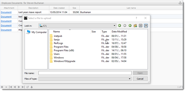
Attachments Sections are grids used for data-bound document and image storage and retrieval.
You build Apps in Lianja App Builder visually using the Page Builder.
If you have not yet done so please read Understanding the Lianja Architecture and also Understanding ART to better understand this article.
An App consists of pages. Pages are made up of Sections. Form sections are made up of FormItems. We call these collectively "UI Elements" or "Visual Elements".
Setting Attributes Declaratively
You adjust the appearance and behavior of each UI Element in the Attributes Tab of the App Inspector.

The attributes available consist of some common ones as well as some specific to the UI Element being inspected.
Getting and Setting Attributes Programmatically
The setAttribute(name, value) method can be used to set the value of an Attribute:
Lianja.get("pageid.sectionid").setAttribute("title","Section1")
Note: on the desktop, the shortened form setAttr(name,value) is also available.
The getAttribute(name) method can be used to get the value of an Attribute:
cTitle = Lianja.get("pageid.sectionid").getAttribute("title")
Note: on the desktop, the shortened form getAttr(name) is also available.
See Also
Attachments Options, DocumentView Options, DocumentView Section Attributes
Demo Apps (included in the Lianja App Builder distribution):
- Lianja Demo (lianjademo)
- Lianja Web UI Demo (example_webapp2)
Attributes
Details
| Attribute | Description | Name | Type |
|---|---|---|---|
| Name | The name for this section (unique to the page) | id | Character |
| Full name | The full name for this section including its parent page, e.g. page1.section1 | fullid | Character |
| Alias name | The alias name for this section | aliasid | Character |
| Dashboard group | The dashboard section that this section belongs to. From v5.2. | horizontalgroup | Character |
| Horizontal stretch | The horizontal % stretch factor that this section should occupy. From v5.2. | horizontalgroupstretchfactor | Character |
| Vertical stretch | The vertical % stretch factor that this section should occupy. From v5.2. | verticalgroupstretchfactor | Character |
| App Doc | The App Doc file for this section. This will be included in the App Doc when it is generated. | appdoc | Character |
| MetaData version | The MetaData version number. You can set this in the setupUI hook to prevent MetaData being applied multiple times. | metaDataVersion | Int |
| Meta types | A comma separated list of metatype names | metatypes | Character |
| Custom Props | A ';' separated list of custom prop key pairs, e.g. name=barry;company=lianja From v5.3. |
customprops | Character |
| Type | The type of section: attachments (readonly) | type | Character |
| Caption | The section caption displayed in the section header | title | Character |
| Database | The database for this section | database | Character |
| Table | The table for this section | table | Character |
| OrderBy | Optionally specify an order for non-child sections. (From v4.1) | orderby | Character |
| SQL statement | The SQL statement used to populate a Virtual Table. Use {} macros in the WHERE condition to relate parent-->child sections and ORDER BY to order the display of records. This is native SQL for the target SQL database and may call stored procedures as well as SQL Select. | sql | Character |
| Timelines enabled | Enable database timelines for this section | timelinesEnabled | Boolean |
| Filter | The filter expression that restricts the records that will be included in the data | filter | Character |
| Where condition | The dynamic WHERE condition for a Virtual Table that restricts which records will be retrieved | wherecond | Character |
| Height | The section height | height | Int |
| Fixed height | Fix the section height (True | False) | fixedHeight | Boolean |
| Auto layout percent | Auto layout percentage of page size. If set to 0, then all sections on a page are resized to an equal height | autoLayoutPercentage | Int |
| Readonly | Section is readonly (True | False) | readOnly | Boolean |
| Sortable | Section is sortable by clicking on the column headers (True | False) | sortable | Boolean |
| Double click to edit | Double click grid rows to edit data (True | False) | doubleClickToEdit | Boolean |
Appearance
| Attribute | Description | Name | Type |
|---|---|---|---|
| Background color | Section background color | backColor | Character |
| Foreground color | Section foreground color | foreColor | Character |
| Grid background color | Grid background color | gridBackColor | Character |
| Grid foreground color | Grid foreground color | gridForeColor | Character |
| Row dynamic background | The expression or function that provides dynamic row color formatting. e.g. iif(amount<0,'red',) | gridRowDynamicBackColor | Character |
| Row dynamic foreground | The expression or function that provides dynamic row color formatting. e.g. iif(amount<0,'white',) | gridRowDynamicForeColor | Character |
| CSS style | CSS style (separate attributes with ; or use app:/filename.css) | cssStyle | Character |
| Gradient colors | Render the background color as a gradient (True | False) | sectionGradient | Boolean |
| Gradient type | Specify the gradient type | sectionGradientType | Int |
| Gradient start color | Gradient start color | sectionFromColor | Character |
| Gradient end color | Gradient end color | sectionToColor | Character |
| Transparency | Specify a transparency percentage from 0 to 100 | transparency | Int |
| Background image | The background image for the section (png | jpg | gif). Use app:/imagename.ext for app specific images. |
picture | Character |
| Stretch image | Stretch the background image to fill the section (True | False) | stretch | Boolean |
| Margin | Margin size around the section | margin | Int |
| Add spacer at bottom | Add spacer at bottom of section (True | False) | spacerVisible | Boolean |
| Show actionbar | Show the actionbar (True | False) | showGridActionbar | Boolean |
| Hide column headers | Hide column headers at runtime (True | False). From v4.1. | gridhideheaders | Boolean |
| Show grid lines | Show grid lines (True | False) | showGrid | Boolean |
| Show images inline | Show image columns as inline images (True | False). From v4.1. | gridinlineimages | Boolean |
| Show memo/varchar inline | Show memo/varchar columns as inline text (True | False). From v4.1. | gridinlinememos | Boolean |
| Inline width | The display size width for inline images and memos. From v4.1. | gridinlineimagewidth | Int |
| Inline height | The display size height for inline images and memos. From v4.1. | gridinlineimageheight | Int |
| Inline effect | The display effect for inline images and memos (None | Dropshadow | Raisedshadow). From v4.1. | gridinlineeffect | Character |
| Show logicals as CheckBoxes | Display logical/Boolean values as CheckBoxes (True | False) | showGridCheckBox | Boolean |
| Alternating row colors | Display alternating row colors (True | False) | showGridAlternatingColors | Boolean |
| Grid row height | Height of the grid rows | gridRowHeight | Int |
| Autoresize columns | Autoresize grid columns to fit data (True | False) | autoResizeGridColumns | Boolean |
| Stretch last column | Stretch last grid column (True | False) | autoStretchGridColumns | Boolean |
| Split grid | Split the grid into a grid and a form (True | False) | splitbar | Boolean |
| Show split edit | Display grid in split/form edit mode when displayed (True | False) | showSplitEdit | Boolean |
| Show memo/object panel | Show memo/object panel in splitbar mode (True | False) | showGridMemos | Boolean |
| Scrollbar | Section displays the grid vertical scrollbar (True | False) | scrollbar | Boolean |
| MultiSelect rows | Enable multi selection of grid rows. The SelectionChanged delegate is called as rows are selected or deselected (True | False) | multiSelectGridRows | Boolean |
| MultiSelect rows expression | The expression to evaluate when a multi select row operation is performed. These are passed as a comma separated list to the SelectionChanged delegate. | multiSelectGridRowsExpression | Boolean |
| Infinitely scrollable | Grid is always rendered using infinite scroll for large data sets (mousewheel on desktop/web, flick up and down on mobile) (True | False). From v4.1. | infinitescroll | Boolean |
| Pagination | Grid is always rendered using pagination (for large data sets)(True | False) | pagination | Boolean |
| Automatic pagination | Grid is rendered using pagination if the number of records exceeds below amount (True | False) | autoPagination | Boolean |
| Automatic pagination size | Grid is rendered using pagination if Automatic pagination is true and the number of records exceeds this amount | autoPaginationSize | Int |
Header
| Attribute | Description | Name | Type |
|---|---|---|---|
| Hide header | Hide section header at runtime (True | False) | hideHeaderAtRuntime | Boolean |
| Hide actionbar | Hide actionbar when stacked section is activated at runtime (True | False) |
hideActionBarAtRuntime | Boolean |
| Show record count badge | Show the record count badge in the section header (True | False). From v5.2. | showreccount | Boolean |
| Header CSS style | CSS style (separate attributes with ; or use app:/filename.css) | headerCssStyle | Character |
| Header icon | The image for the Header (png | jpg | gif). Use app:/imagename.ext for app specific images. |
headerIcon | Character |
| Gradient colors | Render the Header background color as a gradient (True | False) | headerGradient | Boolean |
| Gradient type | Specify the gradient type | headerGradientType | Int |
| Gradient start color | Gradient start color | headerFromColor | Character |
| Gradient end color | Gradient end color | headerToColor | Character |
| Show OK/Cancel buttons | Show OK/Cancel buttons in the section header (True | False) | showOkCancelButtons | Boolean |
| Show Add/Delete buttons | Show Add/Delete buttons in the section header (True | False) | showAddDeleteButtons | Boolean |
| Show Print button | Show Print button in the section header (True | False) | showPrintButton | Boolean |
| Show Edit button | Show Edit button in the section header (True | False) | showEditButton | Boolean |
| Hide custom search icon | Hide the custom search icon (True | False) | hideCustomSearchIcon | Boolean |
| Show Custom search dialog | Show custom search dialog when custom search icon clicked (True | False) | showcustomsearchdialog | Boolean |
| Show custom search dialog panel | Show custom search dialog panel when custom search icon clicked (True | False) |
showcustomsearchdialogpanel | Boolean |
| Show info tips icon | Show the info tips icon in the section header (True | False) | showInfoTipsIcon | Boolean |
| Show help icon | Show the help icon in the section header (True | False) | showHelpIcon | Boolean |
| Help topic | Help topic to display when the help icon is clicked in the section header | helpTopic | Character |
Custom Header Style
| Attribute | Description | Name | Type |
|---|---|---|---|
| Use custom header style | Use a custom header style (True | False) | headercustomstyle | Boolean |
| Header background color | Header background color | headerbackcolor | Character |
| Header foreground color | Header foreground color | headerforecolor | Character |
| Header bottom border | Display the header bottom border (True | False) | headerbottomborder | Boolean |
| Header bottom border height | Height (in pixels) of the header bottom border (if displayed) | headerbottomborderheight | Int |
| Header bottom border color | Header bottom border color | headerbottombordercolor | Character |
Attachments options
| Attribute | Description | Name | Type |
|---|---|---|---|
| Attachment field | Name of the (blob) attachment column | attachmentField | Character |
| Attachment date field | Name of the (date) attachment creation date column | attachmentDateField | Character |
| Attachment description field | Name of the (character) attachment description column | attachmentDescField | Character |
| Attachment size field | Name of the (numeric) attachment file size column | attachmentSizeField | Character |
| Attachment link text | Link text to display for the attachment | attachmentLinkText | Character |
Related Data
| Attribute | Description | Name | Type |
|---|---|---|---|
| Parent section name | Name of related parent section | parentid | Character |
| Automatically relate | Automatically relate the child section (True | False). If this is unchecked then you need to manually relate it in the parentdatachanged delegate. | autoRelateChildSection | Boolean |
| Parent key | Parent key | parentKeyExpr | Character |
| Child key | Child key | childKeyExpr | Character |
Menu
| Attribute | Description | Name | Type |
|---|---|---|---|
| Visible | Section menu visible (True | False) | sectionMenuVisible | Boolean |
| Height | Section menu height | sectionMenuHeight | Int |
| Background color | Section menu background color | sectionMenuBackColor | Character |
| Foreground color | Section menu foreground color | sectionMenuForeColor | Character |
| Custom menu panel | The .rsp or .jssp page used to create the custom menu panel. This page should generate dynamic HTML5/JavaScript. | customSectionMenuPanel | Character |
| Custom menu | Section menu contents | customSectionMenu | Character |
| Custom action | Action to perform when a menu item is selected | sectionMenuAction | Character |
| Context Menu | A comma separated list of menu items to popup when a user right clicks on the Section. Selecting an item calls the rightclick delegate with the item text as an argument. From v4.2. | contextMenu | Character |
Search Panel
| Attribute | Description | Name | Type |
|---|---|---|---|
| Visible | Section search panel visible (True | False) | searchPanelVisible | Boolean |
| Height | Section search panel height | searchPanelHeight | Int |
| Background color | Section search panel background color | searchPanelBackColor | Character |
| Foreground color | Section search panel foreground color | searchPanelForeColor | Character |
| Auto create | Automatically create search panel for all Section search fields | searchPanelAutoCreate | Boolean |
| Custom search panel | The delegate used to create the custom search panel | searchPanelAction | Character |
Subtitle
| Attribute | Description | Name | Type |
|---|---|---|---|
| Visible | Section subtitle visible (True | False) | subtitleVisible | Boolean |
| Caption | Section subtitle caption | subtitleCaption | Character |
| Height | Section subtitle height | subtitleHeight | Int |
| Background color | Section subtitle background color | subtitleBackColor | Character |
| Foreground color | Section subtitle foreground color | subtitleForeColor | Character |
| Font | Section subtitle font | subtitleFont | Int |
| CSS style | CSS style | subtitleCssStyle | Character |
Summary
| Attribute | Description | Name | Type |
|---|---|---|---|
| Visible | Section summary visible (True | False) | summaryvisible | Boolean |
| Minimum | Section summary minimum (True | False). From v6.0. | summarymin | Boolean |
| Maximum | Section summary maximum (True | False). From v6.0. | summarymax | Boolean |
| Average | Section summary average (True | False). From v6.0. | summaryaverage | Boolean |
| Total | Section summary total (True | False). From v6.0. | summarytotal | Boolean |
| Background color | Section summary background color | summarybackcolor | Character |
| Foreground color | Section summary foreground color (lines) | summaryforecolor | Character |
| Text color | Section summary text color. From v6.0. | summarytextcolor | Character |
| Attribute | Description | Name | Type |
|---|---|---|---|
| Visible | Section footer visible (True | False) | footerVisible | Boolean |
| Caption | Section footer caption | footerText | Character |
| Height | Section footer height | footerHeight | Int |
| Background color | Section footer background color | footerBackColor | Character |
| Foreground color | Section footer foreground color | footerForeColor | Character |
| CSS style | CSS style (separate attributes with ; or use app:/filename.css or specify CSS classes separated by spaces). | footercssstyle | Character |
| Custom menu | Section footer menu contents | customOptionsMenu | Character |
| Custom action | Action to perform when a footer menu item is selected | customOptionsMenuAction | Character |
| Footer button CSS | Footer button CSS style | footerButtonCss | Character |
| Footer button width | Footer button width | footerButtonWidth | Int |
Other Options
| Attribute | Description | Name | Type |
|---|---|---|---|
| Hide form NavBar | Hide form Navigation Bar at runtime if this section is in an Accordion Stack (True | False) | hideFormNavBar | Boolean |
| Hide SearchBox | Hide the Page Header Instant Search box when this section is selected in an Accordion Stack (True | False). | hidesearchbox | Boolean |
| Collapsable | The section is collapsible at runtime (True | False) | collapsableAtRuntime | Boolean |
| Exclude from accordion | The section is excluded from accordion behavior at runtime (True | False) | excludeAccordionAtRuntime | Boolean |
| Inherit dictionary rules | Inherit the data dictionary rules (True | False) | applyDictionary | Boolean |
| Dictionary overrides | Empty dictionary entries override rules (True | False). From v9.4. | dictionaryoverrides | Boolean |
| Section to refresh when data modified | Section to refresh when data is modified in this section | refreshSectionOnChange | Character |
| Return tabs | Treat the return key as a Tab on the fields in this section (True | False) | returnTabs | Boolean |
| Enable when editing | Disable editing until in 'Edit' mode (True | False) | enabledonedit | Boolean |
| Double-click action | Page to activate on double click of a grid row | doubleClickAction | Character |
| Deferred add | When adding new records, do not commit a blank record until saved. (True | False) | deferredadd | Boolean |
| Hide search icon | Hide the search icon at runtime (True | False) | hideSearchIcon | Boolean |
Custom Delegates
| Attribute | Description | Name | Type |
|---|---|---|---|
| Scripting language | The default scripting language for custom code in this section (Inherit | Recital | Visual FoxPro | Python | JavaScript | PHP) | scriptingLanguage | Character |
| Custom library | The filename of the library containing code for event handlers and custom procedures/functions | customLibrary | Character |
| The delegate for the Print event. This is called when you click the 'Print' icon. From v4.2. | printAction | Character | |
| Expanded | The delegate for the Expanded event | expandedAction | Character |
| Collapsed | The delegate for the Collapsed event | collapsedAction | Character |
| Hotkey | The delegate for the Hotkey event. | hotkeyAction | Character |
| Enabled When | The delegate for the EnabledWhen event | enabledWhenAction | Character |
| Visible When | The delegate for the VisibleWhen event | visibleWhenAction | Character |
| Valid When | The delegate for the ValidWhen event | validWhenAction | Character |
| Activate | The delegate for the Activate event | activateAction | Character |
| Deactivate | The delegate for the Deactivate event | deactivateAction | Character |
| Init | The delegate for the Init event | initAction | Character |
| Destroy | The delegate for the Destroy event | destroyAction | Character |
| Load | The delegate for the Load event | loadAction | Character |
| Ready | The delegate for the Ready event | readyAction | Character |
| Unload | The delegate for the Unload event | unloadAction | Character |
| Change | The delegate for the Change event | changedAction | Character |
| Link Click | The delegate for the Hyperlink/Button Click event. This is called with two arguments: functionname(controlsource,text) | linkClickAction | Character |
| Selection Changed | The delegate for the Selection Changed event (for multi row selection) | selectionChangedAction | Character |
| Before Data Create | The delegate for the BeforeCreate event | beforeCreateAction | Character |
| After Data Create | The delegate for the AfterCreate event | afterCreateAction | Character |
| After Data Changed | The delegate for the dataChanged event (after data is read) | dataChangedAction | Character |
| Before Data Update | The delegate for the BeforeUpdate event | beforeUpdateAction | Character |
| After Data Update | The delegate for the AfterUpdate event | afterUpdateAction | Character |
| Before Data Delete | The delegate for the BeforeDelete event | beforeDeleteAction | Character |
| After Data Delete | The delegate for the AfterDelete event | afterDeleteAction | Character |
| Before Refresh action | The delegate for the BeforeRefresh event. From v6.2. | beforeRefreshAction | Character |
| Refresh | The delegate for the Refresh event | refreshAction | Character |
| After Refresh action | The delegate for the AfterRefresh event. | afterRefreshAction | Character |
| Before Edit | The delegate for the BeforeEdit event. From v5.4. | beforeEditAction | Character |
| After Edit | The delegate for the AfterEdit event. From v5.4. | afterEditAction | Character |
| Init Form Defaults | The delegate for the InitFormDefaults event called when adding a new record. | initFormDefaults | Character |
| Parent data changed | The delegate for the ParentDataChanged event | parentDataChangedAction | Character |
| Dialog button delegate | The delegate for the DialogButtonClicked event. If a dialogbutton on a Field has no delegate, the Section delegate will be called. If the section has no delegate, then the Page delegate will be called. | dialogButtonAction | Character |
| Double Click | The delegate for the Double Clicked event | dblClickAction | Character |
| Sort | The delegate for the column Sort event fired when the header is clicked. This is called with two arguments: nColumn, nDirection | sort | Character |
| Right Click | The delegate for the Right Clicked event | rightClickAction | Character |
| Timer | The delegate for the Timer event | timerAction | Character |
| Timer interval | The timer interval in seconds that the Timer event will be called at runtime | timerInterval | Int |
| State Changed | The delegate for the Statechanged event. | stateChangedAction | Character |
| Custom footer menu | The delegate for the footer menu event | customMenuAction | Character |
| Custom search command | The delegate for the search event | customSearch | Character |
| Custom section menu | The delegate for the section menu event | customSectionMenuAction | Character |
Gestures
| Attribute | Description | Name | Type |
|---|---|---|---|
| Gestures enabled | Enable gestures for this page: swipe, pan, pinch, tap and tapandhold (True | False). If enabled, then the Gestures delegate will be called with two arguments, e.g. 'swipe','left' or 'swipe','right'. |
gesturesEnabled | Boolean |
| Swipe left gesture | The delegate for the gestureSwipeLeft event. | gestureSwipeLeftAction | Character |
| Swipe right gesture | The delegate for the gestureSwipeRight event. | gestureSwipeRightAction | Character |
| Swipe up gesture | The delegate for the gestureSwipeUp event. | gestureSwipeUpAction | Character |
| Swipe down gesture | The delegate for the gestureSwipeDown event. | gestureSwipeDownAction | Character |
| Pan gesture | The delegate for the gesturePan event. | gesturePanAction | Character |
| Pinch gesture | The delegate for the gesturePinch event. | gesturePinchAction | Character |
| Tap gesture | The delegate for the gestureTap event. | gestureTapAction | Character |
| Tap and hold gesture | The delegate for the gestureTapAndHold event. | gestureTapAndHoldAction | Character |
| Gestures | The catch all delegate for the gestures event. | gesturesAction | Character |
Permissions and Roles
| Attribute | Description | Name | Type |
|---|---|---|---|
| Create roles | A comma separated list of roles that can perform create operations on data in the section. | permcreate | Character |
| Read roles | A comma separated list of roles that can read (and view) the section. | permRead | Character |
| Update roles | A comma separated list of roles that can perform update operations on data in the section. | permUpdate | Character |
| Delete roles | A comma separated list of roles that can perform delete operations on data in the section. | permDelete | Character |
UI Presentation Rules
| Attribute | Description | Name | Type |
|---|---|---|---|
| Desktop | Include this section in a Desktop client (True | False). | desktopUI | Boolean |
| Web | Include this section in a Web client (True | False). | webUI | Boolean |
| Tablet | Include this section in a Tablet client (True | False). | tabletUI | Boolean |
| Phone | Include this section in a Phone client (True | False). | mobileUI | Boolean |
| UI States | UI states that affect this section. Specify multiple states as a comma separated list. | state | Character |
| Initial UI state | The initial UI state for this section. This will be applied to the section and all its fields and gadgets. | uiStateInit | Character |
| Readonly when | Section is readonly at runtime if specified expression evaluates to true. | readonlyWhen | Character |
| Visible when | Section is visible at runtime if specified expression evaluates to true. | visibleWhen | Character |
| Display orientation | Display depending on mobile device orientation for Tablets and Phones. (Always | Portrait | Landscape) | displayOrientation | Character |
| Apply rules on change | Apply UI presentation rules (Visible when and Readonly when) when data is changed interactively or when navigating records (True | False). | applyRulesOnChange | Boolean |
| Apply rules on parent change | Apply section UI presentation rules (Visible when and Readonly when) when parent data is changed by navigating records (True | False) | applyRulesOnParentChange | Boolean |
| Search Panel Responsive UI width breakpoint | The Search Panel responsive UI width breakpoint in Web/Mobile Apps. From v5.4. | searchpanelresponsivevisibility | Int |
| Menu Responsive UI width breakpoint | The Menu responsive UI width breakpoint in Web/Mobile Apps. From v5.4. | responsivemenuwidth | Int |
| Responsive UI width breakpoint | The section responsive UI visibility width breakpoint in Web/Mobile Apps. From v5.4. | responsivewidthvisibility | Int |
| Responsive UI height breakpoint | The section responsive UI visibility height breakpoint in Web/Mobile Apps. From v5.4. | responsiveheightvisibility | Int |