Difference between revisions of "TabView Section Attributes"
Yvonne.milne (Talk | contribs) |
Yvonne.milne (Talk | contribs) (→Header) |
||
| (47 intermediate revisions by 3 users not shown) | |||
| Line 1: | Line 1: | ||
| − | == | + | =Overview= |
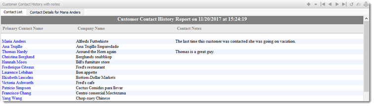
| − | [[ | + | TabView Sections are tabbed containers for other Sections. |
| + | {{DISPLAYTITLE:TabView Section}} | ||
| + | [[File:TabView_section.png|middle|758px|link=]] | ||
| + | |||
| + | You build Apps in Lianja App Builder visually using the [[:Category:Page_Builder|Page Builder]]. | ||
| + | |||
| + | If you have not yet done so please read [[Understanding_the_Lianja_App_Architecture|Understanding the Lianja Architecture]] and also [[Lianja_is_all_about_ART|Understanding ART]] to better understand this article. | ||
| + | |||
| + | An App consists of pages. Pages are made up of Sections. Form sections are made up of FormItems. We call these collectively "UI Elements" or "Visual Elements". | ||
| + | |||
| + | ==Setting Attributes Declaratively== | ||
| + | |||
| + | You adjust the appearance and behavior of each UI Element in the '''Attributes''' Tab of the [[:Category:App_Inspector|App Inspector]]. | ||
| + | |||
| + | [[{{ns:file}}:bm-attributes.png|800px|left|border|link={{filepath:bm-attributes.png}}|Attributes]] | ||
| + | <br clear=all> | ||
| + | |||
| + | The attributes available consist of some common ones as well as some specific to the UI Element being inspected. | ||
| − | ==Getting and Setting Attributes== | + | ==Getting and Setting Attributes Programmatically== |
The '''setAttribute(name, value)''' method can be used to set the value of an Attribute: | The '''setAttribute(name, value)''' method can be used to set the value of an Attribute: | ||
<pre>Lianja.get("pageid.sectionid").setAttribute("title","Section1")</pre> | <pre>Lianja.get("pageid.sectionid").setAttribute("title","Section1")</pre> | ||
| − | Note: the shortened form '''setAttr(name,value)''' is also available. | + | Note: on the desktop, the shortened form '''setAttr(name,value)''' is also available. |
The '''getAttribute(name)''' method can be used to get the value of an Attribute: | The '''getAttribute(name)''' method can be used to get the value of an Attribute: | ||
| Line 13: | Line 30: | ||
<pre>cTitle = Lianja.get("pageid.sectionid").getAttribute("title")</pre> | <pre>cTitle = Lianja.get("pageid.sectionid").getAttribute("title")</pre> | ||
| − | Note: the shortened form '''getAttr(name)''' is also available. | + | Note: on the desktop, the shortened form '''getAttr(name)''' is also available. |
| + | =See Also= | ||
| + | [[TabView Sections (Video)]] | ||
| + | |||
| + | Demo Apps (included in the Lianja App Builder distribution): | ||
| + | * Lianja Demo (lianjademo) | ||
| + | * Lianja Tablet Web UI Demo (example_webapp1) | ||
| + | |||
| + | =Attributes= | ||
==Details== | ==Details== | ||
{| class="wikitable" width="100%" | {| class="wikitable" width="100%" | ||
!width="20%"|Attribute | !width="20%"|Attribute | ||
| − | !width=" | + | !width="45%"|Description |
| + | !width="25%"|Name | ||
| + | !width="10%"|Type | ||
|- | |- | ||
|valign="top"|[[Details Attributes#Name|Name]]||The name for this section (unique to the page) | |valign="top"|[[Details Attributes#Name|Name]]||The name for this section (unique to the page) | ||
| + | |valign="top"|id||valign="top"|Character | ||
| + | |- | ||
| + | |valign="top"|[[Details Attributes#Full name|Full name]]||The full name for this section including its parent page, e.g. page1.section1 | ||
| + | |valign="top"|fullid||valign="top"|Character | ||
| + | |- | ||
| + | |valign="top"|[[Details Attributes#Alias name|Alias name]]||The alias name for this section | ||
| + | |valign="top"|aliasid||Character | ||
| + | |- | ||
| + | |valign="top"|[[Dashboard Sections|Dashboard group]]||The dashboard section that this section belongs to. From v5.2. | ||
| + | |valign="top"|horizontalgroup||valign="top"|Character | ||
| + | |- | ||
| + | |valign="top"|[[Dashboard Sections|Horizontal stretch]]||The horizontal % stretch factor that this section should occupy. From v5.2. | ||
| + | |valign="top"|horizontalgroupstretchfactor||valign="top"|Character | ||
| + | |- | ||
| + | |valign="top"|[[Dashboard Sections|Vertical stretch]]||The vertical % stretch factor that this section should occupy. From v5.2. | ||
| + | |valign="top"|verticalgroupstretchfactor||valign="top"|Character | ||
| + | |- | ||
| + | |valign="top"|[[Details Attributes#App Doc|App Doc]]||The App Doc file for this section. This will be included in the [[App Doc]] when it is generated. | ||
| + | |valign="top"|appdoc||valign="top"|Character | ||
| + | |- | ||
| + | |valign="top"|[[Details Attributes#MetaData version|MetaData version]]||The MetaData version number. You can set this in the setupUI hook to prevent MetaData being applied multiple times. | ||
| + | |valign="top"|metaDataVersion||valign="top"|Int | ||
|- | |- | ||
|valign="top"|[[MetaTypes|Meta types]]||A comma separated list of metatype names | |valign="top"|[[MetaTypes|Meta types]]||A comma separated list of metatype names | ||
| + | |valign="top"|metatypes||valign="top"|Character | ||
| + | |- | ||
| + | |valign="top"|[[Details Attributes#Custom Props|Custom Props]]||A ';' separated list of custom prop key pairs, e.g. name=barry;company=lianja<br>From v5.3. | ||
| + | |valign="top"|customprops||valign="top"|Character | ||
|- | |- | ||
|valign="top"|[[Details Attributes#Type|Type]]||The type of section: tabview (readonly) | |valign="top"|[[Details Attributes#Type|Type]]||The type of section: tabview (readonly) | ||
| + | |valign="top"|type||valign="top"|Character | ||
|- | |- | ||
|valign="top"|[[Details Attributes#Caption|Caption]]||The section caption displayed in the section header | |valign="top"|[[Details Attributes#Caption|Caption]]||The section caption displayed in the section header | ||
| + | |valign="top"|title||valign="top"|Character | ||
|- | |- | ||
|valign="top"|[[Details Attributes#Database|Database]]||The database for this section | |valign="top"|[[Details Attributes#Database|Database]]||The database for this section | ||
| + | |valign="top"|database||valign="top"|Character | ||
|- | |- | ||
|valign="top"|[[Details Attributes#Height|Height]]||The section height | |valign="top"|[[Details Attributes#Height|Height]]||The section height | ||
| + | |valign="top"|height||valign="top"|Int | ||
|- | |- | ||
|valign="top"|[[Details Attributes#Fixed height|Fixed height]]||Fix the section height (True | False) | |valign="top"|[[Details Attributes#Fixed height|Fixed height]]||Fix the section height (True | False) | ||
| + | |valign="top"|fixedHeight||valign="top"|Boolean | ||
|- | |- | ||
|valign="top"|[[Details Attributes#Auto layout percent|Auto layout percent]]||Auto layout percentage of page size. If set to 0, then all sections on a page are resized to an equal height | |valign="top"|[[Details Attributes#Auto layout percent|Auto layout percent]]||Auto layout percentage of page size. If set to 0, then all sections on a page are resized to an equal height | ||
| + | |valign="top"|autoLayoutPercentage||valign="top"|Int | ||
|- | |- | ||
|} | |} | ||
| Line 41: | Line 100: | ||
{| class="wikitable" width="100%" | {| class="wikitable" width="100%" | ||
!width="20%"|Attribute | !width="20%"|Attribute | ||
| − | !width=" | + | !width="45%"|Description |
| + | !width="25%"|Name | ||
| + | !width="10%"|Type | ||
|- | |- | ||
|valign="top"|[[Colors|Background color]]||Section background color | |valign="top"|[[Colors|Background color]]||Section background color | ||
| + | |valign="top"|backColor||valign="top"|Character | ||
|- | |- | ||
|valign="top"|[[Colors|Foreground color]]||Section foreground color | |valign="top"|[[Colors|Foreground color]]||Section foreground color | ||
| + | |valign="top"|foreColor||valign="top"|Character | ||
|- | |- | ||
|valign="top"|[[Shading and Transparency|Transparency]]||Specify a transparency percentage from 0 to 100 | |valign="top"|[[Shading and Transparency|Transparency]]||Specify a transparency percentage from 0 to 100 | ||
| + | |valign="top"|transparency||valign="top"|Int | ||
|- | |- | ||
|valign="top"|[[Section Appearance#Margin|Margin]]||Margin size around the section | |valign="top"|[[Section Appearance#Margin|Margin]]||Margin size around the section | ||
| + | |valign="top"|margin||valign="top"|Int | ||
|- | |- | ||
|valign="top"|[[Section Appearance#Add spacer at bottom|Add spacer at bottom]]||Add spacer at bottom of section (True | False) | |valign="top"|[[Section Appearance#Add spacer at bottom|Add spacer at bottom]]||Add spacer at bottom of section (True | False) | ||
| + | |valign="top"|spacerVisible||valign="top"|Boolean | ||
|- | |- | ||
|} | |} | ||
| Line 58: | Line 124: | ||
{| class="wikitable" width="100%" | {| class="wikitable" width="100%" | ||
!width="20%"|Attribute | !width="20%"|Attribute | ||
| − | !width=" | + | !width="45%"|Description |
| + | !width="25%"|Name | ||
| + | !width="10%"|Type | ||
|- | |- | ||
|valign="top"|[[Section Header#Hide header|Hide header]]||Hide section header at runtime(True | False) | |valign="top"|[[Section Header#Hide header|Hide header]]||Hide section header at runtime(True | False) | ||
| + | |valign="top"|hideHeaderAtRuntime||valign="top"|Boolean | ||
|- | |- | ||
| − | |valign="top"|[[Section Header#Hide actionbar|Hide actionbar]]||Hide actionbar | + | |valign="top"|[[Section Header#Hide actionbar|Hide actionbar]]||Hide actionbar when stacked section is activated at runtime<br>(True | False) |
| + | |valign="top"|hideActionBarAtRuntime||valign="top"|Boolean | ||
|- | |- | ||
|valign="top"|[[Section Header#Header CSS style|Header CSS style]]||CSS style (separate attributes with ; or use app:/filename.css) | |valign="top"|[[Section Header#Header CSS style|Header CSS style]]||CSS style (separate attributes with ; or use app:/filename.css) | ||
| + | |valign="top"|headerCssStyle||valign="top"|Character | ||
|- | |- | ||
|valign="top"|[[Section Header#Header icon|Header icon]]||The image for the Header (png | jpg | gif).<br>Use app:/imagename.ext for app specific images. | |valign="top"|[[Section Header#Header icon|Header icon]]||The image for the Header (png | jpg | gif).<br>Use app:/imagename.ext for app specific images. | ||
| + | |valign="top"|headerIcon||valign="top"|Character | ||
|- | |- | ||
|valign="top"|[[Gradients#Gradient colors|Gradient colors]]||Render the Header background color as a gradient (True | False) | |valign="top"|[[Gradients#Gradient colors|Gradient colors]]||Render the Header background color as a gradient (True | False) | ||
| + | |valign="top"|headerGradient||valign="top"|Boolean | ||
|- | |- | ||
|valign="top"|[[Gradients#Gradient type|Gradient type]]||Specify the gradient type | |valign="top"|[[Gradients#Gradient type|Gradient type]]||Specify the gradient type | ||
| + | |valign="top"|headerGradientType||valign="top"|Int | ||
|- | |- | ||
|valign="top"|[[Gradients#Gradient start color|Gradient start color]]||Gradient start color | |valign="top"|[[Gradients#Gradient start color|Gradient start color]]||Gradient start color | ||
| + | |valign="top"|headerFromColor||valign="top"|Character | ||
|- | |- | ||
|valign="top"|[[Gradients#Gradient end color|Gradient end color]]||Gradient end color | |valign="top"|[[Gradients#Gradient end color|Gradient end color]]||Gradient end color | ||
| + | |valign="top"|headerToColor||valign="top"|Character | ||
|- | |- | ||
|valign="top"|[[Section Header#Show OK/Cancel buttons|Show OK/Cancel buttons]]||Show OK/Cancel buttons in the section header (True | False) | |valign="top"|[[Section Header#Show OK/Cancel buttons|Show OK/Cancel buttons]]||Show OK/Cancel buttons in the section header (True | False) | ||
| + | |valign="top"|showOkCancelButtons||valign="top"|Boolean | ||
|- | |- | ||
|valign="top"|[[Section Header#Show Add/Delete buttons|Show Add/Delete buttons]]||Show Add/Delete buttons in the section header (True | False) | |valign="top"|[[Section Header#Show Add/Delete buttons|Show Add/Delete buttons]]||Show Add/Delete buttons in the section header (True | False) | ||
| + | |valign="top"|showAddDeleteButtons||valign="top"|Boolean | ||
|- | |- | ||
|valign="top"|[[Section Header#Show Print button|Show Print button]]||Show Print button in the section header (True | False) | |valign="top"|[[Section Header#Show Print button|Show Print button]]||Show Print button in the section header (True | False) | ||
| + | |valign="top"|showPrintButton||valign="top"|Boolean | ||
| + | |- | ||
| + | |valign="top"|[[Section Header#Show Edit button|Show Edit button]]||Show Edit button in the section header (True | False) | ||
| + | |valign="top"|showEditButton||valign="top"|Boolean | ||
|- | |- | ||
|valign="top"|[[Section Header#Hide custom search icon|Hide custom search icon]]||Hide the custom search icon (True | False) | |valign="top"|[[Section Header#Hide custom search icon|Hide custom search icon]]||Hide the custom search icon (True | False) | ||
| + | |valign="top"|hideCustomSearchIcon||valign="top"|Boolean | ||
| + | |- | ||
| + | |valign="top"|[[Section Header#Show Custom search dialog|Show Custom search dialog]]||Show custom search dialog when custom search icon clicked (True | False) | ||
| + | |valign="top"|showcustomsearchdialog||valign="top"|Boolean | ||
| + | |- | ||
| + | |valign="top"|[[Section Header#Show custom search dialog panel|Show custom search dialog panel]]||Show custom search dialog panel when custom search icon clicked<br>(True | False) | ||
| + | |valign="top"|showcustomsearchdialogpanel||valign="top"|Boolean | ||
|- | |- | ||
|valign="top"|[[Section Header#Show info tips icon|Show info tips icon]]||Show the info tips icon in the section header (True | False) | |valign="top"|[[Section Header#Show info tips icon|Show info tips icon]]||Show the info tips icon in the section header (True | False) | ||
| + | |valign="top"|showInfoTipsIcon||valign="top"|Boolean | ||
|- | |- | ||
|valign="top"|[[Section Header#Show help icon|Show help icon]]||Show the help icon in the section header (True | False) | |valign="top"|[[Section Header#Show help icon|Show help icon]]||Show the help icon in the section header (True | False) | ||
| + | |valign="top"|showHelpIcon||valign="top"|Boolean | ||
|- | |- | ||
|valign="top"|[[Section Header#Help topic|Help topic]]||Help topic to display when the help icon is clicked in the section header | |valign="top"|[[Section Header#Help topic|Help topic]]||Help topic to display when the help icon is clicked in the section header | ||
| + | |valign="top"|helpTopic||valign="top"|Character | ||
| + | |- | ||
| + | |} | ||
| + | |||
| + | ==Custom Header Style== | ||
| + | {| class="wikitable" width="100%" | ||
| + | !width="20%"|Attribute | ||
| + | !width="45%"|Description | ||
| + | !width="25%"|Name | ||
| + | !width="10%"|Type | ||
| + | |- | ||
| + | |valign="top"|[[Section Header#Use custom header style|Use custom header style]]||Use a custom header style (True | False) | ||
| + | |valign="top"|headercustomstyle||valign="top"|Boolean | ||
| + | |- | ||
| + | |valign="top"|[[Section Header#Header background color|Header background color]]||Header background color | ||
| + | |valign="top"|headerbackcolor||valign="top"|Character | ||
| + | |- | ||
| + | |valign="top"|[[Section Header#Header foreground color|Header foreground color]]||Header foreground color | ||
| + | |valign="top"|headerforecolor||valign="top"|Character | ||
| + | |- | ||
| + | |valign="top"|[[Section Header#Header bottom border|Header bottom border]]||Display the header bottom border (True | False) | ||
| + | |valign="top"|headerbottomborder||valign="top"|Boolean | ||
| + | |- | ||
| + | |valign="top"|[[Section Header#Header bottom border height|Header bottom border height]]||Height (in pixels) of the header bottom border (if displayed) | ||
| + | |valign="top"|headerbottomborderheight||valign="top"|Int | ||
| + | |- | ||
| + | |valign="top"|[[Section Header#Header bottom border color|Header bottom border color]]||Header bottom border color | ||
| + | |valign="top"|headerbottombordercolor||valign="top"|Character | ||
| + | |- | ||
| + | |valign="top"|[[Section Header#Show record count badge|Show record count badge]]||Show the record count badge in the section header (True | False). | ||
| + | |valign="top"|showreccount||valign="top"|Boolean | ||
|- | |- | ||
|} | |} | ||
| Line 95: | Line 217: | ||
{| class="wikitable" width="100%" | {| class="wikitable" width="100%" | ||
!width="20%"|Attribute | !width="20%"|Attribute | ||
| − | !width=" | + | !width="45%"|Description |
| + | !width="25%"|Name | ||
| + | !width="10%"|Type | ||
|- | |- | ||
|valign="top"|[[Related Data#Parent section name|Parent section name]]||Name of related parent section | |valign="top"|[[Related Data#Parent section name|Parent section name]]||Name of related parent section | ||
| + | |valign="top"|parentid||valign="top"|Character | ||
|- | |- | ||
|valign="top"|[[Related Data#Automatically relate|Automatically relate]]||Automatically relate the child section (True | False). If this is unchecked then you need to manually relate it in the parentdatachanged delegate. | |valign="top"|[[Related Data#Automatically relate|Automatically relate]]||Automatically relate the child section (True | False). If this is unchecked then you need to manually relate it in the parentdatachanged delegate. | ||
| + | |valign="top"|autoRelateChildSection||valign="top"|Boolean | ||
|- | |- | ||
|valign="top"|[[Related Data#Parent key|Parent key]]||Parent key | |valign="top"|[[Related Data#Parent key|Parent key]]||Parent key | ||
| + | |valign="top"|parentKeyExpr||valign="top"|Character | ||
|- | |- | ||
|valign="top"|[[Related Data#Child key|Child key]]||Child key | |valign="top"|[[Related Data#Child key|Child key]]||Child key | ||
| + | |valign="top"|childKeyExpr||valign="top"|Character | ||
|- | |- | ||
|} | |} | ||
| Line 110: | Line 238: | ||
{| class="wikitable" width="100%" | {| class="wikitable" width="100%" | ||
!width="20%"|Attribute | !width="20%"|Attribute | ||
| − | !width=" | + | !width="45%"|Description |
| + | !width="25%"|Name | ||
| + | !width="10%"|Type | ||
|- | |- | ||
|valign="top"|[[Section Menus#Visible|Visible]]||Section menu visible (True | False) | |valign="top"|[[Section Menus#Visible|Visible]]||Section menu visible (True | False) | ||
| + | |valign="top"|sectionMenuVisible||Boolean | ||
|- | |- | ||
|valign="top"|[[Section Menus#Height|Height]]||Section menu height | |valign="top"|[[Section Menus#Height|Height]]||Section menu height | ||
| + | |valign="top"|sectionMenuHeight||Int | ||
|- | |- | ||
|valign="top"|[[Section Menus#Background color|Background color]]||Section menu background color | |valign="top"|[[Section Menus#Background color|Background color]]||Section menu background color | ||
| + | |valign="top"|sectionMenuBackColor||Character | ||
|- | |- | ||
|valign="top"|[[Section Menus#Foreground color|Foreground color]]||Section menu foreground color | |valign="top"|[[Section Menus#Foreground color|Foreground color]]||Section menu foreground color | ||
| + | |valign="top"|sectionMenuForeColor||Character | ||
| + | |- | ||
| + | |valign="top"|[[Section Menus#Custom menu panel|Custom menu panel]]||The .rsp or .jssp page used to create the custom menu panel. This page should generate dynamic HTML5/JavaScript. | ||
| + | |valign="top"|customSectionMenuPanel||valign="top"|Character | ||
|- | |- | ||
|valign="top"|[[Section Menus#Custom menu|Custom menu]]||Section menu contents | |valign="top"|[[Section Menus#Custom menu|Custom menu]]||Section menu contents | ||
| + | |valign="top"|customSectionMenu||Character | ||
|- | |- | ||
|valign="top"|[[Section Menus#Custom action|Custom action]]||Action to perform when a menu item is selected | |valign="top"|[[Section Menus#Custom action|Custom action]]||Action to perform when a menu item is selected | ||
| + | |valign="top"|sectionMenuAction||Character | ||
| + | |- | ||
| + | |valign="top"|[[Section Menus#Context Menu|Context Menu]]||A comma separated list of menu items to popup when a user right clicks on the Section. Selecting an item calls the [[Custom_Delegates#Right_Click|rightclick]] delegate with the item text as an argument. From v4.2. | ||
| + | |valign="top"|contextMenu||valign="top"|Character | ||
|- | |- | ||
|} | |} | ||
| Line 129: | Line 271: | ||
{| class="wikitable" width="100%" | {| class="wikitable" width="100%" | ||
!width="20%"|Attribute | !width="20%"|Attribute | ||
| − | !width=" | + | !width="45%"|Description |
| + | !width="25%"|Name | ||
| + | !width="10%"|Type | ||
|- | |- | ||
|valign="top"|[[Section Search Panels#Visible|Visible]]||Section search panel visible (True | False) | |valign="top"|[[Section Search Panels#Visible|Visible]]||Section search panel visible (True | False) | ||
| + | |valign="top"|searchPanelVisible||Boolean | ||
|- | |- | ||
|valign="top"|[[Section Search Panels#Height|Height]]||Section search panel height | |valign="top"|[[Section Search Panels#Height|Height]]||Section search panel height | ||
| + | |valign="top"|searchPanelHeight||Int | ||
|- | |- | ||
|valign="top"|[[Section Search Panels#Background color|Background color]]||Section search panel background color | |valign="top"|[[Section Search Panels#Background color|Background color]]||Section search panel background color | ||
| + | |valign="top"|searchPanelBackColor||Character | ||
|- | |- | ||
|valign="top"|[[Section Search Panels#Foreground color|Foreground color]]||Section search panel foreground color | |valign="top"|[[Section Search Panels#Foreground color|Foreground color]]||Section search panel foreground color | ||
| + | |valign="top"|searchPanelForeColor||Character | ||
|- | |- | ||
|valign="top"|[[Section Search Panels#Auto create|Auto create]]||Automatically create search panel for all Section search fields | |valign="top"|[[Section Search Panels#Auto create|Auto create]]||Automatically create search panel for all Section search fields | ||
| + | |valign="top"|searchPanelAutoCreate||Boolean | ||
|- | |- | ||
|valign="top"|[[Section Search Panels#Custom search panel|Custom search panel]]||The delegate used to create the custom search panel | |valign="top"|[[Section Search Panels#Custom search panel|Custom search panel]]||The delegate used to create the custom search panel | ||
| + | |valign="top"|searchPanelAction||Character | ||
|- | |- | ||
|} | |} | ||
| Line 148: | Line 298: | ||
{| class="wikitable" width="100%" | {| class="wikitable" width="100%" | ||
!width="20%"|Attribute | !width="20%"|Attribute | ||
| − | !width=" | + | !width="45%"|Description |
| + | !width="25%"|Name | ||
| + | !width="10%"|Type | ||
|- | |- | ||
|valign="top"|[[Section Subtitles#Visible|Visible]]||Section subtitle visible (True | False) | |valign="top"|[[Section Subtitles#Visible|Visible]]||Section subtitle visible (True | False) | ||
| + | |valign="top"|subtitleVisible||Boolean | ||
|- | |- | ||
|valign="top"|[[Section Subtitles#Caption|Caption]]||Section subtitle caption | |valign="top"|[[Section Subtitles#Caption|Caption]]||Section subtitle caption | ||
| + | |valign="top"|subtitleCaption||Character | ||
|- | |- | ||
|valign="top"|[[Section Subtitles#Height|Height]]||Section subtitle height | |valign="top"|[[Section Subtitles#Height|Height]]||Section subtitle height | ||
| + | |valign="top"|subtitleHeight||Int | ||
|- | |- | ||
|valign="top"|[[Section Subtitles#Background color|Background color]]||Section subtitle background color | |valign="top"|[[Section Subtitles#Background color|Background color]]||Section subtitle background color | ||
| + | |valign="top"|subtitleBackColor||Character | ||
|- | |- | ||
|valign="top"|[[Section Subtitles#Foreground color|Foreground color]]||Section subtitle foreground color | |valign="top"|[[Section Subtitles#Foreground color|Foreground color]]||Section subtitle foreground color | ||
| + | |valign="top"|subtitleForeColor||Character | ||
|- | |- | ||
|valign="top"|[[Section Subtitles#Font|Font]]||Section subtitle font | |valign="top"|[[Section Subtitles#Font|Font]]||Section subtitle font | ||
| + | |valign="top"|subtitleFont||Int | ||
|- | |- | ||
|valign="top"|[[Section Subtitles#CSS style|CSS style]]||CSS style | |valign="top"|[[Section Subtitles#CSS style|CSS style]]||CSS style | ||
| + | |valign="top"|subtitleCssStyle||Character | ||
|- | |- | ||
|} | |} | ||
| Line 169: | Line 328: | ||
{| class="wikitable" width="100%" | {| class="wikitable" width="100%" | ||
!width="20%"|Attribute | !width="20%"|Attribute | ||
| − | !width=" | + | !width="45%"|Description |
| + | !width="25%"|Name | ||
| + | !width="10%"|Type | ||
|- | |- | ||
|valign="top"|[[Section Footers#Visible|Visible]]||Section footer visible (True | False) | |valign="top"|[[Section Footers#Visible|Visible]]||Section footer visible (True | False) | ||
| + | |valign="top"|footerVisible||Boolean | ||
|- | |- | ||
|valign="top"|[[Section Footers#Caption|Caption]]||Section footer caption | |valign="top"|[[Section Footers#Caption|Caption]]||Section footer caption | ||
| + | |valign="top"|footerText||Character | ||
|- | |- | ||
|valign="top"|[[Section Footers#Height|Height]]||Section footer height | |valign="top"|[[Section Footers#Height|Height]]||Section footer height | ||
| + | |valign="top"|footerHeight||Int | ||
|- | |- | ||
|valign="top"|[[Section Footers#Background color|Background color]]||Section footer background color | |valign="top"|[[Section Footers#Background color|Background color]]||Section footer background color | ||
| + | |valign="top"|footerBackColor||Character | ||
|- | |- | ||
|valign="top"|[[Section Footers#Foreground color|Foreground color]]||Section footer foreground color | |valign="top"|[[Section Footers#Foreground color|Foreground color]]||Section footer foreground color | ||
| + | |valign="top"|footerForeColor||Character | ||
| + | |- | ||
| + | |valign="top"|[[Section Footers#CSS style|CSS style]]||CSS style (separate attributes with ; or use app:/filename.css or specify CSS classes separated by spaces). | ||
| + | |valign="top"|footercssstyle||valign="top"|Character | ||
|- | |- | ||
|valign="top"|[[Section Footers#Custom menu|Custom menu]]||Section footer menu contents | |valign="top"|[[Section Footers#Custom menu|Custom menu]]||Section footer menu contents | ||
| + | |valign="top"|customOptionsMenu||Character | ||
|- | |- | ||
|valign="top"|[[Section Footers#Custom action|Custom action]]||Action to perform when a footer menu item is selected | |valign="top"|[[Section Footers#Custom action|Custom action]]||Action to perform when a footer menu item is selected | ||
| + | |valign="top"|customOptionsMenuAction||Character | ||
|- | |- | ||
|valign="top"|[[Section Footers#Footer button CSS|Footer button CSS]]||Footer button CSS style | |valign="top"|[[Section Footers#Footer button CSS|Footer button CSS]]||Footer button CSS style | ||
| + | |valign="top"|footerButtonCss||Character | ||
|- | |- | ||
|valign="top"|[[Section Footers#Footer button width|Footer button width]]||Footer button width | |valign="top"|[[Section Footers#Footer button width|Footer button width]]||Footer button width | ||
| + | |valign="top"|footerButtonWidth||Int | ||
|- | |- | ||
|} | |} | ||
| Line 194: | Line 367: | ||
{| class="wikitable" width="100%" | {| class="wikitable" width="100%" | ||
!width="20%"|Attribute | !width="20%"|Attribute | ||
| − | !width=" | + | !width="45%"|Description |
| + | !width="25%"|Name | ||
| + | !width="10%"|Type | ||
|- | |- | ||
|valign="top"|[[Accordion Behavior#Hide form NavBar|Hide form NavBar]]||Hide form Navigation Bar at runtime if this section is in an Accordion Stack (True | False) | |valign="top"|[[Accordion Behavior#Hide form NavBar|Hide form NavBar]]||Hide form Navigation Bar at runtime if this section is in an Accordion Stack (True | False) | ||
| + | |valign="top"|hideFormNavBar||valign="top"|Boolean | ||
| + | |- | ||
| + | |valign="top"|[[Instant_Search#Hide_SearchBox|Hide SearchBox]]||Hide the Page Header Instant Search box when this section is selected in an Accordion Stack (True | False). From v5.4. | ||
| + | |valign="top"|hidesearchbox||valign="top"|Boolean | ||
|- | |- | ||
|valign="top"|[[Section Appearance#Collapsable|Collapsable]]||The section is collapsible at runtime (True | False) | |valign="top"|[[Section Appearance#Collapsable|Collapsable]]||The section is collapsible at runtime (True | False) | ||
| + | |valign="top"|collapsableAtRuntime||valign="top"|Boolean | ||
|- | |- | ||
|valign="top"|[[Accordion Behavior#Exclude from accordion|Exclude from accordion]]||The section is excluded from accordion behavior at runtime (True | False) | |valign="top"|[[Accordion Behavior#Exclude from accordion|Exclude from accordion]]||The section is excluded from accordion behavior at runtime (True | False) | ||
| + | |valign="top"|excludeAccordionAtRuntime||valign="top"|Boolean | ||
|- | |- | ||
|valign="top"|[[Section Appearance#Hide TabBar at runtime|Hide TabBar at runtime]]||Hide the Tab Bar at runtime so tab pages are used as a stack of sections that can be selected programmatically (True | False) | |valign="top"|[[Section Appearance#Hide TabBar at runtime|Hide TabBar at runtime]]||Hide the Tab Bar at runtime so tab pages are used as a stack of sections that can be selected programmatically (True | False) | ||
| + | |valign="top"|hideTabBarAtRuntime||valign="top"|Boolean | ||
|- | |- | ||
|} | |} | ||
| Line 209: | Line 391: | ||
{| class="wikitable" width="100%" | {| class="wikitable" width="100%" | ||
!width="20%"|Attribute | !width="20%"|Attribute | ||
| − | !width=" | + | !width="45%"|Description |
| + | !width="25%"|Name | ||
| + | !width="10%"|Type | ||
|- | |- | ||
|valign="top"|[[Custom Delegates#Scripting Language|Scripting language]]||The default scripting language for custom code in this section (Inherit | Recital | Visual FoxPro | Python | JavaScript | PHP) | |valign="top"|[[Custom Delegates#Scripting Language|Scripting language]]||The default scripting language for custom code in this section (Inherit | Recital | Visual FoxPro | Python | JavaScript | PHP) | ||
| + | |valign="top"|scriptingLanguage||valign="top"|Character | ||
|- | |- | ||
|valign="top"|[[Custom Delegates#Custom Library|Custom library]]||The filename of the library containing code for event handlers and custom procedures/functions | |valign="top"|[[Custom Delegates#Custom Library|Custom library]]||The filename of the library containing code for event handlers and custom procedures/functions | ||
| + | |valign="top"|customLibrary||valign="top"|Character | ||
| + | |- | ||
| + | |valign="top"|[[Custom Delegates#Print|Print]]||The delegate for the Print event. This is called when you click the 'Print' icon. From v4.2. | ||
| + | |valign="top"|printAction||valign="top"|Character | ||
|- | |- | ||
|valign="top"|[[Custom Delegates#Expanded|Expanded]]||The delegate for the Expanded event | |valign="top"|[[Custom Delegates#Expanded|Expanded]]||The delegate for the Expanded event | ||
| + | |valign="top"|expandedAction||valign="top"|Character | ||
|- | |- | ||
|valign="top"|[[Custom Delegates#Collapsed|Collapsed]]||The delegate for the Collapsed event | |valign="top"|[[Custom Delegates#Collapsed|Collapsed]]||The delegate for the Collapsed event | ||
| + | |valign="top"|collapsedAction||valign="top"|Character | ||
| + | |- | ||
| + | |valign="top"|[[Custom Delegates#Hotkey|Hotkey]]||The delegate for the Hotkey event. | ||
| + | |valign="top"|hotkeyAction||valign="top"|Character | ||
|- | |- | ||
|valign="top"|[[Custom Delegates#Enabled When|Enabled When]]||The delegate for the EnabledWhen event | |valign="top"|[[Custom Delegates#Enabled When|Enabled When]]||The delegate for the EnabledWhen event | ||
| + | |valign="top"|enabledWhenAction||valign="top"|Character | ||
|- | |- | ||
|valign="top"|[[Custom Delegates#Visible When|Visible When]]||The delegate for the VisibleWhen event | |valign="top"|[[Custom Delegates#Visible When|Visible When]]||The delegate for the VisibleWhen event | ||
| + | |valign="top"|visibleWhenAction||valign="top"|Character | ||
|- | |- | ||
|valign="top"|[[Custom Delegates#Valid When|Valid When]]||The delegate for the ValidWhen event | |valign="top"|[[Custom Delegates#Valid When|Valid When]]||The delegate for the ValidWhen event | ||
| + | |valign="top"|validWhenAction||valign="top"|Character | ||
|- | |- | ||
|valign="top"|[[Custom Delegates#Activate|Activate]]||The delegate for the Activate event | |valign="top"|[[Custom Delegates#Activate|Activate]]||The delegate for the Activate event | ||
| + | |valign="top"|activateAction||valign="top"|Character | ||
|- | |- | ||
|valign="top"|[[Custom Delegates#Deactivate|Deactivate]]||The delegate for the Deactivate event | |valign="top"|[[Custom Delegates#Deactivate|Deactivate]]||The delegate for the Deactivate event | ||
| + | |valign="top"|deactivateAction||valign="top"|Character | ||
|- | |- | ||
|valign="top"|[[Custom Delegates#Init|Init]]||The delegate for the Init event | |valign="top"|[[Custom Delegates#Init|Init]]||The delegate for the Init event | ||
| + | |valign="top"|initAction||valign="top"|Character | ||
|- | |- | ||
|valign="top"|[[Custom Delegates#Destroy|Destroy]]||The delegate for the Destroy event | |valign="top"|[[Custom Delegates#Destroy|Destroy]]||The delegate for the Destroy event | ||
| + | |valign="top"|destroyAction||valign="top"|Character | ||
|- | |- | ||
|valign="top"|[[Custom Delegates#Load|Load]]||The delegate for the Load event | |valign="top"|[[Custom Delegates#Load|Load]]||The delegate for the Load event | ||
| + | |valign="top"|loadAction||valign="top"|Character | ||
|- | |- | ||
|valign="top"|[[Custom Delegates#Ready|Ready]]||The delegate for the Ready event | |valign="top"|[[Custom Delegates#Ready|Ready]]||The delegate for the Ready event | ||
| + | |valign="top"|readyAction||valign="top"|Character | ||
|- | |- | ||
|valign="top"|[[Custom Delegates#Unload|Unload]]||The delegate for the Unload event | |valign="top"|[[Custom Delegates#Unload|Unload]]||The delegate for the Unload event | ||
| + | |valign="top"|unloadAction||valign="top"|Character | ||
|- | |- | ||
|valign="top"|[[Custom Delegates#Change|Change]]||The delegate for the Change event | |valign="top"|[[Custom Delegates#Change|Change]]||The delegate for the Change event | ||
| + | |valign="top"|changedAction||valign="top"|Character | ||
|- | |- | ||
|valign="top"|[[Custom Delegates#Link Click|Link Click]]||The delegate for the Hyperlink/Button Click event. This is called with two arguments: functionname(controlsource,text) | |valign="top"|[[Custom Delegates#Link Click|Link Click]]||The delegate for the Hyperlink/Button Click event. This is called with two arguments: functionname(controlsource,text) | ||
| + | |valign="top"|linkClickAction||valign="top"|Character | ||
|- | |- | ||
| − | |valign="top"|[[Custom Delegates#Before Data Create|Before Data Create]]||The delegate for the | + | |valign="top"|[[Custom Delegates#Before Data Create|Before Data Create]]||The delegate for the BeforeCreate event |
| + | |valign="top"|beforeCreateAction||valign="top"|Character | ||
|- | |- | ||
| − | |valign="top"|[[Custom Delegates#After Data Create|After Data Create]]||The delegate for the | + | |valign="top"|[[Custom Delegates#After Data Create|After Data Create]]||The delegate for the AfterCreate event |
| + | |valign="top"|afterCreateAction||valign="top"|Character | ||
|- | |- | ||
|valign="top"|[[Custom Delegates#After Data Changed|After Data Changed]]||The delegate for the dataChanged event (after data is read) | |valign="top"|[[Custom Delegates#After Data Changed|After Data Changed]]||The delegate for the dataChanged event (after data is read) | ||
| + | |valign="top"|dataChangedAction||valign="top"|Character | ||
|- | |- | ||
|valign="top"|[[Custom Delegates#Before Data Update|Before Data Update]]||The delegate for the BeforeUpdate event | |valign="top"|[[Custom Delegates#Before Data Update|Before Data Update]]||The delegate for the BeforeUpdate event | ||
| + | |valign="top"|beforeUpdateAction||valign="top"|Character | ||
|- | |- | ||
|valign="top"|[[Custom Delegates#After Data Update|After Data Update]]||The delegate for the AfterUpdate event | |valign="top"|[[Custom Delegates#After Data Update|After Data Update]]||The delegate for the AfterUpdate event | ||
| + | |valign="top"|afterUpdateAction||valign="top"|Character | ||
|- | |- | ||
|valign="top"|[[Custom Delegates#Before Data Delete|Before Data Delete]]||The delegate for the BeforeDelete event | |valign="top"|[[Custom Delegates#Before Data Delete|Before Data Delete]]||The delegate for the BeforeDelete event | ||
| + | |valign="top"|beforeDeleteAction||valign="top"|Character | ||
|- | |- | ||
|valign="top"|[[Custom Delegates#After Data Delete|After Data Delete]]||The delegate for the AfterDelete event | |valign="top"|[[Custom Delegates#After Data Delete|After Data Delete]]||The delegate for the AfterDelete event | ||
| + | |valign="top"|afterDeleteAction||valign="top"|Character | ||
| + | |- | ||
| + | |valign="top"|[[Custom Delegates#Before Refresh|Before Refresh action]]||The delegate for the BeforeRefresh event. From v6.2. | ||
| + | |valign="top"|beforeRefreshAction||valign="top"|Character | ||
|- | |- | ||
|valign="top"|[[Custom Delegates#Refresh|Refresh]]||The delegate for the Refresh event | |valign="top"|[[Custom Delegates#Refresh|Refresh]]||The delegate for the Refresh event | ||
| + | |valign="top"|refreshAction||valign="top"|Character | ||
| + | |- | ||
| + | |valign="top"|[[Custom Delegates#After Refresh|After Refresh action]]||The delegate for the AfterRefresh event. | ||
| + | |valign="top"|afterRefreshAction||valign="top"|Character | ||
| + | |- | ||
| + | |valign="top"|[[Custom Delegates#Before Edit|Before Edit]]||The delegate for the BeforeEdit event. From v5.4. | ||
| + | |valign="top"|beforeEditAction||valign="top"|Character | ||
| + | |- | ||
| + | |valign="top"|[[Custom Delegates#After Edit|After Edit]]||The delegate for the AfterEdit event. From v5.4. | ||
| + | |valign="top"|afterEditAction||valign="top"|Character | ||
| + | |- | ||
| + | |valign="top"|[[Custom Delegates#Init Form Defaults|Init Form Defaults]]||The delegate for the InitFormDefaults event called when adding a new record. | ||
| + | |valign="top"|initFormDefaults||valign="top"|Character | ||
|- | |- | ||
|valign="top"|[[Custom Delegates#Parent data changed|Parent data changed]]||The delegate for the ParentDataChanged event | |valign="top"|[[Custom Delegates#Parent data changed|Parent data changed]]||The delegate for the ParentDataChanged event | ||
| + | |valign="top"|parentDataChangedAction||valign="top"|Character | ||
|- | |- | ||
|valign="top"|[[Custom Delegates#Dialog button delegate|Dialog button delegate]]||The delegate for the DialogButtonClicked event. If a dialogbutton on a Field has no delegate, the Section delegate will be called. If the section has no delegate, then the Page delegate will be called. | |valign="top"|[[Custom Delegates#Dialog button delegate|Dialog button delegate]]||The delegate for the DialogButtonClicked event. If a dialogbutton on a Field has no delegate, the Section delegate will be called. If the section has no delegate, then the Page delegate will be called. | ||
| + | |valign="top"|dialogButtonAction||valign="top"|Character | ||
| + | |- | ||
| + | |valign="top"|[[Custom Delegates#Right Click|Right Click]]||The delegate for the Right Clicked event | ||
| + | |valign="top"|rightClickAction||valign="top"|Character | ||
|- | |- | ||
|valign="top"|[[Custom Delegates#Timer|Timer]]||The delegate for the Timer event | |valign="top"|[[Custom Delegates#Timer|Timer]]||The delegate for the Timer event | ||
| + | |valign="top"|timerAction||valign="top"|Character | ||
|- | |- | ||
|valign="top"|[[Custom Delegates#Timer interval|Timer interval]]||The timer interval in seconds that the Timer event will be called at runtime | |valign="top"|[[Custom Delegates#Timer interval|Timer interval]]||The timer interval in seconds that the Timer event will be called at runtime | ||
| + | |valign="top"|timerInterval||valign="top"|Int | ||
| + | |- | ||
| + | |valign="top"|[[Custom Delegates#State Changed|State Changed]]||The delegate for the Statechanged event. | ||
| + | |valign="top"|stateChangedAction||valign="top"|Character | ||
|- | |- | ||
|valign="top"|[[Custom Delegates#Custom footer menu|Custom footer menu]]||The delegate for the footer menu event | |valign="top"|[[Custom Delegates#Custom footer menu|Custom footer menu]]||The delegate for the footer menu event | ||
| + | |valign="top"|customMenuAction||valign="top"|Character | ||
|- | |- | ||
|valign="top"|[[Custom Delegates#Custom search command|Custom search command]]||The delegate for the search event | |valign="top"|[[Custom Delegates#Custom search command|Custom search command]]||The delegate for the search event | ||
| + | |valign="top"|customSearch||valign="top"|Character | ||
|- | |- | ||
|valign="top"|[[Custom Delegates#Custom section menu|Custom section menu]]||The delegate for the section menu event | |valign="top"|[[Custom Delegates#Custom section menu|Custom section menu]]||The delegate for the section menu event | ||
| + | |valign="top"|customSectionMenuAction||valign="top"|Character | ||
|- | |- | ||
|} | |} | ||
| Line 278: | Line 520: | ||
{| class="wikitable" width="100%" | {| class="wikitable" width="100%" | ||
!width="20%"|Attribute | !width="20%"|Attribute | ||
| − | !width=" | + | !width="45%"|Description |
| + | !width="25%"|Name | ||
| + | !width="10%"|Type | ||
|- | |- | ||
|valign="top"|[[Gestures|Swipe navigation]]||Enable swipe left and swipe right to navigate between Tab panels (True | False). | |valign="top"|[[Gestures|Swipe navigation]]||Enable swipe left and swipe right to navigate between Tab panels (True | False). | ||
| + | |valign="top"|swipeNavigation||valign="top"|Boolean | ||
|- | |- | ||
|valign="top"|[[Gestures|Gestures enabled]]||Enable gestures for this page: swipe, pan, pinch, tap and tapandhold (True | False).<br>If enabled, then the Gestures delegate will be called with two arguments, e.g. 'swipe','left' or 'swipe','right'. | |valign="top"|[[Gestures|Gestures enabled]]||Enable gestures for this page: swipe, pan, pinch, tap and tapandhold (True | False).<br>If enabled, then the Gestures delegate will be called with two arguments, e.g. 'swipe','left' or 'swipe','right'. | ||
| + | |valign="top"|gesturesEnabled||valign="top"|Boolean | ||
|- | |- | ||
|valign="top"|[[Custom Delegates#Swipe left gesture|Swipe left gesture]]||The delegate for the gestureSwipeLeft event. | |valign="top"|[[Custom Delegates#Swipe left gesture|Swipe left gesture]]||The delegate for the gestureSwipeLeft event. | ||
| + | |valign="top"|gestureSwipeLeftAction||valign="top"|Character | ||
|- | |- | ||
|valign="top"|[[Custom Delegates#Swipe right gesture|Swipe right gesture]]||The delegate for the gestureSwipeRight event. | |valign="top"|[[Custom Delegates#Swipe right gesture|Swipe right gesture]]||The delegate for the gestureSwipeRight event. | ||
| + | |valign="top"|gestureSwipeRightAction||valign="top"|Character | ||
|- | |- | ||
|valign="top"|[[Custom Delegates#Swipe up gesture|Swipe up gesture]]||The delegate for the gestureSwipeUp event. | |valign="top"|[[Custom Delegates#Swipe up gesture|Swipe up gesture]]||The delegate for the gestureSwipeUp event. | ||
| + | |valign="top"|gestureSwipeUpAction||valign="top"|Character | ||
|- | |- | ||
|valign="top"|[[Custom Delegates#Swipe down gesture|Swipe down gesture]]||The delegate for the gestureSwipeDown event. | |valign="top"|[[Custom Delegates#Swipe down gesture|Swipe down gesture]]||The delegate for the gestureSwipeDown event. | ||
| + | |valign="top"|gestureSwipeDownAction||valign="top"|Character | ||
|- | |- | ||
|valign="top"|[[Custom Delegates#Pan gesture|Pan gesture]]||The delegate for the gesturePan event. | |valign="top"|[[Custom Delegates#Pan gesture|Pan gesture]]||The delegate for the gesturePan event. | ||
| + | |valign="top"|gesturePanAction||valign="top"|Character | ||
|- | |- | ||
|valign="top"|[[Custom Delegates#Pinch gesture|Pinch gesture]]||The delegate for the gesturePinch event. | |valign="top"|[[Custom Delegates#Pinch gesture|Pinch gesture]]||The delegate for the gesturePinch event. | ||
| + | |valign="top"|gesturePinchAction||valign="top"|Character | ||
|- | |- | ||
|valign="top"|[[Custom Delegates#Tap gesture|Tap gesture]]||The delegate for the gestureTap event. | |valign="top"|[[Custom Delegates#Tap gesture|Tap gesture]]||The delegate for the gestureTap event. | ||
| + | |valign="top"|gestureTapAction||valign="top"|Character | ||
|- | |- | ||
|valign="top"|[[Custom Delegates#Tap and hold gesture|Tap and hold gesture]]||The delegate for the gestureTapAndHold event. | |valign="top"|[[Custom Delegates#Tap and hold gesture|Tap and hold gesture]]||The delegate for the gestureTapAndHold event. | ||
| + | |valign="top"|gestureTapAndHoldAction||valign="top"|Character | ||
|- | |- | ||
|valign="top"|[[Custom Delegates#Gestures|Gestures]]||The catch all delegate for the gestures event. | |valign="top"|[[Custom Delegates#Gestures|Gestures]]||The catch all delegate for the gestures event. | ||
| + | |valign="top"|gesturesAction||valign="top"|Character | ||
|- | |- | ||
|} | |} | ||
| Line 307: | Line 562: | ||
{| class="wikitable" width="100%" | {| class="wikitable" width="100%" | ||
!width="20%"|Attribute | !width="20%"|Attribute | ||
| − | !width=" | + | !width="45%"|Description |
| + | !width="25%"|Name | ||
| + | !width="10%"|Type | ||
|- | |- | ||
| − | |valign="top"|[[Users and Roles|Create roles]]||A comma separated list of roles that can perform create operations on data in the section | + | |valign="top"|[[Users and Roles|Create roles]]||A comma separated list of roles that can perform create operations on data in the section. |
| + | |valign="top"|permcreate||valign="top"|Character | ||
|- | |- | ||
| − | |valign="top"|[[Users and Roles|Read roles]]||A comma separated list of roles that can read (and view) the section | + | |valign="top"|[[Users and Roles|Read roles]]||A comma separated list of roles that can read (and view) the section. |
| + | |valign="top"|permRead||valign="top"|Character | ||
|- | |- | ||
| − | |valign="top"|[[Users and Roles|Update roles]]||A comma separated list of roles that can perform update operations on data in the section | + | |valign="top"|[[Users and Roles|Update roles]]||A comma separated list of roles that can perform update operations on data in the section. |
| + | |valign="top"|permUpdate||valign="top"|Character | ||
|- | |- | ||
| − | |valign="top"|[[Users and Roles|Delete roles]]||A comma separated list of roles that can perform delete operations on data in the section | + | |valign="top"|[[Users and Roles|Delete roles]]||A comma separated list of roles that can perform delete operations on data in the section. |
| + | |valign="top"|permDelete||valign="top"|Character | ||
|- | |- | ||
|} | |} | ||
| Line 322: | Line 583: | ||
{| class="wikitable" width="100%" | {| class="wikitable" width="100%" | ||
!width="20%"|Attribute | !width="20%"|Attribute | ||
| − | !width=" | + | !width="45%"|Description |
| + | !width="25%"|Name | ||
| + | !width="10%"|Type | ||
|- | |- | ||
| − | |valign="top"|[[UI Presentation Rules#Desktop|Desktop]]||Include this section in a Desktop client (True | False). | + | |valign="top"|[[UI Presentation Rules#Desktop|Desktop]]||Include this section in a Desktop client (True | False). |
| + | |valign="top"|desktopUI||valign="top"|Boolean | ||
|- | |- | ||
|valign="top"|[[UI Presentation Rules#Web|Web]]||Include this section in a Web client (True | False). | |valign="top"|[[UI Presentation Rules#Web|Web]]||Include this section in a Web client (True | False). | ||
| + | |valign="top"|webUI||valign="top"|Boolean | ||
|- | |- | ||
|valign="top"|[[UI Presentation Rules#Tablet|Tablet]]||Include this section in a Tablet client (True | False). | |valign="top"|[[UI Presentation Rules#Tablet|Tablet]]||Include this section in a Tablet client (True | False). | ||
| + | |valign="top"|tabletUI||valign="top"|Boolean | ||
|- | |- | ||
|valign="top"|[[UI Presentation Rules#Phone|Phone]]||Include this section in a Phone client (True | False). | |valign="top"|[[UI Presentation Rules#Phone|Phone]]||Include this section in a Phone client (True | False). | ||
| + | |valign="top"|mobileUI||valign="top"|Boolean | ||
|- | |- | ||
|valign="top"|[[UI Presentation Rules#UI States|UI States]]||UI states that affect this section. Specify multiple states as a comma separated list. | |valign="top"|[[UI Presentation Rules#UI States|UI States]]||UI states that affect this section. Specify multiple states as a comma separated list. | ||
| + | |valign="top"|state||valign="top"|Character | ||
|- | |- | ||
|valign="top"|[[UI Presentation Rules#Initial UI state|Initial UI state]]||The initial UI state for this section. This will be applied to the section and all its fields and gadgets. | |valign="top"|[[UI Presentation Rules#Initial UI state|Initial UI state]]||The initial UI state for this section. This will be applied to the section and all its fields and gadgets. | ||
| + | |valign="top"|uiStateInit||valign="top"|Character | ||
|- | |- | ||
|valign="top"|[[UI Presentation Rules#Readonly when|Readonly when]]||Section is readonly at runtime if specified expression evaluates to true. | |valign="top"|[[UI Presentation Rules#Readonly when|Readonly when]]||Section is readonly at runtime if specified expression evaluates to true. | ||
| + | |valign="top"|readonlyWhen||valign="top"|Character | ||
|- | |- | ||
|valign="top"|[[UI Presentation Rules#Visible when|Visible when]]||Section is visible at runtime if specified expression evaluates to true. | |valign="top"|[[UI Presentation Rules#Visible when|Visible when]]||Section is visible at runtime if specified expression evaluates to true. | ||
| + | |valign="top"|visibleWhen||valign="top"|Character | ||
|- | |- | ||
|valign="top"|[[UI Presentation Rules#Display orientation|Display orientation]]||Display depending on mobile device orientation for Tablets and Phones. (Always | Portrait | Landscape) | |valign="top"|[[UI Presentation Rules#Display orientation|Display orientation]]||Display depending on mobile device orientation for Tablets and Phones. (Always | Portrait | Landscape) | ||
| + | |valign="top"|displayOrientation||valign="top"|Character | ||
|- | |- | ||
|valign="top"|[[UI Presentation Rules#Apply rules on change|Apply rules on change]]||Apply UI presentation rules (Visible when and Readonly when) when data is changed interactively or when navigating records (True | False). | |valign="top"|[[UI Presentation Rules#Apply rules on change|Apply rules on change]]||Apply UI presentation rules (Visible when and Readonly when) when data is changed interactively or when navigating records (True | False). | ||
| + | |valign="top"|applyRulesOnChange||valign="top"|Boolean | ||
|- | |- | ||
|valign="top"|[[UI Presentation Rules#Apply rules on parent change|Apply rules on parent change]]||Apply section UI presentation rules (Visible when and Readonly when) when parent data is changed by navigating records (True | False) | |valign="top"|[[UI Presentation Rules#Apply rules on parent change|Apply rules on parent change]]||Apply section UI presentation rules (Visible when and Readonly when) when parent data is changed by navigating records (True | False) | ||
| + | |valign="top"|applyRulesOnParentChange||valign="top"|Boolean | ||
| + | |- | ||
| + | |valign="top"|[[UI Presentation Rules#Search Panel Responsive UI width breakpoint|Search Panel Responsive UI width breakpoint]]||The Search Panel responsive UI width breakpoint in Web/Mobile Apps. From v5.4. | ||
| + | |valign="top"|searchpanelresponsivevisibility||valign="top"|Int | ||
| + | |- | ||
| + | |valign="top"|[[UI Presentation Rules#Menu Responsive UI width breakpoint|Menu Responsive UI width breakpoint]]||valign="top"|The Menu responsive UI width breakpoint in Web/Mobile Apps. From v5.4. | ||
| + | |valign="top"|responsivemenuwidth||valign="top"|Int | ||
| + | |- | ||
| + | |valign="top"|[[UI Presentation Rules#TabBar Responsive UI width breakpoint|TabBar Responsive UI width breakpoint]]||valign="top"|The TabBar responsive UI width breakpoint in Web/Mobile Apps. From v5.5. | ||
| + | |valign="top"|responsivetabbarwidth||valign="top"|Int | ||
| + | |- | ||
| + | |valign="top"|[[UI Presentation Rules#Responsive UI width breakpoint|Responsive UI width breakpoint]]||The section responsive UI visibility width breakpoint in Web/Mobile Apps. From v5.4. | ||
| + | |valign="top"|responsivewidthvisibility||valign="top"|Int | ||
| + | |- | ||
| + | |valign="top"|[[UI Presentation Rules#Responsive UI height breakpoint|Responsive UI height breakpoint]]||The section responsive UI visibility height breakpoint in Web/Mobile Apps. From v5.4. | ||
| + | |valign="top"|responsiveheightvisibility||valign="top"|Int | ||
|- | |- | ||
|} | |} | ||
[[Category:Attributes|3 Tabview Section]] | [[Category:Attributes|3 Tabview Section]] | ||
| + | [[Category:Sections]] | ||
Latest revision as of 10:01, 31 May 2023
Contents
Overview
TabView Sections are tabbed containers for other Sections.
You build Apps in Lianja App Builder visually using the Page Builder.
If you have not yet done so please read Understanding the Lianja Architecture and also Understanding ART to better understand this article.
An App consists of pages. Pages are made up of Sections. Form sections are made up of FormItems. We call these collectively "UI Elements" or "Visual Elements".
Setting Attributes Declaratively
You adjust the appearance and behavior of each UI Element in the Attributes Tab of the App Inspector.

The attributes available consist of some common ones as well as some specific to the UI Element being inspected.
Getting and Setting Attributes Programmatically
The setAttribute(name, value) method can be used to set the value of an Attribute:
Lianja.get("pageid.sectionid").setAttribute("title","Section1")
Note: on the desktop, the shortened form setAttr(name,value) is also available.
The getAttribute(name) method can be used to get the value of an Attribute:
cTitle = Lianja.get("pageid.sectionid").getAttribute("title")
Note: on the desktop, the shortened form getAttr(name) is also available.
See Also
Demo Apps (included in the Lianja App Builder distribution):
- Lianja Demo (lianjademo)
- Lianja Tablet Web UI Demo (example_webapp1)
Attributes
Details
| Attribute | Description | Name | Type |
|---|---|---|---|
| Name | The name for this section (unique to the page) | id | Character |
| Full name | The full name for this section including its parent page, e.g. page1.section1 | fullid | Character |
| Alias name | The alias name for this section | aliasid | Character |
| Dashboard group | The dashboard section that this section belongs to. From v5.2. | horizontalgroup | Character |
| Horizontal stretch | The horizontal % stretch factor that this section should occupy. From v5.2. | horizontalgroupstretchfactor | Character |
| Vertical stretch | The vertical % stretch factor that this section should occupy. From v5.2. | verticalgroupstretchfactor | Character |
| App Doc | The App Doc file for this section. This will be included in the App Doc when it is generated. | appdoc | Character |
| MetaData version | The MetaData version number. You can set this in the setupUI hook to prevent MetaData being applied multiple times. | metaDataVersion | Int |
| Meta types | A comma separated list of metatype names | metatypes | Character |
| Custom Props | A ';' separated list of custom prop key pairs, e.g. name=barry;company=lianja From v5.3. |
customprops | Character |
| Type | The type of section: tabview (readonly) | type | Character |
| Caption | The section caption displayed in the section header | title | Character |
| Database | The database for this section | database | Character |
| Height | The section height | height | Int |
| Fixed height | Fix the section height (True | False) | fixedHeight | Boolean |
| Auto layout percent | Auto layout percentage of page size. If set to 0, then all sections on a page are resized to an equal height | autoLayoutPercentage | Int |
Appearance
| Attribute | Description | Name | Type |
|---|---|---|---|
| Background color | Section background color | backColor | Character |
| Foreground color | Section foreground color | foreColor | Character |
| Transparency | Specify a transparency percentage from 0 to 100 | transparency | Int |
| Margin | Margin size around the section | margin | Int |
| Add spacer at bottom | Add spacer at bottom of section (True | False) | spacerVisible | Boolean |
Header
| Attribute | Description | Name | Type |
|---|---|---|---|
| Hide header | Hide section header at runtime(True | False) | hideHeaderAtRuntime | Boolean |
| Hide actionbar | Hide actionbar when stacked section is activated at runtime (True | False) |
hideActionBarAtRuntime | Boolean |
| Header CSS style | CSS style (separate attributes with ; or use app:/filename.css) | headerCssStyle | Character |
| Header icon | The image for the Header (png | jpg | gif). Use app:/imagename.ext for app specific images. |
headerIcon | Character |
| Gradient colors | Render the Header background color as a gradient (True | False) | headerGradient | Boolean |
| Gradient type | Specify the gradient type | headerGradientType | Int |
| Gradient start color | Gradient start color | headerFromColor | Character |
| Gradient end color | Gradient end color | headerToColor | Character |
| Show OK/Cancel buttons | Show OK/Cancel buttons in the section header (True | False) | showOkCancelButtons | Boolean |
| Show Add/Delete buttons | Show Add/Delete buttons in the section header (True | False) | showAddDeleteButtons | Boolean |
| Show Print button | Show Print button in the section header (True | False) | showPrintButton | Boolean |
| Show Edit button | Show Edit button in the section header (True | False) | showEditButton | Boolean |
| Hide custom search icon | Hide the custom search icon (True | False) | hideCustomSearchIcon | Boolean |
| Show Custom search dialog | Show custom search dialog when custom search icon clicked (True | False) | showcustomsearchdialog | Boolean |
| Show custom search dialog panel | Show custom search dialog panel when custom search icon clicked (True | False) |
showcustomsearchdialogpanel | Boolean |
| Show info tips icon | Show the info tips icon in the section header (True | False) | showInfoTipsIcon | Boolean |
| Show help icon | Show the help icon in the section header (True | False) | showHelpIcon | Boolean |
| Help topic | Help topic to display when the help icon is clicked in the section header | helpTopic | Character |
Custom Header Style
| Attribute | Description | Name | Type |
|---|---|---|---|
| Use custom header style | Use a custom header style (True | False) | headercustomstyle | Boolean |
| Header background color | Header background color | headerbackcolor | Character |
| Header foreground color | Header foreground color | headerforecolor | Character |
| Header bottom border | Display the header bottom border (True | False) | headerbottomborder | Boolean |
| Header bottom border height | Height (in pixels) of the header bottom border (if displayed) | headerbottomborderheight | Int |
| Header bottom border color | Header bottom border color | headerbottombordercolor | Character |
| Show record count badge | Show the record count badge in the section header (True | False). | showreccount | Boolean |
Related Data
| Attribute | Description | Name | Type |
|---|---|---|---|
| Parent section name | Name of related parent section | parentid | Character |
| Automatically relate | Automatically relate the child section (True | False). If this is unchecked then you need to manually relate it in the parentdatachanged delegate. | autoRelateChildSection | Boolean |
| Parent key | Parent key | parentKeyExpr | Character |
| Child key | Child key | childKeyExpr | Character |
Menu
| Attribute | Description | Name | Type |
|---|---|---|---|
| Visible | Section menu visible (True | False) | sectionMenuVisible | Boolean |
| Height | Section menu height | sectionMenuHeight | Int |
| Background color | Section menu background color | sectionMenuBackColor | Character |
| Foreground color | Section menu foreground color | sectionMenuForeColor | Character |
| Custom menu panel | The .rsp or .jssp page used to create the custom menu panel. This page should generate dynamic HTML5/JavaScript. | customSectionMenuPanel | Character |
| Custom menu | Section menu contents | customSectionMenu | Character |
| Custom action | Action to perform when a menu item is selected | sectionMenuAction | Character |
| Context Menu | A comma separated list of menu items to popup when a user right clicks on the Section. Selecting an item calls the rightclick delegate with the item text as an argument. From v4.2. | contextMenu | Character |
Search Panel
| Attribute | Description | Name | Type |
|---|---|---|---|
| Visible | Section search panel visible (True | False) | searchPanelVisible | Boolean |
| Height | Section search panel height | searchPanelHeight | Int |
| Background color | Section search panel background color | searchPanelBackColor | Character |
| Foreground color | Section search panel foreground color | searchPanelForeColor | Character |
| Auto create | Automatically create search panel for all Section search fields | searchPanelAutoCreate | Boolean |
| Custom search panel | The delegate used to create the custom search panel | searchPanelAction | Character |
Subtitle
| Attribute | Description | Name | Type |
|---|---|---|---|
| Visible | Section subtitle visible (True | False) | subtitleVisible | Boolean |
| Caption | Section subtitle caption | subtitleCaption | Character |
| Height | Section subtitle height | subtitleHeight | Int |
| Background color | Section subtitle background color | subtitleBackColor | Character |
| Foreground color | Section subtitle foreground color | subtitleForeColor | Character |
| Font | Section subtitle font | subtitleFont | Int |
| CSS style | CSS style | subtitleCssStyle | Character |
| Attribute | Description | Name | Type |
|---|---|---|---|
| Visible | Section footer visible (True | False) | footerVisible | Boolean |
| Caption | Section footer caption | footerText | Character |
| Height | Section footer height | footerHeight | Int |
| Background color | Section footer background color | footerBackColor | Character |
| Foreground color | Section footer foreground color | footerForeColor | Character |
| CSS style | CSS style (separate attributes with ; or use app:/filename.css or specify CSS classes separated by spaces). | footercssstyle | Character |
| Custom menu | Section footer menu contents | customOptionsMenu | Character |
| Custom action | Action to perform when a footer menu item is selected | customOptionsMenuAction | Character |
| Footer button CSS | Footer button CSS style | footerButtonCss | Character |
| Footer button width | Footer button width | footerButtonWidth | Int |
Other Options
| Attribute | Description | Name | Type |
|---|---|---|---|
| Hide form NavBar | Hide form Navigation Bar at runtime if this section is in an Accordion Stack (True | False) | hideFormNavBar | Boolean |
| Hide SearchBox | Hide the Page Header Instant Search box when this section is selected in an Accordion Stack (True | False). From v5.4. | hidesearchbox | Boolean |
| Collapsable | The section is collapsible at runtime (True | False) | collapsableAtRuntime | Boolean |
| Exclude from accordion | The section is excluded from accordion behavior at runtime (True | False) | excludeAccordionAtRuntime | Boolean |
| Hide TabBar at runtime | Hide the Tab Bar at runtime so tab pages are used as a stack of sections that can be selected programmatically (True | False) | hideTabBarAtRuntime | Boolean |
Custom Delegates
| Attribute | Description | Name | Type |
|---|---|---|---|
| Scripting language | The default scripting language for custom code in this section (Inherit | Recital | Visual FoxPro | Python | JavaScript | PHP) | scriptingLanguage | Character |
| Custom library | The filename of the library containing code for event handlers and custom procedures/functions | customLibrary | Character |
| The delegate for the Print event. This is called when you click the 'Print' icon. From v4.2. | printAction | Character | |
| Expanded | The delegate for the Expanded event | expandedAction | Character |
| Collapsed | The delegate for the Collapsed event | collapsedAction | Character |
| Hotkey | The delegate for the Hotkey event. | hotkeyAction | Character |
| Enabled When | The delegate for the EnabledWhen event | enabledWhenAction | Character |
| Visible When | The delegate for the VisibleWhen event | visibleWhenAction | Character |
| Valid When | The delegate for the ValidWhen event | validWhenAction | Character |
| Activate | The delegate for the Activate event | activateAction | Character |
| Deactivate | The delegate for the Deactivate event | deactivateAction | Character |
| Init | The delegate for the Init event | initAction | Character |
| Destroy | The delegate for the Destroy event | destroyAction | Character |
| Load | The delegate for the Load event | loadAction | Character |
| Ready | The delegate for the Ready event | readyAction | Character |
| Unload | The delegate for the Unload event | unloadAction | Character |
| Change | The delegate for the Change event | changedAction | Character |
| Link Click | The delegate for the Hyperlink/Button Click event. This is called with two arguments: functionname(controlsource,text) | linkClickAction | Character |
| Before Data Create | The delegate for the BeforeCreate event | beforeCreateAction | Character |
| After Data Create | The delegate for the AfterCreate event | afterCreateAction | Character |
| After Data Changed | The delegate for the dataChanged event (after data is read) | dataChangedAction | Character |
| Before Data Update | The delegate for the BeforeUpdate event | beforeUpdateAction | Character |
| After Data Update | The delegate for the AfterUpdate event | afterUpdateAction | Character |
| Before Data Delete | The delegate for the BeforeDelete event | beforeDeleteAction | Character |
| After Data Delete | The delegate for the AfterDelete event | afterDeleteAction | Character |
| Before Refresh action | The delegate for the BeforeRefresh event. From v6.2. | beforeRefreshAction | Character |
| Refresh | The delegate for the Refresh event | refreshAction | Character |
| After Refresh action | The delegate for the AfterRefresh event. | afterRefreshAction | Character |
| Before Edit | The delegate for the BeforeEdit event. From v5.4. | beforeEditAction | Character |
| After Edit | The delegate for the AfterEdit event. From v5.4. | afterEditAction | Character |
| Init Form Defaults | The delegate for the InitFormDefaults event called when adding a new record. | initFormDefaults | Character |
| Parent data changed | The delegate for the ParentDataChanged event | parentDataChangedAction | Character |
| Dialog button delegate | The delegate for the DialogButtonClicked event. If a dialogbutton on a Field has no delegate, the Section delegate will be called. If the section has no delegate, then the Page delegate will be called. | dialogButtonAction | Character |
| Right Click | The delegate for the Right Clicked event | rightClickAction | Character |
| Timer | The delegate for the Timer event | timerAction | Character |
| Timer interval | The timer interval in seconds that the Timer event will be called at runtime | timerInterval | Int |
| State Changed | The delegate for the Statechanged event. | stateChangedAction | Character |
| Custom footer menu | The delegate for the footer menu event | customMenuAction | Character |
| Custom search command | The delegate for the search event | customSearch | Character |
| Custom section menu | The delegate for the section menu event | customSectionMenuAction | Character |
Gestures
| Attribute | Description | Name | Type |
|---|---|---|---|
| Swipe navigation | Enable swipe left and swipe right to navigate between Tab panels (True | False). | swipeNavigation | Boolean |
| Gestures enabled | Enable gestures for this page: swipe, pan, pinch, tap and tapandhold (True | False). If enabled, then the Gestures delegate will be called with two arguments, e.g. 'swipe','left' or 'swipe','right'. |
gesturesEnabled | Boolean |
| Swipe left gesture | The delegate for the gestureSwipeLeft event. | gestureSwipeLeftAction | Character |
| Swipe right gesture | The delegate for the gestureSwipeRight event. | gestureSwipeRightAction | Character |
| Swipe up gesture | The delegate for the gestureSwipeUp event. | gestureSwipeUpAction | Character |
| Swipe down gesture | The delegate for the gestureSwipeDown event. | gestureSwipeDownAction | Character |
| Pan gesture | The delegate for the gesturePan event. | gesturePanAction | Character |
| Pinch gesture | The delegate for the gesturePinch event. | gesturePinchAction | Character |
| Tap gesture | The delegate for the gestureTap event. | gestureTapAction | Character |
| Tap and hold gesture | The delegate for the gestureTapAndHold event. | gestureTapAndHoldAction | Character |
| Gestures | The catch all delegate for the gestures event. | gesturesAction | Character |
Permissions and Roles
| Attribute | Description | Name | Type |
|---|---|---|---|
| Create roles | A comma separated list of roles that can perform create operations on data in the section. | permcreate | Character |
| Read roles | A comma separated list of roles that can read (and view) the section. | permRead | Character |
| Update roles | A comma separated list of roles that can perform update operations on data in the section. | permUpdate | Character |
| Delete roles | A comma separated list of roles that can perform delete operations on data in the section. | permDelete | Character |
UI Presentation Rules
| Attribute | Description | Name | Type |
|---|---|---|---|
| Desktop | Include this section in a Desktop client (True | False). | desktopUI | Boolean |
| Web | Include this section in a Web client (True | False). | webUI | Boolean |
| Tablet | Include this section in a Tablet client (True | False). | tabletUI | Boolean |
| Phone | Include this section in a Phone client (True | False). | mobileUI | Boolean |
| UI States | UI states that affect this section. Specify multiple states as a comma separated list. | state | Character |
| Initial UI state | The initial UI state for this section. This will be applied to the section and all its fields and gadgets. | uiStateInit | Character |
| Readonly when | Section is readonly at runtime if specified expression evaluates to true. | readonlyWhen | Character |
| Visible when | Section is visible at runtime if specified expression evaluates to true. | visibleWhen | Character |
| Display orientation | Display depending on mobile device orientation for Tablets and Phones. (Always | Portrait | Landscape) | displayOrientation | Character |
| Apply rules on change | Apply UI presentation rules (Visible when and Readonly when) when data is changed interactively or when navigating records (True | False). | applyRulesOnChange | Boolean |
| Apply rules on parent change | Apply section UI presentation rules (Visible when and Readonly when) when parent data is changed by navigating records (True | False) | applyRulesOnParentChange | Boolean |
| Search Panel Responsive UI width breakpoint | The Search Panel responsive UI width breakpoint in Web/Mobile Apps. From v5.4. | searchpanelresponsivevisibility | Int |
| Menu Responsive UI width breakpoint | The Menu responsive UI width breakpoint in Web/Mobile Apps. From v5.4. | responsivemenuwidth | Int |
| TabBar Responsive UI width breakpoint | The TabBar responsive UI width breakpoint in Web/Mobile Apps. From v5.5. | responsivetabbarwidth | Int |
| Responsive UI width breakpoint | The section responsive UI visibility width breakpoint in Web/Mobile Apps. From v5.4. | responsivewidthvisibility | Int |
| Responsive UI height breakpoint | The section responsive UI visibility height breakpoint in Web/Mobile Apps. From v5.4. | responsiveheightvisibility | Int |