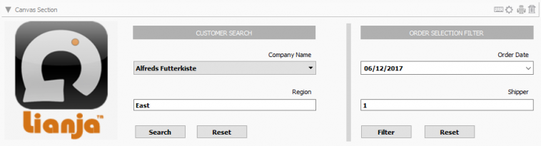
Canvas Sections allow highly customized layouts with a wide range of advanced containers and controls.
Getting and Setting Attributes
The setAttribute(name, value) method can be used to set the value of an Attribute:
Lianja.get("pageid.sectionid").setAttribute("title","Section1")
Note: the shortened form setAttr(name,value) is also available.
The getAttribute(name) method can be used to get the value of an Attribute:
cTitle = Lianja.get("pageid.sectionid").getAttribute("title")
Note: the shortened form getAttr(name) is also available.
Details
| Attribute
|
Description
|
Name
|
Type
|
| Name |
The name for this section (unique to the page)
|
id |
Character
|
| MetaData version |
The MetaData version number. You can set this in the setupUI hook to prevent MetaData being applied multiple times.
|
metaDataVersion |
Int
|
| Meta types |
A comma separated list of metatype names
|
metatypes |
Character
|
| Type |
The type of section: canvas (readonly)
|
type |
Character
|
| Caption |
The section caption displayed in the section header
|
title |
Character
|
| Database |
The database for this section
|
database |
Character
|
| Table |
The table for this section
|
table |
Character
|
| SQL statement |
The SQL statement used to populate a Virtual Table. Use {} macros in the WHERE condition to relate parent-->child sections and ORDER BY to order the display of records. This is native SQL for the target SQL database and may call stored procedures as well as SQL Select.
|
sql |
Character
|
| Timelines enabled |
Enable database timelines for this section
|
timelinesEnabled |
Boolean
|
| Filter |
The filter expression that restricts the records that will be included in the data
|
filter |
Character
|
| Where condition |
The dynamic WHERE condition for a Virtual Table that restricts which records will be retrieved
|
wherecond |
Character
|
| Search field |
The search field for the section
|
searchField |
Character
|
| Height |
The section height
|
height |
Int
|
| Fixed height |
Fix the section height (True | False)
|
fixedHeight |
Boolean
|
| Auto layout percent |
Auto layout percentage of page size. If set to 0, then all sections on a page are resized to an equal height
|
autoLayoutPercentage |
Int
|
| Readonly |
Section is readonly (True | False)
|
readOnly |
Boolean
|
Appearance
| Attribute
|
Description
|
Name
|
Type
|
| Background color |
Section background color
|
backColor |
Character
|
| Foreground color |
Section foreground color
|
foreColor |
Character
|
| CSS style |
CSS style (separate attributes with ; or use app:/filename.css)
|
cssStyle |
Character
|
| Gradient colors |
Render the background color as a gradient (True | False)
|
sectionGradient |
Boolean
|
| Gradient type |
Specify the gradient type
|
sectionGradientType |
Int
|
| Gradient start color |
Gradient start color
|
sectionFromColor |
Character
|
| Gradient end color |
Gradient end color
|
sectionToColor |
Character
|
| Caption position |
The position of the captions (None | Above | Beside | RightToLeft)
|
labelType |
Character
|
| Caption size |
The size of the caption font (Small | Medium | Large | Largest)
|
labelSize |
Character
|
| Data size |
The size of the data font (Small | Medium | Large | Largest)
|
dataSize |
Character
|
| Transparency |
Specify a transparency percentage from 0 to 100
|
transparency |
Int
|
| Background image |
The background image for the section (png | jpg | gif).
Use app:/imagename.ext for app specific images.
|
picture |
Character
|
| Stretch image |
Stretch the background image to fill the section (True | False)
|
stretch |
Boolean
|
| Margin |
Margin size around the section
|
margin |
Int
|
| Spacing |
Spacing between items in the section
|
spacing |
Int
|
| Caption width |
Width of the captions for fields in the section
|
labelWidth |
Int
|
| Border-radius |
Border radius of items in the section
|
borderRadius |
Int
|
| Add spacer at bottom |
Add spacer at bottom of section (True | False)
|
spacerVisible |
Boolean
|
| Attribute
|
Description
|
Name
|
Type
|
| Hide header |
Hide section header at runtime(True | False)
|
hideHeaderAtRuntime |
Boolean
|
| Hide actionbar |
Hide actionbar buttons in the section header (True | False)
|
hideActionBarAtRuntime |
Boolean
|
| Hide navigation buttons |
Hide actionbar navigation buttons in the section header (True | False)
|
hideNavButtons |
Boolean
|
| Hide editing buttons |
Hide the Save/Cancel editing buttons in the section header (True | False). Don't change this unless you are handling these operations programatically.
|
hideEditingButtons |
Boolean
|
| Header CSS style |
CSS style (separate attributes with ; or use app:/filename.css)
|
headerCssStyle |
Character
|
| Background color |
Header background color
|
headerBackColor |
Character
|
| Foreground color |
Header foreground color
|
headerForeColor |
Character
|
| Header icon |
The image for the Header (png | jpg | gif).
Use app:/imagename.ext for app specific images.
|
headerIcon |
Character
|
| Gradient colors |
Render the Header background color as a gradient (True | False)
|
headerGradient |
Boolean
|
| Gradient type |
Specify the gradient type
|
headerGradientType |
Int
|
| Gradient start color |
Gradient start color
|
headerFromColor |
Character
|
| Gradient end color |
Gradient end color
|
headerToColor |
Character
|
| Show OK/Cancel buttons |
Show OK/Cancel buttons in the section header (True | False)
|
showOkCancelButtons |
Boolean
|
| Show Add/Delete buttons |
Show Add/Delete buttons in the section header (True | False)
|
showAddDeleteButtons |
Boolean
|
| Show Print button |
Show Print button in the section header (True | False)
|
showPrintButton |
Boolean
|
| Show Edit button |
Show Edit button in the section header (True | False)
|
showEditButton |
Boolean
|
| Hide custom search icon |
Hide the custom search icon (True | False)
|
hideCustomSearchIcon |
Boolean
|
| Show info tips icon |
Show the info tips icon in the section header (True | False)
|
showInfoTipsIcon |
Boolean
|
| Show help icon |
Show the help icon in the section header (True | False)
|
showHelpIcon |
Boolean
|
| Help topic |
Help topic to display when the help icon is clicked in the section header
|
helpTopic |
Character
|
Related Data
| Attribute
|
Description
|
Name
|
Type
|
| Parent section name |
Name of related parent section
|
|
|
| Automatically relate |
Automatically relate the child section (True | False). If this is unchecked then you need to manually relate it in the parentdatachanged delegate.
|
autoRelateChildSection |
Boolean
|
| Parent key |
Parent key
|
|
|
| Child key |
Child key
|
childKeyExpr |
Character
|
| Attribute
|
Description
|
Name
|
Type
|
| Visible |
Section menu visible (True | False)
|
sectionMenuVisible |
Boolean
|
| Height |
Section menu height
|
sectionMenuHeight |
Int
|
| Background color |
Section menu background color
|
sectionMenuBackColor |
Character
|
| Foreground color |
Section menu foreground color
|
sectionMenuForeColor |
Character
|
| Custom menu panel |
The .rsp or .jssp page used to create the custom menu panel. This page should generate dynamic HTML5/JavaScript.
|
customSectionMenuPanel |
Character
|
| Custom menu |
Section menu contents
|
customSectionMenu |
Character
|
| Custom action |
Action to perform when a menu item is selected
|
sectionMenuAction |
Character
|
Search Panel
| Attribute
|
Description
|
Name
|
Type
|
| Visible |
Section search panel visible (True | False)
|
searchPanelVisible |
Boolean
|
| Height |
Section search panel height
|
searchPanelHeight |
Int
|
| Background color |
Section search panel background color
|
searchPanelBackColor |
Character
|
| Foreground color |
Section search panel foreground color
|
searchPanelForeColor |
Character
|
| Auto create |
Automatically create search panel for all Section search fields
|
searchPanelAutoCreate |
Boolean
|
| Custom search panel |
The delegate used to create the custom search panel
|
searchPanelAction |
Character
|
Subtitle
| Attribute
|
Description
|
Name
|
Type
|
| Visible |
Section subtitle visible (True | False)
|
subtitleVisible |
Boolean
|
| Caption |
Section subtitle caption
|
subtitleCaption |
Character
|
| Height |
Section subtitle height
|
subtitleHeight |
Int
|
| Background color |
Section subtitle background color
|
subtitleBackColor |
Character
|
| Foreground color |
Section subtitle foreground color
|
subtitleForeColor |
Character
|
| Font |
Section subtitle font
|
subtitleFont |
Int
|
| CSS style |
CSS style
|
subtitleCssStyle |
Character
|
| Attribute
|
Description
|
Name
|
Type
|
| Visible |
Section footer visible (True | False)
|
footerVisible |
Boolean
|
| Caption |
Section footer caption
|
footerText |
Character
|
| Height |
Section footer height
|
footerHeight |
Int
|
| Background color |
Section footer background color
|
footerBackColor |
Character
|
| Foreground color |
Section footer foreground color
|
footerForeColor |
Character
|
| Custom menu |
Section footer menu contents
|
customOptionsMenu |
Character
|
| Custom action |
Action to perform when a footer menu item is selected
|
customOptionsMenuAction |
Character
|
| Footer button CSS |
Footer button CSS style
|
footerButtonCss |
Character
|
| Footer button width |
Footer button width
|
footerButtonWidth |
Int
|
Other Options
| Attribute
|
Description
|
Name
|
Type
|
| Hide form NavBar |
Hide form Navigation Bar at runtime if this section is in an Accordion Stack (True | False)
|
hideFormNavBar |
Boolean
|
| Collapsable |
The section is collapsible at runtime (True | False)
|
collapsableAtRuntime |
Boolean
|
| Exclude from accordion |
The section is excluded from accordion behavior at runtime (True | False)
|
excludeAccordionAtRuntime |
Boolean
|
| Inherit dictionary rules |
Inherit the data dictionary rules (True | False)
|
applyDictionary |
Boolean
|
| Section to refresh when data modified |
Section to refresh when data is modified in this section
|
refreshSectionOnChange |
Character
|
| Return tabs |
Treat the return key as a Tab on the fields in this section (True | False)
|
returnTabs |
Boolean
|
| Hide search icon |
Hide the search icon at runtime (True | False)
|
hideSearchIcon |
Boolean
|
Custom Delegates
| Attribute
|
Description
|
Name
|
Type
|
| Scripting language |
The default scripting language for custom code in this section (Inherit | Recital | Visual FoxPro | Python | JavaScript | PHP)
|
scriptingLanguage |
Character
|
| Custom library |
The filename of the library containing code for event handlers and custom procedures/functions
|
customLibrary |
Character
|
| Expanded |
The delegate for the Expanded event
|
expandedAction |
Character
|
| Collapsed |
The delegate for the Collapsed event
|
collapsedAction |
Character
|
| Hotkey |
The delegate for the Hotkey event (e.g. F1-F10, Ctrl+F1). The key is passed as a parameter, e.g. 'F2'. From v3.2.
|
hotkeyAction |
Character
|
| Enabled When |
The delegate for the EnabledWhen event
|
enabledWhenAction |
Character
|
| Visible When |
The delegate for the VisibleWhen event
|
visibleWhenAction |
Character
|
| Valid When |
The delegate for the ValidWhen event
|
validWhenAction |
Character
|
| Activate |
The delegate for the Activate event
|
activateAction |
Character
|
| Deactivate |
The delegate for the Deactivate event
|
deactivateAction |
Character
|
| Init |
The delegate for the Init event
|
initAction |
Character
|
| Destroy |
The delegate for the Destroy event
|
destroyAction |
Character
|
| Load |
The delegate for the Load event
|
loadAction |
Character
|
| Ready |
The delegate for the Ready event
|
readyAction |
Character
|
| Unload |
The delegate for the Unload event
|
unloadAction |
Character
|
| Change |
The delegate for the Change event
|
changedAction |
Character
|
| Link Click |
The delegate for the Hyperlink/Button Click event. This is called with two arguments: functionname(controlsource,text)
|
linkClickAction |
Character
|
| Before Data Create |
The delegate for the BeforeCreate event
|
beforeCreateAction |
Character
|
| After Data Create |
The delegate for the AfterCreate event
|
afterCreateAction |
Character
|
| After Data Changed |
The delegate for the dataChanged event (after data is read)
|
dataChangedAction |
Character
|
| Before Data Update |
The delegate for the BeforeUpdate event
|
beforeUpdateAction |
Character
|
| After Data Update |
The delegate for the AfterUpdate event
|
afterUpdateAction |
Character
|
| Before Data Delete |
The delegate for the BeforeDelete event
|
beforeDeleteAction |
Character
|
| After Data Delete |
The delegate for the AfterDelete event
|
afterDeleteAction |
Character
|
| Refresh |
The delegate for the Refresh event
|
refreshAction |
Character
|
| After Refresh action |
The delegate for the AfterRefresh event.
|
afterRefreshAction |
Character
|
| Parent data changed |
The delegate for the ParentDataChanged event
|
parentDataChangedAction |
Character
|
| Dialog button delegate |
The delegate for the DialogButtonClicked event. If a dialogbutton on a Field has no delegate, the Section delegate will be called. If the section has no delegate, then the Page delegate will be called.
|
dialogButtonAction |
Character
|
| Timer |
The delegate for the Timer event
|
timerAction |
Character
|
| Timer interval |
The timer interval in seconds that the Timer event will be called at runtime
|
timerInterval |
Int
|
| State Changed |
The delegate for the Statechanged event.
|
stateChangedAction |
Character
|
| Custom footer menu |
The delegate for the footer menu event
|
customMenuAction |
Character
|
| Custom search command |
The delegate for the search event
|
customSearch |
Character
|
| Custom section menu |
The delegate for the section menu event
|
customSectionMenuAction |
Character
|
Gestures
| Attribute
|
Description
|
Name
|
Type
|
| Gestures enabled |
Enable gestures for this page: swipe, pan, pinch, tap and tapandhold (True | False).
If enabled, then the Gestures delegate will be called with two arguments, e.g. 'swipe','left' or 'swipe','right'.
|
gesturesEnabled |
Boolean
|
| Swipe left gesture |
The delegate for the gestureSwipeLeft event.
|
gestureSwipeLeftAction |
Character
|
| Swipe right gesture |
The delegate for the gestureSwipeRight event.
|
gestureSwipeRightAction |
Character
|
| Swipe up gesture |
The delegate for the gestureSwipeUp event.
|
gestureSwipeUpAction |
Character
|
| Swipe down gesture |
The delegate for the gestureSwipeDown event.
|
gestureSwipeDownAction |
Character
|
| Pan gesture |
The delegate for the gesturePan event.
|
gesturePanAction |
Character
|
| Pinch gesture |
The delegate for the gesturePinch event.
|
gesturePinchAction |
Character
|
| Tap gesture |
The delegate for the gestureTap event.
|
gestureTapAction |
Character
|
| Tap and hold gesture |
The delegate for the gestureTapAndHold event.
|
gestureTapAndHoldAction |
Character
|
| Gestures |
The catch all delegate for the gestures event.
|
gesturesAction |
Character
|
Permissions and Roles
| Attribute
|
Description
|
Name
|
Type
|
| Create roles |
A comma separated list of roles that can perform create operations on data in the section.
|
permcreate |
Character
|
| Read roles |
A comma separated list of roles that can read (and view) the section.
|
permRead |
Character
|
| Update roles |
A comma separated list of roles that can perform update operations on data in the section.
|
permUpdate |
Character
|
| Delete roles |
A comma separated list of roles that can perform delete operations on data in the section.
|
permDelete |
Character
|
UI Presentation Rules
| Attribute
|
Description
|
Name
|
Type
|
| Desktop |
Include this section in a Desktop client (True | False).
|
desktopUI |
Boolean
|
| Web |
Include this section in a Web client (True | False).
|
webUI |
Boolean
|
| Tablet |
Include this section in a Tablet client (True | False).
|
tabletUI |
Boolean
|
| Phone |
Include this section in a Phone client (True | False).
|
mobileUI |
Boolean
|
| UI States |
UI states that affect this section. Specify multiple states as a comma separated list.
|
state |
Character
|
| Initial UI state |
The initial UI state for this section. This will be applied to the section and all its fields and gadgets.
|
uiStateInit |
Character
|
| Readonly when |
Section is readonly at runtime if specified expression evaluates to true.
|
readonlyWhen |
Character
|
| Visible when |
Section is visible at runtime if specified expression evaluates to true.
|
visibleWhen |
Character
|
| Display orientation |
Display depending on mobile device orientation for Tablets and Phones. (Always | Portrait | Landscape)
|
displayOrientation |
Character
|
| Apply rules on change |
Apply UI presentation rules (Visible when and Readonly when) when data is changed interactively or when navigating records (True | False).
|
applyRulesOnChange |
Boolean
|
| Apply rules on parent change |
Apply section UI presentation rules (Visible when and Readonly when) when parent data is changed by navigating records (True | False)
|
applyRulesOnParentChange |
Boolean
|