Difference between revisions of "Form Tools"
Yvonne.milne (Talk | contribs) (→Collection) |
Yvonne.milne (Talk | contribs) (→Field) |
||
| (12 intermediate revisions by the same user not shown) | |||
| Line 10: | Line 10: | ||
</div> | </div> | ||
| − | [[{{ns:file}}:form_tools_float1.png|800px|link={{filepath:form_tools_float1.png}}|Form Tools]] | + | [[{{ns:file}}:form_tools_float1.png|800px|border|link={{filepath:form_tools_float1.png}}|Form Tools]] |
<br clear=all> | <br clear=all> | ||
| Line 16: | Line 16: | ||
Collections are used to group Pages together in the [[Pages Menu]]. Click '''Collection''' in the Form Tools and you will be prompted to enter a name for your new collection. | Collections are used to group Pages together in the [[Pages Menu]]. Click '''Collection''' in the Form Tools and you will be prompted to enter a name for your new collection. | ||
| − | [[{{ns:file}}:ft_collection1.png|800px|link={{filepath:ft_collection1.png}}|Form Tools: Collection]] | + | [[{{ns:file}}:ft_collection1.png|800px|border|link={{filepath:ft_collection1.png}}|Form Tools: Collection]] |
<br clear=all> | <br clear=all> | ||
In the Pages Menu, select and drag and drop existing Pages to add them to the newly created collection. | In the Pages Menu, select and drag and drop existing Pages to add them to the newly created collection. | ||
| − | [[{{ns:file}}:ft_collection2.png|800px|link={{filepath:ft_collection2.png}}|Form Tools: Collection]] | + | [[{{ns:file}}:ft_collection2.png|800px|border|link={{filepath:ft_collection2.png}}|Form Tools: Collection]] |
<br clear=all> | <br clear=all> | ||
After dragging and dropping ''Employee Information'', this Page has now been added to the ''HR'' collection. | After dragging and dropping ''Employee Information'', this Page has now been added to the ''HR'' collection. | ||
| − | [[{{ns:file}}:ft_collection3.png|800px|link={{filepath:ft_collection3.png}}|Form Tools: Collection]] | + | [[{{ns:file}}:ft_collection3.png|800px|border|link={{filepath:ft_collection3.png}}|Form Tools: Collection]] |
<br clear=all> | <br clear=all> | ||
Collections can also be created by right-clicking in the Pages Menu panel and selecting '''New collection...'''. | Collections can also be created by right-clicking in the Pages Menu panel and selecting '''New collection...'''. | ||
| − | [[{{ns:file}}:ft_collection4.png|800px|link={{filepath:ft_collection4.png}}|Form Tools: Collection]] | + | [[{{ns:file}}:ft_collection4.png|800px|border|link={{filepath:ft_collection4.png}}|Form Tools: Collection]] |
<br clear=all> | <br clear=all> | ||
Right-click on a collection name to display the context menu. This gives options to '''Rename...''' or '''Delete...''' the collection. | Right-click on a collection name to display the context menu. This gives options to '''Rename...''' or '''Delete...''' the collection. | ||
| − | [[{{ns:file}}:ft_collection5.png|800px|link={{filepath:ft_collection5.png}}|Form Tools: Collection]] | + | [[{{ns:file}}:ft_collection5.png|800px|border|link={{filepath:ft_collection5.png}}|Form Tools: Collection]] |
<br clear=all> | <br clear=all> | ||
| Line 47: | Line 47: | ||
|- | |- | ||
|valign="top"|Blank | |valign="top"|Blank | ||
| − | |valign="top"|Creates a new Page in the App. | + | |valign="top"|Creates a new Page in the App using the the [[Page Wizard]]. |
| + | |- | ||
| + | |valign="top"|Form Page | ||
| + | |valign="top"|Creates a new Page in the App using the the [[Page Wizard]], then a new [[Form Section Attributes|Form Section]] using the [[Section Wizard]]. | ||
| + | |- | ||
| + | |valign="top"|Grid Page | ||
| + | |valign="top"|Creates a new Page in the App using the the [[Page Wizard]], then a new [[Grid Section Attributes|Grid Section]] using the [[Section Wizard]]. | ||
| + | |- | ||
| + | |valign="top"|WebView Page | ||
| + | |valign="top"|Creates a new Page in the App using the the [[Page Wizard]], then a new [[Webview Section Attributes|WebView Section]] using the [[Section Wizard]]. | ||
| + | |- | ||
| + | |valign="top"|Report Page | ||
| + | |valign="top"|Creates a new Page in the App using the the [[Page Wizard]], then a new [[Report Section Attributes|Report Section]] using the [[Section Wizard]]. | ||
|- | |- | ||
|valign="top"|Page Center | |valign="top"|Page Center | ||
| − | |valign="top"|Creates a new [[Page Center Tiles|Page Center]] Page in the App. Page Center Pages are used for Page navigation and have a single [[Page Center Section Attributes|Page Center Section]] containing tiles for Page selection. The Page '''Name''' | + | |valign="top"|Creates a new [[Page Center Tiles|Page Center]] Page in the App. Page Center Pages are used for Page navigation and have a single [[Page Center Section Attributes|Page Center Section]] containing tiles for Page selection. The Page's '''Name''' (identifier) will be set to ''pageX'' where ''X'' is a number. The '''Title''' (as displayed in the Pages Menu) will be set to ''Page Center'' and the '''Caption''' (as displayed in the Page Header) set to ''Lianja Page Center''. These can be modified as required in the Page [[Attributes]]. |
|- | |- | ||
|valign="top"|VFP Forms | |valign="top"|VFP Forms | ||
| − | |valign="top"|After you have [[Importing Visual FoxPro Files|imported a Visual FoxPro Form]] into the current App, it is listed here. A new Page is created in the App with a full page [[Developing Lianja Custom Sections in Visual FoxPro|Custom Section]] that uses the imported VFP Form code. | + | |valign="top"|After you have [[Importing Visual FoxPro Files|imported a Visual FoxPro Form]] into the current App, it is listed here. A new Page is created in the App with a full page [[Developing Lianja Custom Sections in Visual FoxPro|Custom Section]] that uses the imported VFP Form code. The Page's '''Name''' (identifier), '''Title''' (as displayed in the Pages Menu) and '''Caption''' (as displayed in the Page Header) will be set to ''pageX'' where ''X'' is a number. These can be modified as required in the Page [[Attributes]]. |
|- | |- | ||
|valign="top"|VFP Classes | |valign="top"|VFP Classes | ||
| − | |valign="top"|After you have [[Importing Visual FoxPro Files|imported a Visual FoxPro Class Library]] into the current App, it is listed here. A new Page is created in the App with a full page [[Developing Lianja Custom Sections in Visual FoxPro|Custom Section]] that uses the imported VFP Class Library code. The Page '''Name''', '''Title''' and '''Caption''' | + | |valign="top"|After you have [[Importing Visual FoxPro Files|imported a Visual FoxPro Class Library]] into the current App, it is listed here. A new Page is created in the App with a full page [[Developing Lianja Custom Sections in Visual FoxPro|Custom Section]] that uses the imported VFP Class Library code. The Page's '''Name''' (identifier), '''Title''' (as displayed in the Pages Menu) and '''Caption''' (as displayed in the Page Header) will be set to ''pageX'' where ''X'' is a number. These can be modified as required in the Page [[Attributes]]. |
|- | |- | ||
|valign="top"|[[Page Templates|Templates]] | |valign="top"|[[Page Templates|Templates]] | ||
| Line 75: | Line 87: | ||
|valign="top"|[[Grid Section Attributes|Grid]] | |valign="top"|[[Grid Section Attributes|Grid]] | ||
|valign="top"|Grid Sections are used for displaying and editing multiple rows of data. In the desktop client, they can optionally have a split display with a built-in single-row form. | |valign="top"|Grid Sections are used for displaying and editing multiple rows of data. In the desktop client, they can optionally have a split display with a built-in single-row form. | ||
| + | |- | ||
| + | |valign="top"|[[Attachments Section Attributes|Attachments]] | ||
| + | |valign="top"|Attachments Sections are grids used for data-bound document and image storage and retrieval. | ||
| + | |- | ||
| + | |valign="top"|[[Dashboard Section Attributes|Dashboard]] | ||
| + | |valign="top"|Dashboard Sections are used to group multiple related sections and display them horizontally to form a dashboard. | ||
|- | |- | ||
|valign="top"|[[Webview Section Attributes|Webview]] | |valign="top"|[[Webview Section Attributes|Webview]] | ||
| Line 84: | Line 102: | ||
|valign="top"|[[TabView Section Attributes|TabView]] | |valign="top"|[[TabView Section Attributes|TabView]] | ||
|valign="top"|TabView Sections are tabbed containers for other Sections. | |valign="top"|TabView Sections are tabbed containers for other Sections. | ||
| − | |||
| − | |||
| − | |||
|- | |- | ||
|valign="top"|[[Canvas Section Attributes|Canvas]] | |valign="top"|[[Canvas Section Attributes|Canvas]] | ||
| Line 93: | Line 108: | ||
|valign="top"|[[CatalogView Section Attributes|CatalogView]] | |valign="top"|[[CatalogView Section Attributes|CatalogView]] | ||
|valign="top"|CatalogView Sections are data bound WebViews that display a catalog of items. Each page provides a table of cells comprising an image, a caption, a sub caption, some details and optional links to drill down to additional information about the selected catalog item. | |valign="top"|CatalogView Sections are data bound WebViews that display a catalog of items. Each page provides a table of cells comprising an image, a caption, a sub caption, some details and optional links to drill down to additional information about the selected catalog item. | ||
| + | |- | ||
| + | |valign="top"|[[DatalistView Section Attributes|DatalistView]] | ||
| + | |valign="top"|DatalistView Sections are used to display a bootstrap styled list of data records with clickable rows. | ||
| + | |- | ||
| + | |valign="top"|[[ChartView Section Attributes|ChartView]] | ||
| + | |valign="top"|ChartView Sections generate charts configured using developer specified parameters. | ||
|- | |- | ||
|valign="top"|[[TreeView Section Attributes|TreeView]] | |valign="top"|[[TreeView Section Attributes|TreeView]] | ||
| Line 108: | Line 129: | ||
|valign="top"|[[DocumentView Section Attributes|DocumentView]] | |valign="top"|[[DocumentView Section Attributes|DocumentView]] | ||
|valign="top"|DocumentView Sections are used to view pdf documents. DocumentView Sections include tools for printing, downloading, searching, zooming and navigating the document displayed without having to install any plugins. | |valign="top"|DocumentView Sections are used to view pdf documents. DocumentView Sections include tools for printing, downloading, searching, zooming and navigating the document displayed without having to install any plugins. | ||
| + | |- | ||
| + | |valign="top"|[[ArticleView Section Attributes|ArticleView]] | ||
| + | |valign="top"|ArticleView Sections are used to render an HTML page with a (default) bootstrap theme. | ||
|- | |- | ||
|valign="top"|[[GalleryView Section Attributes|GalleryView]] | |valign="top"|[[GalleryView Section Attributes|GalleryView]] | ||
| Line 126: | Line 150: | ||
|valign="top"|[[Page Center Section Attributes|Page Center]] | |valign="top"|[[Page Center Section Attributes|Page Center]] | ||
|valign="top"|Page Center Sections display Tiles for opening Pages. The interface is the equivalent of the Lianja App Center, but for Pages instead of Apps. | |valign="top"|Page Center Sections display Tiles for opening Pages. The interface is the equivalent of the Lianja App Center, but for Pages instead of Apps. | ||
| + | |- | ||
| + | |valign="top"|[[Visual_Components#Using_the_Form_Tools_to_Add_Visual_Components|Visual Components]] | ||
| + | |valign="top"|Visual Components are Sections previously saved as [[Visual_Components|components]]. If the component was created from a Canvas Section, it will be added as a JavaScript Custom Section. If the component was created from a WebView/WebView based Section, it will be added as a WebView Section. | ||
|- | |- | ||
|valign="top"|[[Charts Section Attributes|Charts]] | |valign="top"|[[Charts Section Attributes|Charts]] | ||
| Line 154: | Line 181: | ||
|valign="top"|Image Gadgets display data-bound or file based images. | |valign="top"|Image Gadgets display data-bound or file based images. | ||
|- | |- | ||
| − | |valign="top"|[[Richtexteditor Gadget Attributes| | + | |valign="top"|[[Richtexteditor Gadget Attributes|Rich Text Editor]] |
|valign="top"|Richtexteditor Gadgets are rich text editors (HTML formatting). | |valign="top"|Richtexteditor Gadgets are rich text editors (HTML formatting). | ||
|- | |- | ||
| − | |valign="top"|[[Editbox Gadget Attributes| | + | |valign="top"|[[Editbox Gadget Attributes|EditBox]] |
|valign="top"|Editbox Gadgets are plain text editors. | |valign="top"|Editbox Gadgets are plain text editors. | ||
|- | |- | ||
| − | |valign="top"|[[Webview Gadget Attributes| | + | |valign="top"|[[Webview Gadget Attributes|WebView]] |
| − | |valign="top"|Webview Gadgets are embedded browsers to run HTML, [[Visual FoxPro Server Pages]] (.rsp) or [[JavaScript Server Pages]] (.jssp). | + | |valign="top"|Webview Gadgets are embedded browsers to run HTML, [[Visual FoxPro Server Pages|Lianja Server Pages]] (.rsp) or [[JavaScript Server Pages]] (.jssp). |
|- | |- | ||
| − | |valign="top"|[[Listview Gadget Attributes| | + | |valign="top"|[[Listview Gadget Attributes|ListView]] |
|valign="top"|Listview Gadgets display a list of selectable items. | |valign="top"|Listview Gadgets display a list of selectable items. | ||
|- | |- | ||
| Line 169: | Line 196: | ||
|valign="top"|Grid Gadgets are used for displaying and editing multiple rows of data. | |valign="top"|Grid Gadgets are used for displaying and editing multiple rows of data. | ||
|- | |- | ||
| − | |valign="top"|[[Checklistview Gadget Attributes| | + | |valign="top"|[[Checklistview Gadget Attributes|CheckListView]] |
|valign="top"|Checklistview Gadgets display a group of selectable checkboxes or radio buttons. | |valign="top"|Checklistview Gadgets display a group of selectable checkboxes or radio buttons. | ||
|- | |- | ||
| − | |valign="top"|[[Treeview Gadget Attributes| | + | |valign="top"|[[Treeview Gadget Attributes|TreeView]] |
|valign="top"|Treeview Gadgets are data-bound tree grids that allow you to drill down through levels of hierarchical nodes. | |valign="top"|Treeview Gadgets are data-bound tree grids that allow you to drill down through levels of hierarchical nodes. | ||
|- | |- | ||
| − | |valign="top"|[[ | + | |valign="top"|[[Visual_Components#Using_the_Form_Tools_to_Add_Visual_Components|Visual Components]] |
| − | |valign="top"| | + | |valign="top"|Visual Components are Sections previously saved as [[Visual_Components|components]]. If the component was created from a Canvas Section, it will be added as a JavaScript Custom Gadget. If the component was created from a WebView/WebView based Section, it will be added as a WebView Gadget. |
|- | |- | ||
|valign="top"|[[Chart Gadget Attributes|Chart]] | |valign="top"|[[Chart Gadget Attributes|Chart]] | ||
|valign="top"|Chart Gadgets contain charts and graphs for data visualization. | |valign="top"|Chart Gadgets contain charts and graphs for data visualization. | ||
|- | |- | ||
| − | |valign="top"| | + | |valign="top"|Google |
| − | |valign="top"|Google Map Gadgets display URL based | + | |valign="top"|[[Google Map Gadget Attributes|Google Map Gadgets]] display URL based maps.<br>[[Google Bar Chart Gadget Attributes|Google Bar Chart Gadgets]] display URL based bar charts.<br>[[Google Pie Chart Gadget Attributes|Google Pie Chart Gadgets]] display URL based pie charts. |
| − | + | ||
| − | + | ||
| − | + | ||
| − | + | ||
| − | + | ||
| − | + | ||
|- | |- | ||
|valign="top"|[[Custom Gadget Attributes|Custom]] | |valign="top"|[[Custom Gadget Attributes|Custom]] | ||
| Line 198: | Line 219: | ||
The '''Field''' option is available when you have a [[Form Section Attributes|Form Section]] selected. Click '''Field''' and a new field will be added to the section after any existing fields or gadgets. The new field is not data-bound and has the Caption ''Untitled''. | The '''Field''' option is available when you have a [[Form Section Attributes|Form Section]] selected. Click '''Field''' and a new field will be added to the section after any existing fields or gadgets. The new field is not data-bound and has the Caption ''Untitled''. | ||
| − | [[{{ns:file}}:ft_newfield.png|800px|link={{filepath:ft_newfield.png}}|Form Tools: New Field]] | + | [[{{ns:file}}:ft_newfield.png|800px|border|link={{filepath:ft_newfield.png}}|Form Tools: New Field]] |
<br clear=all> | <br clear=all> | ||
| Line 212: | Line 233: | ||
Add a Divider to a [[Form Section Attributes|Form Section]]: | Add a Divider to a [[Form Section Attributes|Form Section]]: | ||
| − | [[{{ns:file}}:ft_dividers.png|800px|link={{filepath:ft_dividers.png}}|Form Tools: Dividers]] | + | [[{{ns:file}}:ft_dividers.png|800px|border|link={{filepath:ft_dividers.png}}|Form Tools: Dividers]] |
<br clear=all> | <br clear=all> | ||
| Line 233: | Line 254: | ||
|} | |} | ||
| − | == | + | ==Caption== |
| − | The ''' | + | The '''Caption''' menu allows you to change the [[Formitem_Appearance|caption appearance]] (position and text size) of [[Form Section Attributes|Form Section]] fields. |
| − | [[{{ns:file}}:ft_labels.png|left|link={{filepath:ft_labels.png}}|Form Tools: | + | [[{{ns:file}}:ft_labels.png|left|link={{filepath:ft_labels.png}}|Form Tools: Caption]] |
<br clear=all> | <br clear=all> | ||
| Line 246: | Line 267: | ||
Select a control, or select multiple controls by pressing the '''Shift''' key while selecting, then choose the size. | Select a control, or select multiple controls by pressing the '''Shift''' key while selecting, then choose the size. | ||
| + | |||
| + | From v8.0, all controls can be selected using the [[#Options|Select All]] option from the [[#Advanced|Advanced]] options submenu. | ||
==Format== | ==Format== | ||
| Line 260: | Line 283: | ||
==Align== | ==Align== | ||
| − | The '''Align''' menu allows you to change the [[Geometry|geometry attributes]] of [[#Advanced|Advanced Controls]]. | + | The '''Align''' menu allows you to change the [[Geometry|geometry attributes]] and [[Formitem_Appearance#Text_alignment|data text alignment]] of [[#Advanced|Advanced Controls]]. |
[[{{ns:file}}:ft_align1.png|left|link={{filepath:ft_align1.png}}|Form Tools: Align]] | [[{{ns:file}}:ft_align1.png|left|link={{filepath:ft_align1.png}}|Form Tools: Align]] | ||
| Line 266: | Line 289: | ||
Select multiple controls by pressing the '''Shift''' key while selecting then choose an option to align or match the attribute(s) of all the selected controls to that of the first selected control. | Select multiple controls by pressing the '''Shift''' key while selecting then choose an option to align or match the attribute(s) of all the selected controls to that of the first selected control. | ||
| − | |||
| − | |||
| − | |||
| − | |||
| − | |||
| − | |||
| − | |||
==Advanced== | ==Advanced== | ||
| Line 283: | Line 299: | ||
|ActiveX | |ActiveX | ||
|Control for embedded ActiveX component (Windows desktop) | |Control for embedded ActiveX component (Windows desktop) | ||
| + | |- | ||
| + | |Chart | ||
| + | |Control for WebView based chart. From v8.0. | ||
|- | |- | ||
|CheckBox | |CheckBox | ||
| Line 292: | Line 311: | ||
|CommandButton | |CommandButton | ||
|Button control | |Button control | ||
| + | |- | ||
| + | |Container | ||
| + | |Control for transparent container panel. From v8.0. | ||
|- | |- | ||
|Date TextBox | |Date TextBox | ||
| Line 301: | Line 323: | ||
|EditBox | |EditBox | ||
|Editor control | |Editor control | ||
| + | |- | ||
| + | |Groupbox | ||
| + | |Control for titled transparent groupbox panel. From v8.0. | ||
|- | |- | ||
|Hyperlink | |Hyperlink | ||
| Line 370: | Line 395: | ||
|- | |- | ||
|Enable/Disable click events | |Enable/Disable click events | ||
| − | |See [[ | + | |See [[#Disable Click Events|below]]. |
|- | |- | ||
|Enable/Disable move events | |Enable/Disable move events | ||
| − | |See [[ | + | |See [[#Disable Move Events|below]]. |
| + | |- | ||
| + | |Select All | ||
| + | |Select all controls in the section. From v8.0. | ||
|- | |- | ||
|} | |} | ||
| Line 385: | Line 413: | ||
==Extensions== | ==Extensions== | ||
The '''Extensions''' menu lists the available extension tools. Click to open the selected tool. See [[Tools and Extensibility]] for more information. | The '''Extensions''' menu lists the available extension tools. Click to open the selected tool. See [[Tools and Extensibility]] for more information. | ||
| + | |||
| + | This is deprecated from v8.0. | ||
[[{{ns:file}}:ft_extensions.png|left|link={{filepath:ft_extensions.png}}|Form Tools: Extensions]] | [[{{ns:file}}:ft_extensions.png|left|link={{filepath:ft_extensions.png}}|Form Tools: Extensions]] | ||
| Line 390: | Line 420: | ||
[[Category:Page Builder]] | [[Category:Page Builder]] | ||
| + | [[Category:Lianja v8.0]] | ||
Latest revision as of 11:00, 27 October 2022
Contents
Overview
The Form Tools at the bottom of the Page Builder in the Pages Workspace are used to add new UI Elements to your App: Pages, Sections, Gadgets, Fields, Advanced Controls and Extensions. Using the Form Tools, you can also control common appearance attributes and create new Collections for grouping Pages in the Page Menu.
To open a multi-option Form Tools menu in its own floating window, click the dashed line highlighted in blue at the top of the menu.
The menu is then opened in its own window that can be re-positioned and stays open until you click the [x] in the window title.

Collection
Collections are used to group Pages together in the Pages Menu. Click Collection in the Form Tools and you will be prompted to enter a name for your new collection.

In the Pages Menu, select and drag and drop existing Pages to add them to the newly created collection.

After dragging and dropping Employee Information, this Page has now been added to the HR collection.

Collections can also be created by right-clicking in the Pages Menu panel and selecting New collection....

Right-click on a collection name to display the context menu. This gives options to Rename... or Delete... the collection.

Page
Add a Page of the following type:
| Name | Description |
|---|---|
| Blank | Creates a new Page in the App using the the Page Wizard. |
| Form Page | Creates a new Page in the App using the the Page Wizard, then a new Form Section using the Section Wizard. |
| Grid Page | Creates a new Page in the App using the the Page Wizard, then a new Grid Section using the Section Wizard. |
| WebView Page | Creates a new Page in the App using the the Page Wizard, then a new WebView Section using the Section Wizard. |
| Report Page | Creates a new Page in the App using the the Page Wizard, then a new Report Section using the Section Wizard. |
| Page Center | Creates a new Page Center Page in the App. Page Center Pages are used for Page navigation and have a single Page Center Section containing tiles for Page selection. The Page's Name (identifier) will be set to pageX where X is a number. The Title (as displayed in the Pages Menu) will be set to Page Center and the Caption (as displayed in the Page Header) set to Lianja Page Center. These can be modified as required in the Page Attributes. |
| VFP Forms | After you have imported a Visual FoxPro Form into the current App, it is listed here. A new Page is created in the App with a full page Custom Section that uses the imported VFP Form code. The Page's Name (identifier), Title (as displayed in the Pages Menu) and Caption (as displayed in the Page Header) will be set to pageX where X is a number. These can be modified as required in the Page Attributes. |
| VFP Classes | After you have imported a Visual FoxPro Class Library into the current App, it is listed here. A new Page is created in the App with a full page Custom Section that uses the imported VFP Class Library code. The Page's Name (identifier), Title (as displayed in the Pages Menu) and Caption (as displayed in the Page Header) will be set to pageX where X is a number. These can be modified as required in the Page Attributes. |
| Templates | After you have saved a Page as a Template, it is listed here. |
Sections
Add a Section of the following type:
| Name | Description |
|---|---|
| Form | Form Sections contain Fields and Gadgets and handle the layout automatically. |
| Grid | Grid Sections are used for displaying and editing multiple rows of data. In the desktop client, they can optionally have a split display with a built-in single-row form. |
| Attachments | Attachments Sections are grids used for data-bound document and image storage and retrieval. |
| Dashboard | Dashboard Sections are used to group multiple related sections and display them horizontally to form a dashboard. |
| Webview | WebView Sections are embedded browsers to run HTML, Visual FoxPro Server Pages (.rsp) or JavaScript Server Pages (.jssp). |
| Image Strip | Image Strip Sections display a horizontal 'strip' of data-bound images. They can optionally include a text notes panel. |
| TabView | TabView Sections are tabbed containers for other Sections. |
| Canvas | Canvas Sections allow highly customized layouts with a wide range of advanced containers and controls. |
| CatalogView | CatalogView Sections are data bound WebViews that display a catalog of items. Each page provides a table of cells comprising an image, a caption, a sub caption, some details and optional links to drill down to additional information about the selected catalog item. |
| DatalistView | DatalistView Sections are used to display a bootstrap styled list of data records with clickable rows. |
| ChartView | ChartView Sections generate charts configured using developer specified parameters. |
| TreeView | TreeView Sections are data-bound tree grids that allow you to drill down through levels of hierarchical nodes. |
| CarouselView | CarouselView Sections display a series of full-section images along with their captions. Images can scroll automatically or using on-screen controls. They are ideal as welcome pages. |
| PanelView | PanelView sections are similar to CarouselView Sections, but instead of displaying a carousel of images, they allow you to display panels containing dynamic WebView content using Visual FoxPro Server Pages (.rsp) or JavaScript Server Pages (.jssp). |
| CommentsView | CommentsView Sections are used for social interaction within business Apps. Users can collaborate directly inside the App with access to the entire conversation history. |
| DocumentView | DocumentView Sections are used to view pdf documents. DocumentView Sections include tools for printing, downloading, searching, zooming and navigating the document displayed without having to install any plugins. |
| ArticleView | ArticleView Sections are used to render an HTML page with a (default) bootstrap theme. |
| GalleryView | GalleryView Sections are used to display a gallery of Tiles. Clicking on a Tile automatically displays a full-section Content panel. |
| VideoPlayer | VideoPlayer Sections are used to display a data-bound video player. |
| Report | Report Sections are used to display tabular reports. |
| Calendar | Calendar Sections provide a calendar interface to allow for the creation, display, update and deletion of appointments and other time planner events. |
| Org Chart | Org Chart Sections are used to display an organization chart with clickable nodes. |
| Page Center | Page Center Sections display Tiles for opening Pages. The interface is the equivalent of the Lianja App Center, but for Pages instead of Apps. |
| Visual Components | Visual Components are Sections previously saved as components. If the component was created from a Canvas Section, it will be added as a JavaScript Custom Section. If the component was created from a WebView/WebView based Section, it will be added as a WebView Section. |
| Charts | Chart Sections provide a quick and easy way to clearly and graphically communicate information about your data from the simplest pie or bar chart through to more sophisticated and complex graphs. |
| Timeline | Timeline Sections display timeline (chronological row versioning for Lianja database tables) information. |
| Notifications | Notifications Sections display timeline (chronological row versioning for Lianja database tables) notifications. |
| Custom | Custom Sections are coded in Lianja/VFP, JavaScript, TypeScript, Babel, PHP or Python. |
| Templates | After you have saved a Section as a Template, it is listed here. |
Gadgets
Add a Gadget of the following type to a Form Section:
| Name | Description |
|---|---|
| Image | Image Gadgets display data-bound or file based images. |
| Rich Text Editor | Richtexteditor Gadgets are rich text editors (HTML formatting). |
| EditBox | Editbox Gadgets are plain text editors. |
| WebView | Webview Gadgets are embedded browsers to run HTML, Lianja Server Pages (.rsp) or JavaScript Server Pages (.jssp). |
| ListView | Listview Gadgets display a list of selectable items. |
| Grid | Grid Gadgets are used for displaying and editing multiple rows of data. |
| CheckListView | Checklistview Gadgets display a group of selectable checkboxes or radio buttons. |
| TreeView | Treeview Gadgets are data-bound tree grids that allow you to drill down through levels of hierarchical nodes. |
| Visual Components | Visual Components are Sections previously saved as components. If the component was created from a Canvas Section, it will be added as a JavaScript Custom Gadget. If the component was created from a WebView/WebView based Section, it will be added as a WebView Gadget. |
| Chart | Chart Gadgets contain charts and graphs for data visualization. |
| Google Map Gadgets display URL based maps. Google Bar Chart Gadgets display URL based bar charts. Google Pie Chart Gadgets display URL based pie charts. | |
| Custom | Custom Gadgets are coded in Lianja/VFP, JavaScript, TypeScript, Babel, PHP or Python. |
Field
The Field option is available when you have a Form Section selected. Click Field and a new field will be added to the section after any existing fields or gadgets. The new field is not data-bound and has the Caption Untitled.

The currently selected section is displayed with a blue border.
If the Section can be resized, the bottom border contains a 'handle' that can be dragged to change the section height.
Dividers
Add a Divider to a Form Section:

| Name | Description |
|---|---|
| Subtitle | A label with a caption. |
| Horizontal Separator | A horizontal line. |
| Column Divider | A label with a caption at the top of a column. |
| Spacer | An empty label with the same default background as a field. |
Caption
The Caption menu allows you to change the caption appearance (position and text size) of Form Section fields.
Text
The Text menu allows you to change the Caption text size of Advanced Controls.
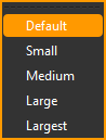
Select a control, or select multiple controls by pressing the Shift key while selecting, then choose the size.
From v8.0, all controls can be selected using the Select All option from the Advanced options submenu.
Format
The Format menu allows you to change various appearance attributes of Canvas Section Advanced Controls or Form Section formitems.
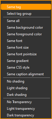
For 'Same ...' options, select multiple Advanced Controls by pressing the Shift key while selecting then choose an option to match the attribute(s) of all the selected controls to that of the first selected control.
For 'shading' options, select one or more controls, then choose the option. This can also be used on a Form Section to affect the shading for all its formitems.
'Transparency' options can be used on a Form Section to affect the transparency for all its formitems.
Align
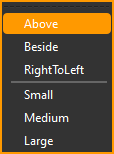
The Align menu allows you to change the geometry attributes and data text alignment of Advanced Controls.
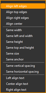
Select multiple controls by pressing the Shift key while selecting then choose an option to align or match the attribute(s) of all the selected controls to that of the first selected control.
Advanced
Add an Advanced Canvas Control of the following type to a Canvas Section. See also Canvas Designer and Advanced Canvas Control Attributes.
| Control | Description |
|---|---|
| ActiveX | Control for embedded ActiveX component (Windows desktop) |
| Chart | Control for WebView based chart. From v8.0. |
| CheckBox | Control for boolean state - True (checked) or False (unchecked) |
| ComboBox | Control combining a TextBox and a ListBox |
| CommandButton | Button control |
| Container | Control for transparent container panel. From v8.0. |
| Date TextBox | Control combining a date TextBox and a popup calendar |
| DateTime TextBox | Control combining a date/time TextBox and a popup calendar |
| EditBox | Editor control |
| Groupbox | Control for titled transparent groupbox panel. From v8.0. |
| Hyperlink | Hyperlink label control |
| Image | Control for displaying images |
| Label | Textual label control |
| LCDnumber | Numeric label control with LCD-like digits |
| ListBox | Control with a single column list |
| Numeric TextBox | Textbox control for numeric values |
| OptionButton | Control to select/deselect an option |
| OptionGroup | Container used to group OptionButtons |
| Progress Bar | Bar control for minimum, current (%) and maximum numeric values |
| Rich Text Editor | Rich text editor control |
| Separator | Separator label control |
| Slider | Vertical or horizontal numeric slider with minimum and maximum values |
| Spinner | Numeric TextBox control with increment/decrement controls |
| Subtitle | Subtitle label control |
| TextBox | Textbox control |
| TreeGrid | Tree grid control |
| WebView | Embedded WebKit Control |
Options
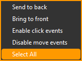
| Option | Description |
|---|---|
| Send to back | Send the selected control(s) to the back (for overlapping controls). |
| Bring to front | Bring the selected control(s) to the front (for overlapping controls). |
| Enable/Disable click events | See below. |
| Enable/Disable move events | See below. |
| Select All | Select all controls in the section. From v8.0. |
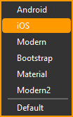
Themes
The Themes menu lists the available App appearance themes. Click to apply the selected theme. See Understanding UI Theming in Lianja for more information.
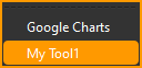
Extensions
The Extensions menu lists the available extension tools. Click to open the selected tool. See Tools and Extensibility for more information.
This is deprecated from v8.0.