Difference between revisions of "Data Attributes"
Yvonne.milne (Talk | contribs) |
Yvonne.milne (Talk | contribs) (→Dictionary overrides) |
||
| (216 intermediate revisions by the same user not shown) | |||
| Line 1: | Line 1: | ||
| − | |||
| − | |||
==See Also== | ==See Also== | ||
[[Autosuggestions]], [[Choices]], [[Colors]], [[Data Mapping]], [[Fonts]], [[Formitem Appearance]], [[Help Attributes]], [[Input Masks]], [[Instant Search]] | [[Autosuggestions]], [[Choices]], [[Colors]], [[Data Mapping]], [[Fonts]], [[Formitem Appearance]], [[Help Attributes]], [[Input Masks]], [[Instant Search]] | ||
| Line 6: | Line 4: | ||
==ActiveX control== | ==ActiveX control== | ||
ActiveX component control to embed. | ActiveX component control to embed. | ||
| + | * Supported by [[Advanced Canvas Control Attributes|Canvas Section ActiveX Advanced Control]] | ||
[[{{ns:file}}:da_activex.png|450px|thumb|left|link={{filepath:da_activex.png}}|ActiveX control]] | [[{{ns:file}}:da_activex.png|450px|thumb|left|link={{filepath:da_activex.png}}|ActiveX control]] | ||
| Line 17: | Line 16: | ||
or its full name: | or its full name: | ||
<pre>Calendar Control 12.0</pre> | <pre>Calendar Control 12.0</pre> | ||
| − | |||
[[#Notes on Client Support|Notes on Client Support]] | [[#Notes on Client Support|Notes on Client Support]] | ||
| Line 23: | Line 21: | ||
==Anchor== | ==Anchor== | ||
The anchor value for the control. Add values together for multiple anchors. | The anchor value for the control. Add values together for multiple anchors. | ||
| + | * Supported by [[Advanced Canvas Control Attributes|Canvas Section Advanced Controls]] | ||
{| class="wikitable" width="100%" | {| class="wikitable" width="100%" | ||
| Line 56: | Line 55: | ||
|valign="top"|Autosize||4096 | |valign="top"|Autosize||4096 | ||
|- | |- | ||
| − | |valign="top"| | + | |valign="top"|Autostretch||8192 |
|- | |- | ||
|} | |} | ||
| − | + | ===Anchor Builder=== | |
| + | |||
| + | From v9.1.11, you can use the anchor builder in the [[Page Builder Assistant]] to select/remove anchors: | ||
| + | |||
| + | [[{{ns:file}}:l9_anchorbuilder.png|800px|left|border|link={{filepath:l9_anchorbuilder.png}}|Anchor Builder]] | ||
| + | <br clear=all> | ||
[[#Notes on Client Support|Notes on Client Support]] | [[#Notes on Client Support|Notes on Client Support]] | ||
| Line 66: | Line 70: | ||
==Allow multiple selections== | ==Allow multiple selections== | ||
Allow multiple selections (True | False) | Allow multiple selections (True | False) | ||
| + | * Supported by [[Checklistview Gadget Attributes|Checklistview Gadget]] and [[Advanced Canvas Control Attributes|Canvas Section OptionGroup Advanced Control]]. | ||
[[{{ns:file}}:da_multiple_sel_true.png|450px|thumb|left|link={{filepath:da_multiple_sel_true.png}}|Allow multiple selections: True]] | [[{{ns:file}}:da_multiple_sel_true.png|450px|thumb|left|link={{filepath:da_multiple_sel_true.png}}|Allow multiple selections: True]] | ||
| Line 87: | Line 92: | ||
<br clear=all> | <br clear=all> | ||
| − | + | The same applies to the [[Advanced Canvas Control Attributes|Canvas Section OptionGroup Advanced Control]]. | |
[[#Notes on Client Support|Notes on Client Support]] | [[#Notes on Client Support|Notes on Client Support]] | ||
| Line 93: | Line 98: | ||
==Alternating row colors== | ==Alternating row colors== | ||
Alternate row colors (True | False) | Alternate row colors (True | False) | ||
| + | * Supported by [[Treeview Gadget Attributes|Treeview Gadget]]. | ||
[[{{ns:file}}:da_alt_row_colors.png|450px|thumb|left|link={{filepath:da_alt_row_colors.png}}|Alternating row colors: True]] | [[{{ns:file}}:da_alt_row_colors.png|450px|thumb|left|link={{filepath:da_alt_row_colors.png}}|Alternating row colors: True]] | ||
| Line 106: | Line 112: | ||
<br clear=all> | <br clear=all> | ||
| − | |||
| − | |||
[[#Notes on Client Support|Notes on Client Support]] | [[#Notes on Client Support|Notes on Client Support]] | ||
| Line 113: | Line 117: | ||
==Automatic pagination== | ==Automatic pagination== | ||
Grid is rendered using pagination if the number of records exceeds [[#Automatic pagination size|below amount]] (True | False). | Grid is rendered using pagination if the number of records exceeds [[#Automatic pagination size|below amount]] (True | False). | ||
| + | * Supported by [[Grid Gadget Attributes|Grid Gadget]]. | ||
[[{{ns:file}}:da_autopagination.png|450px|thumb|left|link={{filepath:da_autopagination.png}}|Automatic pagination: True]] | [[{{ns:file}}:da_autopagination.png|450px|thumb|left|link={{filepath:da_autopagination.png}}|Automatic pagination: True]] | ||
| Line 121: | Line 126: | ||
By default, when a Grid Gadget is added, the '''Automatic pagination''' attribute is checked (True). | By default, when a Grid Gadget is added, the '''Automatic pagination''' attribute is checked (True). | ||
| − | If the number of records exceeds the [[#Automatic pagination size|Automatic pagination size]], the | + | If the number of records exceeds the [[#Automatic pagination size|Automatic pagination size]], the grid rows are displayed in pages. |
Unchecking the '''Automatic pagination''' attribute disables automatic pagination. | Unchecking the '''Automatic pagination''' attribute disables automatic pagination. | ||
| Line 127: | Line 132: | ||
<br clear=all> | <br clear=all> | ||
| − | * | + | * See also [[#Pagination|Pagination]]. |
| + | * The [[#Hide the action bar|Hide the action bar]] attribute must be unchecked (False) for pagination. | ||
[[#Notes on Client Support|Notes on Client Support]] | [[#Notes on Client Support|Notes on Client Support]] | ||
| Line 135: | Line 141: | ||
* Supported by [[Grid Gadget Attributes|Grid Gadget]]. | * Supported by [[Grid Gadget Attributes|Grid Gadget]]. | ||
* See [[#Automatic pagination|Automatic pagination]]. | * See [[#Automatic pagination|Automatic pagination]]. | ||
| + | * See also [[#Pagination|Pagination]]. | ||
[[#Notes on Client Support|Notes on Client Support]] | [[#Notes on Client Support|Notes on Client Support]] | ||
==Autosuggestions== | ==Autosuggestions== | ||
| − | [[{{ns:file}}:autosuggestions.png| | + | Autosuggest a list of values as the user types. |
| + | * Supported by [[Field Attributes|Form Section Fields]] and [[Advanced Canvas Control Attributes|Canvas Section Advanced Textbox Controls]]. | ||
| + | |||
| + | [[{{ns:file}}:autosuggestions.png|x253px|thumb|left|link={{filepath:autosuggestions.png}}|Autosuggestions]] | ||
<br clear=all> | <br clear=all> | ||
* See [[Autosuggestions]]. | * See [[Autosuggestions]]. | ||
| + | |||
| + | [[#Notes on Client Support|Notes on Client Support]] | ||
==Autosuggestion headers== | ==Autosuggestion headers== | ||
| + | A comma separated list of column headers to display for the [[#Autosuggestions|Autosuggestions]]. | ||
| + | * Supported by [[Field Attributes|Form Section Fields]] and [[Advanced Canvas Control Attributes|Canvas Section Advanced Textbox Controls]]. | ||
| + | |||
* See [[Autosuggestions]]. | * See [[Autosuggestions]]. | ||
| + | |||
| + | [[#Notes on Client Support|Notes on Client Support]] | ||
==Autosuggestion column to search== | ==Autosuggestion column to search== | ||
| + | The column to search for [[#Autosuggestins|Autosuggestions]]. | ||
| + | * Supported by [[Field Attributes|Form Section Fields]] and [[Advanced Canvas Control Attributes|Canvas Section Advanced Textbox Controls]]. | ||
| + | |||
* See [[Autosuggestions]]. | * See [[Autosuggestions]]. | ||
| + | |||
| + | [[#Notes on Client Support|Notes on Client Support]] | ||
==Background color== | ==Background color== | ||
| + | The background color for the data. | ||
| + | * Supported by [[Field Attributes|Form Section Fields]] and [[Advanced Canvas Control Attributes|Canvas Section Advanced Controls]]. | ||
* See [[Colors]]. | * See [[Colors]]. | ||
| + | |||
| + | [[#Notes on Client Support|Notes on Client Support]] | ||
| + | |||
| + | ==Caption== | ||
| + | The caption for the control. | ||
| + | * Supported by [[Advanced Canvas Control Attributes|Canvas Section Advanced Commmandbutton Controls]]. | ||
| + | |||
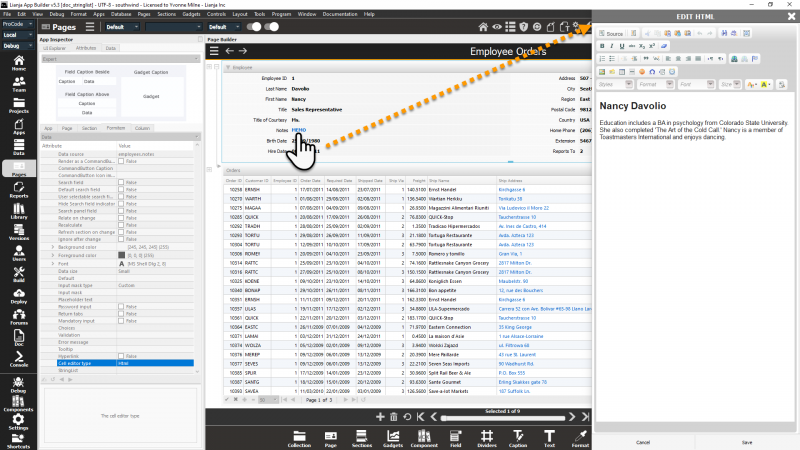
| + | ==Cell editor type== | ||
| + | The cell editor type. This can be Text, Html or Stringlist. | ||
| + | * Supported by [[Field Attributes|Form Section Fields]], [[Grid Column Attributes|Grid Columns]] and [[Advanced Canvas Control Attributes|Canvas Section Advanced TextBox Controls]]. | ||
| + | * 'Text' can be specified for character or varchar/memo columns and uses a slide-in plain text editor dialog panel for editing. | ||
| + | |||
| + | [[{{ns:file}}:celleditortext.png|800px|left|border|link={{filepath:celleditortext.png}}|Text Cell Editor]] | ||
| + | <br clear=all> | ||
| + | |||
| + | * 'Html' can be specified for varchar/memo columns and uses a slide-in HTML editor dialog panel for editing. | ||
| + | |||
| + | [[{{ns:file}}:celleditorhtml.png|800px|left|border|link={{filepath:celleditorhtmlt.png}}|HTML Cell Editor]] | ||
| + | <br clear=all> | ||
| + | |||
| + | * 'Stringlist' can be specified for varchar/memo columns and uses a slide-in [[StringList Editor]] dialog panel for editing. | ||
| + | |||
| + | [[{{ns:file}}:stringlisteditor1.png|800px|left|border|link={{filepath:stringlisteditor1.png}}|StringList Editor]] | ||
| + | <br clear=all> | ||
| + | |||
| + | The [[#StringList|StringList]] attribute is used to define the list of choices to be displayed in the [[StringList Editor]]. | ||
| + | |||
| + | [[#Notes on Client Support|Notes on Client Support]] | ||
==Choices== | ==Choices== | ||
| − | [[{{ns:file}}:choices.png| | + | A list of choices. |
| + | * Supported by [[Field Attributes|Form Section Fields]], [[Grid Column Attributes|Grid Columns]] and [[Advanced Canvas Control Attributes|Canvas Section Advanced Combobox Controls]]. | ||
| + | |||
| + | [[{{ns:file}}:choices.png|x253px|thumb|left|link={{filepath:choices.png}}|Choices]] | ||
<br clear=all> | <br clear=all> | ||
* See [[Choices]]. | * See [[Choices]]. | ||
| + | |||
| + | [[#Notes on Client Support|Notes on Client Support]] | ||
==Choicelist== | ==Choicelist== | ||
| − | A list of | + | A list of choices. |
| − | * Supported by [[ | + | * Supported by [[Checklistview Gadget Attributes|ChecklistView Gadget]]. |
| − | + | ||
==Column alignments== | ==Column alignments== | ||
A comma separated list of column alignments, e.g.left,right,center. | A comma separated list of column alignments, e.g.left,right,center. | ||
* Supported by [[Listview Gadget Attributes|Listview Gadget]], [[Treeview Gadget Attributes|Treeview Gadget]]. | * Supported by [[Listview Gadget Attributes|Listview Gadget]], [[Treeview Gadget Attributes|Treeview Gadget]]. | ||
| + | * Not currently implemented. | ||
| + | |||
| + | [[#Notes on Client Support|Notes on Client Support]] | ||
==Column icons== | ==Column icons== | ||
A comma separated list of column icons. | A comma separated list of column icons. | ||
* Supported by [[Treeview Gadget Attributes|Treeview Gadget]]. | * Supported by [[Treeview Gadget Attributes|Treeview Gadget]]. | ||
| + | |||
| + | [[{{ns:file}}:da_column_icons.png|450px|thumb|left|link={{filepath:da_column_icons.png}}|Column icons]] | ||
| + | |||
| + | |||
| + | |||
| + | Here the '''Column icons''' attribute of the Treeview Gadget specifies the filenames for the icons to be displayed at the start of the first two columns. | ||
| + | |||
| + | <br clear=all> | ||
| + | |||
| + | <pre>:/images/forms,:/images/cat_contacts_sm</pre> | ||
| + | |||
| + | [[#Notes on Client Support|Notes on Client Support]] | ||
==Column widths== | ==Column widths== | ||
A comma separated list of column widths. | A comma separated list of column widths. | ||
* Supported by [[Listview Gadget Attributes|Listview Gadget]], [[Treeview Gadget Attributes|Treeview Gadget]]. | * Supported by [[Listview Gadget Attributes|Listview Gadget]], [[Treeview Gadget Attributes|Treeview Gadget]]. | ||
| + | * Not currently implemented. | ||
| + | |||
| + | [[#Notes on Client Support|Notes on Client Support]] | ||
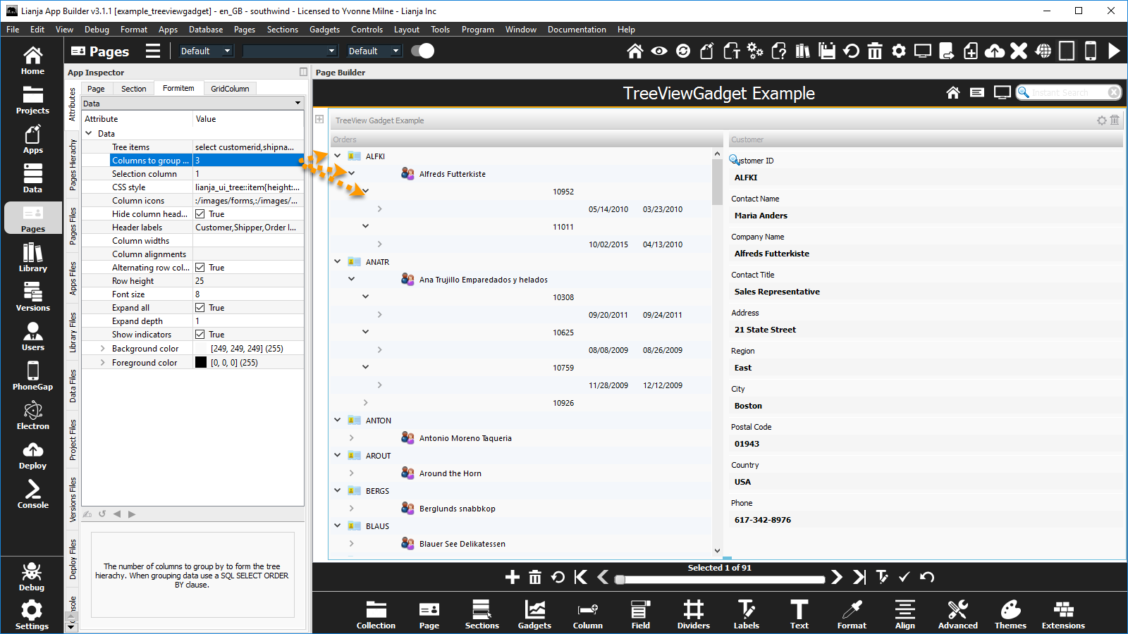
==Columns to group by== | ==Columns to group by== | ||
| Line 182: | Line 256: | ||
* Supported by [[Treeview Gadget Attributes|Treeview Gadget]]. | * Supported by [[Treeview Gadget Attributes|Treeview Gadget]]. | ||
| − | = | + | [[{{ns:file}}:da_columns_groupby_2.png|450px|thumb|left|link={{filepath:da_columns_groupby_2.png}}|Columns to group by: 2]] |
| − | == | + | |
| + | |||
| + | Here the '''Columns to group by''' is set to 2, so the tree items are grouped by customerid and shipname; the first 2 columns in the [[#Tree items|Tree items]] attribute SQL Select statement. | ||
| + | |||
| + | <br clear=all> | ||
| + | |||
| + | [[{{ns:file}}:da_columns_groupby_3.png|450px|thumb|left|link={{filepath:da_columns_groupby_3.png}}|Columns to group by: 3]] | ||
| + | |||
| + | |||
| + | |||
| + | Here the '''Columns to group by''' is set to 3, so the tree items are grouped by customerid, shipname and orderid; the first 3 columns in the [[#Tree items|Tree items]] attribute SQL Select statement. | ||
| + | |||
| + | <br clear=all> | ||
| + | |||
| + | The [[#Tree items|Tree items]] attribute SQL Select statement is set to: | ||
| + | <pre>select customerid,shipname,orderid,orderdate,shippeddate from orders order by customerid</pre> | ||
| + | |||
| + | [[#Notes on Client Support|Notes on Client Support]] | ||
==Context Menu== | ==Context Menu== | ||
* See [[Help Attributes#Context Menu|Help Attributes: Context Menu]]. | * See [[Help Attributes#Context Menu|Help Attributes: Context Menu]]. | ||
| + | |||
| + | [[#Notes on Client Support|Notes on Client Support]] | ||
| + | |||
| + | ==Control CSS style== | ||
| + | Control CSS style (separate attributes with ';' or use ''app:/''filename.css or specify CSS classes separated by spaces). | ||
| + | * From v4.1 | ||
| + | * See [[CSS]] | ||
==Custom attributes== | ==Custom attributes== | ||
| − | + | ||
| − | == | + | [[#Notes on Client Support|Notes on Client Support]] |
| − | + | ||
| − | * | + | ==Data CSS style== |
| + | Data CSS style (separate attributes with ';' or use ''app:/''filename.css or specify CSS classes separated by spaces). | ||
| + | * From v4.1 | ||
| + | * See [[CSS]] | ||
==Data size== | ==Data size== | ||
* See [[Formitem Appearance#Data size|Formitem Appearance: Data size]]. | * See [[Formitem Appearance#Data size|Formitem Appearance: Data size]]. | ||
| + | |||
| + | [[#Notes on Client Support|Notes on Client Support]] | ||
==Data source== | ==Data source== | ||
| Line 207: | Line 310: | ||
* The '''Data source''' for a [[Grid Gadget Attributes|Grid Gadget]] should be specified as a table name or a [[SQL SELECT]] statement. | * The '''Data source''' for a [[Grid Gadget Attributes|Grid Gadget]] should be specified as a table name or a [[SQL SELECT]] statement. | ||
| + | |||
| + | [[#Notes on Client Support|Notes on Client Support]] | ||
==Default== | ==Default== | ||
| + | Default value as an expression, e.g. date(), 0.0, space(10). | ||
| + | * Supported by [[Field Attributes|Form Section Fields]], [[Advanced Canvas Control Attributes|Canvas Section Advanced Controls]], [[Grid Column Attributes|Grid Columns]] and [[Checklistview Gadget Attributes|Checklistview Gadget]] | ||
| + | |||
[[{{ns:file}}:fi_default.png|450px|thumb|left|link={{filepath:fi_default.png}}|Default]] | [[{{ns:file}}:fi_default.png|450px|thumb|left|link={{filepath:fi_default.png}}|Default]] | ||
| Line 214: | Line 322: | ||
| − | The '''Default''' attribute is | + | The '''Default''' attribute specifies the default value for the field when a new record is added or the initial value of a memory variable data source. |
| − | + | Here the orders.orderdate is populated with the system date when a new record is added. | |
| + | The shipping details have also been populated with data from the parent customers table, e.g. 'Ship Name' has a '''Default''' of customers.companyname. | ||
| + | |||
| + | And the '''Default''' has also been set on the orders.orderid field using the [[SEQNO()]] function to generate a unique sequential number. | ||
| + | |||
<br clear=all> | <br clear=all> | ||
| − | + | Note: the orders.customerid field automatically inherits the current customers.customerid value due to the Relationship Builder relation set between the customers Form Section and the orders Grid Section (key: customerid). | |
| − | + | ||
| − | + | ||
| − | + | ||
| − | + | ||
<br clear=all> | <br clear=all> | ||
| − | [[ | + | [[#Notes on Client Support|Notes on Client Support]] |
| + | ===Data Dictionary: Default=== | ||
| + | The '''Default''' attribute corresponds to the [[SQL Constraints|Default Column Constraint]] stored in the table's Data Dictionary. | ||
| − | + | This can be set in the [[Creating_a_database_and_its_tables#Create_and_Modify_Columns|Table Designer]] ('Create a Column' and 'Modify a Column' dialogs prior to v6.3) in the Data Workspace and Page Builder or specified in the [[CREATE TABLE]] and [[ALTER TABLE]] commands. | |
| − | < | + | <code lang="recital"> |
| + | // Mandatory | ||
| + | ALTER TABLE "orders" MODIFY CONSTRAINT ORDERDATE SET DEFAULT date() | ||
| + | </code> | ||
| − | [[ | + | * See [[#Inherit dictionary rules|Inherit dictionary rules]] for enabling dictionary inheritance. |
| + | ==Default search field== | ||
| + | * See [[Instant Search]]. | ||
| + | [[#Notes on Client Support|Notes on Client Support]] | ||
| − | + | ==Deferred add== | |
| + | When adding new records, do not commit a blank record until saved. (True | False) | ||
| + | * Uncheck this (False) if you want to use custom autosuggestions against data in the same table. Default is True. | ||
| − | + | [[#Notes on Client Support|Notes on Client Support]] | |
| − | The | + | ==Dialog button== |
| + | The control has a dialog button that can be clicked to call the dialogButtonClicked delegate (True|False). | ||
| − | + | * In Form Sections, the control/section must be in edit mode for the [...] dialog button to be displayed. | |
| + | * See also [[#Dialog button delegate|Dialog button delegate]] and [[#Dialog button menu delegate|screenshots below]]. | ||
| − | + | [[#Notes on Client Support|Notes on Client Support]] | |
| − | The | + | ==Dialog button delegate== |
| + | The delegate for the dialogButtonClicked event. | ||
| + | * See also [[Custom_Delegates#Dialog_button_delegate|Custom Delegates:Dialog button delegate]] | ||
| − | [[ | + | [[#Notes on Client Support|Notes on Client Support]] |
| + | ==Dialog button menu== | ||
| + | Clicking the Dialog button drops down a menu of the specified comma-separated options. From v9.1.12. | ||
| + | [[{{ns:file}}:l9_dialogbuttonmenu.png|800px|left|border|link={{l9_dialogbuttonmenu.png}}|Dialog Buttons in Web Client]] | ||
| + | <br clear=all> | ||
| − | + | [[#Notes on Client Support|Notes on Client Support]] | |
| + | ==Dialog button menu delegate== | ||
| + | The delegate for the dialogButtonMenu event. From v9.1.12. | ||
| + | * See also [[Custom_Delegates#Dialog_button_menu_delegate|Custom Delegates:Dialog button menu delegate]] | ||
| + | * The [[#Dialog button|Dialog button]], [[#Dialog button menu|Dialog button menu]], [[#Dialog button delegate|Dialog button delegate]] and [[#Dialog button menu delegate|Dialog button menu delegate]] can be configured from the [[Page Builder Assistant]] | ||
| + | [[{{ns:file}}:l9_dialogbuttonmenu2.png|800px|left|border|link={{l9_dialogbuttonmenu2.png}}|Page Builder Assistant]] | ||
| + | <br clear=all> | ||
| + | * or [[App Inspector]] / Attributes: | ||
| + | [[{{ns:file}}:l9_dialogbuttonmenu3.png|800px|left|border|link={{l9_dialogbuttonmenu3.png}}|Attributes]] | ||
<br clear=all> | <br clear=all> | ||
| − | + | [[#Notes on Client Support|Notes on Client Support]] | |
| − | + | ==Dictionary overrides== | |
| − | / | + | Empty dictionary entries override rules (True | False). |
| − | ALTER TABLE | + | * Supported by [[Form Section Attributes|Form]], [[Grid Section Attributes|Grid]], [[Attachments Section Attributes|Attachments]] and [[Canvas Section Attributes|Canvas]] Sections. |
| − | + | * If [[#Inherit dictionary rules|Inherit dictionary rules]] is True and '''Dictionary overrides''' is True, empty entries in the table's dictionary override the corresponding section and formitem/column attributes set in the App. | |
| + | * See [[Creating_a_database_and_its_tables#Create_and_Modify_Columns|Create and Modify Columns]] (GUI) and the [[CREATE TABLE|create table]] and [[ALTER TABLE|alter table]] commands for setting and changing table dictionary entries. | ||
| + | * '''Dictionary overrides''' is False by default. | ||
| + | * See also [[#Inherit dictionary rules|Inherit dictionary rules]], [[#Inherit dictionary caption|Inherit dictionary caption]] and [[App Settings#Section_defaults|App Setting (Section defaults: Inherit dictionary rules)]]. | ||
| + | * From v9.4. | ||
| − | + | ==Editable== | |
| − | + | [[#Notes on Client Support|Notes on Client Support]] | |
| − | + | ||
| − | == | + | ==Enable when editing== |
| − | + | Disable editing until in 'Edit' mode (True | False) | |
| − | + | * Supported by [[Canvas Section Attributes|Canvas Section]]. Also [[Form Section Attributes|Form Section]] and [[Grid Section Attributes|Grid Section]] from v6.0. | |
| − | + | * Default is False and [[Advanced Canvas Control Attributes|Canvas Section controls]] can be edited without clicking the edit button. When True, click the edit button to enable the controls as with a [[Form Section Attributes|Form Section]]. | |
| − | + | [[#Notes on Client Support|Notes on Client Support]] | |
==Error message== | ==Error message== | ||
| + | |||
| + | [[#Notes on Client Support|Notes on Client Support]] | ||
==Expand all== | ==Expand all== | ||
Expand all Tree items when first loaded (True | False). | Expand all Tree items when first loaded (True | False). | ||
* Supported by [[Treeview Gadget Attributes|Treeview Gadget]]. | * Supported by [[Treeview Gadget Attributes|Treeview Gadget]]. | ||
| + | |||
| + | [[{{ns:file}}:da_expand_all.png|450px|thumb|left|link={{filepath:da_expand_all.png}}|Expand all: Expand depth = 1]] | ||
| + | |||
| + | |||
| + | The '''Expand all''' attribute is unchecked (False) by default. | ||
| + | |||
| + | Here the ''''Expand all''' attribute has been checked (True), so the nodes are expanded when first loaded up to the depth specified in the [[#Expand depth|Expand depth]] attribute, here 1. | ||
| + | |||
| + | <br clear=all> | ||
| + | |||
| + | [[{{ns:file}}:da_expand_depth.png|450px|thumb|left|link={{filepath:da_expand_depth.png}}|Expand all: Expand depth = 2]] | ||
| + | |||
| + | |||
| + | |||
| + | Here the [[#Expand depth|Expand depth]] attribute has been set to 2. | ||
| + | |||
| + | Note: if the [[#Expand depth|Expand depth]] attribute is left at its default value 0, all nodes are expanded when the Treeview Gadget is first loaded. | ||
| + | |||
| + | <br clear=all> | ||
| + | |||
| + | [[#Notes on Client Support|Notes on Client Support]] | ||
==Expand depth== | ==Expand depth== | ||
Expand all Tree items when first loaded to this depth. | Expand all Tree items when first loaded to this depth. | ||
* Supported by [[Treeview Gadget Attributes|Treeview Gadget]]. | * Supported by [[Treeview Gadget Attributes|Treeview Gadget]]. | ||
| + | * Used in conjunction with [[#Expand all|Expand all (see above)]] | ||
| + | |||
| + | [[#Notes on Client Support|Notes on Client Support]] | ||
==Filter== | ==Filter== | ||
The filter expression that restricts the records that will be included in the grid. | The filter expression that restricts the records that will be included in the grid. | ||
* Supported by [[Grid Gadget Attributes|Grid Gadget]]. | * Supported by [[Grid Gadget Attributes|Grid Gadget]]. | ||
| + | |||
| + | [[{{ns:file}}:da_filter.png|450px|thumb|left|link={{filepath:da_filter.png}}|Filter]] | ||
| + | |||
| + | <br clear=all> | ||
| + | |||
| + | Here rows in the Grid Gadget are filtered on the following logical expression: | ||
| + | discount > 0 | ||
| + | |||
| + | [[#Notes on Client Support|Notes on Client Support]] | ||
==Font== | ==Font== | ||
* See [[Fonts]]. | * See [[Fonts]]. | ||
| + | |||
| + | [[#Notes on Client Support|Notes on Client Support]] | ||
==Font size== | ==Font size== | ||
Font size for the Tree or CheckListView items. | Font size for the Tree or CheckListView items. | ||
* Supported by [[Checklistview Gadget Attributes|Checklistview Gadget]] and [[Treeview Gadget Attributes|Treeview Gadget]] | * Supported by [[Checklistview Gadget Attributes|Checklistview Gadget]] and [[Treeview Gadget Attributes|Treeview Gadget]] | ||
| + | |||
| + | [[{{ns:file}}:da_fontsize_checklist.png|450px|thumb|left|link={{filepath:da_fontsize_checklist.png}}|Font size: Checklistview Gadget]] | ||
| + | |||
| + | |||
| + | |||
| + | Here the '''Font size''' attribute of the Checklistview Gadget has been increased from the default of 8 to 16. | ||
| + | |||
| + | <br clear=all> | ||
| + | |||
| + | [[{{ns:file}}:da_fontsize_tree.png|450px|thumb|left|link={{filepath:da_fontsize_tree.png}}|Font size: Treeview Gadget]] | ||
| + | |||
| + | |||
| + | |||
| + | Here the '''Font size''' attribute of the Treeview Gadget is at the default of 0 (corresponds to 8). | ||
| + | |||
| + | <br clear=all> | ||
| + | |||
| + | [[#Notes on Client Support|Notes on Client Support]] | ||
==Foreground color== | ==Foreground color== | ||
* See [[Colors]]. | * See [[Colors]]. | ||
| + | |||
| + | [[#Notes on Client Support|Notes on Client Support]] | ||
==Get data mapping== | ==Get data mapping== | ||
| + | Custom data mapping when reading data. Specify this as an expression. | ||
| + | * Supported by [[Field Attributes|Form Section Fields]], [[Advanced Canvas Control Attributes|Canvas Section Advanced Controls]] and [[Grid Column Attributes|Grid Columns]]. | ||
* See [[Data Mapping]]. | * See [[Data Mapping]]. | ||
| + | |||
| + | [[#Notes on Client Support|Notes on Client Support]] | ||
==Grid row height== | ==Grid row height== | ||
Height of the grid rows. | Height of the grid rows. | ||
* Supported by [[Grid Gadget Attributes|Grid Gadget]]. | * Supported by [[Grid Gadget Attributes|Grid Gadget]]. | ||
| + | |||
| + | [[{{ns:file}}:da_grid_row_height.png|450px|thumb|left|link={{filepath:da_grid_row_height.png}}|Grid row height]] | ||
| + | |||
| + | |||
| + | |||
| + | Here the '''Grid row height''' attribute has been increased from its default value of 22 to 30. | ||
| + | |||
| + | <br clear=all> | ||
| + | |||
| + | [[#Notes on Client Support|Notes on Client Support]] | ||
==GroupBox caption== | ==GroupBox caption== | ||
An optional caption for the GroupBox containing the CheckListView items. | An optional caption for the GroupBox containing the CheckListView items. | ||
* Supported by [[Checklistview Gadget Attributes|Checklistview Gadget]]. | * Supported by [[Checklistview Gadget Attributes|Checklistview Gadget]]. | ||
| + | |||
| + | [[{{ns:file}}:da_groupbox_caption.png|450px|thumb|left|link={{filepath:da_groupbox_caption.png}}|GroupBox caption]] | ||
| + | |||
| + | |||
| + | |||
| + | Here the '''GroupBox caption''' attribute has been set to the text 'GroupBox caption'. | ||
| + | |||
| + | |||
| + | Note that in the 'CheckListView App' (example_checklistview) demo App, the '''CSS style''' is set to 'border:0px;'. | ||
| + | |||
| + | This has been removed here to display the default groupbox border. | ||
| + | |||
| + | <br clear=all> | ||
| + | |||
| + | [[#Notes on Client Support|Notes on Client Support]] | ||
==Header labels== | ==Header labels== | ||
A comma separated list of header labels. | A comma separated list of header labels. | ||
| − | * Supported by [[ | + | * Supported by [[Treeview Gadget Attributes|Treeview Gadget]]. |
| + | * Not currently implemented for [[Listview Gadget Attributes|Listview Gadget]]. | ||
| + | |||
| + | [[{{ns:file}}:da_header_labels.png|450px|thumb|left|link={{filepath:da_header_labels.png}}|Header labels]] | ||
| + | |||
| + | |||
| + | |||
| + | |||
| + | The [[#Hide column headers|Hide column headers]] attribute must be unchecked (False) to display the '''Header labels'''. | ||
| + | <br clear=all> | ||
| + | |||
| + | Here the '''Header labels''' attribute has been set to: | ||
| + | |||
| + | <pre>Customer,Shipper,Order ID,Date Ordered,Date Shipped</pre> | ||
| + | |||
| + | [[#Notes on Client Support|Notes on Client Support]] | ||
==Help topic== | ==Help topic== | ||
* See [[Help Attributes#Help table|Help Attributes: Help table]]. | * See [[Help Attributes#Help table|Help Attributes: Help table]]. | ||
| − | + | [[#Notes on Client Support|Notes on Client Support]] | |
| − | + | ||
| − | + | ||
==Hide column headers== | ==Hide column headers== | ||
Hide the column headers (True | False). | Hide the column headers (True | False). | ||
* Supported by [[Treeview Gadget Attributes|Treeview Gadget]]. | * Supported by [[Treeview Gadget Attributes|Treeview Gadget]]. | ||
| + | |||
| + | [[{{ns:file}}:da_hide_column_headers.png|450px|thumb|left|link={{filepath:da_hide_column_headers.png}}|Hide column headers]] | ||
| + | |||
| + | |||
| + | |||
| + | Here the '''Hide column headers''' attribute is unchecked (False), so the comma-separated string specified in the [[#Header labels|Header labels]] is displayed in the column headers. | ||
| + | |||
| + | <br clear=all> | ||
| + | |||
| + | [[#Notes on Client Support|Notes on Client Support]] | ||
==Hide OK/Cancel Buttons== | ==Hide OK/Cancel Buttons== | ||
Hide the OK/Cancel buttons (True | False). | Hide the OK/Cancel buttons (True | False). | ||
* Supported by [[Grid Gadget Attributes|Grid Gadget]]. | * Supported by [[Grid Gadget Attributes|Grid Gadget]]. | ||
| + | |||
| + | [[{{ns:file}}:da_hide_ok.png|450px|thumb|left|link={{filepath:da_hide_ok.png}}|Hide the OK/Cancel buttons: False]] | ||
| + | |||
| + | |||
| + | |||
| + | When a Grid Gadget is added, the '''Hide the OK/Cancel buttons''' attribute is unchecked (False) by default. | ||
| + | |||
| + | <br clear=all> | ||
| + | |||
| + | [[{{ns:file}}:da_hide_ok_true.png|450px|thumb|left|link={{filepath:da_hide_ok_true.png}}|Hide the OK/Cancel buttons: True]] | ||
| + | |||
| + | |||
| + | |||
| + | Check the '''Hide the OK/Cancel buttons''' attribute (True) to hide the OK and Cancel buttons in the action bar. | ||
| + | |||
| + | <br clear=all> | ||
| + | |||
| + | * See also [[#Hide the action bar|Hide the action bar]]. | ||
| + | |||
| + | [[#Notes on Client Support|Notes on Client Support]] | ||
==Hide search field indicator== | ==Hide search field indicator== | ||
* See [[Instant Search]]. | * See [[Instant Search]]. | ||
| + | |||
| + | [[#Notes on Client Support|Notes on Client Support]] | ||
| + | |||
| + | ==Hide the action bar== | ||
| + | Hide the action bar (True | False). | ||
| + | * Supported by [[Grid Gadget Attributes|Grid Gadget]]. | ||
| + | |||
| + | [[{{ns:file}}:da_hide_ab.png|450px|thumb|left|link={{filepath:da_hide_ab.png}}|Hide the action bar: False]] | ||
| + | |||
| + | |||
| + | |||
| + | When a Grid Gadget is added, the '''Hide the action bar''' attribute is unchecked (False) by default. | ||
| + | |||
| + | <br clear=all> | ||
| + | |||
| + | [[{{ns:file}}:da_hide_ab_true.png|450px|thumb|left|link={{filepath:da_hide_ab_true.png}}|Hide the action bar: True]] | ||
| + | |||
| + | |||
| + | |||
| + | Check the '''Hide the action bar''' attribute (True) to hide the action bar. | ||
| + | |||
| + | <br clear=all> | ||
| + | |||
| + | * [[#Pagination|Pagination]] and [[#Automatic Pagination|Automatic Pagination]] require the action bar to be shown. | ||
| + | * See also [[#Hide_OK.2FCancel_Buttons|Hide OK/Cancel Buttons]]. | ||
| + | |||
| + | [[#Notes on Client Support|Notes on Client Support]] | ||
| + | |||
| + | ==HTML editor== | ||
| + | Choose the HTML editor to use for this UI element (Desktop | Web | Mobile). | ||
| + | * Supported by [[Webview Section Attributes|WebView Section]] and [[Webview Gadget Attributes|WebView Gadget]]. | ||
| + | * This overrides the [[App_Settings#General_App_Configuration|App-wide setting]] for desktop Apps. | ||
| + | * From v9.0. | ||
==Hyperlink== | ==Hyperlink== | ||
| + | |||
| + | [[#Notes on Client Support|Notes on Client Support]] | ||
| + | |||
| + | ==Icon image== | ||
| + | The icon image for the control. | ||
| + | * Supported by [[Advanced Canvas Control Attributes|Canvas Section Advanced Commmandbutton Controls]]. | ||
==Ignore after change== | ==Ignore after change== | ||
After data is edited (TextBox only), the 'Change' delegate only is called and it is assumed to update the field. This provides the ability to handle custom search logic in the App for this field (True | False) | After data is edited (TextBox only), the 'Change' delegate only is called and it is assumed to update the field. This provides the ability to handle custom search logic in the App for this field (True | False) | ||
* Supported by [[Field Attributes|Form Section Fields]] and [[Advanced Canvas Control Attributes|Canvas Section Advanced Controls]]. | * Supported by [[Field Attributes|Form Section Fields]] and [[Advanced Canvas Control Attributes|Canvas Section Advanced Controls]]. | ||
| + | |||
| + | [[#Notes on Client Support|Notes on Client Support]] | ||
==Image== | ==Image== | ||
The static image to be displayed in this gadget. | The static image to be displayed in this gadget. | ||
* Supported by [[Image Gadget Attributes|Image Gadget]] | * Supported by [[Image Gadget Attributes|Image Gadget]] | ||
| + | |||
| + | [[{{ns:file}}:da_image.png|450px|thumb|left|link={{filepath:da_image.png}}|Image]] | ||
| + | |||
| + | |||
| + | |||
| + | Here the Image gadget's '''Image''' attribute is set to 'stars.jpg'. | ||
| + | |||
| + | The [[#Stretch image|Stretch image]] attribute is checked (True) by default, so the image is resized to fit the gadget. | ||
| + | |||
| + | <br clear=all> | ||
| + | |||
| + | [[#Notes on Client Support|Notes on Client Support]] | ||
==Inherit dictionary rules== | ==Inherit dictionary rules== | ||
| − | [[Field Attributes|Form Section]] and [[Advanced Canvas Control Attributes|Canvas Section Advanced]] | + | Inherit the data dictionary rules (e.g. Choices will change when dictionary Choices is altered) |
| + | * Supported by [[Form Section Attributes|Form]] and [[Canvas Section Attributes|Canvas]] Sections. Section behavior is also determined by the '''Inherit dictionary rules''' [[App Settings#Section_defaults|App Setting (Section defaults)]]. | ||
| + | * Supported by [[Field Attributes|Form Section Fields]] and [[Advanced Canvas Control Attributes|Canvas Section Advanced Controls]]. | ||
| − | [[{{ns:file}}:section_inherit.png| | + | [[{{ns:file}}:section_inherit.png|x253px|thumb|left|link={{filepath:section_inherit.png}}|Section: Inherit dictionary rules]] |
| + | Form Section Fields and Canvas Section Advanced Controls can 'inherit' the Data Dictionary rules. This populates the control's relevant attributes with the settings from the Data Dictionary. | ||
By default, controls have the '''Inherit dictionary rules''' attribute set to True, but the containing Form and Canvas Sections have the attribute set to False. | By default, controls have the '''Inherit dictionary rules''' attribute set to True, but the containing Form and Canvas Sections have the attribute set to False. | ||
| Line 359: | Line 681: | ||
<br clear=all> | <br clear=all> | ||
| − | [[{{ns:file}}:field_inherit1.png| | + | [[{{ns:file}}:field_inherit1.png|x253px|thumb|left|link={{filepath:field_inherit.png}}|Field: Inherit dictionary rules]] |
| Line 371: | Line 693: | ||
<br clear=all> | <br clear=all> | ||
| + | |||
| + | * See also [[#Dictionary overrides|Dictionary overrides]]. | ||
| + | |||
| + | [[#Notes on Client Support|Notes on Client Support]] | ||
| + | |||
| + | ==Inherit dictionary caption== | ||
| + | When [[#Inherit_dictionary_rules|Inherit dictionary rules]] is set to true at both section and formitem level, '''Inherit dictionary caption''' determines whether this also applies to the formitem caption. If '''Inherit dictionary caption''' is true, the formitem inherits the column's field caption, if false, the formitem can have a caption customized in the UI. | ||
| + | |||
| + | * Supported by [[Field Attributes|Form Section Fields]] and [[Advanced Canvas Control Attributes|Canvas Section Advanced Controls]]. | ||
| + | |||
| + | [[#Notes on Client Support|Notes on Client Support]] | ||
==Input mask== | ==Input mask== | ||
* See [[Input Masks]]. | * See [[Input Masks]]. | ||
| + | |||
| + | [[#Notes on Client Support|Notes on Client Support]] | ||
==Input mask type== | ==Input mask type== | ||
* See [[Input Masks]]. | * See [[Input Masks]]. | ||
| + | |||
| + | [[#Notes on Client Support|Notes on Client Support]] | ||
==List items== | ==List items== | ||
A list of items. | A list of items. | ||
| − | * Supported by [[Listview Gadget Attributes|Listview Gadget]]. | + | * Supported by [[Listview Gadget Attributes|Listview Gadget]] and [[Advanced Canvas Control Attributes|Canvas Section Advanced OptionGroup Controls]]. |
| − | + | [[{{ns:file}}:da_list_items_text.png|450px|thumb|left|link={{filepath:da_list_items_text.png}}|List items: comma separated text]] | |
| − | [[{{ns:file}}: | + | |
| + | Here the '''List items''' is set to the comma separated text string shown below. | ||
| − | + | Note it includes icon file names prefixed with an '@'. | |
| − | + | ||
| − | + | ||
<br clear=all> | <br clear=all> | ||
| − | + | <pre>USA@:/images/cat_internet_sm,UK@:/images/home,Germany@:/images/cat_finance_sm</pre> | |
| + | [[{{ns:file}}:da_list_items_select.png|450px|thumb|left|link={{filepath:da_list_items_select.png}}|List items: SQL Select]] | ||
| − | + | Here the '''List items''' is set to the SQL Select statement shown below. | |
| − | + | ||
| − | + | ||
<br clear=all> | <br clear=all> | ||
| − | + | <pre>select productname from products order by productname</pre> | |
| − | + | Note: [[Advanced Canvas Control Attributes|Canvas Section Advanced OptionGroup Controls]] do not support SQL Select statement based '''List items'''. | |
| − | [[ | + | [[#Notes on Client Support|Notes on Client Support]] |
| + | ==Maintain aspect ratio== | ||
| + | Whether image will be scaled maintaining its aspect ratio. | ||
| + | * Supported by [[Image Gadget Attributes|Image Gadget]]. | ||
| + | * Also supported by the [[Image]] UI Framework Class. Note: if enabling, set this property first, before setting the Picture property. | ||
| + | * From v5.4. | ||
| + | ==Mandatory input== | ||
| + | Data must be entered in this field. | ||
| + | * Supported by [[Field Attributes|Form Section Fields]] and [[Advanced Canvas Control Attributes|Canvas Section Advanced Textbox Controls]]. | ||
| − | + | [[{{ns:file}}:fi_mandatory.png|450px|thumb|left|link=|Mandatory input]] | |
| + | |||
| + | |||
| + | |||
| + | |||
| + | The '''Mandatory input''' attribute specifies that the field cannot be empty. | ||
| + | |||
| + | Attempting to save a record without entering non-empty data in a field with the '''Mandatory input''' attribute set returns an error message and the record is not saved. | ||
| + | |||
| + | Note: 0 is considered an [[EMPTY()|empty]] numeric value. | ||
<br clear=all> | <br clear=all> | ||
| − | + | [[#Notes on Client Support|Notes on Client Support]] | |
| + | |||
| + | ===Data Dictionary: Not Null=== | ||
| + | |||
| + | The '''Mandatory input''' attribute corresponds to the [[SQL Constraints|Not Null Column Constraint]] stored in the table's Data Dictionary. | ||
| + | |||
| + | This can be set in the [[Creating_a_database_and_its_tables#Create_and_Modify_Columns|Table Designer]] ('Create a Column' and 'Modify a Column' dialogs prior to v6.3) in the Data Workspace and Page Builder or specified in the [[CREATE TABLE]] and [[ALTER TABLE]] commands. | ||
<code lang="recital"> | <code lang="recital"> | ||
| Line 427: | Line 784: | ||
* See [[#Inherit dictionary rules|Inherit dictionary rules]] above for enabling dictionary inheritance. | * See [[#Inherit dictionary rules|Inherit dictionary rules]] above for enabling dictionary inheritance. | ||
| + | |||
| + | ==Maximum value== | ||
| + | The maximum value for a ProgressBar or Slider. | ||
| + | * Supported by ProgressBar and Slider [[Advanced Canvas Control Attributes|Canvas Section Advanced Controls]]. | ||
| + | |||
| + | [[#Notes on Client Support|Notes on Client Support]] | ||
| + | |||
| + | ==Minimum value== | ||
| + | The minimum value for a ProgressBar or Slider. | ||
| + | * Supported by ProgressBar and Slider [[Advanced Canvas Control Attributes|Canvas Section Advanced Controls]]. | ||
| + | |||
| + | [[#Notes on Client Support|Notes on Client Support]] | ||
| + | |||
| + | ==Orientation== | ||
| + | The orientation for a ProgressBar or Slider (Horizontal|Vertical). | ||
| + | * Supported by ProgressBar and Slider [[Advanced Canvas Control Attributes|Canvas Section Advanced Controls]]. | ||
| + | |||
| + | [[#Notes on Client Support|Notes on Client Support]] | ||
==Pagination== | ==Pagination== | ||
| − | Grid is always rendered using pagination (for large data sets)(True | False) | + | Grid is always rendered using pagination (for large data sets) (True | False) |
* Supported by [[Grid Gadget Attributes|Grid Gadget]]. | * Supported by [[Grid Gadget Attributes|Grid Gadget]]. | ||
| + | |||
| + | [[{{ns:file}}:da_pagination.png|450px|thumb|left|link={{filepath:da_pagination.png}}|Pagination: True]] | ||
| + | |||
| + | |||
| + | |||
| + | |||
| + | If the '''Pagination''' attribute is checked (True) - default is unchecked (False) - the grid rows are always displayed in pages, regardless of the number of records. | ||
| + | |||
| + | <br clear=all> | ||
| + | |||
| + | * See also [[#Automatic pagination|Automatic pagination]]. | ||
| + | * The [[#Hide the action bar|Hide the action bar]] attribute must be unchecked (False) for pagination. | ||
| + | |||
| + | [[#Notes on Client Support|Notes on Client Support]] | ||
==Password input== | ==Password input== | ||
* See [[Input Masks#Password input|Input Masks: Password input]]. | * See [[Input Masks#Password input|Input Masks: Password input]]. | ||
| + | |||
| + | [[#Notes on Client Support|Notes on Client Support]] | ||
==Placeholder text== | ==Placeholder text== | ||
* See [[Input Masks#Placeholder text|Input Masks: Placeholder text]]. | * See [[Input Masks#Placeholder text|Input Masks: Placeholder text]]. | ||
| + | |||
| + | [[#Notes on Client Support|Notes on Client Support]] | ||
==Readonly== | ==Readonly== | ||
* Applies to [[Grid Column Attributes|Grid Columns]]. For [[Field Attributes|Form Section Fields]] and [[Advanced Canvas Control Attributes|Canvas Section Advanced Controls]], see [[#Editable|Editable]]. | * Applies to [[Grid Column Attributes|Grid Columns]]. For [[Field Attributes|Form Section Fields]] and [[Advanced Canvas Control Attributes|Canvas Section Advanced Controls]], see [[#Editable|Editable]]. | ||
| + | |||
| + | [[#Notes on Client Support|Notes on Client Support]] | ||
==Recalculate== | ==Recalculate== | ||
| + | |||
| + | [[#Notes on Client Support|Notes on Client Support]] | ||
==Refresh section when row changes== | ==Refresh section when row changes== | ||
Refresh other fields in the section when row changes (True | False). | Refresh other fields in the section when row changes (True | False). | ||
* Supported by [[Grid Gadget Attributes|Grid Gadget]]. | * Supported by [[Grid Gadget Attributes|Grid Gadget]]. | ||
| + | |||
| + | [[{{ns:file}}:da_refresh_section.png|450px|thumb|left|link={{filepath:da_refresh_section.png}}|Refresh section when row changes: True]] | ||
| + | |||
| + | |||
| + | |||
| + | Here navigating rows in the Grid Gadget refreshes the other fields in the section from the southwind!order_details table. | ||
| + | |||
| + | <br clear=all> | ||
| + | |||
| + | [[#Notes on Client Support|Notes on Client Support]] | ||
==Relate on change== | ==Relate on change== | ||
| − | + | [[#Notes on Client Support|Notes on Client Support]] | |
==Return tabs== | ==Return tabs== | ||
| + | |||
| + | [[#Notes on Client Support|Notes on Client Support]] | ||
==Row height== | ==Row height== | ||
Row height for the Tree or CheckListView items. | Row height for the Tree or CheckListView items. | ||
* Supported by [[Checklistview Gadget Attributes|Checklistview Gadget]] and [[Treeview Gadget Attributes|Treeview Gadget]] | * Supported by [[Checklistview Gadget Attributes|Checklistview Gadget]] and [[Treeview Gadget Attributes|Treeview Gadget]] | ||
| + | |||
| + | [[{{ns:file}}:da_rowheight_checklist.png|450px|thumb|left|link={{filepath:da_rowheight_checklist.png}}|Row height: Checklistview Gadget]] | ||
| + | |||
| + | |||
| + | |||
| + | Here the '''Row height''' attribute of the Checklistview Gadget is set to the default: 25 (pixels). | ||
| + | |||
| + | <br clear=all> | ||
| + | |||
| + | [[{{ns:file}}:da_rowheight_tree.png|450px|thumb|left|link={{filepath:da_rowheight_tree.png}}|Row height: Treeview Gadget]] | ||
| + | |||
| + | |||
| + | |||
| + | Here the '''Row height''' attribute of the Treeview Gadget has been increased from the default of 18 to 25 (pixels). | ||
| + | |||
| + | <br clear=all> | ||
| + | [[#Notes on Client Support|Notes on Client Support]] | ||
==Search field== | ==Search field== | ||
* See [[Instant Search]]. | * See [[Instant Search]]. | ||
| + | |||
| + | [[#Notes on Client Support|Notes on Client Support]] | ||
==Search panel field== | ==Search panel field== | ||
* See [[Section Search Panels]]. | * See [[Section Search Panels]]. | ||
| + | |||
| + | [[#Notes on Client Support|Notes on Client Support]] | ||
==Selection column== | ==Selection column== | ||
The column to substitute into the Click/DblClick delegate. Use {} in the delegate where you want the text from this column to be placed. | The column to substitute into the Click/DblClick delegate. Use {} in the delegate where you want the text from this column to be placed. | ||
* Supported by [[Treeview Gadget Attributes|Treeview Gadget]]. | * Supported by [[Treeview Gadget Attributes|Treeview Gadget]]. | ||
| + | |||
| + | [[{{ns:file}}:da_selection_column.png|450px|thumb|left|link={{filepath:da_selection_column.png}}|Selection column]] | ||
| + | |||
| + | |||
| + | |||
| + | Here the '''Selection column''' is set to 1, so passes the select customerid to the DblClick delegate. | ||
| + | |||
| + | <br clear=all> | ||
| + | |||
| + | The [[#Tree items|Tree items]] attribute is set to: | ||
| + | <pre>select customerid,shipname,orderid,orderdate,shippeddate from orders order by customerid</pre> | ||
| + | The [[Custom_Delegates#Double_click|Double Click delegate]] is set to the following [[Custom_Delegates#Inline_Delegates|inline delegate]]: | ||
| + | <pre>?page:page1.section1?action=search&text={}||page:page1.section1?action=editmode</pre> | ||
| + | |||
| + | [[#Notes on Client Support|Notes on Client Support]] | ||
==Set data mapping== | ==Set data mapping== | ||
| + | Custom data mapping when writing data. Specify this as an expression. | ||
| + | * Supported by [[Field Attributes|Form Section Fields]], [[Advanced Canvas Control Attributes|Canvas Section Advanced Controls]] and [[Grid Column Attributes|Grid Columns]]. | ||
* See [[Data Mapping]]. | * See [[Data Mapping]]. | ||
| + | |||
| + | [[#Notes on Client Support|Notes on Client Support]] | ||
==Show indicators== | ==Show indicators== | ||
Show expand/collapse indicators in the tree (True | False). | Show expand/collapse indicators in the tree (True | False). | ||
* Supported by [[Treeview Gadget Attributes|Treeview Gadget]]. | * Supported by [[Treeview Gadget Attributes|Treeview Gadget]]. | ||
| + | |||
| + | |||
| + | [[{{ns:file}}:da_show_indicators.png|450px|thumb|left|link={{filepath:da_show_indicators.png}}|Show indicators]] | ||
| + | |||
| + | |||
| + | |||
| + | Here the '''Show indicators''' attribute is checked (True), to allow the nodes to be expanded and collapsed. | ||
| + | |||
| + | <br clear=all> | ||
| + | |||
| + | [[#Notes on Client Support|Notes on Client Support]] | ||
==Stretch image== | ==Stretch image== | ||
Stretch image (True | False). | Stretch image (True | False). | ||
* Supported by [[Image Gadget Attributes|Image Gadget]] | * Supported by [[Image Gadget Attributes|Image Gadget]] | ||
| + | |||
| + | [[{{ns:file}}:da_stretch_image.png|450px|thumb|left|link={{filepath:da_stretch_image.png}}|Stretch image: False]] | ||
| + | |||
| + | |||
| + | |||
| + | Here the '''Stretch image''' attribute is unchecked (False). | ||
| + | |||
| + | See the same Image gadget with the '''Stretch image''' attribute checked (True) to resize the image to fit the gadget [[#Image|here]]. | ||
| + | |||
| + | <br clear=all> | ||
| + | |||
| + | [[{{ns:file}}:da_stretch_image_fixed.png|450px|thumb|left|link={{filepath:da_stretch_image_fixed.png}}|Stretch image: False; Fixed width and Fixed height set]] | ||
| + | |||
| + | |||
| + | |||
| + | This is the same Image gadget with the '''Stretch image''' attribute unchecked (False), but with the [[Details Attributes#Fixed width|Fixed width]] and [[Details Attributes#Fixed height|Fixed height]] attributes defined to fit the [[#Image|image]]. | ||
| + | |||
| + | <br clear=all> | ||
| + | |||
| + | [[#Notes on Client Support|Notes on Client Support]] | ||
| + | |||
| + | ==StringList== | ||
| + | A comma-separated list of strings that are available in the [[StringList Editor]]. This can be specified as a [[SQL SELECT|SQL Select]] statement or a {macro()} procedure call that generate the list dynamically. | ||
| + | * Supported by [[Field Attributes|Form Section Fields]], [[Grid Column Attributes|Grid Columns]] and [[Advanced Canvas Control Attributes|Canvas Section Advanced TextBox Controls]]. | ||
| + | * The [[StringList Editor]] is available for editing varchar/memo fields when the [[#Cell editor type|Cell editor type]] is specified as 'Stringlist'. | ||
| + | |||
| + | [[#Notes on Client Support|Notes on Client Support]] | ||
==Tab order== | ==Tab order== | ||
| + | The tab order for this field. | ||
| + | * Supported by [[Field Attributes|Form Section Fields]] and [[Advanced Canvas Control Attributes|Canvas Section Advanced Controls]]. | ||
| + | |||
| + | [[#Notes on Client Support|Notes on Client Support]] | ||
==Text alignment== | ==Text alignment== | ||
| + | Data text alignment. | ||
| + | * Supported by [[Field Attributes|Form Section Fields]], [[Advanced Canvas Control Attributes|Canvas Section Advanced Controls]] and [[Grid Column Attributes|Grid Columns]]. | ||
* See [[Formitem Appearance#Text alignment|Formitem Appearance: Text alignment]]. | * See [[Formitem Appearance#Text alignment|Formitem Appearance: Text alignment]]. | ||
| + | |||
| + | [[#Notes on Client Support|Notes on Client Support]] | ||
| + | |||
| + | ==Tick interval== | ||
| + | The tick interval for a slider. | ||
| + | * Supported by Slider [[Advanced Canvas Control Attributes|Canvas Section Advanced Control]]. | ||
| + | |||
| + | [[#Notes on Client Support|Notes on Client Support]] | ||
| + | |||
| + | ==Tick position== | ||
| + | The tick position for a slider (None|Both Sides|Above|Below|Left|Right). | ||
| + | * Supported by Slider [[Advanced Canvas Control Attributes|Canvas Section Advanced Control]]. | ||
| + | |||
| + | [[#Notes on Client Support|Notes on Client Support]] | ||
==Tooltip== | ==Tooltip== | ||
| + | A tooltip to display when the mouse hovers over the data. | ||
| + | * Supported by [[Field Attributes|Form Section Fields]] and [[Advanced Canvas Control Attributes|Canvas Section Advanced Controls]]. | ||
* See [[Help Attributes#Tooltips|Help Attributes: Tooltips]]. | * See [[Help Attributes#Tooltips|Help Attributes: Tooltips]]. | ||
| + | |||
| + | [[#Notes on Client Support|Notes on Client Support]] | ||
==Tree items== | ==Tree items== | ||
A list of items to display in the Tree. | A list of items to display in the Tree. | ||
* Supported by [[Treeview Gadget Attributes|Treeview Gadget]]. | * Supported by [[Treeview Gadget Attributes|Treeview Gadget]]. | ||
| + | |||
| + | [[{{ns:file}}:da_tree_items.png|450px|thumb|left|link={{filepath:da_tree_items.png}}|Tree items]] | ||
| + | |||
| + | |||
| + | |||
| + | Here the '''Tree items''' is set to the SQL Select statement shown below. | ||
| + | |||
| + | The [[#Hide column headers|Hide column headers]] attribute has been unchecked (False) to show the header text defined in the [[#Header labels|Header labels]]. | ||
| + | |||
| + | <br clear=all> | ||
| + | |||
| + | <pre>select customerid,shipname,orderid,orderdate,shippeddate from orders order by customerid</pre> | ||
| + | |||
| + | [[#Notes on Client Support|Notes on Client Support]] | ||
==URL== | ==URL== | ||
| − | The URL for this gadget or section. | + | The URL for this control, gadget or section. |
| + | * Supported by Chart and Webview [[Advanced Canvas Control Attributes|Canvas Section Advanced Controls]], [[Google Bar Chart Gadget Attributes|Google Bar Chart Gadget]], [[Google Map Gadget Attributes|Google Map Gadget]], [[Google Pie Chart Gadget Attributes|Google Pie Chart Gadget]], [[Webview Gadget Attributes|Webview Gadget]], [[Webview Section Attributes|Webview Section]] | ||
| + | |||
| + | [[#Notes on Client Support|Notes on Client Support]] | ||
==User selectable search field== | ==User selectable search field== | ||
| + | The user can select this as the search field interactively by clicking on it. | ||
| + | * Supported by [[Field Attributes|Form Section Fields]] and [[Advanced Canvas Control Attributes|Canvas Section Advanced Controls]]. | ||
* See [[Instant Search]]. | * See [[Instant Search]]. | ||
| + | |||
| + | [[#Notes on Client Support|Notes on Client Support]] | ||
==Validation== | ==Validation== | ||
| + | Data input validation expression. | ||
| + | * Supported by [[Field Attributes|Form Section Fields]], [[Advanced Canvas Control Attributes|Canvas Section Advanced Controls]] and [[Grid Column Attributes|Grid Columns]]. | ||
| + | |||
| + | [[#Notes on Client Support|Notes on Client Support]] | ||
==Validation error message== | ==Validation error message== | ||
| − | + | Error message to display if data input validation fails. | |
| + | |||
| + | * Supported by [[Grid Column Attributes|Grid Columns]]. | ||
| + | * For [[Field Attributes|Form Section Fields]] and [[Advanced Canvas Control Attributes|Canvas Section Advanced Controls]], see [[#Error message|Error message]]. | ||
| + | |||
| + | [[#Notes on Client Support|Notes on Client Support]] | ||
==Notes on Client Support== | ==Notes on Client Support== | ||
| Line 507: | Line 1,048: | ||
!width="80%"|Notes | !width="80%"|Notes | ||
|- | |- | ||
| − | |valign="top"|ActiveX control||Supported on the Windows Desktop client only. | + | |valign="top"|[[#ActiveX control|ActiveX control]]||Supported on the Windows Desktop client only. |
| + | |- | ||
| + | |valign="top"|[[#Anchor|Anchor]]|| | ||
| + | |- | ||
| + | |valign="top"|[[#Allow multiple selections|Allow multiple selections]]||Setting '''Allow multiple selections''' to false is recognized on the Desktop client only.<br>On the Web/Mobile client, the checklist is displayed and operates as a series of checkboxes. | ||
| + | |- | ||
| + | |valign="top"|[[#Alternating row colors|Alternating row colors]]||The Treeview Gadget is supported on the Desktop client only. | ||
| + | |- | ||
| + | |valign="top"|[[#Automatic pagination|Automatic pagination]]||The Grid Gadget is currently supported on the Desktop client only. | ||
| + | |- | ||
| + | |valign="top"|[[#Automatic pagination size|Automatic pagination size]]||The Grid Gadget is currently supported on the Desktop client only. | ||
| + | |- | ||
| + | |valign="top"|[[#Autosuggestions|Autosuggestions]]|| | ||
| + | |- | ||
| + | |valign="top"|[[#Autosuggestion headers|Autosuggestion headers]]|| | ||
| + | |- | ||
| + | |valign="top"|[[#Autosuggestion column to search|Autosuggestion column to search]]|| | ||
| + | |- | ||
| + | |valign="top"|[[#Background color|Background color]]|| | ||
| + | |- | ||
| + | |valign="top"|[[#Choices|Choices]]|| | ||
| + | |- | ||
| + | |valign="top"|[[#Column alignments|Column alignments]]||The Listview and Treeview Gadgets are currently supported on the Desktop client only. | ||
| + | |- | ||
| + | |valign="top"|[[#Column icons|Column icons]]||The Treeview Gadget is currently supported on the Desktop client only. | ||
| + | |- | ||
| + | |valign="top"|[[#Column widths|Column widths]]||The Listview and Treeview Gadgets are currently supported on the Desktop client only. | ||
| + | |- | ||
| + | |valign="top"|[[#Columns to group by|Columns to group by]]||The Treeview Gadget is currently supported on the Desktop client only. | ||
| + | |- | ||
| + | |valign="top"|[[#Context Menu|Context Menu]]||Currently supported on the Desktop client only. | ||
| + | |- | ||
| + | |valign="top"|[[#Custom attributes|Custom attributes]]|| | ||
| + | |- | ||
| + | |valign="top"|[[#Custom UI component|Custom UI component]]|| | ||
| + | |- | ||
| + | |valign="top"|[[#Data size|Data size]]|| | ||
| + | |- | ||
| + | |valign="top"|[[#Data source|Data source]]|| | ||
| + | |- | ||
| + | |valign="top"|[[#Default|Default]]|| | ||
| + | |- | ||
| + | |valign="top"|[[#Default search field|Default search field]]|| | ||
| + | |- | ||
| + | |valign="top"|[[#Dialog button|Dialog button]]|| | ||
| + | |- | ||
| + | |valign="top"|[[#Dialog button delegate|Dialog button delegate]]|| | ||
| + | |- | ||
| + | |valign="top"|[[#Dialog button menu|Dialog button menu]]|| | ||
| + | |- | ||
| + | |valign="top"|[[#Dialog button menu delegate|Dialog button menu delegate]]|| | ||
| + | |- | ||
| + | |valign="top"|[[#Editable|Editable]]|| | ||
| + | |- | ||
| + | |valign="top"|[[#Error message|Error message]]|| | ||
| + | |- | ||
| + | |valign="top"|[[#Expand all|Expand all]]||The Treeview Gadget is currently supported on the Desktop client only. | ||
| + | |- | ||
| + | |valign="top"|[[#Expand depth|Expand depth]]||The Treeview Gadget is currently supported on the Desktop client only. | ||
| + | |- | ||
| + | |valign="top"|[[#Filter|Filter]]||The Grid Gadget is currently supported on the Desktop client only. | ||
| + | |- | ||
| + | |valign="top"|[[#Font|Font]]|| | ||
| + | |- | ||
| + | |valign="top"|[[#Font size|Font size]]||The '''Font size''' CheckListView Gadget attribute is supported on the Desktop client only.<br>The Treeview Gadget is currently supported on the Desktop client only. | ||
| + | |- | ||
| + | |valign="top"|[[#Foreground color|Foreground color]]|| | ||
| + | |- | ||
| + | |valign="top"|[[#Get data mapping|Get data mapping]]|| | ||
| + | |- | ||
| + | |valign="top"|[[#Grid row height|Grid row height]]||The Grid Gadget is currently supported on the Desktop client only. | ||
| + | |- | ||
| + | |valign="top"|[[#GroupBox caption|GroupBox caption]]||Currently supported on the Desktop client only. | ||
| + | |- | ||
| + | |valign="top"|[[#Header labels|Header labels]]||The Treeview Gadget is currently supported on the Desktop client only. | ||
| + | |- | ||
| + | |valign="top"|[[#Help topic|Help topic]]||Currently supported on the Desktop client only. | ||
| + | |- | ||
| + | |valign="top"|[[#Hide column headers|Hide column headers]]||The Treeview Gadget is currently supported on the Desktop client only. | ||
| + | |- | ||
| + | |valign="top"|[[#Hide_OK.2FCancel_Buttons|Hide OK/Cancel Buttons]]||The Grid Gadget is currently supported on the Desktop client only. | ||
| + | |- | ||
| + | |valign="top"|[[#Hide search field indicator|Hide search field indicator]]|| | ||
| + | |- | ||
| + | |valign="top"|[[#Hide the action bar|Hide the action bar]]||The Grid Gadget is currently supported on the Desktop client only. | ||
| + | |- | ||
| + | |valign="top"|[[#Hyperlink|Hyperlink]]|| | ||
| + | |- | ||
| + | |valign="top"|[[#Ignore after change|Ignore after change]]|| | ||
| + | |- | ||
| + | |valign="top"|[[#Image|Image]]||Static image (filename) Image Gadgets are currently supported on the Desktop client only. Data bound Image Gadgets are supported on all clients. | ||
| + | |- | ||
| + | |valign="top"|[[#Inherit dictionary rules|Inherit dictionary rules]]|| | ||
| + | |- | ||
| + | |valign="top"|[[#Inherit dictionary caption|Inherit dictionary caption]]|| | ||
| + | |- | ||
| + | |valign="top"|[[#Input mask|Input mask]]|| | ||
| + | |- | ||
| + | |valign="top"|[[#Input mask type|Input mask type]]|| | ||
| + | |- | ||
| + | |valign="top"|[[#List items|List items]]||The Listview Gadget is currently supported on the Desktop client only. | ||
| + | |- | ||
| + | |valign="top"|[[#Mandatory input|Mandatory input]]|| | ||
| + | |- | ||
| + | |valign="top"|[[#Maximum value|Maximum value]]|| | ||
| + | |- | ||
| + | |valign="top"|[[#Minimum value|Minimum value]]|| | ||
| + | |- | ||
| + | |valign="top"|[[#Orientation|Orientation]]|| | ||
| + | |- | ||
| + | |valign="top"|[[#Pagination|Pagination]]||The Grid Gadget is currently supported on the Desktop client only. | ||
| + | |- | ||
| + | |valign="top"|[[#Password input|Password input]]|| | ||
| + | |- | ||
| + | |valign="top"|[[#Placeholder text|Placeholder text]]|| | ||
| + | |- | ||
| + | |valign="top"|[[#Readonly|Readonly]]|| | ||
| + | |- | ||
| + | |valign="top"|[[#Recalculate|Recalculate]]|| | ||
| + | |- | ||
| + | |valign="top"|[[#Refresh section when row changes|Refresh section when row changes]]||The Grid Gadget is currently supported on the Desktop client only. | ||
| + | |- | ||
| + | |valign="top"|[[#Relate on change|Relate on change]]|| | ||
| + | |- | ||
| + | |valign="top"|[[#Return tabs|Return tabs]]|| | ||
| + | |- | ||
| + | |valign="top"|[[#Row height|Row height]]||The '''Row height''' CheckListView Gadget attribute is supported on the Desktop client only.<br>The Treeview Gadget is currently supported on the Desktop client only. | ||
| + | |- | ||
| + | |valign="top"|[[#Search field|Search field]]|| | ||
| + | |- | ||
| + | |valign="top"|[[#Search panel field|Search panel field]]|| | ||
| + | |- | ||
| + | |valign="top"|[[#Selection column|Selection column]]||The Treeview Gadget is currently supported on the Desktop client only. | ||
| + | |- | ||
| + | |valign="top"|[[#Set data mapping|Set data mapping]]|| | ||
| + | |- | ||
| + | |valign="top"|[[#Show indicators|Show indicators]]||The Treeview Gadget is currently supported on the Desktop client only. | ||
| + | |- | ||
| + | |valign="top"|[[#Stretch image|Stretch image]]||Setting '''Stretch image''' to false is recognized on the Desktop client only.<br>On the Web/Mobile client, the (data bound) image is always shown resized to fit the Image Gadget. | ||
| + | |- | ||
| + | |valign="top"|[[#Tab order|Tab order]]|| | ||
| + | |- | ||
| + | |valign="top"|[[#Text alignment|Text alignment]]|| | ||
| + | |- | ||
| + | |valign="top"|[[#Tick interval|Tick interval]]|| | ||
| + | |- | ||
| + | |valign="top"|[[#Tick position|Tick position]]|| | ||
|- | |- | ||
| − | |valign="top"| | + | |valign="top"|[[#Tooltip|Tooltip]]||Currently supported on the Desktop client only. |
|- | |- | ||
| − | |valign="top"| | + | |valign="top"|[[#Tree items|Tree items]]||The Treeview Gadget is currently supported on the Desktop client only. |
|- | |- | ||
| − | |valign="top"| | + | |valign="top"|[[#URL|URL]]|| |
|- | |- | ||
| − | |valign="top"| | + | |valign="top"|[[#User selectable search field|User selectable search field]]|| |
|- | |- | ||
| − | |valign="top"| | + | |valign="top"|[[#Validation|Validation]]|| |
|- | |- | ||
| − | |valign="top"| | + | |valign="top"|[[#Validation error message|Validation error message]]|| |
|- | |- | ||
|} | |} | ||
Latest revision as of 05:27, 12 October 2023
Contents
- 1 See Also
- 2 ActiveX control
- 3 Anchor
- 4 Allow multiple selections
- 5 Alternating row colors
- 6 Automatic pagination
- 7 Automatic pagination size
- 8 Autosuggestions
- 9 Autosuggestion headers
- 10 Autosuggestion column to search
- 11 Background color
- 12 Caption
- 13 Cell editor type
- 14 Choices
- 15 Choicelist
- 16 Column alignments
- 17 Column icons
- 18 Column widths
- 19 Columns to group by
- 20 Context Menu
- 21 Control CSS style
- 22 Custom attributes
- 23 Data CSS style
- 24 Data size
- 25 Data source
- 26 Default
- 27 Default search field
- 28 Deferred add
- 29 Dialog button
- 30 Dialog button delegate
- 31 Dialog button menu
- 32 Dialog button menu delegate
- 33 Dictionary overrides
- 34 Editable
- 35 Enable when editing
- 36 Error message
- 37 Expand all
- 38 Expand depth
- 39 Filter
- 40 Font
- 41 Font size
- 42 Foreground color
- 43 Get data mapping
- 44 Grid row height
- 45 GroupBox caption
- 46 Header labels
- 47 Help topic
- 48 Hide column headers
- 49 Hide OK/Cancel Buttons
- 50 Hide search field indicator
- 51 Hide the action bar
- 52 HTML editor
- 53 Hyperlink
- 54 Icon image
- 55 Ignore after change
- 56 Image
- 57 Inherit dictionary rules
- 58 Inherit dictionary caption
- 59 Input mask
- 60 Input mask type
- 61 List items
- 62 Maintain aspect ratio
- 63 Mandatory input
- 64 Maximum value
- 65 Minimum value
- 66 Orientation
- 67 Pagination
- 68 Password input
- 69 Placeholder text
- 70 Readonly
- 71 Recalculate
- 72 Refresh section when row changes
- 73 Relate on change
- 74 Return tabs
- 75 Row height
- 76 Search field
- 77 Search panel field
- 78 Selection column
- 79 Set data mapping
- 80 Show indicators
- 81 Stretch image
- 82 StringList
- 83 Tab order
- 84 Text alignment
- 85 Tick interval
- 86 Tick position
- 87 Tooltip
- 88 Tree items
- 89 URL
- 90 User selectable search field
- 91 Validation
- 92 Validation error message
- 93 Notes on Client Support
See Also
Autosuggestions, Choices, Colors, Data Mapping, Fonts, Formitem Appearance, Help Attributes, Input Masks, Instant Search
ActiveX control
ActiveX component control to embed.
- Supported by Canvas Section ActiveX Advanced Control

The ActiveX control attribute can be set (as shown above) to the registered component's UUID, e.g.
{8E27C92B-1264-101C-8A2F-040224009C02}
or its class name:
MSCal.Calendar
or its full name:
Calendar Control 12.0
Anchor
The anchor value for the control. Add values together for multiple anchors.
- Supported by Canvas Section Advanced Controls
| Anchor | Value |
|---|---|
| None | 0 |
| Top left | 1 |
| Top absolute | 2 |
| Bottom absolute | 4 |
| Right absolute | 8 |
| Top relative | 16 |
| Left relative | 32 |
| Bottom relative | 64 |
| Right relative | 128 |
| Horizontal fixed size | 256 |
| Vertical fixed size | 512 |
| Autowidth | 1024 |
| Autoheight | 2048 |
| Autosize | 4096 |
| Autostretch | 8192 |
Anchor Builder
From v9.1.11, you can use the anchor builder in the Page Builder Assistant to select/remove anchors:

Allow multiple selections
Allow multiple selections (True | False)
- Supported by Checklistview Gadget and Canvas Section OptionGroup Advanced Control.

By default, when a Checklistview Gadget is added, the Allow multiple selections attribute is checked (True).
The checklist is displayed as a series of checkboxes.

When the Allow multiple selections attribute is unchecked (False), the checklist is displayed as a series of radio buttons.
The same applies to the Canvas Section OptionGroup Advanced Control.
Alternating row colors
Alternate row colors (True | False)
- Supported by Treeview Gadget.

By default, when a Treeview Gadget is added, the Alternate row colors attribute is checked (True).
The Treeview is displayed with alternating 'Alice blue' rows.
Unchecking the Alternate row colors attribute causes all rows to be displayed in the Background color.
Automatic pagination
Grid is rendered using pagination if the number of records exceeds below amount (True | False).
- Supported by Grid Gadget.

By default, when a Grid Gadget is added, the Automatic pagination attribute is checked (True).
If the number of records exceeds the Automatic pagination size, the grid rows are displayed in pages.
Unchecking the Automatic pagination attribute disables automatic pagination.
- See also Pagination.
- The Hide the action bar attribute must be unchecked (False) for pagination.
Automatic pagination size
Grid is rendered using pagination if Automatic pagination is true and the number of records exceeds this amount.
- Supported by Grid Gadget.
- See Automatic pagination.
- See also Pagination.
Autosuggestions
Autosuggest a list of values as the user types.
- Supported by Form Section Fields and Canvas Section Advanced Textbox Controls.

- See Autosuggestions.
Autosuggestion headers
A comma separated list of column headers to display for the Autosuggestions.
- Supported by Form Section Fields and Canvas Section Advanced Textbox Controls.
- See Autosuggestions.
Autosuggestion column to search
The column to search for Autosuggestions.
- Supported by Form Section Fields and Canvas Section Advanced Textbox Controls.
- See Autosuggestions.
Background color
The background color for the data.
- Supported by Form Section Fields and Canvas Section Advanced Controls.
- See Colors.
Caption
The caption for the control.
- Supported by Canvas Section Advanced Commmandbutton Controls.
Cell editor type
The cell editor type. This can be Text, Html or Stringlist.
- Supported by Form Section Fields, Grid Columns and Canvas Section Advanced TextBox Controls.
- 'Text' can be specified for character or varchar/memo columns and uses a slide-in plain text editor dialog panel for editing.

- 'Html' can be specified for varchar/memo columns and uses a slide-in HTML editor dialog panel for editing.
- 'Stringlist' can be specified for varchar/memo columns and uses a slide-in StringList Editor dialog panel for editing.

The StringList attribute is used to define the list of choices to be displayed in the StringList Editor.
Choices
A list of choices.
- Supported by Form Section Fields, Grid Columns and Canvas Section Advanced Combobox Controls.

- See Choices.
Choicelist
A list of choices.
- Supported by ChecklistView Gadget.
Column alignments
A comma separated list of column alignments, e.g.left,right,center.
- Supported by Listview Gadget, Treeview Gadget.
- Not currently implemented.
Column icons
A comma separated list of column icons.
- Supported by Treeview Gadget.
Here the Column icons attribute of the Treeview Gadget specifies the filenames for the icons to be displayed at the start of the first two columns.
:/images/forms,:/images/cat_contacts_sm
Column widths
A comma separated list of column widths.
- Supported by Listview Gadget, Treeview Gadget.
- Not currently implemented.
Columns to group by
The number of columns to group by to form the tree hierarchy. When grouping data, use a SQL SELECT ORDER BY clause.
- Supported by Treeview Gadget.

Here the Columns to group by is set to 2, so the tree items are grouped by customerid and shipname; the first 2 columns in the Tree items attribute SQL Select statement.
Here the Columns to group by is set to 3, so the tree items are grouped by customerid, shipname and orderid; the first 3 columns in the Tree items attribute SQL Select statement.
The Tree items attribute SQL Select statement is set to:
select customerid,shipname,orderid,orderdate,shippeddate from orders order by customerid
Context Menu
Control CSS style
Control CSS style (separate attributes with ';' or use app:/filename.css or specify CSS classes separated by spaces).
- From v4.1
- See CSS
Custom attributes
Data CSS style
Data CSS style (separate attributes with ';' or use app:/filename.css or specify CSS classes separated by spaces).
- From v4.1
- See CSS
Data size
Data source
The field or memory variable the control is bound to.
For a field, this should be in the format tablename.fieldname:
customers.customerid
For memory variables, use the 'm.' prefix:
m.cMemvar1
- The Data source for a Grid Gadget should be specified as a table name or a SQL SELECT statement.
Default
Default value as an expression, e.g. date(), 0.0, space(10).
- Supported by Form Section Fields, Canvas Section Advanced Controls, Grid Columns and Checklistview Gadget

The Default attribute specifies the default value for the field when a new record is added or the initial value of a memory variable data source.
Here the orders.orderdate is populated with the system date when a new record is added.
The shipping details have also been populated with data from the parent customers table, e.g. 'Ship Name' has a Default of customers.companyname.
And the Default has also been set on the orders.orderid field using the SEQNO() function to generate a unique sequential number.
Note: the orders.customerid field automatically inherits the current customers.customerid value due to the Relationship Builder relation set between the customers Form Section and the orders Grid Section (key: customerid).
Data Dictionary: Default
The Default attribute corresponds to the Default Column Constraint stored in the table's Data Dictionary.
This can be set in the Table Designer ('Create a Column' and 'Modify a Column' dialogs prior to v6.3) in the Data Workspace and Page Builder or specified in the CREATE TABLE and ALTER TABLE commands.
// Mandatory
ALTER TABLE "orders" MODIFY CONSTRAINT ORDERDATE SET DEFAULT date()
- See Inherit dictionary rules for enabling dictionary inheritance.
Default search field
- See Instant Search.
Deferred add
When adding new records, do not commit a blank record until saved. (True | False)
- Uncheck this (False) if you want to use custom autosuggestions against data in the same table. Default is True.
Dialog button
The control has a dialog button that can be clicked to call the dialogButtonClicked delegate (True|False).
- In Form Sections, the control/section must be in edit mode for the [...] dialog button to be displayed.
- See also Dialog button delegate and screenshots below.
Dialog button delegate
The delegate for the dialogButtonClicked event.
Clicking the Dialog button drops down a menu of the specified comma-separated options. From v9.1.12.

The delegate for the dialogButtonMenu event. From v9.1.12.
- See also Custom Delegates:Dialog button menu delegate
- The Dialog button, Dialog button menu, Dialog button delegate and Dialog button menu delegate can be configured from the Page Builder Assistant

- or App Inspector / Attributes:

Dictionary overrides
Empty dictionary entries override rules (True | False).
- Supported by Form, Grid, Attachments and Canvas Sections.
- If Inherit dictionary rules is True and Dictionary overrides is True, empty entries in the table's dictionary override the corresponding section and formitem/column attributes set in the App.
- See Create and Modify Columns (GUI) and the create table and alter table commands for setting and changing table dictionary entries.
- Dictionary overrides is False by default.
- See also Inherit dictionary rules, Inherit dictionary caption and App Setting (Section defaults: Inherit dictionary rules).
- From v9.4.
Editable
Enable when editing
Disable editing until in 'Edit' mode (True | False)
- Supported by Canvas Section. Also Form Section and Grid Section from v6.0.
- Default is False and Canvas Section controls can be edited without clicking the edit button. When True, click the edit button to enable the controls as with a Form Section.
Error message
Expand all
Expand all Tree items when first loaded (True | False).
- Supported by Treeview Gadget.

The Expand all attribute is unchecked (False) by default.
Here the 'Expand all attribute has been checked (True), so the nodes are expanded when first loaded up to the depth specified in the Expand depth attribute, here 1.
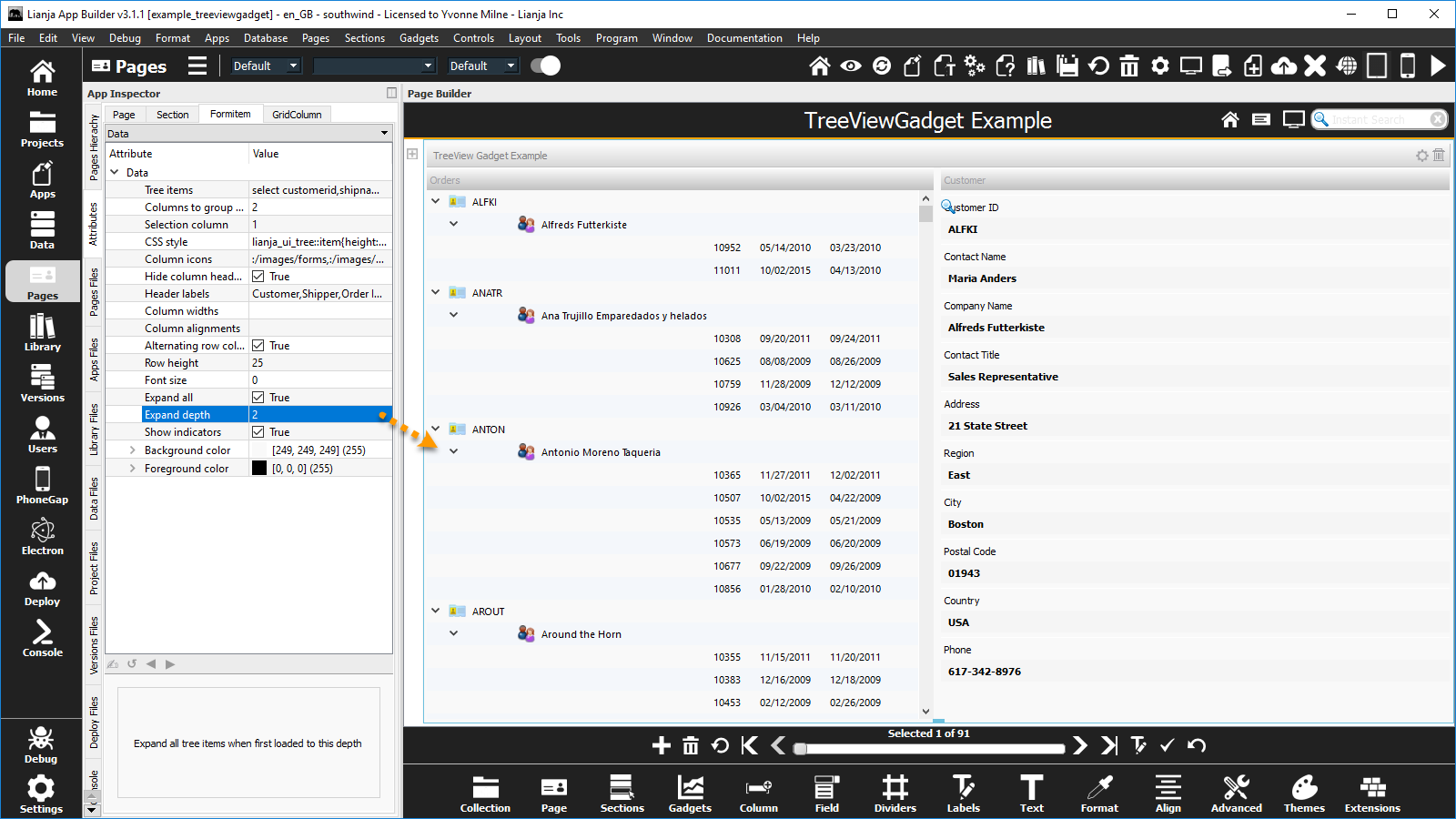
Here the Expand depth attribute has been set to 2.
Note: if the Expand depth attribute is left at its default value 0, all nodes are expanded when the Treeview Gadget is first loaded.
Expand depth
Expand all Tree items when first loaded to this depth.
- Supported by Treeview Gadget.
- Used in conjunction with Expand all (see above)
Filter
The filter expression that restricts the records that will be included in the grid.
- Supported by Grid Gadget.

Here rows in the Grid Gadget are filtered on the following logical expression:
discount > 0
Font
- See Fonts.
Font size
Font size for the Tree or CheckListView items.
- Supported by Checklistview Gadget and Treeview Gadget

Here the Font size attribute of the Checklistview Gadget has been increased from the default of 8 to 16.

Here the Font size attribute of the Treeview Gadget is at the default of 0 (corresponds to 8).
Foreground color
- See Colors.
Get data mapping
Custom data mapping when reading data. Specify this as an expression.
- Supported by Form Section Fields, Canvas Section Advanced Controls and Grid Columns.
- See Data Mapping.
Grid row height
Height of the grid rows.
- Supported by Grid Gadget.

Here the Grid row height attribute has been increased from its default value of 22 to 30.
GroupBox caption
An optional caption for the GroupBox containing the CheckListView items.
- Supported by Checklistview Gadget.

Here the GroupBox caption attribute has been set to the text 'GroupBox caption'.
Note that in the 'CheckListView App' (example_checklistview) demo App, the CSS style is set to 'border:0px;'.
This has been removed here to display the default groupbox border.
Header labels
A comma separated list of header labels.
- Supported by Treeview Gadget.
- Not currently implemented for Listview Gadget.

The Hide column headers attribute must be unchecked (False) to display the Header labels.
Here the Header labels attribute has been set to:
Customer,Shipper,Order ID,Date Ordered,Date Shipped
Help topic
Hide column headers
Hide the column headers (True | False).
- Supported by Treeview Gadget.

Here the Hide column headers attribute is unchecked (False), so the comma-separated string specified in the Header labels is displayed in the column headers.
Hide OK/Cancel Buttons
Hide the OK/Cancel buttons (True | False).
- Supported by Grid Gadget.

When a Grid Gadget is added, the Hide the OK/Cancel buttons attribute is unchecked (False) by default.

Check the Hide the OK/Cancel buttons attribute (True) to hide the OK and Cancel buttons in the action bar.
- See also Hide the action bar.
Hide search field indicator
- See Instant Search.
Hide the action bar
Hide the action bar (True | False).
- Supported by Grid Gadget.

When a Grid Gadget is added, the Hide the action bar attribute is unchecked (False) by default.

Check the Hide the action bar attribute (True) to hide the action bar.
- Pagination and Automatic Pagination require the action bar to be shown.
- See also Hide OK/Cancel Buttons.
HTML editor
Choose the HTML editor to use for this UI element (Desktop | Web | Mobile).
- Supported by WebView Section and WebView Gadget.
- This overrides the App-wide setting for desktop Apps.
- From v9.0.
Hyperlink
Icon image
The icon image for the control.
- Supported by Canvas Section Advanced Commmandbutton Controls.
Ignore after change
After data is edited (TextBox only), the 'Change' delegate only is called and it is assumed to update the field. This provides the ability to handle custom search logic in the App for this field (True | False)
- Supported by Form Section Fields and Canvas Section Advanced Controls.
Image
The static image to be displayed in this gadget.
- Supported by Image Gadget

Here the Image gadget's Image attribute is set to 'stars.jpg'.
The Stretch image attribute is checked (True) by default, so the image is resized to fit the gadget.
Inherit dictionary rules
Inherit the data dictionary rules (e.g. Choices will change when dictionary Choices is altered)
- Supported by Form and Canvas Sections. Section behavior is also determined by the Inherit dictionary rules App Setting (Section defaults).
- Supported by Form Section Fields and Canvas Section Advanced Controls.

Form Section Fields and Canvas Section Advanced Controls can 'inherit' the Data Dictionary rules. This populates the control's relevant attributes with the settings from the Data Dictionary.
By default, controls have the Inherit dictionary rules attribute set to True, but the containing Form and Canvas Sections have the attribute set to False.
To enable dictionary inheritance for all the controls in a Section, set the Section's attribute to True.

The attributes of the controls will be populated with the dictionary settings (save and reload the App).
Inherit dictionary rules can then be disabled for individual controls as required.
Remember, enabling Inherit dictionary rules for the control has no effect unless Inherit dictionary rules for the control's containing Section is enabled.
- See also Dictionary overrides.
Inherit dictionary caption
When Inherit dictionary rules is set to true at both section and formitem level, Inherit dictionary caption determines whether this also applies to the formitem caption. If Inherit dictionary caption is true, the formitem inherits the column's field caption, if false, the formitem can have a caption customized in the UI.
- Supported by Form Section Fields and Canvas Section Advanced Controls.
Input mask
- See Input Masks.
Input mask type
- See Input Masks.
List items
A list of items.
- Supported by Listview Gadget and Canvas Section Advanced OptionGroup Controls.

Here the List items is set to the comma separated text string shown below.
Note it includes icon file names prefixed with an '@'.
USA@:/images/cat_internet_sm,UK@:/images/home,Germany@:/images/cat_finance_sm

Here the List items is set to the SQL Select statement shown below.
select productname from products order by productname
Note: Canvas Section Advanced OptionGroup Controls do not support SQL Select statement based List items.
Maintain aspect ratio
Whether image will be scaled maintaining its aspect ratio.
- Supported by Image Gadget.
- Also supported by the Image UI Framework Class. Note: if enabling, set this property first, before setting the Picture property.
- From v5.4.
Mandatory input
Data must be entered in this field.
- Supported by Form Section Fields and Canvas Section Advanced Textbox Controls.

The Mandatory input attribute specifies that the field cannot be empty.
Attempting to save a record without entering non-empty data in a field with the Mandatory input attribute set returns an error message and the record is not saved.
Note: 0 is considered an empty numeric value.
Data Dictionary: Not Null
The Mandatory input attribute corresponds to the Not Null Column Constraint stored in the table's Data Dictionary.
This can be set in the Table Designer ('Create a Column' and 'Modify a Column' dialogs prior to v6.3) in the Data Workspace and Page Builder or specified in the CREATE TABLE and ALTER TABLE commands.
// Mandatory
ALTER TABLE "customers" MODIFY CONSTRAINT CUSTOMERID SET NOT NULL
// Not Mandatory
ALTER TABLE "customers" MODIFY CONSTRAINT CUSTOMERID SET NULL
- See Inherit dictionary rules above for enabling dictionary inheritance.
Maximum value
The maximum value for a ProgressBar or Slider.
- Supported by ProgressBar and Slider Canvas Section Advanced Controls.
Minimum value
The minimum value for a ProgressBar or Slider.
- Supported by ProgressBar and Slider Canvas Section Advanced Controls.
Orientation
The orientation for a ProgressBar or Slider (Horizontal|Vertical).
- Supported by ProgressBar and Slider Canvas Section Advanced Controls.
Pagination
Grid is always rendered using pagination (for large data sets) (True | False)
- Supported by Grid Gadget.
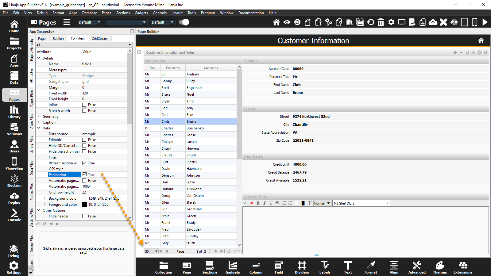
If the Pagination attribute is checked (True) - default is unchecked (False) - the grid rows are always displayed in pages, regardless of the number of records.
- See also Automatic pagination.
- The Hide the action bar attribute must be unchecked (False) for pagination.
Password input
Placeholder text
Readonly
- Applies to Grid Columns. For Form Section Fields and Canvas Section Advanced Controls, see Editable.
Recalculate
Refresh section when row changes
Refresh other fields in the section when row changes (True | False).
- Supported by Grid Gadget.

Here navigating rows in the Grid Gadget refreshes the other fields in the section from the southwind!order_details table.
Relate on change
Return tabs
Row height
Row height for the Tree or CheckListView items.
- Supported by Checklistview Gadget and Treeview Gadget

Here the Row height attribute of the Checklistview Gadget is set to the default: 25 (pixels).

Here the Row height attribute of the Treeview Gadget has been increased from the default of 18 to 25 (pixels).
Search field
- See Instant Search.
Search panel field
Selection column
The column to substitute into the Click/DblClick delegate. Use {} in the delegate where you want the text from this column to be placed.
- Supported by Treeview Gadget.

Here the Selection column is set to 1, so passes the select customerid to the DblClick delegate.
The Tree items attribute is set to:
select customerid,shipname,orderid,orderdate,shippeddate from orders order by customerid
The Double Click delegate is set to the following inline delegate:
?page:page1.section1?action=search&text={}||page:page1.section1?action=editmode
Set data mapping
Custom data mapping when writing data. Specify this as an expression.
- Supported by Form Section Fields, Canvas Section Advanced Controls and Grid Columns.
- See Data Mapping.
Show indicators
Show expand/collapse indicators in the tree (True | False).
- Supported by Treeview Gadget.
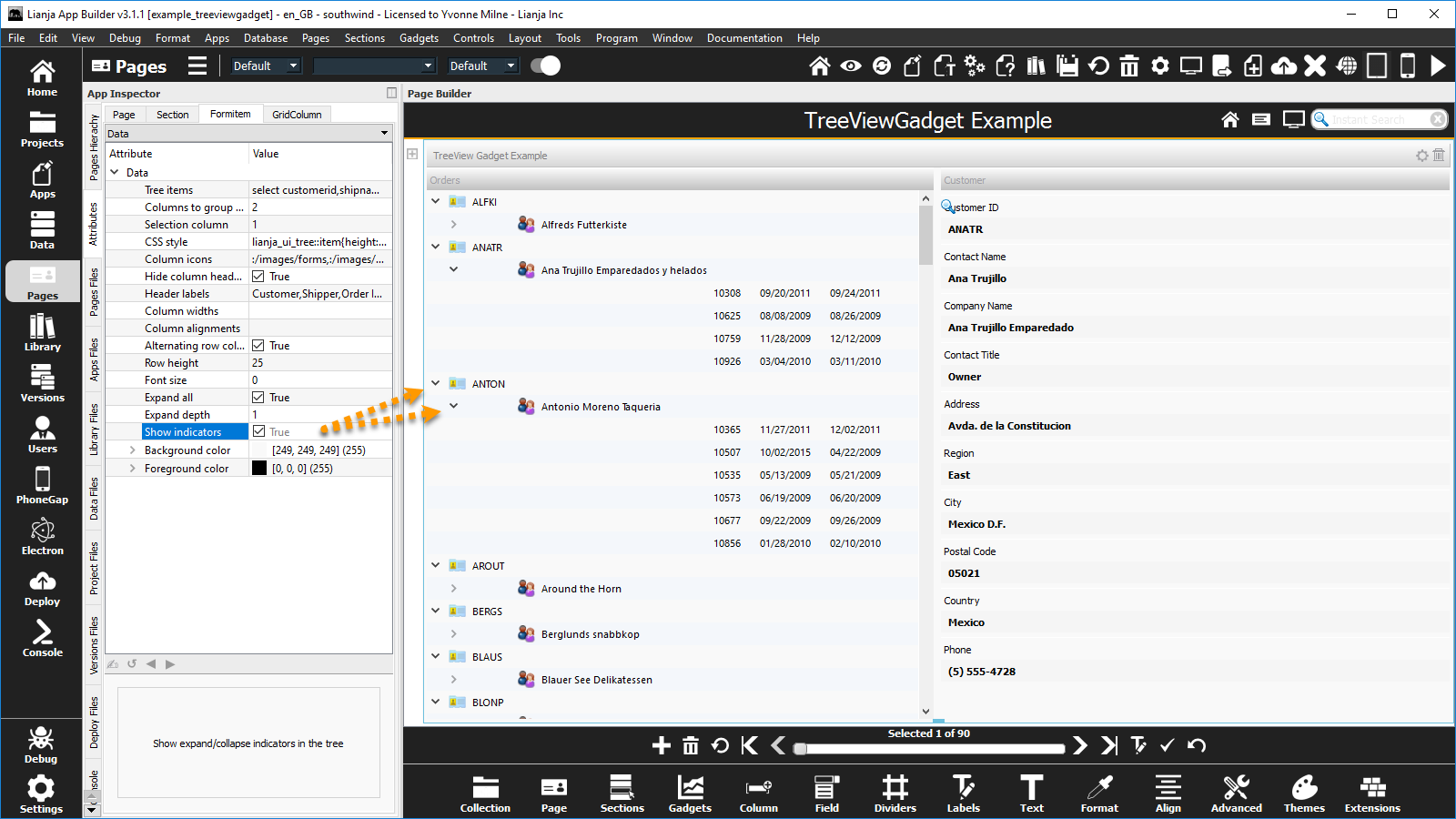
Here the Show indicators attribute is checked (True), to allow the nodes to be expanded and collapsed.
Stretch image
Stretch image (True | False).
- Supported by Image Gadget

Here the Stretch image attribute is unchecked (False).
See the same Image gadget with the Stretch image attribute checked (True) to resize the image to fit the gadget here.

This is the same Image gadget with the Stretch image attribute unchecked (False), but with the Fixed width and Fixed height attributes defined to fit the image.
StringList
A comma-separated list of strings that are available in the StringList Editor. This can be specified as a SQL Select statement or a {macro()} procedure call that generate the list dynamically.
- Supported by Form Section Fields, Grid Columns and Canvas Section Advanced TextBox Controls.
- The StringList Editor is available for editing varchar/memo fields when the Cell editor type is specified as 'Stringlist'.
Tab order
The tab order for this field.
- Supported by Form Section Fields and Canvas Section Advanced Controls.
Text alignment
Data text alignment.
- Supported by Form Section Fields, Canvas Section Advanced Controls and Grid Columns.
- See Formitem Appearance: Text alignment.
Tick interval
The tick interval for a slider.
- Supported by Slider Canvas Section Advanced Control.
Tick position
The tick position for a slider (None|Both Sides|Above|Below|Left|Right).
- Supported by Slider Canvas Section Advanced Control.
Tooltip
A tooltip to display when the mouse hovers over the data.
- Supported by Form Section Fields and Canvas Section Advanced Controls.
- See Help Attributes: Tooltips.
Tree items
A list of items to display in the Tree.
- Supported by Treeview Gadget.

Here the Tree items is set to the SQL Select statement shown below.
The Hide column headers attribute has been unchecked (False) to show the header text defined in the Header labels.
select customerid,shipname,orderid,orderdate,shippeddate from orders order by customerid
URL
The URL for this control, gadget or section.
- Supported by Chart and Webview Canvas Section Advanced Controls, Google Bar Chart Gadget, Google Map Gadget, Google Pie Chart Gadget, Webview Gadget, Webview Section
User selectable search field
The user can select this as the search field interactively by clicking on it.
- Supported by Form Section Fields and Canvas Section Advanced Controls.
- See Instant Search.
Validation
Data input validation expression.
- Supported by Form Section Fields, Canvas Section Advanced Controls and Grid Columns.
Validation error message
Error message to display if data input validation fails.
- Supported by Grid Columns.
- For Form Section Fields and Canvas Section Advanced Controls, see Error message.
Notes on Client Support
| Attribute | Notes |
|---|---|
| ActiveX control | Supported on the Windows Desktop client only. |
| Anchor | |
| Allow multiple selections | Setting Allow multiple selections to false is recognized on the Desktop client only. On the Web/Mobile client, the checklist is displayed and operates as a series of checkboxes. |
| Alternating row colors | The Treeview Gadget is supported on the Desktop client only. |
| Automatic pagination | The Grid Gadget is currently supported on the Desktop client only. |
| Automatic pagination size | The Grid Gadget is currently supported on the Desktop client only. |
| Autosuggestions | |
| Autosuggestion headers | |
| Autosuggestion column to search | |
| Background color | |
| Choices | |
| Column alignments | The Listview and Treeview Gadgets are currently supported on the Desktop client only. |
| Column icons | The Treeview Gadget is currently supported on the Desktop client only. |
| Column widths | The Listview and Treeview Gadgets are currently supported on the Desktop client only. |
| Columns to group by | The Treeview Gadget is currently supported on the Desktop client only. |
| Context Menu | Currently supported on the Desktop client only. |
| Custom attributes | |
| Custom UI component | |
| Data size | |
| Data source | |
| Default | |
| Default search field | |
| Dialog button | |
| Dialog button delegate | |
| Dialog button menu | |
| Dialog button menu delegate | |
| Editable | |
| Error message | |
| Expand all | The Treeview Gadget is currently supported on the Desktop client only. |
| Expand depth | The Treeview Gadget is currently supported on the Desktop client only. |
| Filter | The Grid Gadget is currently supported on the Desktop client only. |
| Font | |
| Font size | The Font size CheckListView Gadget attribute is supported on the Desktop client only. The Treeview Gadget is currently supported on the Desktop client only. |
| Foreground color | |
| Get data mapping | |
| Grid row height | The Grid Gadget is currently supported on the Desktop client only. |
| GroupBox caption | Currently supported on the Desktop client only. |
| Header labels | The Treeview Gadget is currently supported on the Desktop client only. |
| Help topic | Currently supported on the Desktop client only. |
| Hide column headers | The Treeview Gadget is currently supported on the Desktop client only. |
| Hide OK/Cancel Buttons | The Grid Gadget is currently supported on the Desktop client only. |
| Hide search field indicator | |
| Hide the action bar | The Grid Gadget is currently supported on the Desktop client only. |
| Hyperlink | |
| Ignore after change | |
| Image | Static image (filename) Image Gadgets are currently supported on the Desktop client only. Data bound Image Gadgets are supported on all clients. |
| Inherit dictionary rules | |
| Inherit dictionary caption | |
| Input mask | |
| Input mask type | |
| List items | The Listview Gadget is currently supported on the Desktop client only. |
| Mandatory input | |
| Maximum value | |
| Minimum value | |
| Orientation | |
| Pagination | The Grid Gadget is currently supported on the Desktop client only. |
| Password input | |
| Placeholder text | |
| Readonly | |
| Recalculate | |
| Refresh section when row changes | The Grid Gadget is currently supported on the Desktop client only. |
| Relate on change | |
| Return tabs | |
| Row height | The Row height CheckListView Gadget attribute is supported on the Desktop client only. The Treeview Gadget is currently supported on the Desktop client only. |
| Search field | |
| Search panel field | |
| Selection column | The Treeview Gadget is currently supported on the Desktop client only. |
| Set data mapping | |
| Show indicators | The Treeview Gadget is currently supported on the Desktop client only. |
| Stretch image | Setting Stretch image to false is recognized on the Desktop client only. On the Web/Mobile client, the (data bound) image is always shown resized to fit the Image Gadget. |
| Tab order | |
| Text alignment | |
| Tick interval | |
| Tick position | |
| Tooltip | Currently supported on the Desktop client only. |
| Tree items | The Treeview Gadget is currently supported on the Desktop client only. |
| URL | |
| User selectable search field | |
| Validation | |
| Validation error message |