Difference between revisions of "Data Attributes"
Yvonne.milne (Talk | contribs) |
Yvonne.milne (Talk | contribs) |
||
| Line 40: | Line 40: | ||
* See [[Choices]]. | * See [[Choices]]. | ||
| + | |||
| + | ==Column alignments== | ||
| + | A comma separated list of column alignments, e.g.left,right,center. | ||
| + | * Supported by [[Listview Gadget Attributes|Listview Gadget]]. | ||
| + | |||
| + | ==Column widths== | ||
| + | A comma separated list of column widths. | ||
| + | * Supported by [[Listview Gadget Attributes|Listview Gadget]]. | ||
==CommandButton Caption== | ==CommandButton Caption== | ||
| Line 163: | Line 171: | ||
An optional caption for the GroupBox containing the CheckListView items. | An optional caption for the GroupBox containing the CheckListView items. | ||
* Supported by [[Checklistview Gadget Attributes|Checklistview Gadget]]. | * Supported by [[Checklistview Gadget Attributes|Checklistview Gadget]]. | ||
| + | |||
| + | ==Header labels== | ||
| + | A comma separated list of header labels. | ||
| + | * Supported by [[Listview Gadget Attributes|Listview Gadget]]. | ||
==Help topic== | ==Help topic== | ||
Revision as of 09:59, 23 May 2016
Under Construction
Contents
- 1 See Also
- 2 Anchor
- 3 Allow multiple selections
- 4 Automatic pagination
- 5 Automatic pagination size
- 6 Autosuggestions
- 7 Autosuggestion headers
- 8 Autosuggestion column to search
- 9 Background color
- 10 Choices
- 11 Column alignments
- 12 Column widths
- 13 CommandButton Caption
- 14 CommandButton Icon image
- 15 Context Menu
- 16 Custom attributes
- 17 Custom UI component
- 18 Data size
- 19 Data source
- 20 Default
- 21 Default search field
- 22 Dialog button
- 23 Dialog button delegate
- 24 Editable
- 25 Error message
- 26 Filter
- 27 Font
- 28 Font size
- 29 Foreground color
- 30 Get data mapping
- 31 Grid row height
- 32 GroupBox caption
- 33 Header labels
- 34 Help topic
- 35 Hide actionbar
- 36 Hide OK/Cancel Buttons
- 37 Hide search field indicator
- 38 Hyperlink
- 39 Image
- 40 Inherit dictionary rules
- 41 Input mask
- 42 Input mask type
- 43 Mandatory input
- 44 Pagination
- 45 Password input
- 46 Placeholder text
- 47 Readonly
- 48 Recalculate
- 49 Relate on change
- 50 Render as a CommandButton
- 51 Return tabs
- 52 Row height
- 53 Search field
- 54 Search panel field
- 55 Set data mapping
- 56 Stretch image
- 57 Tab order
- 58 Text alignment
- 59 Tooltip
- 60 URL
- 61 User selectable search field
- 62 Validation
- 63 Validation error message
- 64 Notes on Client Support
See Also
Autosuggestions, Choices, Colors, Data Mapping, Fonts, Formitem Appearance, Help Attributes, Input Masks, Instant Search
Anchor
Allow multiple selections
Allow multiple selections (True | False)
- Supported by Checklistview Gadget.
Automatic pagination
Grid is rendered using pagination if the number of records exceeds below amount (True | False).
- Supported by Grid Gadget.
Automatic pagination size
Grid is rendered using pagination if Automatic pagination is true and the number of records exceeds this amount.
- Supported by Grid Gadget.
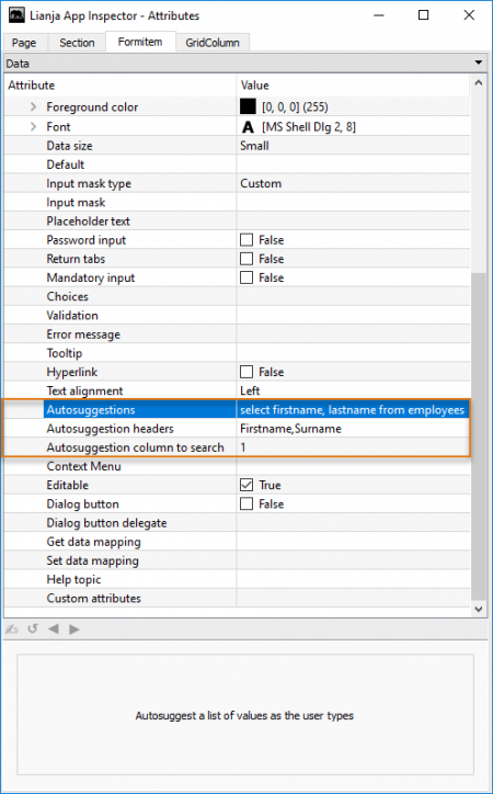
Autosuggestions
- See Autosuggestions.
Autosuggestion headers
- See Autosuggestions.
Autosuggestion column to search
- See Autosuggestions.
Background color
- See Colors.
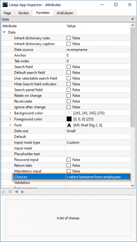
Choices
- See Choices.
Column alignments
A comma separated list of column alignments, e.g.left,right,center.
- Supported by Listview Gadget.
Column widths
A comma separated list of column widths.
- Supported by Listview Gadget.
CommandButton Caption
CommandButton Icon image
Context Menu
Custom attributes
Custom UI component
Specify a custom UI component from the UI Page Library to embed into this gadget.
- Supported by Component Gadget.
Data size
Data source
The field or memory variable the control is bound to.
For a field, this should be in the format tablename.fieldname:
customers.customerid
For memory variables, use the 'm.' prefix:
m.cMemvar1
- The Data source for a Grid Gadget should be specified as a table name or a SQL SELECT statement.
Default
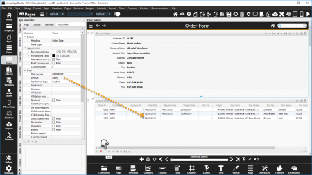
The Default attribute is available in Form Section Fields, Canvas Section Advanced Controls and Grid Columns.
It specifies the default value for the field when a new record is added or the initial value of a memory variable data source.
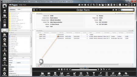
Here the orders.orderdate is populated with the system date when a new record is added.
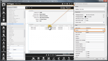
Double-click the header of a column in a Grid Section to access the Column Attributes.
Here again the orders.orderdate is populated with the system date when a new record is added.
A Default has also been set on the orders.orderid field using the SEQNO() function to generate a unique sequential number.
The orders.customerid field automatically inherits the current customers.customerid value due to the Relationship Builder relation set between the customers Form Section and the orders Grid Section (key: customerid).
Data Dictionary: Default
The Default attribute corresponds to the Default Column Constraint stored in the table's Data Dictionary.
The Default Column Constraint can be set in the Create a Column and Modify a Column dialogs in the Data Workspace and Page Builder.
It can also be specified in the CREATE TABLE and ALTER TABLE commands.
// Mandatory
ALTER TABLE "orders" MODIFY CONSTRAINT ORDERDATE SET DEFAULT date()
- See Inherit dictionary rules for enabling dictionary inheritance.
Default search field
- See Instant Search.
Dialog button
Dialog button delegate
Editable
Error message
Filter
The filter expression that restricts the records that will be included in the grid.
- Supported by Grid Gadget.
Font
- See Fonts.
Font size
Font size for the Tree or CheckListView items.
- Supported by Checklistview Gadget and Treeview Gadget
Foreground color
- See Colors.
Get data mapping
- See Data Mapping.
Grid row height
Height of the grid rows.
- Supported by Grid Gadget.
GroupBox caption
An optional caption for the GroupBox containing the CheckListView items.
- Supported by Checklistview Gadget.
Header labels
A comma separated list of header labels.
- Supported by Listview Gadget.
Help topic
Hide actionbar
Hide actionbar buttons (True | False).
- Supported by Grid Gadget.
Hide OK/Cancel Buttons
Hide the OK/Cancel buttons (True | False).
- Supported by Grid Gadget.
Hide search field indicator
- See Instant Search.
Hyperlink
Image
The static image to be displayed in this gadget.
- Supported by Image Gadget
Inherit dictionary rules
Form Section and Canvas Section Advanced controls can 'inherit' the Data Dictionary rules. This populates the control's relevant attributes with the settings from the Data Dictionary.
By default, controls have the Inherit dictionary rules attribute set to True, but the containing Form and Canvas Sections have the attribute set to False.
To enable dictionary inheritance for all the controls in a Section, set the Section's attribute to True.
The attributes of the controls will be populated with the dictionary settings (save and reload the App).
Inherit dictionary rules can then be disabled for individual controls as required.
Remember, enabling Inherit dictionary rules for the control has no effect unless Inherit dictionary rules for the control's containing Section is enabled.
Input mask
- See Input Masks.
Input mask type
- See Input Masks.
Mandatory input
The Mandatory input attribute is available in Form Section Fields and Canvas Section Advanced Controls.
It specifies that the field cannot be empty.
Attempting to save a record without entering non-empty data in a field with the Mandatory input attribute set returns an error message and the record is not saved.
Note: 0 is considered an empty numeric value.
Data Dictionary: Not Null
The Mandatory input attribute corresponds to the Not Null Column Constraint stored in the table's Data Dictionary.
The Mandatory / Not Null Column Constraint can be set in the Create a Column and Modify a Column dialogs in the Data Workspace and Page Builder.
It can also be specified in the CREATE TABLE and ALTER TABLE commands.
// Mandatory
ALTER TABLE "customers" MODIFY CONSTRAINT CUSTOMERID SET NOT NULL
// Not Mandatory
ALTER TABLE "customers" MODIFY CONSTRAINT CUSTOMERID SET NULL
- See Inherit dictionary rules above for enabling dictionary inheritance.
Pagination
Grid is always rendered using pagination (for large data sets)(True | False)
- Supported by Grid Gadget.
Password input
Placeholder text
Readonly
- Applies to Grid Columns. For Form Section Fields and Canvas Section Advanced Controls, see Editable.
Recalculate
Relate on change
Render as a CommandButton
Return tabs
Row height
Row height for the Tree or CheckListView items.
- Supported by Checklistview Gadget and Treeview Gadget
Search field
- See Instant Search.
Search panel field
Set data mapping
- See Data Mapping.
Stretch image
Stretch image (True | False).
- Supported by Image Gadget
Tab order
Text alignment
Tooltip
URL
The URL for this gadget or section.
User selectable search field
- See Instant Search.
Validation
Validation error message
- Applies to Grid Columns. For Form Section Fields and Canvas Section Advanced Controls, see Error message.
Notes on Client Support
| Attribute | Notes |
|---|---|
| Context Menu | Currently supported on the Desktop client only. |
| Help topic | Currently supported on the Desktop client only. |
| Tooltip | Currently supported on the Desktop client only. |
