Calendar Options
Under Construction
Contents
- 1 See Also
- 2 Overview
- 3 Lianja Web UI Calendar Demo
- 4 Calendar Table
- 5 Using a Calendar Section
- 6 Calendar Section Attributes
- 6.1 Default view
- 6.2 Event type column
- 6.3 Event type choices
- 6.4 Event title column
- 6.5 Event start column
- 6.6 Event end column
- 6.7 Event repeat column
- 6.8 Event allday column
- 6.9 Event key column
- 6.10 Event type value
- 6.11 Autosize
- 6.12 Other options
- 6.13 Click delegate
- 6.14 Dynamic day backcolor
- 6.15 Dynamic event backcolor
- 6.16 Dynamic event forecolor
- 6.17 Custom delegate library
- 6.18 Filter
- 7 Notes on Client Support
See Also
CommentsView Section Attributes
Overview
Calendar Sections provide a calendar interface to allow for the creation, display, update and deletion of appointments and other time planner events.
Lianja Web UI Calendar Demo
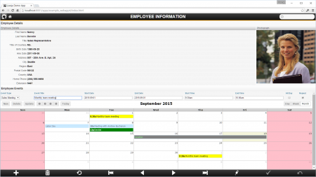
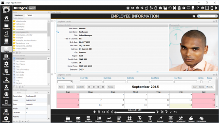
The 'Lianja Web UI Calendar Demo' (example_webapp4) is included in the Lianja App Builder distribution to demonstrate the use of a Calendar Section.
Calendar Sections are also included in 'Lianja Mobile App Demo' (lianja_mobiledemo) and 'Lianja Web UI Page Center Demo' (example_pagecenter").
This single Page App has a main Form Section for the southwind!employees table and a related Calendar Section for that employee's appointments.
Calendar Table
The example_webapp4 App uses the southwind!employees_calendar table. Its structure is listed below. Your table can have different field names and additional fields, but the data type of the fields used by the Calendar Section should match those shown here.
| Field | Field Name | Type | Width | Notes |
|---|---|---|---|---|
| 1 | LASTNAME | Character | 20 | Related key field. A numeric related field can also be used. Not required if no related parent Section. |
| 2 | EVENTTITLE | Character | 80 | The title for the event that will be displayed in the calendar. |
| 3 | EVENTSTART | DateTime | 8 | The start date and time of the event. |
| 4 | EVENTEND | DateTime | 8 | The end date and time of the event. |
| 5 | EVENTREPEAT | Integer | 11 | Non 0 value flags the event as a repeating event. Repeating events are repeated monthly to the end of the event year. |
| 6 | EVENTALLDAY | Logical | 1 | Whether the event lasts all day. |
| 7 | EVENTTYPE | Character | 40 | The category type for the event. |
Using a Calendar Section
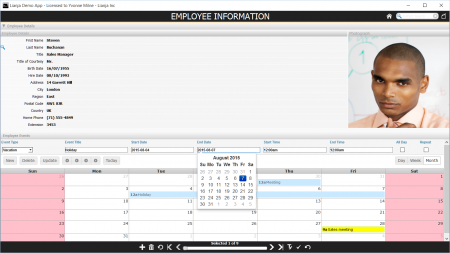
The controls at the top of the Calendar Section are used to enter details about an event. Clicking on an event in the main calendar loads the event's details into the controls.
| Control | Description |
|---|---|
| Event Type | Combobox with event types. Displayed when the 'Event type choices' Section attribute is defined. |
| Event Title | Textbox to enter the title for the event. |
| Start Date | Date picker to select the start date for the event. |
| End Date | Date picker to select the end date for the event. |
| Start Time | Time picker to select the start time for the event. |
| End Time | Time picker to select the end time for the event. |
| All Day | Checkbox to flag whether the event lasts all day. |
| Repeat | Checkbox to flag whether the event is a repeating event. |
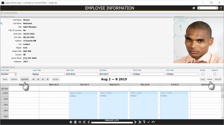
The buttons below the controls, handle data and display operations.
| Button | Description |
|---|---|
| New | Populates the controls with the current date and default times. |
| Delete | Deletes the event currently displayed in the controls. |
| Update | Saves the event currently displayed in the controls. |
| < | Calendar display goes back one year. |
| < | Calendar display goes back one month, one week or one day depending on the current view (Month, Week, Day). |
| > | Calendar display goes forward one month, one week or one day depending on the current view (Month, Week, Day). |
| > | Calendar display goes forward one year. |
| Today | Calendar display goes to Today. |
| Day | Calendar display goes to Day view. |
| Week | Calendar display goes to Week view. |
| Month | Calendar display goes to Month view. |
Calendar Section Attributes
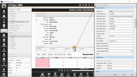
Double-click the Section header or click the cog icon to access the Section Attributes.
The Details section at the top of the attributes dialog holds the specification of the database and table.
The Calendar Section options are described here.
Default view
The Default view - the starting view for the calendar - can be 'Month', 'Week' or 'Day'.
Event type column
Required. The name of a character column. It corresponds to the 'Event Type' control. The control is a free-entry textbox unless the Event type choices is populated, in which case it is a combobox and a choice must be made from the list. The calendar can also be filtered by the event type, by specifying a valid event type in the Event type value attribute.
eventtype
Event type choices
Optional. These are choices for the Event type column and should be specified as a list of comma-separated character strings postfixed with optional background and foreground colors in the format :background:foreground. The colors are character strings and can be any of the standard web colors e.g. "pink", "lightgreen" or an HTML/CSS style color code e.g. "#cfcfcf". Events will be displayed in the calendar body using their event type's colors.
Note that if the list starts with a comma, a blank event type will be displayed until the combobox is expanded.
,Sales Meeting:yellow:black,Meeting,Vacation,Sick:red:yellow,Appointment:green:white,Other
Event title column
Event start column
Event end column
Event repeat column
Event allday column
Event key column
Event type value
Autosize
Other options
Click delegate
Dynamic day backcolor
Dynamic event backcolor
Dynamic event forecolor
Custom delegate library
Filter
Notes on Client Support
| Attribute | Notes |
|---|---|
| Default view | The default view to be displayed (Month | Week | Day) |
| Event type column | The (character) event type column from the table for the events in the calendar. Defaults to 'eventtype'. |
| Event type choices | The event type choices for the events in the calendar. This can be a comma separated list or a SQL statement. |
| Event title column | The (character) event title column from the table. Defaults to 'eventtitle'. |
| Event start column | The (datetime) event start column from the table. Defaults to 'eventstart'. |
| Event end column | The (datetime) event end column from the table. Defaults to 'eventend'. |
| Event repeat column | The (int) event repeating flag column from the table. Defaults to 'eventrepeat'. |
| Event allday column | The (logical) event allday flag column from the table. Defaults to 'eventallday'. |
| Event key column | The key expression for events in the calendar. Defaults to 'eventkey'. |
| Event type value | The event type for this calendar, e.g. meeting, vacation, appointment. Calendar contents will be filtered on this. |
| Autosize | Autosize the calendar into the viewport (True | False) |
| Other options | Other calendar options |
| Click delegate | Delegate to call when a calendar event is clicked |
| Dynamic day backcolor | Delegate to return the background colors and dates. You should return this as a comma separated list. The delegate is called with one parameter: 'dates' or 'colors'. The currently selected cursor contains the selected records. |
| Dynamic event backcolor | Delegate to return the background color of the event for the specified event type, which is passed as a parameter |
| Dynamic event forecolor | Delegate to return the foreground color of the event for the specified event type, which is passed as a parameter |
| Custom delegate library | Custom library containing the day and event dynamic color delegates |
| Filter | The filter expression that restricts which events will be included in the calendar |
