Difference between revisions of "BROWSE"
Yvonne.milne (Talk | contribs) |
Barrymavin (Talk | contribs) (→Description) |
||
| (29 intermediate revisions by 3 users not shown) | |||
| Line 1: | Line 1: | ||
| − | |||
| − | |||
==Purpose== | ==Purpose== | ||
Data grid | Data grid | ||
| Line 7: | Line 5: | ||
BROWSE | BROWSE | ||
| − | [ | + | [TABLE <tablename>] |
| − | + | ||
| − | + | ||
| − | + | ||
| − | + | ||
[FIELDS <field list>] | [FIELDS <field list>] | ||
| Line 17: | Line 11: | ||
[FOR <expL1>] | [FOR <expL1>] | ||
| − | [ | + | [NOACTIONBAR] |
| − | + | ||
| − | + | ||
| − | + | ||
| − | + | ||
| − | + | ||
| − | + | ||
[NOAPPEND] | [NOAPPEND] | ||
| − | |||
| − | |||
[NODELETE] | [NODELETE] | ||
[NOEDIT | NOMODIFY] | [NOEDIT | NOMODIFY] | ||
| − | |||
| − | |||
| − | |||
| − | |||
| − | |||
| − | |||
| − | |||
| − | |||
| − | |||
| − | |||
[STYLE <expC1>] | [STYLE <expC1>] | ||
| − | |||
| − | |||
[TITLE <expC2>] | [TITLE <expC2>] | ||
| − | [ | + | [CAPTION <expC2>] |
| − | [ | + | [KEY <expr>] |
| − | [ | + | [SPLITBAR] |
| − | [ | + | [PROPERTIES "name=value;name2=value;etc"] |
==See Also== | ==See Also== | ||
| − | [[ | + | [[SQL_SELECT|SELECT]], [[SELECT]], [[SELECT()]], [[SET DELETED]], [[USE]] |
==Description== | ==Description== | ||
| − | The BROWSE user-interface tool displays the records from the currently active table in a grid window. | + | The BROWSE user-interface tool displays the records from the currently active table or (since 7.0) the TABLE specified in a grid window. |
| − | {| class="wikitable" | + | {| class="wikitable" width="100%" |
| − | !Keyword||Description | + | !width="35%"|Keyword||Description |
| − | + | ||
| − | + | ||
| − | + | ||
| − | + | ||
|- | |- | ||
| − | |FIELDS <field list>||The comma-separated <field list> enables you to: specify the order in which the specified fields display and incorporate special handling options for each field. Please see below for these options. | + | |valign="top"|FIELDS <field list>||The comma-separated <field list> enables you to: specify the order in which the specified fields display and incorporate special handling options for each field. Please see below for these options. |
|- | |- | ||
|} | |} | ||
| − | <field> [:R | + | <field> [:R] |
| − | + | ||
| − | + | ||
[:C = <expC> | <@alias>,<expC>] | [:C = <expC> | <@alias>,<expC>] | ||
[:V = <expL> [F:] [:E = <expC>] | [:V = <expL> [F:] [:E = <expC>] | ||
| − | |||
| − | |||
[:H = <expC>] | [:H = <expC>] | ||
| − | [: | + | [:P = <expC>] |
Each field in the <field list> may be followed by special handling options. A delimiter precedes each option, either : or . | Each field in the <field list> may be followed by special handling options. A delimiter precedes each option, either : or . | ||
| − | {| class="wikitable" | + | {| class="wikitable" width="100%" |
| − | !Option||Description | + | !width="35%"|Option||Description |
|- | |- | ||
| − | |:R||Fields are read-only, so may be viewed, but not edited. | + | |valign="top"|:R||Fields are read-only, so may be viewed, but not edited. |
|- | |- | ||
| − | |:< | + | |valign="top"|:C = <expC> | <@alias>,<expC>||The Choicelist option associates a pulldown choicelist with a field. The choicelist may be either 'static': a string of comma-separated choices or 'dynamic': @alias,string or a SQL Select query. |
|- | |- | ||
| − | | | + | |valign="top"|:V = <expL> [:E = <expC>] [:F]||Validates the field value based on the evaluation of <expL>. If <expL> returns true (.T.), the field value is considered valid. If <expL> returns false (.F.), the value is rejected and an error message displayed. If the :E option is specified, <expC> replaces the default error message. The validation is only enforced when the field value changes unless the :F option is used. |
| − | + | ||
| − | + | ||
| − | + | ||
| − | |:V = <expL> [:E = <expC>] [:F]||Validates the field value based on the evaluation of <expL>. If <expL> returns true (.T.), the field value is considered valid. If <expL> returns false (.F.), the value is rejected and an error message displayed. If the :E option is specified, <expC> replaces the default error message. The validation is only enforced when the field value changes unless the :F option is used. | + | |
This option does not work on memo fields. | This option does not work on memo fields. | ||
|- | |- | ||
| − | |:H = <expC>||Replaces the default field headings, field name or description, with the character expression <expC> | + | |valign="top"|:H = <expC>||Replaces the default field headings, field name or description, with the character expression <expC>. |
| − | + | ||
| − | + | ||
| − | + | ||
| − | + | ||
|- | |- | ||
| − | |: | + | |valign="top"|:P = <expC>||Sets the picture format to <expC>. For more information on picture template characters and picture formatting, see @...GET. |
|- | |- | ||
|} | |} | ||
| − | |||
| − | {| class="wikitable" | + | {| class="wikitable" width="100%" |
| − | !Keyword||Description | + | !width="35%"|Keyword||Description |
|- | |- | ||
| − | | | + | |valign="top"|TABLE <tablename>||Opens the specified table if its not yet open. This may be databasename!tablename. |
|- | |- | ||
| − | | | + | |valign="top"|FOR <condition>||Restricts the BROWSE to those records matching the <condition>. |
|- | |- | ||
| − | | | + | |valign="top"|NOACTIONBAR||Hides the actionbar at the bottom of the grid. |
|- | |- | ||
| − | | | + | |valign="top"|NOAPPEND||Disables the appending of new records into the table. |
|- | |- | ||
| − | | | + | |valign="top"|NODELETE||valign=top|Disables record deletion. |
|- | |- | ||
| − | | | + | |valign="top"|NOEDIT | NOMODIFY||Disables record editing, providing read-only access to the table. |
|- | |- | ||
| − | | | + | |valign="top"|STYLE <expC1>||Specify the CSS style, <expC1>, to be used. |
|- | |- | ||
| − | | | + | |valign="top"|TITLE <expC2>||Specify a title, <expC2> to be displayed. |
|- | |- | ||
| − | | | + | |valign="top"|CAPTION <expC3>||valign=top|The selection caption to be displayed. Use this for picklists |
|- | |- | ||
| − | | | + | |valign="top"|SPLITBAR||valign=top|Enable split screen editing. |
|- | |- | ||
| − | | | + | |valign="top"|KEY <expr>||valign=top|position (seek) to the specified key in the grid. |
|- | |- | ||
| − | | | + | |valign="top"|PROPERTIES <expr>||valign=top|Apply the specified properties to the grid e.g PROPERTIES "showsplitedit=true;splitmemolist=notes:caption;splitmemoeditors=html;splitimagelist=photo:caption". <br>The :caption is optional but can be used to provide a more meaningful Tab caption. |
| − | + | ||
| − | + | ||
| − | + | ||
| − | | | + | |
| − | | | + | |
| − | + | ||
| − | + | ||
| − | + | ||
| − | + | ||
| − | + | ||
| − | + | ||
| − | + | ||
| − | + | ||
| − | + | ||
| − | + | ||
| − | + | ||
|- | |- | ||
|} | |} | ||
| Line 165: | Line 106: | ||
open database southwind | open database southwind | ||
use example | use example | ||
| − | browse | + | browse fields title:c="Mr,Mrs,Ms",; |
| − | + | last_name:r,; | |
| − | + | first_name | |
| + | |||
| + | // Style keyword | ||
| + | open database southwind | ||
| + | use example | ||
| + | browse noactionbar ; | ||
| + | style "* { selection-color:yellow; ; | ||
| + | selection-background-color:black; ; | ||
| + | gridline-color:green; ; | ||
| + | background:black;color:yellow; ; | ||
| + | } ; | ||
| + | QTableView::item { background:lightgreen; } ; | ||
| + | QHeaderView::section { background-color:green;color:white;border:0px; } " | ||
</code> | </code> | ||
| + | |||
| + | ==Browse Splitbar== | ||
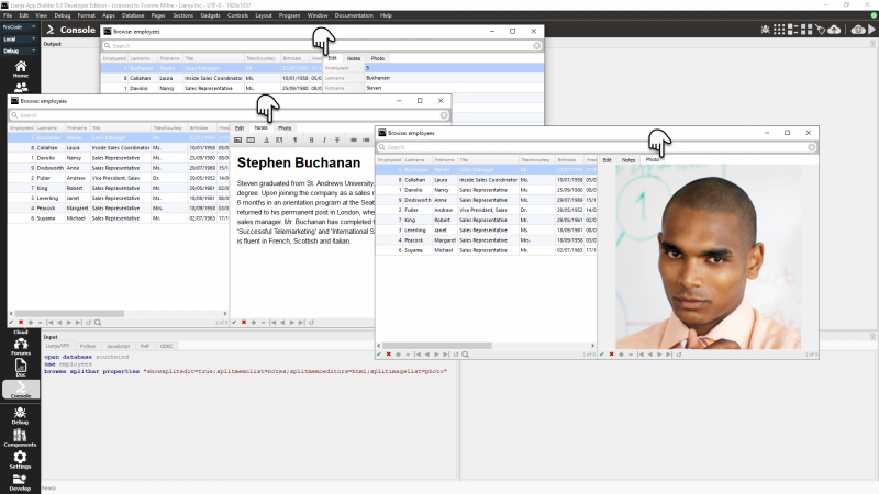
| + | The '''splitbar''' keyword displays a split grid. The '''properties''' specify the memo/varchar and or image/blob column(s) to be displayed, here the employees memo column 'notes' and image column 'photo': | ||
| + | |||
| + | <pre>splitmemolist=notes;splitimagelist=photo</pre> | ||
| + | |||
| + | The memo editor type can also be specified: 'html' or 'text': | ||
| + | |||
| + | <pre>splitmemoeditors=html</pre> | ||
| + | |||
| + | [[{{ns:file}}:browseSplitbar.png|800px|left|border|link={{filepath:browseSplitbar.png}}|Browse Splitbar]] | ||
| + | <br clear=all> | ||
| + | |||
| + | See also: [[Split Grid Sections]] | ||
| + | |||
| + | ==Query Builder== | ||
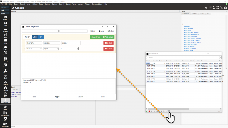
| + | From Lianja v6.3, the [[QueryBuilder]] is supported in BROWSE. Just click the icon in the actionbar to open the [[QueryBuilder]]. | ||
| + | |||
| + | [[{{ns:file}}:browse_querybuilder.png|800px|left|border|link={{filepath:browse_querybuilder.png}}|Browse: Query Builder]] | ||
| + | <br clear=all> | ||
| + | |||
| + | ==Search Bar== | ||
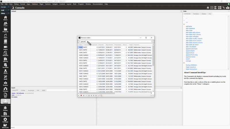
| + | From Lianja v6.3, a Search Bar is supported in BROWSE. This searches across all columns. Type a value, then press Return to search. Pressing the down arrow will focus onto the grid. Once you choose a record you can press Return/Enter to select it. The _result variable will contain the record number of the selected record and it will be active in the cursor that you are browsing. | ||
| + | |||
| + | This low-code functionality can be used effectively for picklists from dialog button delegates or custom query delegates. | ||
| + | |||
| + | [[{{ns:file}}:browse_searchbar.png|800px|left|border|link={{filepath:browse_searchbar.png}}|Browse: Search Bar]] | ||
| + | <br clear=all> | ||
| + | |||
| + | The same [[Grid_Appearance#Search_bar_visible|Search Bar]] functionality is also available in [[Grid Section Attributes|Grid Sections]] and the [[:Category:Data_Workspace|Data Editor in the Data Workspace]] from v6.3. | ||
[[Category:Documentation]] | [[Category:Documentation]] | ||
[[Category:Commands]] | [[Category:Commands]] | ||
| − | [[Category: | + | [[Category:NoSQL Commands]] |
| − | [[Category: | + | [[Category:Lianja v6.3]] |
Latest revision as of 23:54, 23 March 2024
Contents
Purpose
Data grid
Syntax
BROWSE
[TABLE <tablename>]
[FIELDS <field list>]
[FOR <expL1>]
[NOACTIONBAR]
[NOAPPEND]
[NODELETE]
[NOEDIT | NOMODIFY]
[STYLE <expC1>]
[TITLE <expC2>]
[CAPTION <expC2>]
[KEY <expr>]
[SPLITBAR]
[PROPERTIES "name=value;name2=value;etc"]
See Also
SELECT, SELECT, SELECT(), SET DELETED, USE
Description
The BROWSE user-interface tool displays the records from the currently active table or (since 7.0) the TABLE specified in a grid window.
| Keyword | Description |
|---|---|
| FIELDS <field list> | The comma-separated <field list> enables you to: specify the order in which the specified fields display and incorporate special handling options for each field. Please see below for these options. |
<field> [:R]
[:C = <expC> | <@alias>,<expC>]
[:V = <expL> [F:] [:E = <expC>]
[:H = <expC>]
[:P = <expC>]
Each field in the <field list> may be followed by special handling options. A delimiter precedes each option, either : or .
| Option | Description |
|---|---|
| :R | Fields are read-only, so may be viewed, but not edited. |
| :C = <expC> | <@alias>,<expC> | The Choicelist option associates a pulldown choicelist with a field. The choicelist may be either 'static': a string of comma-separated choices or 'dynamic': @alias,string or a SQL Select query. |
| :V = <expL> [:E = <expC>] [:F] | Validates the field value based on the evaluation of <expL>. If <expL> returns true (.T.), the field value is considered valid. If <expL> returns false (.F.), the value is rejected and an error message displayed. If the :E option is specified, <expC> replaces the default error message. The validation is only enforced when the field value changes unless the :F option is used.
This option does not work on memo fields. |
| :H = <expC> | Replaces the default field headings, field name or description, with the character expression <expC>. |
| :P = <expC> | Sets the picture format to <expC>. For more information on picture template characters and picture formatting, see @...GET. |
| Keyword | Description |
|---|---|
| TABLE <tablename> | Opens the specified table if its not yet open. This may be databasename!tablename. |
| FOR <condition> | Restricts the BROWSE to those records matching the <condition>. |
| NOACTIONBAR | Hides the actionbar at the bottom of the grid. |
| NOAPPEND | Disables the appending of new records into the table. |
| NODELETE | Disables record deletion. |
| NOEDIT | NOMODIFY | Disables record editing, providing read-only access to the table. |
| STYLE <expC1> | Specify the CSS style, <expC1>, to be used. |
| TITLE <expC2> | Specify a title, <expC2> to be displayed. |
| CAPTION <expC3> | The selection caption to be displayed. Use this for picklists |
| SPLITBAR | Enable split screen editing. |
| KEY <expr> | position (seek) to the specified key in the grid. |
| PROPERTIES <expr> | Apply the specified properties to the grid e.g PROPERTIES "showsplitedit=true;splitmemolist=notes:caption;splitmemoeditors=html;splitimagelist=photo:caption". The :caption is optional but can be used to provide a more meaningful Tab caption. |
Example
open database southwind
use example
browse fields title:c="Mr,Mrs,Ms",;
	last_name:r,;
	first_name

// Style keyword
open database southwind
use example
browse noactionbar ;
	style "* { selection-color:yellow; ;
		selection-background-color:black; ;
		gridline-color:green; ;
		background:black;color:yellow; ;
		} ;
	QTableView::item { background:lightgreen; } ;
	QHeaderView::section { background-color:green;color:white;border:0px; } "
Browse Splitbar
The splitbar keyword displays a split grid. The properties specify the memo/varchar and or image/blob column(s) to be displayed, here the employees memo column 'notes' and image column 'photo':
splitmemolist=notes;splitimagelist=photo
The memo editor type can also be specified: 'html' or 'text':
splitmemoeditors=html
See also: Split Grid Sections
Query Builder
From Lianja v6.3, the QueryBuilder is supported in BROWSE. Just click the icon in the actionbar to open the QueryBuilder.
Search Bar
From Lianja v6.3, a Search Bar is supported in BROWSE. This searches across all columns. Type a value, then press Return to search. Pressing the down arrow will focus onto the grid. Once you choose a record you can press Return/Enter to select it. The _result variable will contain the record number of the selected record and it will be active in the cursor that you are browsing.
This low-code functionality can be used effectively for picklists from dialog button delegates or custom query delegates.
The same Search Bar functionality is also available in Grid Sections and the Data Editor in the Data Workspace from v6.3.


