Difference between revisions of "CatalogView Section Attributes"
Barrymavin (Talk | contribs) |
Yvonne.milne (Talk | contribs) |
||
| Line 23: | Line 23: | ||
<pre>Lianja.get("pageid.sectionid").setAttribute("title","Section1")</pre> | <pre>Lianja.get("pageid.sectionid").setAttribute("title","Section1")</pre> | ||
| − | Note: the shortened form '''setAttr(name,value)''' is also available. | + | Note: on the desktop, the shortened form '''setAttr(name,value)''' is also available. |
The '''getAttribute(name)''' method can be used to get the value of an Attribute: | The '''getAttribute(name)''' method can be used to get the value of an Attribute: | ||
| Line 29: | Line 29: | ||
<pre>cTitle = Lianja.get("pageid.sectionid").getAttribute("title")</pre> | <pre>cTitle = Lianja.get("pageid.sectionid").getAttribute("title")</pre> | ||
| − | Note: the shortened form '''getAttr(name)''' is also available. | + | Note: on the desktop, the shortened form '''getAttr(name)''' is also available. |
=See Also= | =See Also= | ||
Revision as of 11:51, 5 February 2018
Contents
Overview
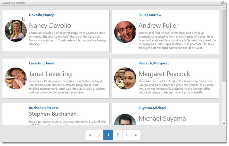
CatalogView Sections are data bound WebViews that display a catalog of items. Each page provides a table of cells comprising an image, a caption, a sub caption, some details and optional links to drill down to additional information about the selected catalog item.
You build Apps in Lianja App Builder visually using the Page Builder.
If you have not yet down so please read Understanding the Lianja Architecture and also Understanding ART to better understand this article.
An App consists of pages. Pages are made up of Sections. Form sections are made up of FormItems. We call these collectively "UI Elements" or "Visual Elements".
Setting Attributes Declaratively
You adjust the appearance and behavior of each UI Element in the Attributes Tab of the App Inspector.

The attributes available consist of some common ones as well as some specific to the UI Element being inspected.
Getting and Setting Attributes Programmatically
The setAttribute(name, value) method can be used to set the value of an Attribute:
Lianja.get("pageid.sectionid").setAttribute("title","Section1")
Note: on the desktop, the shortened form setAttr(name,value) is also available.
The getAttribute(name) method can be used to get the value of an Attribute:
cTitle = Lianja.get("pageid.sectionid").getAttribute("title")
Note: on the desktop, the shortened form getAttr(name) is also available.
See Also
CatalogView Options, CatalogView Sections (Video)
Demo Apps (included in the Lianja App Builder distribution):
- CatalogView App (example_catalogview)
- Lianja Tablet Web UI Demo (example_webapp1)
Attributes
Details
| Attribute | Description | Name | Type |
|---|---|---|---|
| Name | The name for this section (unique to the page) | id | Character |
| Alias name | The alias name for this section | aliasid | Character |
| MetaData version | The MetaData version number. You can set this in the setupUI hook to prevent MetaData being applied multiple times. | metaDataVersion | Int |
| Meta types | A comma separated list of metatype names | metatypes | Character |
| Type | The type of section: catalogview (readonly) | type | Character |
| Caption | The section caption displayed in the section header | title | Character |
| Database | The database for this section | database | Character |
| Table | The table for this section | table | Character |
| Height | The section height | height | Int |
| Fixed height | Fix the section height (True | False) | fixedHeight | Boolean |
| Auto layout percent | Auto layout percentage of page size. If set to 0, then all sections on a page are resized to an equal height | autoLayoutPercentage | Int |
Appearance
| Attribute | Description | Name | Type |
|---|---|---|---|
| Margin | Margin size around the section | margin | Int |
| Add spacer at bottom | Add spacer at bottom of section (True | False) | spacerVisible | Boolean |
Header
| Attribute | Description | Name | Type |
|---|---|---|---|
| Hide header | Hide section header at runtime(True | False) | hideHeaderAtRuntime | Boolean |
| Hide actionbar | Hide actionbar buttons in the section header (True | False) | hideActionBarAtRuntime | Boolean |
| Header icon | The image for the Header (png | jpg | gif). Use app:/imagename.ext for app specific images. |
headerIcon | Character |
| Gradient colors | Render the Header background color as a gradient (True | False) | headerGradient | Boolean |
| Gradient type | Specify the gradient type | headerGradientType | Int |
| Gradient start color | Gradient start color | headerFromColor | Character |
| Gradient end color | Gradient end color | headerToColor | Character |
| Show Print button | Show Print button in the section header (True | False) | showPrintButton | Boolean |
| Show Edit button | Show Edit button in the section header (True | False) | showEditButton | Boolean |
| Hide custom search icon | Hide the custom search icon (True | False) | hideCustomSearchIcon | Boolean |
| Show info tips icon | Show the info tips icon in the section header (True | False) | showInfoTipsIcon | Boolean |
| Show help icon | Show the help icon in the section header (True | False) | showHelpIcon | Boolean |
| Help topic | Help topic to display when the help icon is clicked in the section header | helpTopic | Character |
Custom Header Style
| Attribute | Description | Name | Type |
|---|---|---|---|
| Use custom header style | Use a custom header style (True | False) | headercustomstyle | Boolean |
| Header background color | Header background color | headerbackcolor | Character |
| Header foreground color | Header foreground color | headerforecolor | Character |
| Header bottom border | Display the header bottom border (True | False) | headerbottomborder | Boolean |
| Header bottom border height | Height (in pixels) of the header bottom border (if displayed) | headerbottomborderheight | Int |
| Header bottom border color | Header bottom border color | headerbottombordercolor | Character |
CatalogView Options
| Attribute | Description | Name | Type |
|---|---|---|---|
| Heading | The Catalogview heading. This defaults to none, which causes the heading to not be displayed | catalogViewHeading | Character |
| Cell width | The width of each cell (this is a percentage that the cell will used in the display area). This defaults to 100% | catalogViewCellWidth | Int |
| Cell height | The height of the cell in pixels. This defaults to just take up the space that is required to display the cell | catalogViewCellHeight | Int |
| Columns across | The number of columns to display across the page | catalogViewTableColumns | Int |
| Image | The name of the (blob/object) column in the table containing the image for each cell | catalogViewImage | Character |
| Image width | The width of the image in pixels | catalogViewImageWidth | Int |
| Image height | The height of the image in pixels | catalogViewImageHeight | Int |
| Caption | The name of the (character) column in the table containing the caption for each cell | catalogViewCaption | Character |
| Caption delegate | The inline delegate to invoke when the caption is clicked. | catalogViewCaptionLink | Character |
| Caption link searchkey | The search key expression to be postfixed to the caption delegate when it is invoked | catalogViewLink | Character |
| Sub caption | The name of the (character) column in the table containing the sub-caption for each cell | catalogViewSubCaption | Character |
| Details | The name of the (memo/varchar) column in the table containing the details for each cell | catalogViewDetails | Character |
| Read more | Show the 'Read more' link (True | False) | catalogViewReadmore | Boolean |
| Details height | Maximum height of details to display if 'Read more' is specified | catalogViewReadmoreSize | Int |
| Read more delegate | The inline delegate to invoke when the 'Read more' link is clicked. Alternatively, the 'Click' delegate can be used. | catalogViewReadmoreLink | Character |
| Read more link searchkey | The search key expression to be postfixed to the 'Read more' delegate when it is invoked | catalogViewReadmoreSearchkey | Character |
| Order by | The orderby expression for the data in the Catalogview | catalogViewOrderby | Character |
| Filter | The filter expression that restricts which records will be included in the Catalogview | catalogViewFilter | Character |
| Pagination | Paginate the rows displayed (True | False) | catalogViewPagination | Boolean |
| Pagination size | The number of rows to paginate | catalogViewPaginationSize | Int |
| Show grid lines | Show grid lines to separate each row (True | False) | catalogViewGridLines | Boolean |
| CSS Stylesheet | You can override the CSS style for the table containing the cells and the style of the cells themselves by specifying your own stylesheet. | catalogViewStylesheet | Character |
| Other options | Other Catalogview options | catalogViewOtherOptions | Character |
| Custom library | Custom library containing the Tile producer delegate. | catalogviewCustomLibrary | Character |
| Tile producer | Delegate to call to render a custom tile. This should just output the HTML. | catalogViewTileDelegate | Character |
Related Data
| Attribute | Description | Name | Type |
|---|---|---|---|
| Parent section name | Name of related parent section | ||
| Automatically relate | Automatically relate the child section (True | False). If this is unchecked then you need to manually relate it in the parentdatachanged delegate. | autoRelateChildSection | Boolean |
Menu
| Attribute | Description | Name | Type |
|---|---|---|---|
| Visible | Section menu visible (True | False) | sectionMenuVisible | Boolean |
| Height | Section menu height | sectionMenuHeight | Int |
| Background color | Section menu background color | sectionMenuBackColor | Character |
| Foreground color | Section menu foreground color | sectionMenuForeColor | Character |
| Custom menu panel | The .rsp or .jssp page used to create the custom menu panel. This page should generate dynamic HTML5/JavaScript. | customSectionMenuPanel | Character |
| Custom menu | Section menu contents | customSectionMenu | Character |
| Custom action | Action to perform when a menu item is selected | sectionMenuAction | Character |
Search Panel
| Attribute | Description | Name | Type |
|---|---|---|---|
| Visible | Section search panel visible (True | False) | searchPanelVisible | Boolean |
| Height | Section search panel height | searchPanelHeight | Int |
| Background color | Section search panel background color | searchPanelBackColor | Character |
| Foreground color | Section search panel foreground color | searchPanelForeColor | Character |
| Auto create | Automatically create search panel for all Section search fields | searchPanelAutoCreate | Boolean |
| Custom search panel | The delegate used to create the custom search panel | searchPanelAction | Character |
Subtitle
| Attribute | Description | Name | Type |
|---|---|---|---|
| Visible | Section subtitle visible (True | False) | subtitleVisible | Boolean |
| Caption | Section subtitle caption | subtitleCaption | Character |
| Height | Section subtitle height | subtitleHeight | Int |
| Background color | Section subtitle background color | subtitleBackColor | Character |
| Foreground color | Section subtitle foreground color | subtitleForeColor | Character |
| Font | Section subtitle font | subtitleFont | Int |
| CSS style | CSS style | subtitleCssStyle | Character |
| Attribute | Description | Name | Type |
|---|---|---|---|
| Visible | Section footer visible (True | False) | footerVisible | Boolean |
| Caption | Section footer caption | footerText | Character |
| Height | Section footer height | footerHeight | Int |
| Background color | Section footer background color | footerBackColor | Character |
| Foreground color | Section footer foreground color | footerForeColor | Character |
| Custom menu | Section footer menu contents | customOptionsMenu | Character |
| Custom action | Action to perform when a footer menu item is selected | customOptionsMenuAction | Character |
| Footer button CSS | Footer button CSS style | footerButtonCss | Character |
| Footer button width | Footer button width | footerButtonWidth | Int |
Other Options
| Attribute | Description | Name | Type |
|---|---|---|---|
| Hide form NavBar | Hide form Navigation Bar at runtime if this section is in an Accordion Stack (True | False) | hideFormNavBar | Boolean |
| Collapsable | The section is collapsible at runtime (True | False) | collapsableAtRuntime | Boolean |
| Exclude from accordion | The section is excluded from accordion behavior at runtime (True | False) | excludeAccordionAtRuntime | Boolean |
Custom Delegates
| Attribute | Description | Name | Type |
|---|---|---|---|
| Scripting language | The default scripting language for custom code in this section (Inherit | Recital | Visual FoxPro | Python | JavaScript | PHP) | scriptingLanguage | Character |
| Custom library | The filename of the library containing code for event handlers and custom procedures/functions | customLibrary | Character |
| Expanded | The delegate for the Expanded event | expandedAction | Character |
| Collapsed | The delegate for the Collapsed event | collapsedAction | Character |
| Hotkey | The delegate for the Hotkey event. | hotkeyAction | Character |
| Init | The delegate for the Init event | initAction | Character |
| Destroy | The delegate for the Destroy event | destroyAction | Character |
| Load | The delegate for the Load event | loadAction | Character |
| Ready | The delegate for the Ready event | readyAction | Character |
| Unload | The delegate for the Unload event | unloadAction | Character |
| Click | The delegate for the Clicked event | clickAction | Character |
| Double Click | The delegate for the Double Clicked event | dblClickAction | Character |
| Parent data changed | The delegate for the ParentDataChanged event | parentDataChangedAction | Character |
| Timer | The delegate for the Timer event | timerAction | Character |
| Timer interval | The timer interval in seconds that the Timer event will be called at runtime | timerInterval | Int |
| State Changed | The delegate for the Statechanged event. | stateChangedAction | Character |
| Custom footer menu | The delegate for the footer menu event | customMenuAction | Character |
| Custom search command | The delegate for the search event | customSearch | Character |
| Custom section menu | The delegate for the section menu event | customSectionMenuAction | Character |
Permissions and Roles
| Attribute | Description | Name | Type |
|---|---|---|---|
| Create roles | A comma separated list of roles that can perform create operations on data in the section. | permcreate | Character |
| Read roles | A comma separated list of roles that can read (and view) the section. | permRead | Character |
| Update roles | A comma separated list of roles that can perform update operations on data in the section. | permUpdate | Character |
| Delete roles | A comma separated list of roles that can perform delete operations on data in the section. | permDelete | Character |
UI Presentation Rules
| Attribute | Description | Name | Type |
|---|---|---|---|
| Desktop | Include this section in a Desktop client (True | False). | desktopUI | Boolean |
| Web | Include this section in a Web client (True | False). | webUI | Boolean |
| Tablet | Include this section in a Tablet client (True | False). | tabletUI | Boolean |
| Phone | Include this section in a Phone client (True | False). | mobileUI | Boolean |
| UI States | UI states that affect this section. Specify multiple states as a comma separated list. | state | Character |
| Initial UI state | The initial UI state for this section. This will be applied to the section and all its fields and gadgets. | uiStateInit | Character |
| Readonly when | Section is readonly at runtime if specified expression evaluates to true. | readonlyWhen | Character |
| Visible when | Section is visible at runtime if specified expression evaluates to true. | visibleWhen | Character |
| Display orientation | Display depending on mobile device orientation for Tablets and Phones. (Always | Portrait | Landscape) | displayOrientation | Character |
| Apply rules on change | Apply UI presentation rules (Visible when and Readonly when) when data is changed interactively or when navigating records (True | False). | applyRulesOnChange | Boolean |
| Apply rules on parent change | Apply section UI presentation rules (Visible when and Readonly when) when parent data is changed by navigating records (True | False) | applyRulesOnParentChange | Boolean |