Difference between revisions of "Treeview Gadget Attributes"
Yvonne.milne (Talk | contribs) (→Details) |
Yvonne.milne (Talk | contribs) (→Overview) |
||
| Line 6: | Line 6: | ||
You build Apps in Lianja App Builder visually using the [[:Category:Page_Builder|Page Builder]]. | You build Apps in Lianja App Builder visually using the [[:Category:Page_Builder|Page Builder]]. | ||
| − | If you have not yet | + | If you have not yet done so please read [[Understanding_the_Lianja_App_Architecture|Understanding the Lianja Architecture]] and also [[Lianja_is_all_about_ART|Understanding ART]] to better understand this article. |
An App consists of pages. Pages are made up of Sections. Form sections are made up of FormItems. We call these collectively "UI Elements" or "Visual Elements". | An App consists of pages. Pages are made up of Sections. Form sections are made up of FormItems. We call these collectively "UI Elements" or "Visual Elements". | ||
Revision as of 07:24, 22 June 2018
Contents
Overview
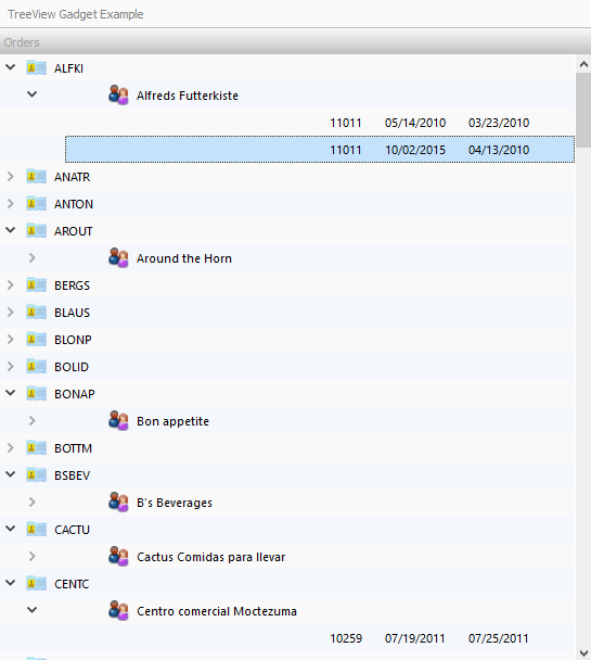
Treeview Gadgets can be loaded into a Form Section. They are data-bound tree grids that allow you to drill down through levels of hierarchical nodes.
You build Apps in Lianja App Builder visually using the Page Builder.
If you have not yet done so please read Understanding the Lianja Architecture and also Understanding ART to better understand this article.
An App consists of pages. Pages are made up of Sections. Form sections are made up of FormItems. We call these collectively "UI Elements" or "Visual Elements".
Setting Attributes Declaratively
You adjust the appearance and behavior of each UI Element in the Attributes Tab of the App Inspector.

The attributes available consist of some common ones as well as some specific to the UI Element being inspected.
Getting and Setting Attributes Programmatically
The setAttribute(name, value) method can be used to set the value of an Attribute:
Lianja.get("pageid.sectionid.fieldid").setAttribute("caption","Formitem1")
Note: on the desktop, the shortened form setAttr(name,value) is also available.
The getAttribute(name) method can be used to get the value of an Attribute:
cTitle = Lianja.get("pageid.sectionid.fieldid").getAttribute("caption")
Note: on the desktop, the shortened form getAttr(name) is also available.
See Also
TreeView Options, TreeView Section Attributes
Demo Apps (included in the Lianja App Builder distribution):
- TreeViewGadget App (example_treeviewgadget)
Attributes
Details
| Attribute | Description | Name | Type |
|---|---|---|---|
| Name | The name for this gadget (unique to the section) | id | Character |
| Full name | The full name for this formitem including its parent page and section, e.g. page1.section1.field1 | (tbc) | Character |
| Alias name | The alias name for this gadget | aliasid | Character |
| Tag | The tag for this formitem | tag | Character |
| Meta types | A comma separated list of metatype names | metatypes | Character |
| Type | The type of control: Gadget (readonly) | type | Character |
| Gadget type | The type of gadget: treeview (readonly) | gadgetType | Character |
| Margin | Margin size around the gadget | gadgetMargin | Int |
| Fixed width | Fixed gadget width in pixels | gadgetFixedWidth | Int |
| Fixed height | Fixed gadget height in pixels | gadgetFixedHeight | Int |
| Inline | Render the gadget inline rather than it its own column (True | False) | gadgetInline | Boolean |
| Stretch width | Auto stretch the width of the gadget into the width of the section (True | False) | gadgetStretchWidth | Boolean |
Geometry
| Attribute | Description | Name | Type |
|---|---|---|---|
| Absolute | Enable or disable absolute positioning (True | False) | absolutePosition | Boolean |
| Top | Top position in pixels | absolutePositionY | Int |
| Left | Left position in pixels | absolutePositionX | Int |
| Width | Width in pixels | absolutePositionWidth | Int |
| Height | Height in pixels | absolutePositionHeight | Int |
| CSS style | CSS style (separate attributes with ; or use app:/filename.css) | cssStyle | Character |
Caption
| Attribute | Description | Name | Type |
|---|---|---|---|
| Caption | The caption for the gadget | caption | Character |
| Caption CSS style | The gadget caption CSS style (separate attributes with ';' or use app:/filename.css or specify CSS classes separated by spaces). | captionCSSstyle | Character |
| Background color | The background color for the caption | backColor | Character |
| Foreground color | The foreground color for the caption | foreColor | Character |
| Font | The font for the caption | captionFont | Character |
| Icon | The image for the caption (png | jpg | gif). Use app:/imagename.ext for app specific images. |
captionIcon | Character |
| Border width | The caption border width | captionBorderWidth | Int |
| Border color | The caption border color | captionBorderColor | Character |
| Transparency | Specify a transparency percentage from 0 to 100 | transparency | Int |
| Gradient colors | Render the caption color as a gradient (True | False) | captionGradient | Boolean |
| Gradient type | Specify the gradient type | captionGradientType | Int |
| Gradient start color | Gradient start color | captionFromColor | Character |
| Gradient end color | Gradient end color | captionToColor | Character |
Data
| Attribute | Description | Name | Type |
|---|---|---|---|
| Tree items | A list of items to display in the Tree, e.g. Static list of choices: Apples,Oranges,Bananas Dynamic list of choices from a table: @tablename,expression Dynamic list of choices from a table (SQL SELECT): select expression from tablename |
choiceList | Character |
| Columns to group by | The number of columns to group by to form the tree hierarchy. When grouping data, use a SQL SELECT ORDER BY clause. | treeGroupByColumns | Int |
| Selection column | The column to substitute into the Click/DblClick delegate. Use {} in the delegate where you want the text from this column to be placed. | treeViewSelectionColumn | Int |
| CSS style | CSS style for the gadget (separate attributes with ; or use app:/filename.css) | gadgetCssStyle | Character |
| Column icons | A comma separated list of column icons. | treeColumnIcons | Character |
| Hide column headers | Hide the column headers (True | False) | treeViewHideColumnHeaders | Boolean |
| Header labels | A comma separated list of header labels | headerLabels | Character |
| Column widths | A comma separated list of column widths | columnWidths | Character |
| Column alignments | A comma separated list of column alignments e.g. left,right,center | columnAlignments | Character |
| Alternating row colors | Alternate row colors (True | False) | treeViewAlternatingRowColors | Boolean |
| Row height | Row height for the Tree items | treeViewRowHeight | Int |
| Font size | Font size for the Tree items | treeViewFontSize | Int |
| Expand all | Expand all Tree items when first loaded (True | False) | treeViewExpandAll | Boolean |
| Expand depth | Expand all Tree items when first loaded to this depth | treeViewExpandDepth | Int |
| Show indicators | Show expand/collapse indicators in the tree (True | False) | treeViewShowIndicators | Boolean |
| Background color | The background color for the gadget | gadgetBackColor | Character |
| Foreground color | The foreground color for the gadget | gadgetForeColor | Character |
Other Options
| Attribute | Description | Name | Type |
|---|---|---|---|
| Hide header | Hide gadget header at runtime (True | False) | gadgetHideHeader | Boolean |
Custom Delegates
| Attribute | Description | Name | Type |
|---|---|---|---|
| Init | The delegate for the Init event | initAction | Character |
| Load | The delegate for the Load event | loadAction | Character |
| Ready | The delegate for the Ready event | readyAction | Character |
| Click | The delegate for the item Clicked event | ClickAction | Character |
| Double Click | The delegate for the item Double Clicked event | dblClickAction | Character |
Permissions and Roles
| Attribute | Description | Name | Type |
|---|---|---|---|
| Read roles | A comma separated list of roles that can read (and view) the data. | permRead | Character |
| Update roles | A comma separated list of roles that can perform update operations on the data. | permUpdate | Character |
UI Presentation Rules
| Attribute | Description | Name | Type |
|---|---|---|---|
| Desktop | Include this gadget in a Desktop client (True | False). | desktopUI | Boolean |
| Web | Include this gadget in a Web client (True | False). | webUI | Boolean |
| Tablet | Include this gadget in a Tablet client (True | False). | tabletUI | Boolean |
| Phone | Include this gadget in a Phone client (True | False). | mobileUI | Boolean |
| UI States | UI states that affect this gadget. Specify multiple states as a comma separated list. | state | Character |
| Initial UI state | The initial UI state for this gadget. | uiStateInit | Character |
| Readonly when | Gadget is readonly at runtime if specified expression evaluates to true. | readonlyWhen | Character |
| Visible when | Gadget is visible at runtime if specified expression evaluates to true. | visibleWhen | Character |
| Hidden at runtime | Hide this formitem at runtime (True | False). | hiddenAtRuntime | Boolean |
| Display orientation | Display depending on mobile device orientation for Tablets and Phones. (Always | Portrait | Landscape) | displayOrientation | Character |
| Apply rules on change | Apply UI presentation rules (Visible when and Readonly when) when data is changed interactively or when navigating records (True | False). | applyRulesOnChange | Boolean |