Difference between revisions of "PanelView Section Attributes"
Yvonne.milne (Talk | contribs) |
Yvonne.milne (Talk | contribs) (→UI Presentation Rules) |
||
| (35 intermediate revisions by 3 users not shown) | |||
| Line 1: | Line 1: | ||
| − | == | + | =Overview= |
| − | [[ | + | PanelView sections are similar to CarouselView Sections, but instead of displaying a carousel of images, they allow you to display panels containing dynamic WebView content using Visual FoxPro Server Pages (.rsp) or JavaScript Server Pages (.jssp). |
| + | {{DISPLAYTITLE:PanelView Section}} | ||
| + | [[File:PanelView_section.png|middle|758px|link=]] | ||
| + | |||
| + | You build Apps in Lianja App Builder visually using the [[:Category:Page_Builder|Page Builder]]. | ||
| + | |||
| + | If you have not yet done so please read [[Understanding_the_Lianja_App_Architecture|Understanding the Lianja Architecture]] and also [[Lianja_is_all_about_ART|Understanding ART]] to better understand this article. | ||
| + | |||
| + | An App consists of pages. Pages are made up of Sections. Form sections are made up of FormItems. We call these collectively "UI Elements" or "Visual Elements". | ||
| + | |||
| + | ==Setting Attributes Declaratively== | ||
| + | |||
| + | You adjust the appearance and behavior of each UI Element in the '''Attributes''' Tab of the [[:Category:App_Inspector|App Inspector]]. | ||
| + | |||
| + | [[{{ns:file}}:bm-attributes.png|800px|left|border|link={{filepath:bm-attributes.png}}|Attributes]] | ||
| + | <br clear=all> | ||
| + | |||
| + | The attributes available consist of some common ones as well as some specific to the UI Element being inspected. | ||
| − | ==Getting and Setting Attributes== | + | ==Getting and Setting Attributes Programmatically== |
The '''setAttribute(name, value)''' method can be used to set the value of an Attribute: | The '''setAttribute(name, value)''' method can be used to set the value of an Attribute: | ||
<pre>Lianja.get("pageid.sectionid").setAttribute("title","Section1")</pre> | <pre>Lianja.get("pageid.sectionid").setAttribute("title","Section1")</pre> | ||
| − | Note: the shortened form '''setAttr(name,value)''' is also available. | + | Note: on the desktop, the shortened form '''setAttr(name,value)''' is also available. |
The '''getAttribute(name)''' method can be used to get the value of an Attribute: | The '''getAttribute(name)''' method can be used to get the value of an Attribute: | ||
| Line 13: | Line 30: | ||
<pre>cTitle = Lianja.get("pageid.sectionid").getAttribute("title")</pre> | <pre>cTitle = Lianja.get("pageid.sectionid").getAttribute("title")</pre> | ||
| − | Note: the shortened form '''getAttr(name)''' is also available. | + | Note: on the desktop, the shortened form '''getAttr(name)''' is also available. |
| + | =See Also= | ||
| + | [[PanelView Options]] | ||
| + | |||
| + | Demo Apps (included in the Lianja App Builder distribution): | ||
| + | * Lianja PanelView Demo (example_panelview) | ||
| + | |||
| + | =Attributes= | ||
==Details== | ==Details== | ||
{| class="wikitable" width="100%" | {| class="wikitable" width="100%" | ||
!width="20%"|Attribute | !width="20%"|Attribute | ||
| − | !width=" | + | !width="45%"|Description |
| − | !width=" | + | !width="25%"|Name |
!width="10%"|Type | !width="10%"|Type | ||
|- | |- | ||
|valign="top"|[[Details Attributes#Name|Name]]||The name for this section (unique to the page) | |valign="top"|[[Details Attributes#Name|Name]]||The name for this section (unique to the page) | ||
|valign="top"|id||valign="top"|Character | |valign="top"|id||valign="top"|Character | ||
| + | |- | ||
| + | |valign="top"|[[Details Attributes#Full name|Full name]]||The full name for this section including its parent page, e.g. page1.section1 | ||
| + | |valign="top"|fullid||valign="top"|Character | ||
| + | |- | ||
| + | |valign="top"|[[Details Attributes#Alias name|Alias name]]||The alias name for this section | ||
| + | |valign="top"|aliasid||Character | ||
| + | |- | ||
| + | |valign="top"|[[Dashboard Sections|Dashboard group]]||The dashboard section that this section belongs to. From v5.2. | ||
| + | |valign="top"|horizontalgroup||valign="top"|Character | ||
| + | |- | ||
| + | |valign="top"|[[Dashboard Sections|Horizontal stretch]]||The horizontal % stretch factor that this section should occupy. From v5.2. | ||
| + | |valign="top"|horizontalgroupstretchfactor||valign="top"|Character | ||
| + | |- | ||
| + | |valign="top"|[[Dashboard Sections|Vertical stretch]]||The vertical % stretch factor that this section should occupy. From v5.2. | ||
| + | |valign="top"|verticalgroupstretchfactor||valign="top"|Character | ||
| + | |- | ||
| + | |valign="top"|[[Details Attributes#App Doc|App Doc]]||The App Doc file for this section. This will be included in the [[App Doc]] when it is generated. | ||
| + | |valign="top"|appdoc||valign="top"|Character | ||
| + | |- | ||
| + | |valign="top"|[[Details Attributes#MetaData version|MetaData version]]||The MetaData version number. You can set this in the setupUI hook to prevent MetaData being applied multiple times. | ||
| + | |valign="top"|metaDataVersion||valign="top"|Int | ||
|- | |- | ||
|valign="top"|[[MetaTypes|Meta types]]||A comma separated list of metatype names | |valign="top"|[[MetaTypes|Meta types]]||A comma separated list of metatype names | ||
|valign="top"|metatypes||valign="top"|Character | |valign="top"|metatypes||valign="top"|Character | ||
| + | |- | ||
| + | |valign="top"|[[Details Attributes#Custom Props|Custom Props]]||A ';' separated list of custom prop key pairs, e.g. name=barry;company=lianja<br>From v5.3. | ||
| + | |valign="top"|customprops||valign="top"|Character | ||
|- | |- | ||
|valign="top"|[[Details Attributes#Type|Type]]||The type of section: panelview (readonly) | |valign="top"|[[Details Attributes#Type|Type]]||The type of section: panelview (readonly) | ||
| Line 48: | Line 96: | ||
{| class="wikitable" width="100%" | {| class="wikitable" width="100%" | ||
!width="20%"|Attribute | !width="20%"|Attribute | ||
| − | !width=" | + | !width="45%"|Description |
| − | !width=" | + | !width="25%"|Name |
!width="10%"|Type | !width="10%"|Type | ||
|- | |- | ||
| Line 63: | Line 111: | ||
{| class="wikitable" width="100%" | {| class="wikitable" width="100%" | ||
!width="20%"|Attribute | !width="20%"|Attribute | ||
| − | !width=" | + | !width="45%"|Description |
| − | !width=" | + | !width="25%"|Name |
!width="10%"|Type | !width="10%"|Type | ||
|- | |- | ||
| Line 70: | Line 118: | ||
|valign="top"|hideHeaderAtRuntime||valign="top"|Boolean | |valign="top"|hideHeaderAtRuntime||valign="top"|Boolean | ||
|- | |- | ||
| − | |valign="top"|[[Section Header#Hide actionbar|Hide actionbar]]||Hide actionbar | + | |valign="top"|[[Section Header#Hide actionbar|Hide actionbar]]||Hide actionbar when stacked section is activated at runtime<br>(True | False) |
|valign="top"|hideActionBarAtRuntime||valign="top"|Boolean | |valign="top"|hideActionBarAtRuntime||valign="top"|Boolean | ||
| − | |||
| − | |||
| − | |||
|- | |- | ||
|valign="top"|[[Section Header#Header icon|Header icon]]||The image for the Header (png | jpg | gif).<br>Use app:/imagename.ext for app specific images. | |valign="top"|[[Section Header#Header icon|Header icon]]||The image for the Header (png | jpg | gif).<br>Use app:/imagename.ext for app specific images. | ||
| Line 93: | Line 138: | ||
|valign="top"|[[Section Header#Show Print button|Show Print button]]||Show Print button in the section header (True | False) | |valign="top"|[[Section Header#Show Print button|Show Print button]]||Show Print button in the section header (True | False) | ||
|valign="top"|showPrintButton||valign="top"|Boolean | |valign="top"|showPrintButton||valign="top"|Boolean | ||
| + | |- | ||
| + | |valign="top"|[[Section Header#Show Edit button|Show Edit button]]||Show Edit button in the section header (True | False) | ||
| + | |valign="top"|showEditButton||valign="top"|Boolean | ||
|- | |- | ||
|valign="top"|[[Section Header#Hide custom search icon|Hide custom search icon]]||Hide the custom search icon (True | False) | |valign="top"|[[Section Header#Hide custom search icon|Hide custom search icon]]||Hide the custom search icon (True | False) | ||
|valign="top"|hideCustomSearchIcon||valign="top"|Boolean | |valign="top"|hideCustomSearchIcon||valign="top"|Boolean | ||
| + | |- | ||
| + | |valign="top"|[[Section Header#Show Custom search dialog|Show Custom search dialog]]||Show custom search dialog when custom search icon clicked (True | False) | ||
| + | |valign="top"|showcustomsearchdialog||valign="top"|Boolean | ||
| + | |- | ||
| + | |valign="top"|[[Section Header#Show custom search dialog panel|Show custom search dialog panel]]||Show custom search dialog panel when custom search icon clicked<br>(True | False) | ||
| + | |valign="top"|showcustomsearchdialogpanel||valign="top"|Boolean | ||
|- | |- | ||
|valign="top"|[[Section Header#Show info tips icon|Show info tips icon]]||Show the info tips icon in the section header (True | False) | |valign="top"|[[Section Header#Show info tips icon|Show info tips icon]]||Show the info tips icon in the section header (True | False) | ||
| Line 105: | Line 159: | ||
|valign="top"|[[Section Header#Help topic|Help topic]]||Help topic to display when the help icon is clicked in the section header | |valign="top"|[[Section Header#Help topic|Help topic]]||Help topic to display when the help icon is clicked in the section header | ||
|valign="top"|helpTopic||valign="top"|Character | |valign="top"|helpTopic||valign="top"|Character | ||
| + | |- | ||
| + | |} | ||
| + | |||
| + | ==Custom Header Style== | ||
| + | {| class="wikitable" width="100%" | ||
| + | !width="20%"|Attribute | ||
| + | !width="45%"|Description | ||
| + | !width="25%"|Name | ||
| + | !width="10%"|Type | ||
| + | |- | ||
| + | |valign="top"|[[Section Header#Use custom header style|Use custom header style]]||Use a custom header style (True | False) | ||
| + | |valign="top"|headercustomstyle||valign="top"|Boolean | ||
| + | |- | ||
| + | |valign="top"|[[Section Header#Header background color|Header background color]]||Header background color | ||
| + | |valign="top"|headerbackcolor||valign="top"|Character | ||
| + | |- | ||
| + | |valign="top"|[[Section Header#Header foreground color|Header foreground color]]||Header foreground color | ||
| + | |valign="top"|headerforecolor||valign="top"|Character | ||
| + | |- | ||
| + | |valign="top"|[[Section Header#Header bottom border|Header bottom border]]||Display the header bottom border (True | False) | ||
| + | |valign="top"|headerbottomborder||valign="top"|Boolean | ||
| + | |- | ||
| + | |valign="top"|[[Section Header#Header bottom border height|Header bottom border height]]||Height (in pixels) of the header bottom border (if displayed) | ||
| + | |valign="top"|headerbottomborderheight||valign="top"|Int | ||
| + | |- | ||
| + | |valign="top"|[[Section Header#Header bottom border color|Header bottom border color]]||Header bottom border color | ||
| + | |valign="top"|headerbottombordercolor||valign="top"|Character | ||
| + | |- | ||
| + | |valign="top"|[[Section Header#Show record count badge|Show record count badge]]||Show the record count badge in the section header (True | False). | ||
| + | |valign="top"|showreccount||valign="top"|Boolean | ||
| + | |- | ||
| + | |} | ||
| + | |||
| + | ==Visual Component Details== | ||
| + | {| class="wikitable" width="100%" | ||
| + | !width="20%"|Attribute | ||
| + | !width="45%"|Description | ||
| + | !width="25%"|Name | ||
| + | !width="10%"|Type | ||
| + | |- | ||
| + | |valign="top"|[[Visual_Components#Component_library_3|Component library]]||This specifies the Component library where the component will be saved. | ||
| + | |valign="top"|componentlib||valign="top"|Character | ||
| + | |- | ||
| + | |valign="top"|[[Visual_Components#Component_name_2|Component name]]||Save as this component name whenever the section is saved. | ||
| + | |valign="top"|componentname||valign="top"|Character | ||
| + | |- | ||
| + | |valign="top"|[[Visual_Components#Component_author_2|Component author]]||The author of this component. | ||
| + | |valign="top"|componentauthor||valign="top"|Character | ||
| + | |- | ||
| + | |valign="top"|[[Visual_Components#Component_version_2|Component version]]||The version of this component. | ||
| + | |valign="top"|componentversion||valign="top"|Character | ||
| + | |- | ||
| + | |valign="top"|[[Visual_Components#Component_description_2|Component description]]||The description of this component. | ||
| + | |valign="top"|componentdescription||valign="top"|Character | ||
| + | |- | ||
| + | |valign="top"|[[Visual_Components#Component_permissions_2|Component permissions]]||The permissions required for this component in Lianja Cloud App Builder. | ||
| + | |valign="top"|componentpermissions||valign="top"|Character | ||
| + | |- | ||
| + | |valign="top"|[[Visual_Components#Component_width_2|Component width]]||The width of this component when activated as a Form. | ||
| + | |valign="top"|componentwidth||valign="top"|Int | ||
| + | |- | ||
| + | |valign="top"|[[Visual_Components#Component_height_2|Component height]]||The height of this component when activated as a Form. | ||
| + | |valign="top"|componentheight||valign="top"|Int | ||
|- | |- | ||
|} | |} | ||
| Line 111: | Line 228: | ||
{| class="wikitable" width="100%" | {| class="wikitable" width="100%" | ||
!width="20%"|Attribute | !width="20%"|Attribute | ||
| − | !width=" | + | !width="45%"|Description |
| + | !width="25%"|Name | ||
| + | !width="10%"|Type | ||
|- | |- | ||
|valign="top"|[[PanelView Options#Menu|Menu]]||The menu to embed at the top of the PanelView section. This is a comma separated list. | |valign="top"|[[PanelView Options#Menu|Menu]]||The menu to embed at the top of the PanelView section. This is a comma separated list. | ||
| + | |valign="top"|panelMenu||valign="top"|Character | ||
|- | |- | ||
|valign="top"|[[PanelView Options#Panels|Panels]]||A comma separated list of .rsp or .jssp pages to be displayed as carousel panels. | |valign="top"|[[PanelView Options#Panels|Panels]]||A comma separated list of .rsp or .jssp pages to be displayed as carousel panels. | ||
| + | |valign="top"|panelList||valign="top"|Character | ||
|- | |- | ||
|valign="top"|[[PanelView Options#Captions|Captions]]||A comma separated list of captions to be displayed in the carousel panels. | |valign="top"|[[PanelView Options#Captions|Captions]]||A comma separated list of captions to be displayed in the carousel panels. | ||
| + | |valign="top"|panelCaptions||valign="top"|Character | ||
|- | |- | ||
|valign="top"|[[PanelView Options#Sub captions|Sub captions]]||A comma separated list of sub captions to be displayed in the carousel panels. | |valign="top"|[[PanelView Options#Sub captions|Sub captions]]||A comma separated list of sub captions to be displayed in the carousel panels. | ||
| + | |valign="top"|panelSubCaptions||valign="top"|Character | ||
|- | |- | ||
|valign="top"|[[PanelView Options#Show controls|Show controls]]||Show the carousel left and right selection controls (True | False). | |valign="top"|[[PanelView Options#Show controls|Show controls]]||Show the carousel left and right selection controls (True | False). | ||
| + | |valign="top"|panelControls||valign="top"|Boolean | ||
|- | |- | ||
|valign="top"|[[PanelView Options#Show indicators|Show indicators]]||Show the carousel panel indicators (True | False). | |valign="top"|[[PanelView Options#Show indicators|Show indicators]]||Show the carousel panel indicators (True | False). | ||
| + | |valign="top"|panelIndicators||valign="top"|Boolean | ||
|- | |- | ||
|valign="top"|[[PanelView Options#Auto select|Auto select]]||Automatically select the panel corresponding to the ordinal position of the menuitem (True | False). | |valign="top"|[[PanelView Options#Auto select|Auto select]]||Automatically select the panel corresponding to the ordinal position of the menuitem (True | False). | ||
| + | |valign="top"|panelAutoSelect||valign="top"|Boolean | ||
|- | |- | ||
|valign="top"|[[PanelView Options#Auto refresh|Auto refresh]]||Automatically refresh the panel contents as they are selected (True | False). | |valign="top"|[[PanelView Options#Auto refresh|Auto refresh]]||Automatically refresh the panel contents as they are selected (True | False). | ||
| + | |valign="top"|panelAutoRefresh||valign="top"|Boolean | ||
|- | |- | ||
|valign="top"|[[PanelView Options#Cycle interval|Cycle interval]]||The interval in seconds to cycle through the panels. 0 (default) specifies no cycling. | |valign="top"|[[PanelView Options#Cycle interval|Cycle interval]]||The interval in seconds to cycle through the panels. 0 (default) specifies no cycling. | ||
| + | |valign="top"|panellInterval||valign="top"|Int | ||
|- | |- | ||
|} | |} | ||
| Line 136: | Line 264: | ||
{| class="wikitable" width="100%" | {| class="wikitable" width="100%" | ||
!width="20%"|Attribute | !width="20%"|Attribute | ||
| − | !width=" | + | !width="45%"|Description |
| − | !width=" | + | !width="25%"|Name |
!width="10%"|Type | !width="10%"|Type | ||
|- | |- | ||
|valign="top"|[[Related Data#Parent section name|Parent section name]]||Name of related parent section | |valign="top"|[[Related Data#Parent section name|Parent section name]]||Name of related parent section | ||
| − | |valign="top"| ||valign="top"| | + | |valign="top"|parentid||valign="top"|Character |
|- | |- | ||
|valign="top"|[[Related Data#Automatically relate|Automatically relate]]||Automatically relate the child section (True | False). If this is unchecked then you need to manually relate it in the parentdatachanged delegate. | |valign="top"|[[Related Data#Automatically relate|Automatically relate]]||Automatically relate the child section (True | False). If this is unchecked then you need to manually relate it in the parentdatachanged delegate. | ||
| Line 147: | Line 275: | ||
|- | |- | ||
|valign="top"|[[Related Data#Parent key|Parent key]]||Parent key | |valign="top"|[[Related Data#Parent key|Parent key]]||Parent key | ||
| − | |valign="top"| ||valign="top"| | + | |valign="top"|parentKeyExpr||valign="top"|Character |
|- | |- | ||
|valign="top"|[[Related Data#Child key|Child key]]||Child key | |valign="top"|[[Related Data#Child key|Child key]]||Child key | ||
| Line 157: | Line 285: | ||
{| class="wikitable" width="100%" | {| class="wikitable" width="100%" | ||
!width="20%"|Attribute | !width="20%"|Attribute | ||
| − | !width=" | + | !width="45%"|Description |
| − | !width=" | + | !width="25%"|Name |
!width="10%"|Type | !width="10%"|Type | ||
|- | |- | ||
| Line 187: | Line 315: | ||
{| class="wikitable" width="100%" | {| class="wikitable" width="100%" | ||
!width="20%"|Attribute | !width="20%"|Attribute | ||
| − | !width=" | + | !width="45%"|Description |
| − | !width=" | + | !width="25%"|Name |
!width="10%"|Type | !width="10%"|Type | ||
|- | |- | ||
| Line 214: | Line 342: | ||
{| class="wikitable" width="100%" | {| class="wikitable" width="100%" | ||
!width="20%"|Attribute | !width="20%"|Attribute | ||
| − | !width=" | + | !width="45%"|Description |
| − | !width=" | + | !width="25%"|Name |
!width="10%"|Type | !width="10%"|Type | ||
|- | |- | ||
| Line 244: | Line 372: | ||
{| class="wikitable" width="100%" | {| class="wikitable" width="100%" | ||
!width="20%"|Attribute | !width="20%"|Attribute | ||
| − | !width=" | + | !width="45%"|Description |
| − | !width=" | + | !width="25%"|Name |
!width="10%"|Type | !width="10%"|Type | ||
|- | |- | ||
| Line 262: | Line 390: | ||
|valign="top"|[[Section Footers#Foreground color|Foreground color]]||Section footer foreground color | |valign="top"|[[Section Footers#Foreground color|Foreground color]]||Section footer foreground color | ||
|valign="top"|footerForeColor||Character | |valign="top"|footerForeColor||Character | ||
| + | |- | ||
| + | |valign="top"|[[Section Footers#CSS style|CSS style]]||CSS style (separate attributes with ; or use app:/filename.css or specify CSS classes separated by spaces). | ||
| + | |valign="top"|footercssstyle||valign="top"|Character | ||
|- | |- | ||
|valign="top"|[[Section Footers#Custom menu|Custom menu]]||Section footer menu contents | |valign="top"|[[Section Footers#Custom menu|Custom menu]]||Section footer menu contents | ||
| Line 280: | Line 411: | ||
{| class="wikitable" width="100%" | {| class="wikitable" width="100%" | ||
!width="20%"|Attribute | !width="20%"|Attribute | ||
| − | !width=" | + | !width="45%"|Description |
| − | !width=" | + | !width="25%"|Name |
!width="10%"|Type | !width="10%"|Type | ||
|- | |- | ||
|valign="top"|[[Accordion Behavior#Hide form NavBar|Hide form NavBar]]||Hide form Navigation Bar at runtime if this section is in an Accordion Stack (True | False) | |valign="top"|[[Accordion Behavior#Hide form NavBar|Hide form NavBar]]||Hide form Navigation Bar at runtime if this section is in an Accordion Stack (True | False) | ||
|valign="top"|hideFormNavBar||valign="top"|Boolean | |valign="top"|hideFormNavBar||valign="top"|Boolean | ||
| + | |- | ||
| + | |valign="top"|[[Instant_Search#Hide_SearchBox|Hide SearchBox]]||Hide the Page Header Instant Search box when this section is selected in an Accordion Stack (True | False). From v5.4. | ||
| + | |valign="top"|hidesearchbox||valign="top"|Boolean | ||
|- | |- | ||
|valign="top"|[[Section Appearance#Collapsable|Collapsable]]||The section is collapsible at runtime (True | False) | |valign="top"|[[Section Appearance#Collapsable|Collapsable]]||The section is collapsible at runtime (True | False) | ||
| Line 298: | Line 432: | ||
{| class="wikitable" width="100%" | {| class="wikitable" width="100%" | ||
!width="20%"|Attribute | !width="20%"|Attribute | ||
| − | !width=" | + | !width="45%"|Description |
| − | !width=" | + | !width="25%"|Name |
!width="10%"|Type | !width="10%"|Type | ||
|- | |- | ||
| Line 307: | Line 441: | ||
|valign="top"|[[Custom Delegates#Custom Library|Custom library]]||The filename of the library containing code for event handlers and custom procedures/functions | |valign="top"|[[Custom Delegates#Custom Library|Custom library]]||The filename of the library containing code for event handlers and custom procedures/functions | ||
|valign="top"|customLibrary||valign="top"|Character | |valign="top"|customLibrary||valign="top"|Character | ||
| + | |- | ||
| + | |valign="top"|[[Custom Delegates#Print|Print]]||The delegate for the Print event.<br>This is called when you click the 'Print' icon. | ||
| + | |valign="top"|printAction||valign="top"|Character | ||
|- | |- | ||
|valign="top"|[[Custom Delegates#Expanded|Expanded]]||The delegate for the Expanded event | |valign="top"|[[Custom Delegates#Expanded|Expanded]]||The delegate for the Expanded event | ||
| Line 313: | Line 450: | ||
|valign="top"|[[Custom Delegates#Collapsed|Collapsed]]||The delegate for the Collapsed event | |valign="top"|[[Custom Delegates#Collapsed|Collapsed]]||The delegate for the Collapsed event | ||
|valign="top"|collapsedAction||valign="top"|Character | |valign="top"|collapsedAction||valign="top"|Character | ||
| + | |- | ||
| + | |valign="top"|[[Custom Delegates#Hotkey|Hotkey]]||The delegate for the Hotkey event. | ||
| + | |valign="top"|hotkeyAction||valign="top"|Character | ||
|- | |- | ||
|valign="top"|[[Custom Delegates#Init|Init]]||The delegate for the Init event | |valign="top"|[[Custom Delegates#Init|Init]]||The delegate for the Init event | ||
| Line 331: | Line 471: | ||
|valign="top"|[[Custom Delegates#Parent data changed|Parent data changed]]||The delegate for the ParentDataChanged event | |valign="top"|[[Custom Delegates#Parent data changed|Parent data changed]]||The delegate for the ParentDataChanged event | ||
|valign="top"|parentDataChangedAction||valign="top"|Character | |valign="top"|parentDataChangedAction||valign="top"|Character | ||
| + | |- | ||
| + | |valign="top"|[[Custom Delegates#Data Producer|Data Producer]]||The delegate for the DataProducer (used in Web Components).<br>From v6.1. | ||
| + | |valign="top"|dataProducerAction||valign="top"|Character | ||
|- | |- | ||
|valign="top"|[[Custom Delegates#Timer|Timer]]||The delegate for the Timer event | |valign="top"|[[Custom Delegates#Timer|Timer]]||The delegate for the Timer event | ||
| Line 337: | Line 480: | ||
|valign="top"|[[Custom Delegates#Timer interval|Timer interval]]||The timer interval in seconds that the Timer event will be called at runtime | |valign="top"|[[Custom Delegates#Timer interval|Timer interval]]||The timer interval in seconds that the Timer event will be called at runtime | ||
|valign="top"|timerInterval||valign="top"|Int | |valign="top"|timerInterval||valign="top"|Int | ||
| + | |- | ||
| + | |valign="top"|[[Custom Delegates#State Changed|State Changed]]||The delegate for the Statechanged event. | ||
| + | |valign="top"|stateChangedAction||valign="top"|Character | ||
|- | |- | ||
|valign="top"|[[Custom Delegates#Custom footer menu|Custom footer menu]]||The delegate for the footer menu event | |valign="top"|[[Custom Delegates#Custom footer menu|Custom footer menu]]||The delegate for the footer menu event | ||
| Line 352: | Line 498: | ||
{| class="wikitable" width="100%" | {| class="wikitable" width="100%" | ||
!width="20%"|Attribute | !width="20%"|Attribute | ||
| − | !width=" | + | !width="45%"|Description |
| − | !width=" | + | !width="25%"|Name |
!width="10%"|Type | !width="10%"|Type | ||
|- | |- | ||
| Line 373: | Line 519: | ||
{| class="wikitable" width="100%" | {| class="wikitable" width="100%" | ||
!width="20%"|Attribute | !width="20%"|Attribute | ||
| − | !width=" | + | !width="45%"|Description |
| − | !width=" | + | !width="25%"|Name |
!width="10%"|Type | !width="10%"|Type | ||
|- | |- | ||
| Line 409: | Line 555: | ||
|valign="top"|[[UI Presentation Rules#Apply rules on parent change|Apply rules on parent change]]||Apply section UI presentation rules (Visible when and Readonly when) when parent data is changed by navigating records (True | False) | |valign="top"|[[UI Presentation Rules#Apply rules on parent change|Apply rules on parent change]]||Apply section UI presentation rules (Visible when and Readonly when) when parent data is changed by navigating records (True | False) | ||
|valign="top"|applyRulesOnParentChange||valign="top"|Boolean | |valign="top"|applyRulesOnParentChange||valign="top"|Boolean | ||
| + | |- | ||
| + | |valign="top"|[[UI Presentation Rules#Search Panel Responsive UI width breakpoint|Search Panel Responsive UI width breakpoint]]||The Search Panel responsive UI width breakpoint in Web/Mobile Apps. From v5.4. | ||
| + | |valign="top"|searchpanelresponsivevisibility||valign="top"|Int | ||
| + | |- | ||
| + | |valign="top"|[[UI Presentation Rules#Menu Responsive UI width breakpoint|Menu Responsive UI width breakpoint]]||valign="top"|The Menu responsive UI width breakpoint in Web/Mobile Apps. From v5.4. | ||
| + | |valign="top"|responsivemenuwidth||valign="top"|Int | ||
| + | |- | ||
| + | |valign="top"|[[UI Presentation Rules#Responsive UI width breakpoint|Responsive UI width breakpoint]]||The section responsive UI visibility width breakpoint in Web/Mobile Apps. From v5.4. | ||
| + | |valign="top"|responsivewidthvisibility||valign="top"|Int | ||
| + | |- | ||
| + | |valign="top"|[[UI Presentation Rules#Responsive UI height breakpoint|Responsive UI height breakpoint]]||The section responsive UI visibility height breakpoint in Web/Mobile Apps. From v5.4. | ||
| + | |valign="top"|responsiveheightvisibility||valign="top"|Int | ||
|- | |- | ||
|} | |} | ||
[[Category:Attributes|3 PanelView Section]] | [[Category:Attributes|3 PanelView Section]] | ||
| + | [[Category:Sections]] | ||
| + | [[Category:WebView Based Sections]] | ||
Latest revision as of 07:46, 22 March 2024
Contents
Overview
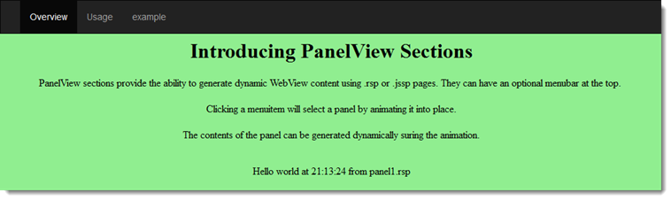
PanelView sections are similar to CarouselView Sections, but instead of displaying a carousel of images, they allow you to display panels containing dynamic WebView content using Visual FoxPro Server Pages (.rsp) or JavaScript Server Pages (.jssp).
You build Apps in Lianja App Builder visually using the Page Builder.
If you have not yet done so please read Understanding the Lianja Architecture and also Understanding ART to better understand this article.
An App consists of pages. Pages are made up of Sections. Form sections are made up of FormItems. We call these collectively "UI Elements" or "Visual Elements".
Setting Attributes Declaratively
You adjust the appearance and behavior of each UI Element in the Attributes Tab of the App Inspector.

The attributes available consist of some common ones as well as some specific to the UI Element being inspected.
Getting and Setting Attributes Programmatically
The setAttribute(name, value) method can be used to set the value of an Attribute:
Lianja.get("pageid.sectionid").setAttribute("title","Section1")
Note: on the desktop, the shortened form setAttr(name,value) is also available.
The getAttribute(name) method can be used to get the value of an Attribute:
cTitle = Lianja.get("pageid.sectionid").getAttribute("title")
Note: on the desktop, the shortened form getAttr(name) is also available.
See Also
Demo Apps (included in the Lianja App Builder distribution):
- Lianja PanelView Demo (example_panelview)
Attributes
Details
| Attribute | Description | Name | Type |
|---|---|---|---|
| Name | The name for this section (unique to the page) | id | Character |
| Full name | The full name for this section including its parent page, e.g. page1.section1 | fullid | Character |
| Alias name | The alias name for this section | aliasid | Character |
| Dashboard group | The dashboard section that this section belongs to. From v5.2. | horizontalgroup | Character |
| Horizontal stretch | The horizontal % stretch factor that this section should occupy. From v5.2. | horizontalgroupstretchfactor | Character |
| Vertical stretch | The vertical % stretch factor that this section should occupy. From v5.2. | verticalgroupstretchfactor | Character |
| App Doc | The App Doc file for this section. This will be included in the App Doc when it is generated. | appdoc | Character |
| MetaData version | The MetaData version number. You can set this in the setupUI hook to prevent MetaData being applied multiple times. | metaDataVersion | Int |
| Meta types | A comma separated list of metatype names | metatypes | Character |
| Custom Props | A ';' separated list of custom prop key pairs, e.g. name=barry;company=lianja From v5.3. |
customprops | Character |
| Type | The type of section: panelview (readonly) | type | Character |
| Caption | The section caption displayed in the section header | title | Character |
| Height | The section height | height | Character |
| Fixed height | Fix the section height (True | False) | fixedHeight | Boolean |
| Auto layout percent | Auto layout percentage of page size. If set to 0, then all sections on a page are resized to an equal height. | autoLayoutPercentage | Int |
Appearance
| Attribute | Description | Name | Type |
|---|---|---|---|
| Margin | Margin size around the section | margin | Int |
| Add spacer at bottom | Add spacer at bottom of section (True | False) | spacerVisible | Boolean |
Header
| Attribute | Description | Name | Type |
|---|---|---|---|
| Hide header | Hide section header at runtime(True | False) | hideHeaderAtRuntime | Boolean |
| Hide actionbar | Hide actionbar when stacked section is activated at runtime (True | False) |
hideActionBarAtRuntime | Boolean |
| Header icon | The image for the Header (png | jpg | gif). Use app:/imagename.ext for app specific images. |
headerIcon | Character |
| Gradient colors | Render the Header background color as a gradient (True | False) | headerGradient | Boolean |
| Gradient type | Specify the gradient type | headerGradientType | Int |
| Gradient start color | Gradient start color | headerFromColor | Character |
| Gradient end color | Gradient end color | headerToColor | Character |
| Show Print button | Show Print button in the section header (True | False) | showPrintButton | Boolean |
| Show Edit button | Show Edit button in the section header (True | False) | showEditButton | Boolean |
| Hide custom search icon | Hide the custom search icon (True | False) | hideCustomSearchIcon | Boolean |
| Show Custom search dialog | Show custom search dialog when custom search icon clicked (True | False) | showcustomsearchdialog | Boolean |
| Show custom search dialog panel | Show custom search dialog panel when custom search icon clicked (True | False) |
showcustomsearchdialogpanel | Boolean |
| Show info tips icon | Show the info tips icon in the section header (True | False) | showInfoTipsIcon | Boolean |
| Show help icon | Show the help icon in the section header (True | False) | showHelpIcon | Boolean |
| Help topic | Help topic to display when the help icon is clicked in the section header | helpTopic | Character |
Custom Header Style
| Attribute | Description | Name | Type |
|---|---|---|---|
| Use custom header style | Use a custom header style (True | False) | headercustomstyle | Boolean |
| Header background color | Header background color | headerbackcolor | Character |
| Header foreground color | Header foreground color | headerforecolor | Character |
| Header bottom border | Display the header bottom border (True | False) | headerbottomborder | Boolean |
| Header bottom border height | Height (in pixels) of the header bottom border (if displayed) | headerbottomborderheight | Int |
| Header bottom border color | Header bottom border color | headerbottombordercolor | Character |
| Show record count badge | Show the record count badge in the section header (True | False). | showreccount | Boolean |
Visual Component Details
| Attribute | Description | Name | Type |
|---|---|---|---|
| Component library | This specifies the Component library where the component will be saved. | componentlib | Character |
| Component name | Save as this component name whenever the section is saved. | componentname | Character |
| Component author | The author of this component. | componentauthor | Character |
| Component version | The version of this component. | componentversion | Character |
| Component description | The description of this component. | componentdescription | Character |
| Component permissions | The permissions required for this component in Lianja Cloud App Builder. | componentpermissions | Character |
| Component width | The width of this component when activated as a Form. | componentwidth | Int |
| Component height | The height of this component when activated as a Form. | componentheight | Int |
PanelView Options
| Attribute | Description | Name | Type |
|---|---|---|---|
| Menu | The menu to embed at the top of the PanelView section. This is a comma separated list. | panelMenu | Character |
| Panels | A comma separated list of .rsp or .jssp pages to be displayed as carousel panels. | panelList | Character |
| Captions | A comma separated list of captions to be displayed in the carousel panels. | panelCaptions | Character |
| Sub captions | A comma separated list of sub captions to be displayed in the carousel panels. | panelSubCaptions | Character |
| Show controls | Show the carousel left and right selection controls (True | False). | panelControls | Boolean |
| Show indicators | Show the carousel panel indicators (True | False). | panelIndicators | Boolean |
| Auto select | Automatically select the panel corresponding to the ordinal position of the menuitem (True | False). | panelAutoSelect | Boolean |
| Auto refresh | Automatically refresh the panel contents as they are selected (True | False). | panelAutoRefresh | Boolean |
| Cycle interval | The interval in seconds to cycle through the panels. 0 (default) specifies no cycling. | panellInterval | Int |
Related Data
| Attribute | Description | Name | Type |
|---|---|---|---|
| Parent section name | Name of related parent section | parentid | Character |
| Automatically relate | Automatically relate the child section (True | False). If this is unchecked then you need to manually relate it in the parentdatachanged delegate. | autoRelateChildSection | Boolean |
| Parent key | Parent key | parentKeyExpr | Character |
| Child key | Child key | childKeyExpr | Character |
Menu
| Attribute | Description | Name | Type |
|---|---|---|---|
| Visible | Section menu visible (True | False) | sectionMenuVisible | Boolean |
| Height | Section menu height | sectionMenuHeight | Int |
| Background color | Section menu background color | sectionMenuBackColor | Character |
| Foreground color | Section menu foreground color | sectionMenuForeColor | Character |
| Custom menu panel | The .rsp or .jssp page used to create the custom menu panel. This page should generate dynamic HTML5/JavaScript. | customSectionMenuPanel | Character |
| Custom menu | Section menu contents | customSectionMenu | Character |
| Custom action | Action to perform when a menu item is selected | sectionMenuAction | Character |
Search Panel
| Attribute | Description | Name | Type |
|---|---|---|---|
| Visible | Section search panel visible (True | False) | searchPanelVisible | Boolean |
| Height | Section search panel height | searchPanelHeight | Int |
| Background color | Section search panel background color | searchPanelBackColor | Character |
| Foreground color | Section search panel foreground color | searchPanelForeColor | Character |
| Auto create | Automatically create search panel for all Section search fields | searchPanelAutoCreate | Boolean |
| Custom search panel | The delegate used to create the custom search panel | searchPanelAction | Character |
Subtitle
| Attribute | Description | Name | Type |
|---|---|---|---|
| Visible | Section subtitle visible (True | False) | subtitleVisible | Boolean |
| Caption | Section subtitle caption | subtitleCaption | Character |
| Height | Section subtitle height | subtitleHeight | Int |
| Background color | Section subtitle background color | subtitleBackColor | Character |
| Foreground color | Section subtitle foreground color | subtitleForeColor | Character |
| Font | Section subtitle font | subtitleFont | Int |
| CSS style | CSS style | subtitleCssStyle | Character |
| Attribute | Description | Name | Type |
|---|---|---|---|
| Visible | Section footer visible (True | False) | footerVisible | Boolean |
| Caption | Section footer caption | footerText | Character |
| Height | Section footer height | footerHeight | Int |
| Background color | Section footer background color | footerBackColor | Character |
| Foreground color | Section footer foreground color | footerForeColor | Character |
| CSS style | CSS style (separate attributes with ; or use app:/filename.css or specify CSS classes separated by spaces). | footercssstyle | Character |
| Custom menu | Section footer menu contents | customOptionsMenu | Character |
| Custom action | Action to perform when a footer menu item is selected | customOptionsMenuAction | Character |
| Footer button CSS | Footer button CSS style | footerButtonCss | Character |
| Footer button width | Footer button width | footerButtonWidth | Int |
Other Options
| Attribute | Description | Name | Type |
|---|---|---|---|
| Hide form NavBar | Hide form Navigation Bar at runtime if this section is in an Accordion Stack (True | False) | hideFormNavBar | Boolean |
| Hide SearchBox | Hide the Page Header Instant Search box when this section is selected in an Accordion Stack (True | False). From v5.4. | hidesearchbox | Boolean |
| Collapsable | The section is collapsible at runtime (True | False) | collapsableAtRuntime | Boolean |
| Exclude from accordion | The section is excluded from accordion behavior at runtime (True | False) | excludeAccordionAtRuntime | Boolean |
Custom Delegates
| Attribute | Description | Name | Type |
|---|---|---|---|
| Scripting language | The default scripting language for custom code in this section (Inherit | Recital | Visual FoxPro | Python | JavaScript | PHP) | scriptingLanguage | Character |
| Custom library | The filename of the library containing code for event handlers and custom procedures/functions | customLibrary | Character |
| The delegate for the Print event. This is called when you click the 'Print' icon. |
printAction | Character | |
| Expanded | The delegate for the Expanded event | expandedAction | Character |
| Collapsed | The delegate for the Collapsed event | collapsedAction | Character |
| Hotkey | The delegate for the Hotkey event. | hotkeyAction | Character |
| Init | The delegate for the Init event | initAction | Character |
| Destroy | The delegate for the Destroy event | destroyAction | Character |
| Load | The delegate for the Load event | loadAction | Character |
| Ready | The delegate for the Ready event | readyAction | Character |
| Unload | The delegate for the Unload event | unloadAction | Character |
| Parent data changed | The delegate for the ParentDataChanged event | parentDataChangedAction | Character |
| Data Producer | The delegate for the DataProducer (used in Web Components). From v6.1. |
dataProducerAction | Character |
| Timer | The delegate for the Timer event | timerAction | Character |
| Timer interval | The timer interval in seconds that the Timer event will be called at runtime | timerInterval | Int |
| State Changed | The delegate for the Statechanged event. | stateChangedAction | Character |
| Custom footer menu | The delegate for the footer menu event | customMenuAction | Character |
| Custom search command | The delegate for the search event | customSearch | Character |
| Custom section menu | The delegate for the section menu event | customSectionMenuAction | Character |
Permissions and Roles
| Attribute | Description | Name | Type |
|---|---|---|---|
| Create roles | A comma separated list of roles that can perform create operations on data in the section. | permcreate | Character |
| Read roles | A comma separated list of roles that can read (and view) the section. | permRead | Character |
| Update roles | A comma separated list of roles that can perform update operations on data in the section. | permUpdate | Character |
| Delete roles | A comma separated list of roles that can perform delete operations on data in the section. | permDelete | Character |
UI Presentation Rules
| Attribute | Description | Name | Type |
|---|---|---|---|
| Desktop | Include this section in a Desktop client (True | False). | desktopUI | Boolean |
| Web | Include this section in a Web client (True | False). | webUI | Boolean |
| Tablet | Include this section in a Tablet client (True | False). | tabletUI | Boolean |
| Phone | Include this section in a Phone client (True | False). | mobileUI | Boolean |
| UI States | UI states that affect this section. Specify multiple states as a comma separated list. | state | Character |
| Initial UI state | The initial UI state for this section. This will be applied to the section and all its fields and gadgets. | uiStateInit | Character |
| Readonly when | Section is readonly at runtime if specified expression evaluates to true. | readonlyWhen | Character |
| Visible when | Section is visible at runtime if specified expression evaluates to true. | visibleWhen | Character |
| Display orientation | Display depending on mobile device orientation for Tablets and Phones. (Always | Portrait | Landscape) | displayOrientation | Character |
| Apply rules on change | Apply UI presentation rules (Visible when and Readonly when) when data is changed interactively or when navigating records (True | False). | applyRulesOnChange | Boolean |
| Apply rules on parent change | Apply section UI presentation rules (Visible when and Readonly when) when parent data is changed by navigating records (True | False) | applyRulesOnParentChange | Boolean |
| Search Panel Responsive UI width breakpoint | The Search Panel responsive UI width breakpoint in Web/Mobile Apps. From v5.4. | searchpanelresponsivevisibility | Int |
| Menu Responsive UI width breakpoint | The Menu responsive UI width breakpoint in Web/Mobile Apps. From v5.4. | responsivemenuwidth | Int |
| Responsive UI width breakpoint | The section responsive UI visibility width breakpoint in Web/Mobile Apps. From v5.4. | responsivewidthvisibility | Int |
| Responsive UI height breakpoint | The section responsive UI visibility height breakpoint in Web/Mobile Apps. From v5.4. | responsiveheightvisibility | Int |