Visual Components
Contents
Getting Started
You design and build visual components in the canvas designer.

- You can save a Canvas section as a custom component which can be used as a custom gadget, embedded in a cell of a grid or embedded in a cell of a formgrid section.
- Custom components are saved into the lib:/components/component_library/component_name directory as JavaScript code so that they can be used in Desktop, Web and Mobile Apps.
- When you save a canvas section as a custom component the JavaScript code is automatically generated.
- The name of the component is taken from the Canvas section Component Details attributes.
- This code should not be edited as it will be generated automatically every time changes are saved to a "Custom Component page".
- Components can be referenced using the notation component:/component_lib.component_name.
- It is best practice to make component libraries unique to your organization e.g. com_yourcompany. This will allow them to be used by other developers without causing any name clashes.
- When generating Web and Mobile Apps, components are included in the index.html file so there is no need to deploy them specifically.
Designing a Visual Component
When editing a canvas section you specify the component library and name in the canvas section attributes.
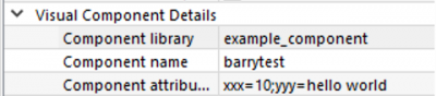
When you click the "Save" icon the canvas section is saved as a component in the directory:
lib:/components\example_component\barrytest.js
example_component is the component library name barrytest.js is the component name in this example
Embedding a Visual Component
Components can be used in custom section and custom gadget code. You simply call the constructor function in JavaScript like this:
mycomponent = yourcomponentlib_componentname();
Customizing a Visual Component at runtime
When a Visual Components is instantiated you can customize the internal attributes and intercept events using delegates.
Arguments (Optional):

    props         -- A string of attribute key/values separated with a ;
    initFunction  -- The init delegate for this component
    loadFunction  -- The load delegate for this component
    readyFunction -- The ready delegate for this component
Example:
var cont = example_component_barrytest("field1.table=customers;field3.backcolor=red;")
return cont;
So as you can see its quite easy to use components from your component libraries in custom sections and gadgets.
App Settings
Component library
This specifies the Component library for this App. Components that are generated are saved here if its name is not overridden in the canvas section attributes.
Components
This specifies the Components needed for this App. Separate each with a ';' to specify more than one, e.g.
example_component.name;example_component.*