Difference between revisions of "UI States"
Yvonne.milne (Talk | contribs) |
Yvonne.milne (Talk | contribs) |
||
| Line 134: | Line 134: | ||
Initial UI state: state2 | Initial UI state: state2 | ||
| + | |||
| + | This means that when the App is first loaded (in runtime), the Orders grid section is not visible. | ||
<br clear=all> | <br clear=all> | ||
Revision as of 11:53, 14 April 2016
Under Construction
Contents
See Also
Lianja system object, SHOWDOCUMENT(), UI Presentation Rules
Overview
UI States App
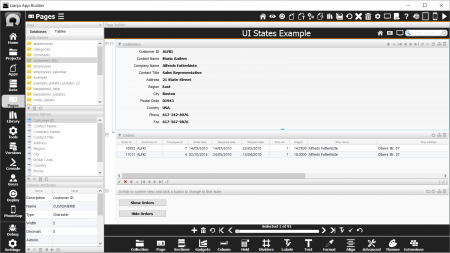
The 'UI States App' (example_uistates) example App is included in the Lianja App Builder distribution to demonstrate the use of UI States.
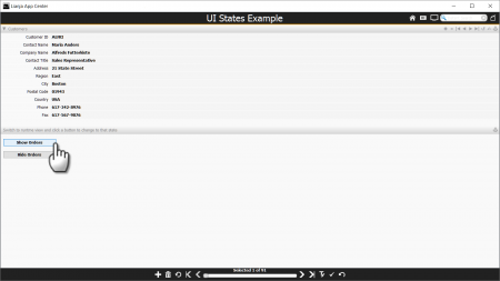
To see the effect of UI states, switch to the Desktop App View.
Clicking the Show Orders and Hide Orders buttons shows and hides the Orders grid section.
As we will see, the 'visible' property of the 'Orders' grid section is being set based on a change of UI State. The UI State is being set in the click event of the buttons.
Setting a UI State
UI States can be changed using the showdocument() function or the Lianja system object showDocument() method.
showdocument(changestate:<state>)
To cause all UI components to revert back to their default attributes (no UI State set), use:
showdocument(resetstate)
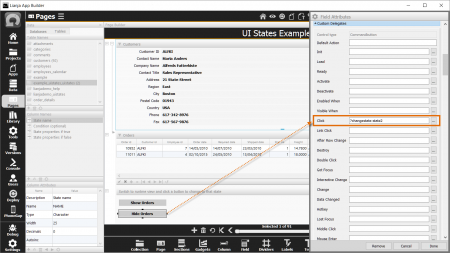
Back in the UI States App (in Development View), open up the Field Attributes for the buttons.
These use the Inline Delegate version of the showdocument() function.
The 'Show Orders' button changes the UI State to 'state1'.
and the 'Hide Orders' button changes the UI state to 'state2'.
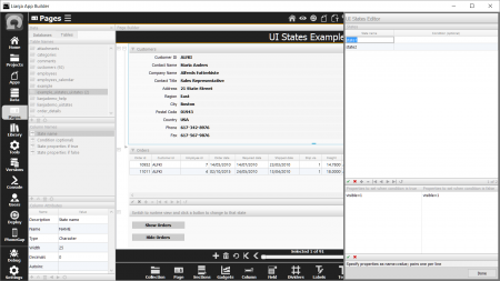
The 'state1' and 'state2' states are defined in the UI States Editor.
UI States Editor
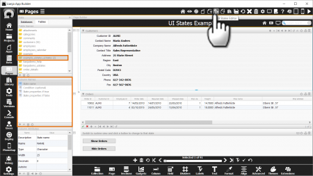
The UI States Editor is accessed from its headerbar toolbutton and is where you define the names and behavior of UI states.
The UI State definitions are written to a table called <app-name>_uistates - here example_uistates_uistates.
When you first open the UI States Editor, you will be prompted to allow the table to be created if it does not already exist.
Here's the UI States Editor with the states 'state1' and 'state2'.
The 'state2' UI state is selected here and has one row of 'property-name=value' entries (in the bottom section) for when the UI State is active (true) and not active (false).
A UI state can have multiple rows or entries. So, when 'state2' is active, affected UI components will have their 'visible' property set to 0 (false) and when 'state2' is not active (i.e. the default state), affected UI components will have their 'visible' property set to 1 (true).
Make sure you set the default state in this way so that when you are in Development View, which uses the default state, you can see and manipulate all your UI components.
Here's 'state1' - the UI state activated when the 'Show Orders' button is clicked - it makes affected UI components visible when it is active, and also when the default state is active.
Attributes
Two attributes control whether a component is affected by a particular UI State and what the starting UI state is:
UI States
The UI States attribute specifies the UI states that affect the container/control. Multiple states should be specified as a comma separated list.
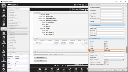
If you open the Section Attributes for the Orders grid section, you will see that it has the entry:
UI States: state1,state2
Initial UI State
The Initial UI state attribute specifies the starting UI state for the container/control.
In the UI States App, this is set in the App Settings as follows:
Initial UI state: state2
This means that when the App is first loaded (in runtime), the Orders grid section is not visible.
Notes on Client Support
| Attribute | Notes |
|---|---|
| UI States | |
| Initial UI State |

