Difference between revisions of "PanelView Options"
Yvonne.milne (Talk | contribs) |
Yvonne.milne (Talk | contribs) (→Notes on Client Support) |
||
| Line 199: | Line 199: | ||
[[Category:Attribute Categories]] | [[Category:Attribute Categories]] | ||
[[Category:Sections]] | [[Category:Sections]] | ||
| + | [[Category:WebView Based Sections]] | ||
Latest revision as of 06:42, 12 April 2024
Contents
See Also
PanelView Section Attributes, CarouselView Options
Overview
PanelView sections are similar to CarouselView Sections, but instead of displaying a carousel of images, they allow you to display panels containing dynamic WebView content using Visual FoxPro Server Pages (.rsp) or JavaScript Server Pages (.jssp).
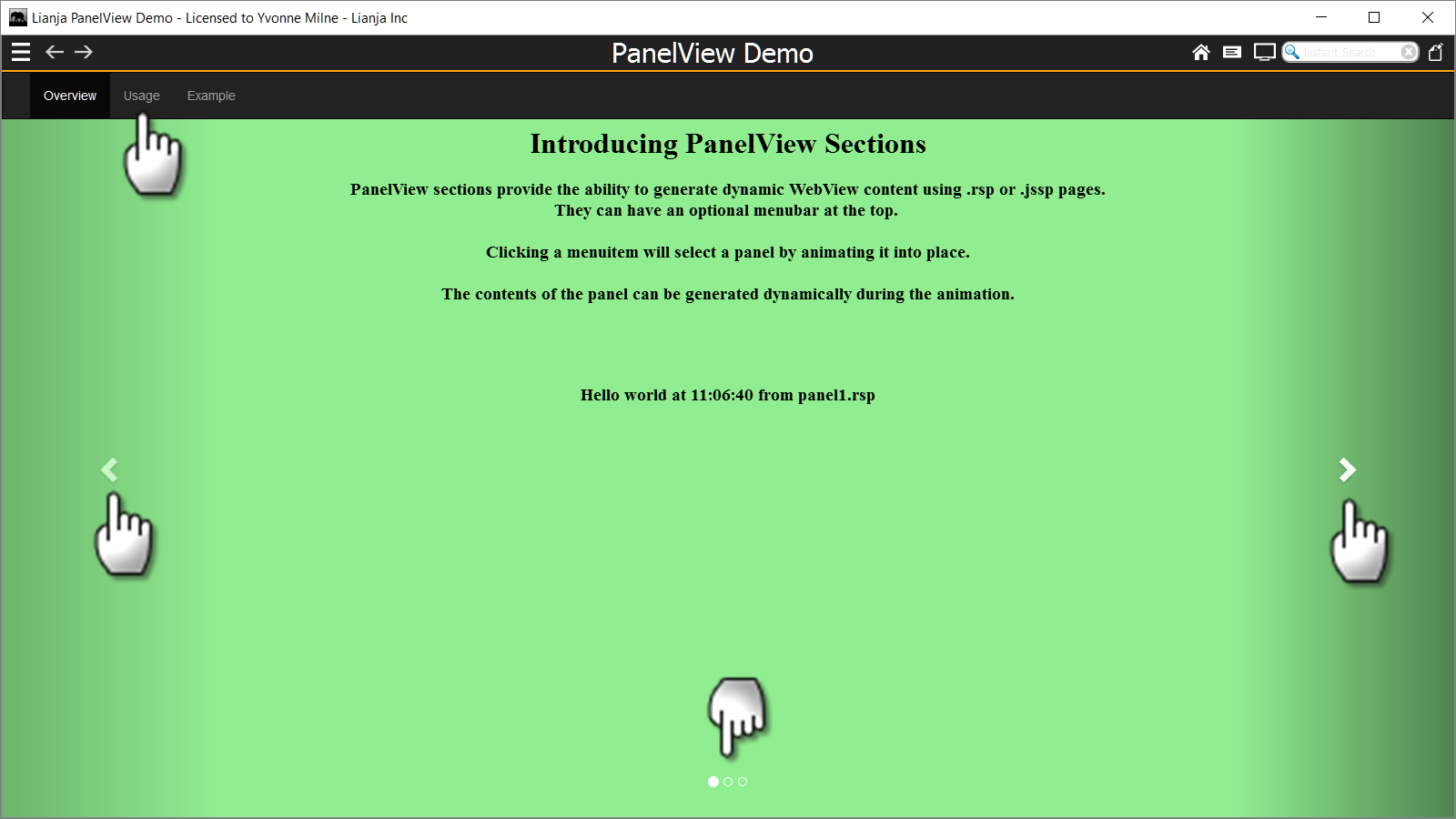
Panel navigation options include a menubar at the top, next and previous arrows (Controls) and selection dots (Indicators).
Lianja PanelView Demo

The 'Lianja PanelView Demo' (example_panelview) is included in the Lianja App Builder distribution to demonstrate the use of a PanelView Section.

PanelView Options

Double-click the Section header or click the cog icon to access the Section Attributes.
The PanelView Section options are described below.
Menu

The Menu attribute is a | separated list of menuitems to be embedded at the top of the PanelView section.
The menu may contain submenus. Sub menuitems are comma separated and in parentheses. e.g.
Item1|Item2(Sub1,Sub2,Sub3)|Item3|Item4(Sub1,Sub2)
The first menuitem cannot have sub menuitems.
Clicking on the [...] button pops up an editor. Just enter each menuitem (and its sub menuitems if required) on a line of its own and the | separators will be added for you.
Note: for single level menus, the menuitems can be comma-separated or | separated.
The Custom section menu Custom delegate is called when a menuitem or sub menuitem is selected. The lowercase menuitem text is passed to the delegate, e.g. 'item1'. For sub menuitems this is prefixed with the parent menuitem and a '|', e.g. 'item4|sub2'.
The 'Lianja PanelView Demo' uses Auto select rather than the Custom section menu Custom delegate to select individual panels.
The code below demonstrates how the same functionality would be handled in a Custom delegate (JavaScript) in the Lianja Web Client:
////////////////////////////////////////////////////////////////
// Event delegate for 'customsectionmenu' event
function page1_section1_customsectionmenu(menuitem)
{
	if (menuitem === "overview")
	{
		Lianja.showDocument("page:page1.section1?action=select&text=1");
	}
	else if (menuitem === "usage")
	{
		Lianja.showDocument("page:page1.section1?action=select&text=2");
	}
	else if (menuitem === "example")
	{
		Lianja.showDocument("page:page1.section1?action=select&text=3");
	}
};
Note the use of the Lianja.showDocument() method to select a panel. The following Lianja.showDocument() options are available from the Custom section menu Custom delegate in the Lianja Web Client:
Select a panel by number according to its numeric position (n) in the Panels list:
Lianja.showDocument("page:pageid.sectionid?action=select&text=n");
Select the next panel:
Lianja.showDocument("page:pageid.sectionid?action=select&text=next");
Select the previous panel:
ianja.showDocument("page:pageid.sectionid?action=select&text=prev");
Enable Cycle:
Lianja.showDocument("page:pageid.sectionid?action=select&text=cycle");
Panels

Create the .rsp or .jssp panel scripts to be used in the PanelView Section in the Apps Workspace.

The Panels attribute is a comma separated list of script file names specifying the script to be run to generate each panel.
Clicking on the [...] button pops up an editor. Just enter each file name on a line of its own and the comma separators will be added for you.
Captions

The Captions attribute is a comma separated list of captions to be displayed on the panels.
Clicking on the [...] button pops up an editor. Just enter each caption on a line of its own and the comma separators will be added for you.
Sub captions

The Sub captions attribute is a comma separated list of captions to be displayed on the panels.
Clicking on the [...] button pops up an editor. Just enter each sub caption on a line of its own and the comma separators will be added for you.
Show controls

The Show controls attribute determines whether the controls (next and previous arrows) are displayed. The controls are shown by default in a new PanelView Section.
Show indicators
The Show indicators attribute determines whether the indicators (selection dots) are displayed. The indicators are shown by default in a new PanelView Section.
Auto select
The Auto select attribute works in conjunction with the Menu. If Auto select is set to True, clicking on a menuitem will automatically select the panel corresponding to the position of the menuitem, e.g. clicking the second menuitem in the Menu list will select the second panel in the Panels list.
Auto refresh
If Auto refresh is set to True, a panel's contents will be automatically refreshed (its script re-run) when it is selected.
Cycle interval
The Cycle interval attribute can be set to a non-zero value to cause the panels to cycle automatically.
For example, with the Cycle interval set to 5, the next panel will be selected every 5 seconds.
Notes on Client Support
| Attribute | Notes |
|---|---|
| Menu | The menu is not supported on the Lianja mobile client. |
| Panels | - |
| Captions | - |
| Sub captions | - |
| Show controls | - |
| Show indicators | - |
| Auto select | - |
| Auto refresh | - |
| Cycle interval | - |