Difference between revisions of "Combobox"
From Lianjapedia
Helen.george (Talk | contribs) |
Yvonne.milne (Talk | contribs) (→Description) |
||
| (9 intermediate revisions by 2 users not shown) | |||
| Line 1: | Line 1: | ||
Note: property, method and event names should be referred to in lowercase in case-sensitive scripting languages. | Note: property, method and event names should be referred to in lowercase in case-sensitive scripting languages. | ||
| + | |||
| + | ====Description==== | ||
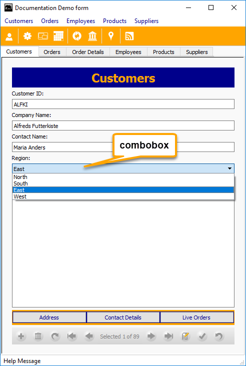
| + | Shown below in a standalone [[Form]]. Click the image to see in a [[Custom_Sections_and_Gadgets|Custom Section]] in a Lianja [[Page Attributes|Page]]. | ||
| + | |||
| + | [[{{ns:file}}:combobox.png|link={{filepath:combobox_cs.png}}|Combobox]] | ||
| + | |||
| + | When selected, the ComboBox control opens, displaying a list of items from which you can choose one. A ComboBox control combines the features of a TextBox control and a ListBox control. You can enter information in the text box portion or select an item from the list box portion of the control. | ||
====Properties==== | ====Properties==== | ||
| Line 26: | Line 33: | ||
|Number of items in the list | |Number of items in the list | ||
|- | |- | ||
| − | |ListIndex | + | |valign=top|ListIndex |
| − | |RW | + | |valign=top|RW |
| − | |Numeric | + | |valign=top|Numeric |
| − | |Current item index value | + | |Current item index value. Starts from 1. |
|- | |- | ||
|Readonly | |Readonly | ||
| Line 46: | Line 53: | ||
|Row data source type | |Row data source type | ||
|- | |- | ||
| − | |Text | + | |valign=top|Text |
| − | |RW | + | |valign=top|RW |
| − | |Character | + | |valign=top|Character |
| − | |Current item text value | + | |Current item text value. |
|- | |- | ||
|Validation | |Validation | ||
| Line 91: | Line 98: | ||
|List | |List | ||
|index as numeric | |index as numeric | ||
| − | |Return the specified item | + | |Return the specified item text |
|- | |- | ||
|RemoveItem | |RemoveItem | ||
Latest revision as of 11:03, 9 April 2018
Note: property, method and event names should be referred to in lowercase in case-sensitive scripting languages.
Contents
Description
Shown below in a standalone Form. Click the image to see in a Custom Section in a Lianja Page.
When selected, the ComboBox control opens, displaying a list of items from which you can choose one. A ComboBox control combines the features of a TextBox control and a ListBox control. You can enter information in the text box portion or select an item from the list box portion of the control.
Properties
This class supports the Common Properties plus the following:
| Property | Access (R/RW) | Value | Description |
|---|---|---|---|
| ColumnCount | RW | Numeric | Number of columns |
| ExtendItems | RW | Boolean | If True, extend items |
| ListCount | R | Numeric | Number of items in the list |
| ListIndex | RW | Numeric | Current item index value. Starts from 1. |
| Readonly | RW | Boolean | If True, object cannot be modified |
| RowSource | RW | Character | Row data source |
| RowSourceType | RW | Numeric | Row data source type |
| Text | RW | Character | Current item text value. |
| Validation | RW | Character | String containing boolean expression to validate data entry |
| ValidationErrorMessage | RW | Character | Message displayed if validation returns False |
| Value | RW | Character or numeric | Current item text or index value |
Methods
This class supports the Common Methods plus the following:
| Method | Args | Description |
|---|---|---|
| AddItem | item as Character | Add the specified item |
| AddItems | selectstatement as Character | commalist as Character | pipelist as Character | items as Array[, icon as Character] | Add the specified items: comma-separated list, pipe-separated list or elements of the specified array, optional including the filename of an icon. |
| Clear | None | Remove all items |
| List | index as numeric | Return the specified item text |
| RemoveItem | item as Character | index as Numeric | Remove the specified object |
Events
This class supports the Common Events plus the following:
| Event | Args | Description |
|---|
