Difference between revisions of "CatalogView Options"
Yvonne.milne (Talk | contribs) |
Yvonne.milne (Talk | contribs) |
||
| Line 31: | Line 31: | ||
| − | The example desktop App ' | + | The example desktop App 'CatalogView App' (example_catalogview) App also displays the employee photograph and notes along with the employee name. |
Clicking on the photograph or the name calls an inline delegate to switch to the 'Employee Details' Page and show the details for the selected employee. | Clicking on the photograph or the name calls an inline delegate to switch to the 'Employee Details' Page and show the details for the selected employee. | ||
| Line 40: | Line 40: | ||
==Atttributes== | ==Atttributes== | ||
| + | |||
| + | ===Data Binding=== | ||
| + | The '''Database''' and '''Table''' Attributes define the data binding for the CatalogView Section. | ||
| + | |||
| + | {| class="wikitable" width="100%" | ||
| + | !width="20%"|Attribute | ||
| + | !width="80%"|Description | ||
| + | |- | ||
| + | |valign="top"|Database||The name of the database | ||
| + | |- | ||
| + | |valign="top"|Table||The name of the table | ||
| + | |- | ||
| + | |} | ||
| + | |||
| + | [[{{ns:file}}:catview_table.png|450px|thumb|right|link={{filepath:catview_table.png}}|Database and Table Attributes]] | ||
| + | |||
| + | |||
| + | |||
| + | |||
| + | Here the example desktop App 'CatalogView App' (example_catalogview) has empty '''Database''' and '''Table''' Attributes. CatalogView Sections will default to using the sample southwind database and the employees table if no '''Database''' and '''Table''' are specified, but remember to complete these for your target data. | ||
| + | |||
| + | <br clear=all> | ||
| + | |||
===Heading=== | ===Heading=== | ||
The Catalogview heading. This defaults to none, which causes the heading to not be displayed | The Catalogview heading. This defaults to none, which causes the heading to not be displayed | ||
| Line 74: | Line 97: | ||
| − | Here the example desktop App ' | + | Here the example desktop App 'CatalogView App' (example_catalogview) App specifies that the image should be the '''photo''' field (from the employees table). |
The Image width and Image height are not set, so the image will be displayed at the default 200 pixels by 200 pixels size. | The Image width and Image height are not set, so the image will be displayed at the default 200 pixels by 200 pixels size. | ||
Revision as of 09:08, 22 April 2015
Under Construction
Contents
- 1 CatalogView Section
- 2 Atttributes
- 2.1 Data Binding
- 2.2 Heading
- 2.3 Cell width
- 2.4 Cell height
- 2.5 Columns across
- 2.6 Image Attributes
- 2.7 Caption
- 2.8 Caption delegate
- 2.9 Caption link searchkey
- 2.10 Sub caption
- 2.11 Details
- 2.12 Read more
- 2.13 Details height
- 2.14 Read more delegate
- 2.15 Read more link searchkey
- 2.16 Order by
- 2.17 Filter
- 2.18 Paginated CatalogView Sections
- 2.19 CSS Stylesheet
- 2.20 Other options
- 2.21 Custom library
- 2.22 Tile producer
- 3 Notes on Client Support
CatalogView Section
The CatalogView Section is a data bound WebViewWidget that displays a catalog of items. Each page provides a table of cells comprising an image, a caption, a sub caption, some details and optional links to drill down to additional information about the selected catalog item.
Two Apps are included in the Lianja App Builder distribution to demonstrate the use of a CatalogView Section.
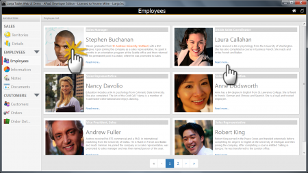
The 'Lianja Tablet Web UI Demo' (example_webapp1) App displays the photograph and notes fields (blob, varchar) from the employees table along with their job title and a 'Read more...' link.
Double-clicking on the photograph or clicking on the 'Read more...' link calls the JavaScript dblclick/click delegates to slide in an employee information panel with details of the selected employee.
It is a paginated CatalogView Section.
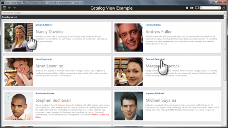
The example desktop App 'CatalogView App' (example_catalogview) App also displays the employee photograph and notes along with the employee name.
Clicking on the photograph or the name calls an inline delegate to switch to the 'Employee Details' Page and show the details for the selected employee.
It is a single page CatalogView Section.
Atttributes
Data Binding
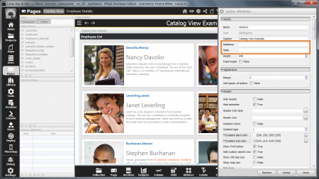
The Database and Table Attributes define the data binding for the CatalogView Section.
| Attribute | Description |
|---|---|
| Database | The name of the database |
| Table | The name of the table |
Here the example desktop App 'CatalogView App' (example_catalogview) has empty Database and Table Attributes. CatalogView Sections will default to using the sample southwind database and the employees table if no Database and Table are specified, but remember to complete these for your target data.
Heading
The Catalogview heading. This defaults to none, which causes the heading to not be displayed
Cell width
The width of each cell (this is a percentage that the cell will used in the display area). This defaults to 100%
Cell height
The height of the cell in pixels. This defaults to just take up the space that is required to display the cell
Columns across
The number of columns to display across the page
Image Attributes
Each cell in the CatalogView Section displays an image from a blob field (alternatively known as an object field) from the bound table.
Image height and width can be set, otherwise they each default to 200 pixels.
| Attribute | Description |
|---|---|
| Image | The name of the (blob/object) column in the table containing the image for each cell |
| Image width | The width of the image in pixels |
| Image height | The height of the image in pixels |
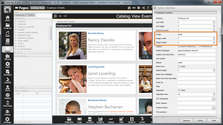
Here the example desktop App 'CatalogView App' (example_catalogview) App specifies that the image should be the photo field (from the employees table).
The Image width and Image height are not set, so the image will be displayed at the default 200 pixels by 200 pixels size.
Caption
The name of the (character) column in the table containing the caption for each cell
Caption delegate
The inline delegate to invoke when the caption is clicked
Caption link searchkey
The search key expression to be postfixed to the caption delegate when it is invoked
Sub caption
The name of the (character) column in the table containing the sub-caption for each cell
Details
The name of the (memo/varchar) column in the table containing the details for each cell
Read more
Show the 'Read more' link (True | False).
Details height
Maximum height of details to display if 'Read more' is specified
Read more delegate
The inline delegate to invoke when the 'Read more' link is clicked
Read more link searchkey
The search key expression to be postfixed to the 'Read more' delegate when it is invoked
Order by
The orderby expression for the data in the Catalogview
Filter
The filter expression that restricts which records will be included in the Catalogview
Paginated CatalogView Sections
For displays of a larger number of catalog items or where a larger cell size is required, CatalogView Sections with multiple pages can be created.
| Attribute | Description |
|---|---|
| Pagination | Paginate the rows displayed (True | False) |
| Pagination size | The number of cells to paginate |
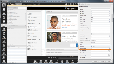
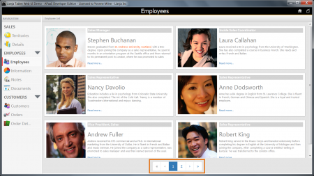
The 'Lianja Tablet Web UI Demo' (example_webapp1) App has Pagination enabled and Pagination size set to 6. Columns across is set to 2, so 3 rows are displayed per page.
Note: Complete rows will be displayed, so with Pagination size set to 5, a page would still display 3 rows of 2 cells.
With Pagination enabled, the page navigation control is automatically displayed.
CSS Stylesheet
You can override the CSS style for the table containing the cells and the style of the cells themselves by specifying your own stylesheet.
Other options
Other Catalogview options
Custom library
Custom library containing the Tile producer delegate.
Tile producer
Delegate to call to render a custom tile. This should just output the HTML.
Notes on Client Support
| Attribute | Notes |
|---|---|
| Heading | |
| Cell width | |
| Cell height | |
| Columns across | |
| Image | |
| Image width | |
| Image height | |
| Caption | |
| Caption delegate | |
| Caption link searchkey | |
| Sub caption | |
| Details | |
| Read more | |
| Details height | |
| Read more delegate | |
| Read more link searchkey | |
| Order by | |
| Filter | |
| Pagination | |
| Pagination size | |
| CSS Stylesheet | |
| Other options | |
| Custom library | |
| Tile producer |
