Difference between revisions of "CarouselView Options"
Yvonne.milne (Talk | contribs) |
Yvonne.milne (Talk | contribs) (→Notes on Client Support) |
||
| (27 intermediate revisions by the same user not shown) | |||
| Line 1: | Line 1: | ||
| − | + | ==See Also== | |
| + | [[CarouselView Section Attributes]], [[PanelView Options]] | ||
| − | + | ==Overview== | |
| − | + | ||
| − | | | + | {| |
| − | | style="text-align:center;" | {{#widget:Vimeo|id=124624079 |width= | + | |style="text-align:center;" | {{#widget:Vimeo|id=124624079 |width=454 |height=253}} |
| − | + | || CarouselView Sections are ideal as Welcome pages.<br><br> The images can be selected by clicking on the left <br> or right control arrows or by using the indicator dots<br> at the bottom of the image.<br><br> They can also be set to automatically cycle through<br> at a specified interval. | |
|} | |} | ||
| − | + | ||
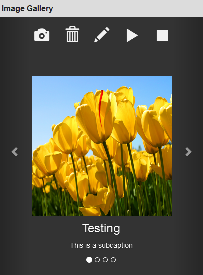
[[{{ns:file}}:carview_app.png|450px|thumb|left|link={{filepath:carview_app.png}}|CarouselView Section]] | [[{{ns:file}}:carview_app.png|450px|thumb|left|link={{filepath:carview_app.png}}|CarouselView Section]] | ||
| − | + | ||
| + | A CarouselView Section displays images along with their captions and sub captions. | ||
| + | |||
| + | It can also optionally have a menu. | ||
| + | |||
| + | The next and previous arrows (Controls) and the selection dots (Indicators) move through the images. | ||
| + | |||
| + | <br clear=all> | ||
| + | |||
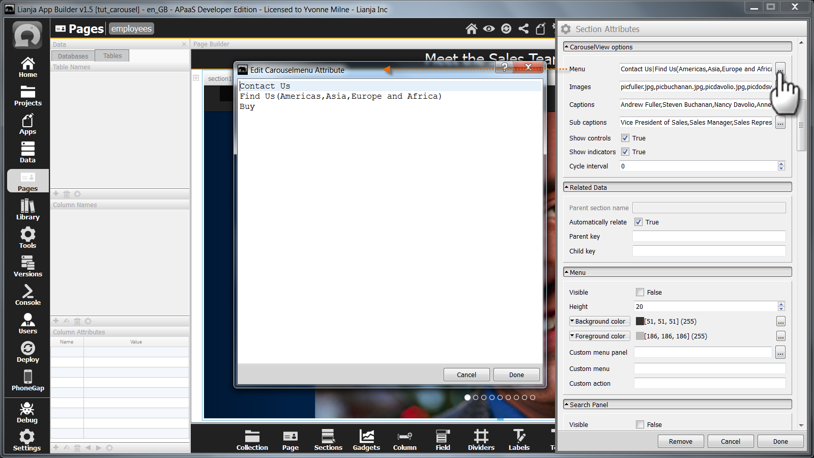
| + | ==Menu== | ||
| + | [[{{ns:file}}:carview_menus.png|450px|thumb|left|link={{filepath:carview_menus.png}}|CarouselView Section:Menu attribute]] | ||
| + | |||
| + | |||
| + | |||
| + | The '''Menu''' attribute is a | separated list of menuitems to be embedded at the top of the CarouselView section. | ||
| + | |||
| + | The menu may contain submenus. Sub menuitems are comma separated and in parentheses. The first menuitem cannot have sub menuitems. | ||
| + | |||
| + | Clicking on the [...] button pops up an editor. Just enter each menuitem (and its sub menuitems if required) on a line of its own and the | separators will be added for you. | ||
| + | |||
| + | Note: for single level menus, the menuitems can be comma-separated or | separated. | ||
| + | |||
| + | The '''Custom section menu''' Custom delegate is called when a menuitem or sub menuitem is selected. | ||
| + | |||
<br clear=all> | <br clear=all> | ||
| Line 21: | Line 45: | ||
| − | + | ||
| + | Add the images files to be used in the CarouselView Section to the App by dragging them into the Apps Workspace. | ||
| + | |||
<br clear=all> | <br clear=all> | ||
| Line 28: | Line 54: | ||
| − | The Images attribute | + | |
| + | The '''Images''' attribute is a comma separated list of image file names specifying the images to be displayed. | ||
| + | |||
| + | Clicking on the [...] button pops up an editor. Just enter each file name on a line of its own and the comma separators will be added for you. | ||
| + | |||
<br clear=all> | <br clear=all> | ||
| Line 36: | Line 66: | ||
| − | The Captions attribute | + | |
| + | The '''Captions''' attribute is a comma separated list of captions to be displayed on the images. | ||
| + | |||
| + | Clicking on the [...] button pops up an editor. Just enter each caption on a line of its own and the comma separators will be added for you. | ||
| + | |||
<br clear=all> | <br clear=all> | ||
==Sub captions== | ==Sub captions== | ||
| − | [[{{ns:file}}: | + | [[{{ns:file}}:carview_subcaptions.png|450px|thumb|left|link={{filepath:carview_subcaptions.png}}|CarouselView Section: Sub captions attribute]] |
| − | |||
| − | |||
| − | + | The '''Sub captions''' attribute is a comma separated list of captions to be displayed on the images. | |
| − | + | ||
| + | Clicking on the [...] button pops up an editor. Just enter each sub caption on a line of its own and the comma separators will be added for you. | ||
| − | |||
| − | |||
<br clear=all> | <br clear=all> | ||
| Line 60: | Line 90: | ||
| − | The Show controls attribute | + | |
| + | The '''Show controls''' attribute determines whether the controls (next and previous arrows) are displayed. | ||
| + | |||
<br clear=all> | <br clear=all> | ||
| Line 68: | Line 100: | ||
| − | The Show indicators attribute | + | |
| + | The '''Show indicators''' attribute determines whether the indicators (selection dots) are displayed. | ||
| Line 74: | Line 107: | ||
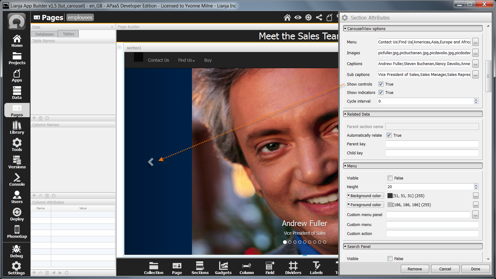
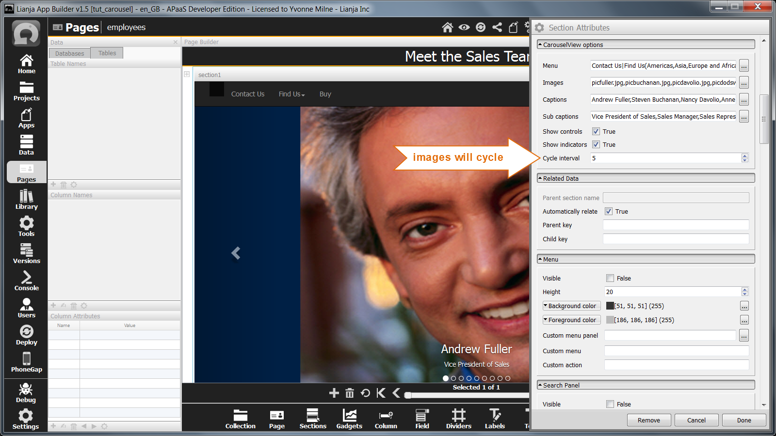
==Cycle interval== | ==Cycle interval== | ||
| − | [[{{ns:file}}:carview_app2.png|450px|thumb|left|link={{filepath:carview_app2.png}}|CarouselView Section]] | + | [[{{ns:file}}:carview_app2.png|450px|thumb|left|link={{filepath:carview_app2.png}}|CarouselView Section: Controls and Indicators]] |
| + | |||
| Line 85: | Line 119: | ||
| − | The Cycle interval attribute can be set to a non-zero value to cause the images to cycle automatically. | + | The '''Cycle interval''' attribute can be set to a non-zero value to cause the images to cycle automatically. |
Here the Cycle interval has been set to 5, so the next image will be selected every 5 seconds. | Here the Cycle interval has been set to 5, so the next image will be selected every 5 seconds. | ||
| Line 91: | Line 125: | ||
<br clear=all> | <br clear=all> | ||
| + | |||
| + | ==Lianja 5.0 Enhancements== | ||
| + | From Lianja v5.0, CarouselView Sections can be data bound and display the images from a blob column and the text from the associated 'caption' and 'subcaption' character columns. | ||
| + | |||
| + | The controls and indicators are used to navigate between records. | ||
| + | |||
| + | The CarouselView Section can be used as the 'child' section to a related 'parent' table. Note that the relation is set using the '''Keyfield''' and '''Keyfield expression'''. | ||
| + | |||
| + | The CarouselView Section records can also be filtered and sorted. | ||
| + | |||
| + | Full CRUD operations are supported in Desktop, Web and Mobile. | ||
| + | |||
| + | ===Database=== | ||
| + | The name of the database for the data bound table. | ||
| + | |||
| + | <pre>southwind</pre> | ||
| + | |||
| + | ===Table=== | ||
| + | The name of the data bound table. | ||
| + | |||
| + | <pre>images</pre> | ||
| + | |||
| + | ===Editable=== | ||
| + | Whether the images can be added and deleted by the end-user (True | False). | ||
| + | |||
| + | ===Order by=== | ||
| + | An optional order by expression to sort the data. | ||
| + | |||
| + | ===Filter=== | ||
| + | An optional filter expression to restrict the included records. | ||
| + | |||
| + | ===Image column=== | ||
| + | The name of the blob column containing the image files. | ||
| + | |||
| + | <pre>image</pre> | ||
| + | |||
| + | ===Caption column=== | ||
| + | The name of the character column for the image caption. | ||
| + | |||
| + | <pre>caption</pre> | ||
| + | |||
| + | ===Subcaption column=== | ||
| + | The name of the character column for the image subcaption. | ||
| + | |||
| + | <pre>subcaption</pre> | ||
| + | |||
| + | ===Keyfield=== | ||
| + | The name of the column into which the '''Keyfield expression''' will be inserted when an image is added. | ||
| + | |||
| + | <pre>cust_id</pre> | ||
| + | |||
| + | This column is also used in conjunction with the '''Keyfield expression''' to restrict the included records for a related table: where ''keyfield'' = ''keyfield expression''. | ||
| + | |||
| + | If a '''Filter''' is specified, this is prefixed to the where clause: where ''filter'' and ''keyfield'' = ''keyfield expression''. | ||
| + | |||
| + | ===Keyfield expression=== | ||
| + | The expression that will be inserted into the '''Keyfield''' when an image is added. Use {expr} to insert dynamic values. | ||
| + | |||
| + | <pre>{cust.cust_id}</pre> | ||
| + | |||
| + | This column is also used in conjunction with the '''Keyfield''' to restrict the included records for a related table: where ''keyfield'' = ''keyfield expression''. | ||
| + | |||
| + | If a '''Filter''' is specified, this is prefixed to the where clause: where ''filter'' and ''keyfield'' = ''keyfield expression''. | ||
| + | |||
| + | ===Display images as photos=== | ||
| + | Whether the images should be shown as photos (True | False). This displays the images centralized and with a border. It is especially suitable for phone Apps or where the CarouselView controls and indicators should be displayed outside the image. | ||
| + | |||
| + | Display images as photos = ''False'' (default): | ||
| + | [[{{ns:file}}:l5_nodisplayphoto.png|left|link={{filepath:l5_nodisplayphoto.png}}|CarouselView Section]] | ||
| + | <br clear=all> | ||
| + | |||
| + | Display images as photos = ''True'': | ||
| + | [[{{ns:file}}:l5_yesdisplayphoto.png|left|link={{filepath:l5_yesdisplayphoto.png}}|CarouselView Section]] | ||
| + | <br clear=all> | ||
| + | |||
| + | ==Lianja 8.0 Enhancements== | ||
| + | From Lianja v8.0 the 'Lianja Carousel Demo' (example_carousel) App is included in the Lianja App Builder distribution to demonstrate CarouselView functionality. | ||
| + | |||
| + | [[{{ns:file}}:l72_cv2.png|left|link={{filepath:l72_cv2.png}}|CarouselView Section]] | ||
| + | <br clear=all> | ||
| + | |||
| + | The 'Custom Web Component Parameters Editor' can now be used to set the CarouselView Attributes: | ||
| + | |||
| + | [[{{ns:file}}:l72_cv1.png|800px|left|border|link={{filepath:l72_cv1.png}}|CarouselView Section]] | ||
| + | <br clear=all> | ||
| + | |||
| + | ==Notes on Client Support== | ||
{| class="wikitable" width="100%" | {| class="wikitable" width="100%" | ||
!width="20%"|Attribute | !width="20%"|Attribute | ||
| − | !width="80%"| | + | !width="80%"|Notes |
| + | |- | ||
| + | |valign="top"|Database||- | ||
| + | |- | ||
| + | |valign="top"|Table||- | ||
| + | |- | ||
| + | |valign="top"|Editable||- | ||
| + | |- | ||
| + | |valign="top"|Menu||- | ||
| + | |- | ||
| + | |valign="top"|Images||- | ||
| + | |- | ||
| + | |valign="top"|Captions||- | ||
| + | |- | ||
| + | |valign="top"|Sub captions||- | ||
| + | |- | ||
| + | |valign="top"|Show controls||- | ||
| + | |- | ||
| + | |valign="top"|Show indicators||- | ||
| + | |- | ||
| + | |valign="top"|Cycle interval||- | ||
|- | |- | ||
| − | |valign="top"| | + | |valign="top"|Order by||- |
|- | |- | ||
| − | |valign="top"| | + | |valign="top"|Filter||- |
|- | |- | ||
| − | |valign="top"| | + | |valign="top"|Image column||- |
|- | |- | ||
| − | |valign="top"| | + | |valign="top"|Caption column||- |
|- | |- | ||
| − | |valign="top"| | + | |valign="top"|Subcaption column||- |
|- | |- | ||
| − | |valign="top"| | + | |valign="top"|Keyfield||- |
|- | |- | ||
| − | |valign="top"| | + | |valign="top"|Keyfield expression||- |
|- | |- | ||
|} | |} | ||
[[Category:Attribute Categories]] | [[Category:Attribute Categories]] | ||
| + | [[Category:Sections]] | ||
| + | [[Category:Lianja v5.0]] | ||
| + | [[Category:Lianja v8.0]] | ||
| + | [[Category:WebView Based Sections]] | ||
Latest revision as of 10:10, 12 April 2024
Contents
See Also
CarouselView Section Attributes, PanelView Options
Overview
| CarouselView Sections are ideal as Welcome pages. The images can be selected by clicking on the left or right control arrows or by using the indicator dots at the bottom of the image. They can also be set to automatically cycle through at a specified interval. |

A CarouselView Section displays images along with their captions and sub captions.
It can also optionally have a menu.
The next and previous arrows (Controls) and the selection dots (Indicators) move through the images.
Menu
The Menu attribute is a | separated list of menuitems to be embedded at the top of the CarouselView section.
The menu may contain submenus. Sub menuitems are comma separated and in parentheses. The first menuitem cannot have sub menuitems.
Clicking on the [...] button pops up an editor. Just enter each menuitem (and its sub menuitems if required) on a line of its own and the | separators will be added for you.
Note: for single level menus, the menuitems can be comma-separated or | separated.
The Custom section menu Custom delegate is called when a menuitem or sub menuitem is selected.
Images

Add the images files to be used in the CarouselView Section to the App by dragging them into the Apps Workspace.

The Images attribute is a comma separated list of image file names specifying the images to be displayed.
Clicking on the [...] button pops up an editor. Just enter each file name on a line of its own and the comma separators will be added for you.
Captions

The Captions attribute is a comma separated list of captions to be displayed on the images.
Clicking on the [...] button pops up an editor. Just enter each caption on a line of its own and the comma separators will be added for you.
Sub captions

The Sub captions attribute is a comma separated list of captions to be displayed on the images.
Clicking on the [...] button pops up an editor. Just enter each sub caption on a line of its own and the comma separators will be added for you.
Show controls
The Show controls attribute determines whether the controls (next and previous arrows) are displayed.
Show indicators
The Show indicators attribute determines whether the indicators (selection dots) are displayed.
Cycle interval

The controls and the indicators are shown by default and are used to move through the images.
The Cycle interval attribute can be set to a non-zero value to cause the images to cycle automatically.
Here the Cycle interval has been set to 5, so the next image will be selected every 5 seconds.
Lianja 5.0 Enhancements
From Lianja v5.0, CarouselView Sections can be data bound and display the images from a blob column and the text from the associated 'caption' and 'subcaption' character columns.
The controls and indicators are used to navigate between records.
The CarouselView Section can be used as the 'child' section to a related 'parent' table. Note that the relation is set using the Keyfield and Keyfield expression.
The CarouselView Section records can also be filtered and sorted.
Full CRUD operations are supported in Desktop, Web and Mobile.
Database
The name of the database for the data bound table.
southwind
Table
The name of the data bound table.
images
Editable
Whether the images can be added and deleted by the end-user (True | False).
Order by
An optional order by expression to sort the data.
Filter
An optional filter expression to restrict the included records.
Image column
The name of the blob column containing the image files.
image
Caption column
The name of the character column for the image caption.
caption
Subcaption column
The name of the character column for the image subcaption.
subcaption
Keyfield
The name of the column into which the Keyfield expression will be inserted when an image is added.
cust_id
This column is also used in conjunction with the Keyfield expression to restrict the included records for a related table: where keyfield = keyfield expression.
If a Filter is specified, this is prefixed to the where clause: where filter and keyfield = keyfield expression.
Keyfield expression
The expression that will be inserted into the Keyfield when an image is added. Use {expr} to insert dynamic values.
{cust.cust_id}
This column is also used in conjunction with the Keyfield to restrict the included records for a related table: where keyfield = keyfield expression.
If a Filter is specified, this is prefixed to the where clause: where filter and keyfield = keyfield expression.
Display images as photos
Whether the images should be shown as photos (True | False). This displays the images centralized and with a border. It is especially suitable for phone Apps or where the CarouselView controls and indicators should be displayed outside the image.
Display images as photos = False (default):
Display images as photos = True:
Lianja 8.0 Enhancements
From Lianja v8.0 the 'Lianja Carousel Demo' (example_carousel) App is included in the Lianja App Builder distribution to demonstrate CarouselView functionality.

The 'Custom Web Component Parameters Editor' can now be used to set the CarouselView Attributes:

Notes on Client Support
| Attribute | Notes |
|---|---|
| Database | - |
| Table | - |
| Editable | - |
| Menu | - |
| Images | - |
| Captions | - |
| Sub captions | - |
| Show controls | - |
| Show indicators | - |
| Cycle interval | - |
| Order by | - |
| Filter | - |
| Image column | - |
| Caption column | - |
| Subcaption column | - |
| Keyfield | - |
| Keyfield expression | - |