Difference between revisions of "CarouselView Options"
From Lianjapedia
Yvonne.milne (Talk | contribs) |
Yvonne.milne (Talk | contribs) |
||
| Line 74: | Line 74: | ||
==Cycle interval== | ==Cycle interval== | ||
| − | [[{{ns:file}}:carview_app2.png|450px|thumb|left|link={{filepath:carview_app2.png}}|CarouselView Section]] | + | [[{{ns:file}}:carview_app2.png|450px|thumb|left|link={{filepath:carview_app2.png}}|CarouselView Section: Controls and Indicators]] |
Revision as of 11:33, 10 April 2015
Under Construction
| CarouselView Sections. | |
|---|---|
| CarouselView Sections are ideal as Welcome pages. The images can be selected by clicking on the left or right control arrows or by using the indicator dots at the bottom of the image. They can also be set to automatically cycle through at a specified interval. | |
Contents
Overview

Options
Images

Drag images

The Images attribute
Captions

The Captions attribute
Sub captions
The Sub captions attribute
Menu
The Menu attribute
Show controls
The Show controls attribute
Show indicators
The Show indicators attribute
Cycle interval

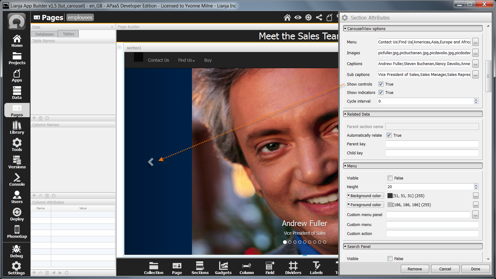
The controls and the indicators are shown by default and are used to move through the images.
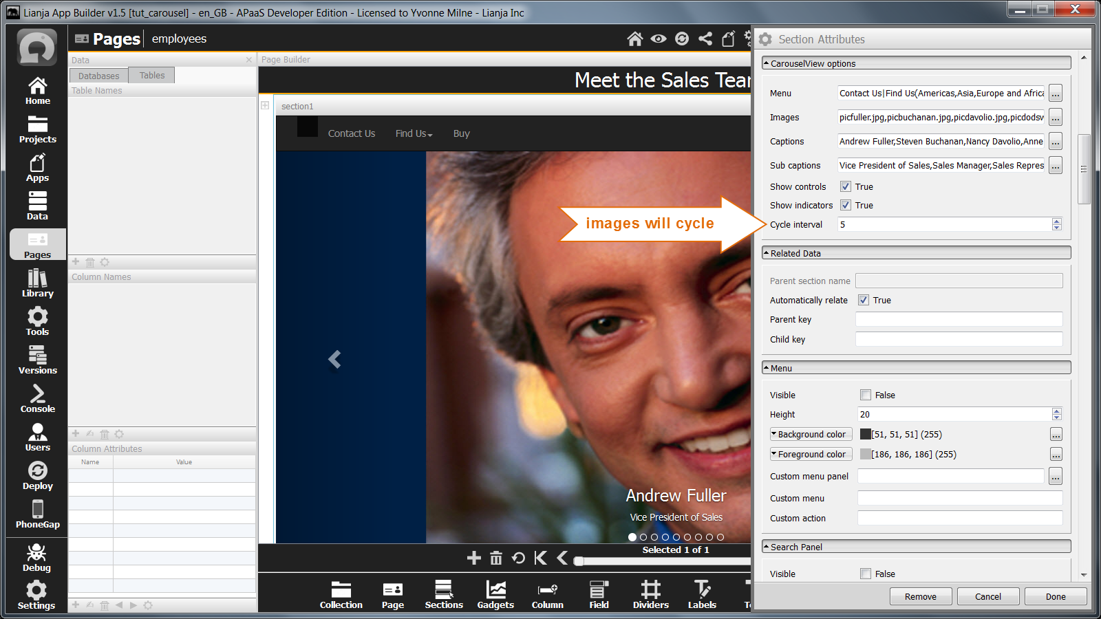
The Cycle interval attribute can be set to a non-zero value to cause the images to cycle automatically.
Here the Cycle interval has been set to 5, so the next image will be selected every 5 seconds.
| Attribute | Description |
|---|---|
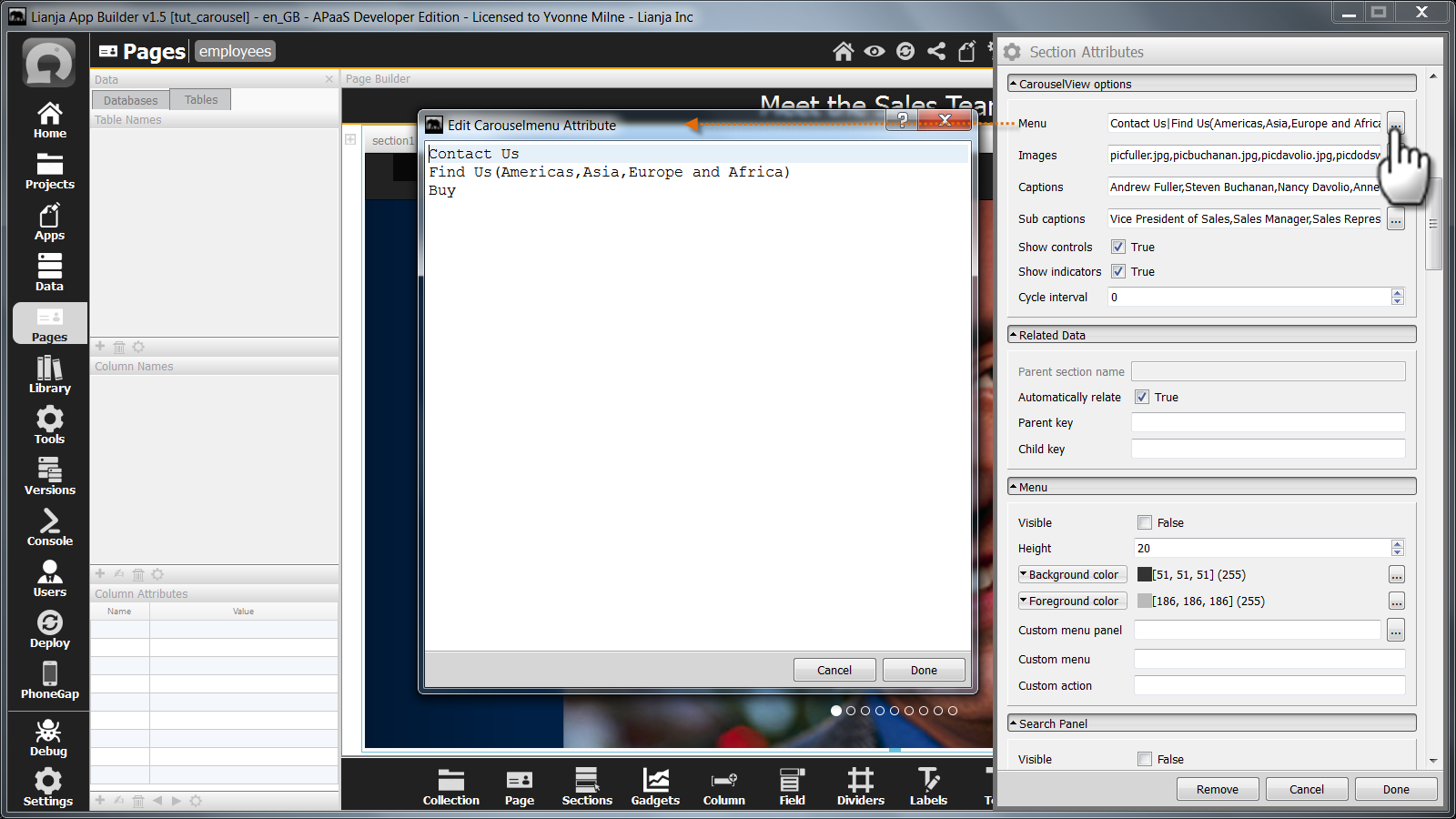
| Menu | The menu to embed at the top of the CarouselView section. This may contain submenus. Menuitems should be | separated, with sub menuitems comma-separated and in parentheses. For single level menus, the menuitems can be comma-separated or | separated. |
| Images | A comma separated list of images to be displayed as a carousel. |
| Captions | A comma separated list of captions to be displayed in the carousel images. |
| Sub captions | A comma separated list of sub captions to be displayed in the carousel images. |
| Show controls | Show the carousel left and right selection controls (True | False). |
| Show indicators | Show the carousel panel indicators (True | False). |
| Cycle interval | The interval in seconds to cycle through the images. 0 (default) specifies no cycling. |