Working with Visual Components
Contents
Overview
Visual Components allow you to create a Canvas Section or WebView/WebView based Section and save it as a component to be embedded in other UI elements with individually customized 'props':
- Custom Sections
- Custom Gadgets
- WebView Sections
- WebView Gadgets
- FormGrid Section Cells
- Grid Section Cells
- Custom Search Panels
- Custom DialogPanels

Creating Visual Components
Canvas Sections, Webview Sections and WebView based Sections (e.g. Report, Charts, CatalogView, DocumentView) can be saved as Visual Components.
App Settings
Component Library
This specifies the Component library for this App. A component that is generated is saved here unless its Component library location is specified in the section attributes.
A component library can contain one or more visual components. For Canvas Sections it is therefore important that you name your page and section with a unique name specific to that component, since the custom delegate code for the section is included in the component JavaScript file.
It is best practice to make component libraries unique to your organization e.g. com_yourcompany. This will allow them to be used by other developers without causing any name clashes.
Canvas Sections
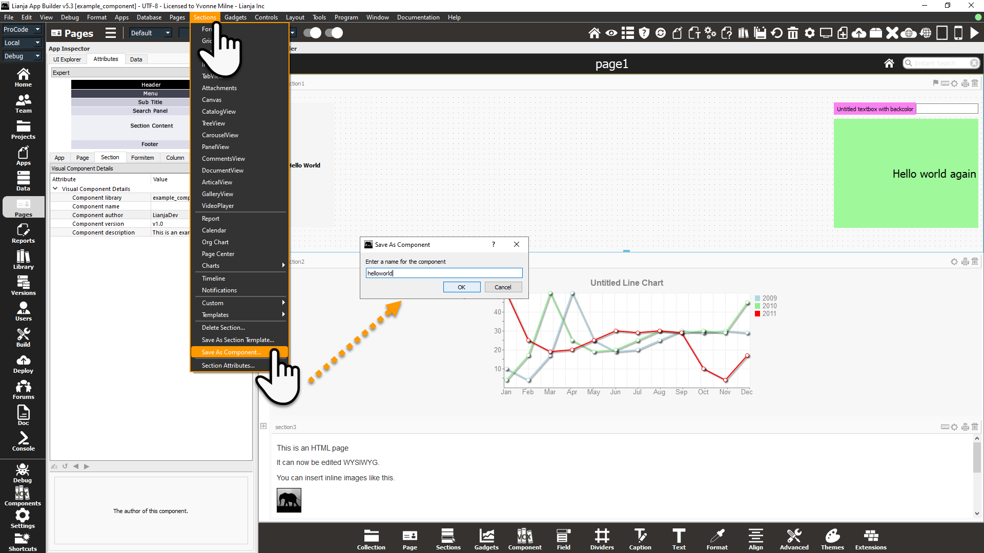
To save a Canvas Section as a Visual Component, make sure the Canvas Section is selected, then click the Sections -> Save As Component... menu option.
If the section's Component name attribute is not set and this is the first time this section has been saved as a component, the 'Save As Component' dialog box will appear allowing you to enter a name for the component.
Alternatively, specify the section's Component name attribute and the component will be created when the App is saved.
By default, the component will be saved in a component library with the same name of the App (here 'example_component'). Component libraries are located in the components directory in the library.
So my component above is saved as:
Windows
C:\lianja\library\components\example_component\helloworld.js
Linux
/opt/lianja/library/components/example_component/helloworld.js
Modifying the Canvas Section and clicking the Sections -> Save As Component... menu option again, overwrites the component with the changes, so the generated code should not be edited directly.
Saving the App will also update any saved components.
Canvas Sections have the following Visual Component Details attributes for the component library location and component name and additional information about the visual component. These are saved in a .config file with the same basename and location as the component .js file, e.g.
Windows
C:\lianja\library\components\example_component\helloworld.config
Linux
/opt/lianja/library/components/example_component/helloworld.config
Component library
The component library sub-directory where the component will be stored. The default is the name of the App.
Component name
The name of the component. This can be specified in the attributes, or will be populated automatically after using the Sections -> Save As Component... menu option and saving and reloading the App.
Component author
Optional author details. This will be displayed in the Component Gallery.
Component version
Optional version details. This will be displayed in the Component Gallery.
Component description
Optional description details. This will be displayed in the Component Gallery.
WebView Sections
WebView Sections and WebView based Sections can also be saved as Visual Components.
WebView based Sections are as follows:
- ArticleView
- Calendar
- CarouselView
- CatalogView
- Charts
- CommentsView
- DocumentView
- GalleryView
- Org Chart
- Page Center
- PanelView
- Report
- TreeView
To save a WebView/WebView based Section as a Visual Component, make sure the Section is selected, then click the Sections -> Save As Component... menu option.
If the section's Component name attribute is not set and this is the first time this section has been saved as a component, the 'Save As Component' dialog box will appear allowing you to enter a name for the component.

Alternatively, specify the section's Component name attribute and the component will be created when the App is saved.
By default, the component will be saved in a component library with the same name of the App (here 'example_component'). Component libraries are located in the components directory in the library.
So my component above is saved as:
Windows
C:\lianja\library\components\example_galleryview\employeegallery.config
Linux
/opt/lianja/library/components/example_galleryview/employeegallery.config
Modifying the Section and clicking the Sections -> Save As Component... menu option again, overwrites the component with the changes, so the generated code should not be edited directly.
Saving the App will also update any saved components.
WebView/WebView based Sections have the following Visual Component Details attributes for the component library location and component name and additional information about the visual component. These are saved in the .config file along with the URL information for the component.
Component library
The component library sub-directory where the component will be stored. The default is the name of the App.
Component name
The name of the component. This can be specified in the attributes, or will be populated automatically after using the Sections -> Save As Component... menu option and saving and reloading the App.
Component author
Optional author details. This will be displayed in the Component Gallery.
Component version
Optional version details. This will be displayed in the Component Gallery.
Component description
Optional description details. This will be displayed in the Component Gallery.
Component Gallery
The Component Gallery can be opened from the System Menu 'Window' menu options, from the ModeBar or from the Form Tools. The pulldown allows a component library to be selected and displays tiles below for each component in that library. The component name and optional version, description and author are shown on the tile.
From the Component Gallery, you can select a component to edit or delete it. When run from the Form Tools, a component can be selected and added to the current Page as a new section.
Select a tile to carry out an operation using the buttons:

| Button | Description |
|---|---|
| EDIT | Opens the App where the selected component was created allowing the section to be edited. |
| DELETE | Deletes the selected component from the component library. This has no effect on the original section in the App where the component was created. |
| CLOSE | Closes the Component Gallery. |
| DONE | Adds the selected component as a section (Custom or WebView) to the current Page and displays the Component Attributes Editor. |
| CANCEL | Closes the Component Gallery without adding the selected component as a section to the current Page. |
Using the Form Tools to Add Visual Components
Sections
From the Form Tools Sections button, you can select a saved component and add it to the current Page as a new Section.
If the component was created from a Canvas Section, it will be added as a JavaScript Custom Section.
If the component was created from a WebView/WebView based Section, it will be added as a WebView Section.
The Component Attributes Editor will be displayed, allowing the component to be customized.

Gadgets
From the Form Tools Gadgets button, you can select a saved component and add it to the current Form Section as a new Gadget.
If the component was created from a Canvas Section, it will be added as a JavaScript Custom Gadget.
If the component was created from a WebView/WebView based Section, it will be added as a WebView Gadget.
The Component Attributes Editor will be displayed, allowing the component to be customized.
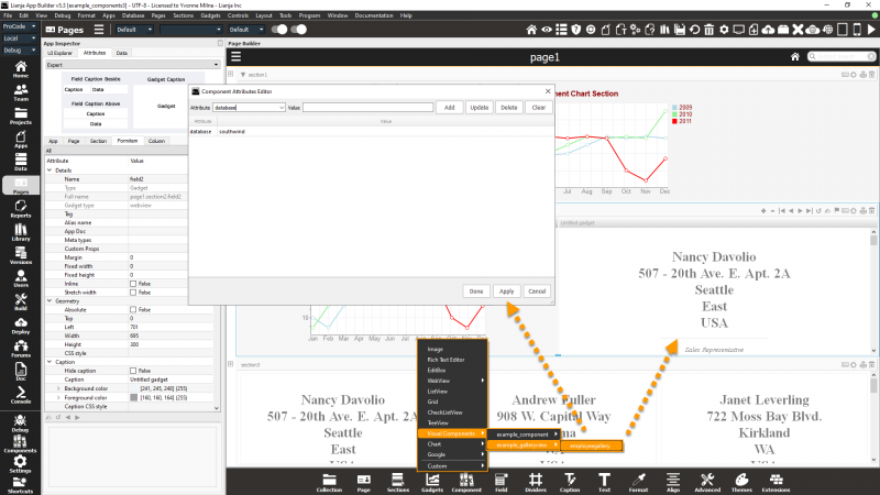
Component Attributes Editor
The Component Attributes Editor allows any editable properties of the component to be customized for this instance without affecting the original component or section. As well as being displayed automatically when you add a Section from the Component Gallery or a Section or Gadget from the Form Tools, it can be shown by clicking on the keyboard icon in the header of a component based Section or Gadget.

UNDER CONSTRUCTION
Using Visual Components
Embedding a Visual Component
Components can be used in custom section and custom gadget code. You simply call the constructor function in JavaScript like this:
mycomponent = yourcomponentlib_componentname();
Customizing a Visual Component at runtime
When a Visual Components is instantiated you can customize the internal attributes and intercept events using delegates.
Arguments (Optional):

    props         -- A string of attribute key/values separated with a ;
    initFunction  -- The init delegate for this component
    loadFunction  -- The load delegate for this component
    readyFunction -- The ready delegate for this component
Examples:
Using "props"
var cont = example_component_barrytest("field1.table=customers;field3.backcolor=red;")
return cont;
In the "init" function
var cont = example_component_barrytest(undefined, function(self)  // initFunction -- "self" is a reference to the component
{
    // reference the UI controls of the component by name using self.controls("name")
    var field3 = self.controls("field3");
    // you can reference the attributes and call methods on any of the UI elements in the
    // canvas section which is now embedded in a  "container"
    field3.backcolor = "red";
    // you can hide UI elements in the container like this
    var field1 = self.controls("field1");
    field1.hide();
    // you can add new UI elements to the container like this (runtime inheritance)
    self.addObject('mytextbox','Textbox');
    mytextbox.name = 'mytextbox';
    mytextbox.top = 19;
    mytextbox.right = 4;
    mytextbox.width = 110;
    mytextbox.controlsource = "customers.customerid";
});
return cont;
So as you can see its quite easy to use components from your component libraries in custom sections and gadgets.
App Settings
Components
This specifies the Components needed for the App. Separate each with a ';' to specify more than one, e.g.
example_component.name;example_component.*
Deployment
When generating Web and Mobile Apps, components are included in the index.html file so there is no need to deploy them manually.
Component libraries are listed under Components in the Deploy Files tab in the App Inspector or Deploy Workspace to allow them to be added to Lianja Package Files.