Difference between revisions of "UI Presentation Rules"
Yvonne.milne (Talk | contribs) (→Responsive UI) |
Yvonne.milne (Talk | contribs) (→Responsive UI) |
||
| Line 244: | Line 244: | ||
=Responsive UI= | =Responsive UI= | ||
| − | |||
| − | |||
From Lianja v5.4 Page, Section and Formitem breakpoint height and width Attributes are available for improved responsive UI handling in Web and Mobile Apps. | From Lianja v5.4 Page, Section and Formitem breakpoint height and width Attributes are available for improved responsive UI handling in Web and Mobile Apps. | ||
| Line 308: | Line 306: | ||
* Specify the minimum item width as the number of pixels. | * Specify the minimum item width as the number of pixels. | ||
* Applies to [[:Category:Attributes#Gadget_Attributes|Gadgets]], [[Field Attributes|Fields]] and [[Advanced Canvas Control Attributes|Advanced Canvas Controls]]. | * Applies to [[:Category:Attributes#Gadget_Attributes|Gadgets]], [[Field Attributes|Fields]] and [[Advanced Canvas Control Attributes|Advanced Canvas Controls]]. | ||
| + | |||
| + | ==TabBar Responsive UI width breakpoint== | ||
| + | The TabBar responsive UI width breakpoint in Web/Mobile Apps. | ||
| + | [[{{ns:file}}:uip_tabbar.png|321px|left|link={{filepath:uip_tabbar.png}}|TabBar Responsive UI]] | ||
| + | <br clear=all> | ||
| + | |||
| + | * The [[TabView Section Attributes|TabView Section TabBar]] will automatically be expanded or collapsed when the breakpoint width is reached on window resizing or mobile viewport size. | ||
| + | * Specify the width breakpoint as the number of pixels. | ||
| + | * Applies to [[TabView Section Attributes|TabView Sections]]. | ||
| + | * From v5.4.1. | ||
| + | * See the Admin Console App (lianjacloud_admin) for an example of this. | ||
Revision as of 11:05, 22 October 2020
Contents
- 1 Overview
- 2 Attributes
- 2.1 Desktop
- 2.2 Web
- 2.3 Tablet
- 2.4 Phone
- 2.5 Use mobile navigation bar
- 2.6 UI States
- 2.7 Initial UI state
- 2.8 Readonly when
- 2.9 Visible when
- 2.10 Page transition effect
- 2.11 Display orientation
- 2.12 Hidden at runtime
- 2.13 Apply rules on change
- 2.14 Apply rules on parent change
- 2.15 Notes on Client Support
- 3 Using UI Element Alias Names
- 4 Responsive UI
- 4.1 Navigation Panel Responsive UI width breakpoint
- 4.2 Search Panel Responsive UI width breakpoint
- 4.3 Menu Responsive UI width breakpoint
- 4.4 Responsive UI form width breakpoint
- 4.5 Responsive UI width breakpoint
- 4.6 Responsive UI height breakpoint
- 4.7 Responsive UI minimum width
- 4.8 TabBar Responsive UI width breakpoint
Overview
A Lianja App can have multiple UI personalities and different functionality depending on the "roles" that you grant to a user and also the device on which the App is being run e.g. Desktop, Web or Mobile.
The Lianja App Builder provides the ability for you to build one App that will run on Desktop, Web and Mobile devices from a single codebase.
Select the "Pages" workspace.
You manage UI Presentation Rules in the "Attributes" Tab of the App Inspector.
Certain UI Elements may only be relevant to a Desktop user, others to a Web user and some only to a Mobile user. Additionally some UI elements may only be visible when running on a Mobile device if the device is in "landscape mode". You can adjust the behavior of an App using UI Personalities.
These are specified in the attributes for a UI Element in the attributes Tab of the App Inspector.
Attributes
Desktop
The Desktop attribute determines whether this element should be included in a Desktop client or not.
Web
The Web attribute determines whether this element should be included in a Web client or not.
- Note that if the App's Web attribute is unchecked (False), Web App View is disabled.
Tablet
The Tablet attribute determines whether this element should be included in a Tablet client or not.
- Note that if the App's Tablet attribute is unchecked (False), Tablet App View is disabled.
Phone
The Phone attribute determines whether this element should be included in a Phone client or not.
- Note that if the App's Phone attribute is unchecked (False), Phone App View is disabled.
The Use mobile navigation bar attribute specifies whether a mobile styled navigation bar (material UI style) should be used. From v4.1.
UI States
The UI States attribute specifies the UI states that affect this element.
- Multiple states should be specified as a comma separated list.
- See UI States.
Initial UI state
The Initial UI state attribute specifies the starting UI state for this element.
- See UI States.
Readonly when
The Readonly when attribute specifies an expression to be evaluated. If the expression evaluates to True, the element is readonly (not editable).
- The Readonly when attribute expression is evaluated at runtime only.
Visible when
The Visible when attribute specifies an expression to be evaluated. If the expression evaluates to True, the element is visible.
- The Visible when attribute expression is evaluated at runtime only.
Page transition effect
The Page transition effect attribute specifies the page transition effect to use when navigating to this page on the Web/Mobile client. (None | Fade | Pop | Flip | Turn | Flow | SlideFade | Slide | SlideUp | SlideDown).
- Applies to Pages only.
Display orientation
The Display orientation attribute determines whether this element is always displayed, only when the orientation is portrait or only when the orientation is landscape. (Always | Portrait | Landscape).
- Applies to mobile devices only.
Hidden at runtime
The Hidden at runtime attribute determines whether this formitem or grid column is hidden at runtime(True | False). Default is False.
- Applies to Form Section Fields, Advanced Canvas Controls and Grid Columns.
- This can be used to hide certain fields in a form or grid that you may need but do not want the users to see e.g. a primary key field which needs to be defined for Virtual Tables so that Update and Delete operations can be performed.
Apply rules on change
The Apply rules on change attribute determines whether the UI presentation rules of the page and its elements should be applied when data is changed interactively and when navigating records (True | False).
- If checked (True), when data changes in this page, section, gadget or formitem (Form Section field or Canvas Advanced Control), the page and its elements' Visible when and Readonly when expressions will be re-evaluated.
Apply rules on parent change
The Apply rules on parent change attribute determines whether the UI presentation rules of this section and its elements should be applied when parent data is changed by navigating records (True | False).
- If checked (True), when data changes in its related parent section, the section and its elements' Visible when and Readonly when expressions will be re-evaluated .
- Applies to Sections.
Notes on Client Support
| Attribute | Notes |
|---|---|
| Desktop | - |
| Web | - |
| Tablet | - |
| Phone | - |
| UI States | UI States are supported on the Desktop client only. |
| Initial UI state | The Initial UI State is supported on the Desktop client only. |
| Readonly when | Readonly when is supported on the Desktop client only. |
| Visible when | Visible when is supported on the Desktop client only. |
| Page transition effect | The Page transition effect is ignored on the Desktop client. |
| Display orientation | The Display orientation is ignored on the Desktop client and fixed orientation devices. |
| Hidden at runtime | - |
| Apply rules on change | Apply rules on change is supported on the Desktop client only. |
| Apply rules on parent change | Apply rules on parent change is supported on the Desktop client only. |
Using UI Element Alias Names
Overview
Using UI Element Alias Names resolves the problem where you want to have a page for phone to be different to the page for web or a web/mobile page to be different to the desktop page. The Name of the page is needed at development time for coding purposes, but you may want to have the same name for more than one page based on their different UI Personalities. By defining an Alias name for the page/section or formitem, when generating the code for web, tablet, or phone you can exclude certain UI elements and generate the code with known names through alias names.
Note: for information on database table aliases, see the USE ... ALIAS ... command and the ALIAS() function. For user-defined commands, see the ALIAS command.
Alias Name Attribute
From Lianja v4.1, the Alias name attribute (aliasid) is supported by Pages, Sections, Gadgets, Fields, and Advanced Canvas Controls.
Example
I have created an App with 3 pages: startpage, page1 and page3.
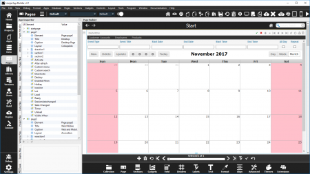
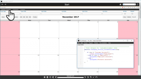
Here you can see startpage with a Calendar Section.
In the App Inspector, you can see the Pages Hierarchy tab showing the 3 pages.
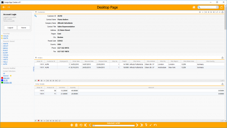
This is page1 (Name attribute). It is for use on desktop clients.
Note that only Desktop is checked in the UI Presentation Rules.
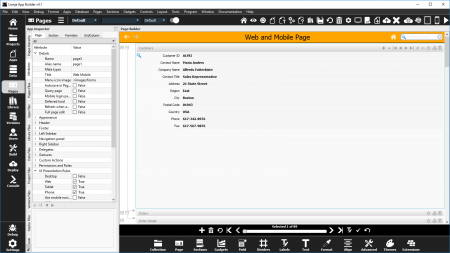
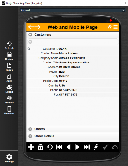
This is page3 (Name attribute). It is for use on mobile and web.
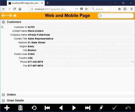
It has a simpler design with no Left Sidebar and uses Accordion Behavior.
Web, Tablet and Phone are checked in the UI Presentation Rules.
The Alias name in the Details attributes is set to page1.
Back to startpage (Name attribute).
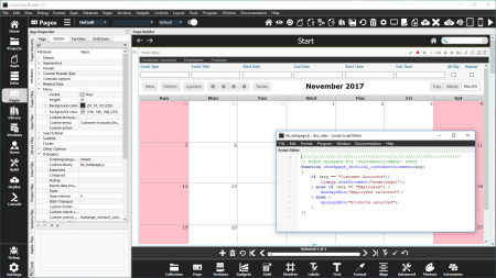
Its Calendar Section has a Section Menu and the JavaScript Custom section menu delegate can be seen in the floating Script Editor.
When the Customer Accounts menu option is clicked, the Lianja.showDocument method is used to switch to page1.
////////////////////////////////////////////////////////////////
// Event delegate for 'customsectionmenu' event
function startpage_section2_customsectionmenu(arg)
{
    if (arg == "Customer Accounts")
    {
	Lianja.showDocument("page:page1");
    } else if (arg == "Employees") {
	messageBox("Employees selected");
    } else {
	messageBox("Products selected");
    }
};
So, here's the App running in Desktop App View.
Clicking the Customer Accounts menu option will call the function startpage_section2_customsectionmenu and pass the argument "Customer Accounts".
Which selects page1, the Desktop page.
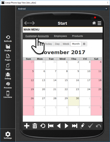
Now here's the App running in Phone App View.
As in Desktop App View, clicking the Customer Accounts menu option will call the function startpage_section2_customsectionmenu and pass the argument "Customer Accounts".
Since the Page with the Name page1 is not included in Phone Apps based on its UI Presentation Rules, but the Page with the Alias name page1 is included, the Web and Mobile Page (Name = page3) is displayed.
And since page3 is the Page included in Web Apps, this is also the Page displayed when the App is running in the Lianja Web Client in the browser.
Responsive UI
From Lianja v5.4 Page, Section and Formitem breakpoint height and width Attributes are available for improved responsive UI handling in Web and Mobile Apps.
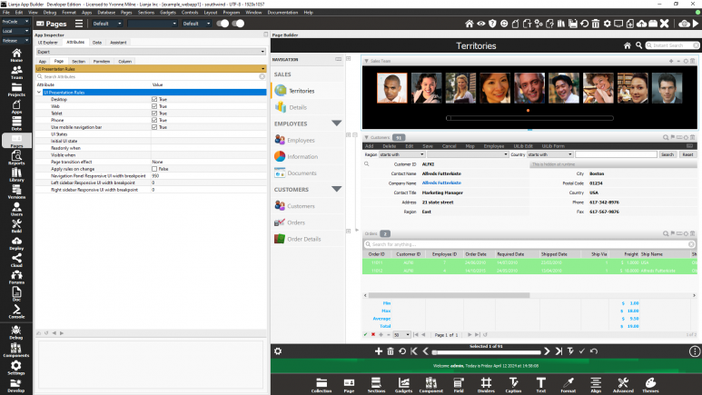
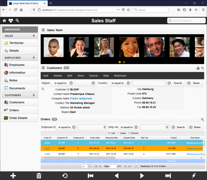
These can be seen in the example_webapp1 demo App (Lianja Tablet Web UI Demo) included in the distribution.
Here is the example_webapp1 App running in the browser with its standard layout:
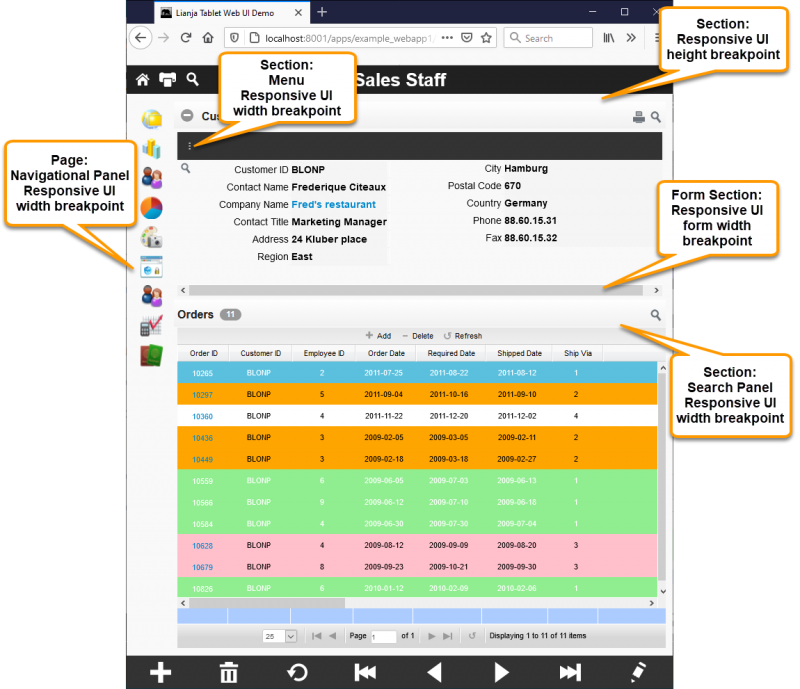
Resizing the browser window triggers the height and width breakpoints set in the Attributes (detailed below) and the UI adjusts accordingly:
The Navigation Panel responsive UI width breakpoint in Web/Mobile Apps.
- The Navigation Panel display will automatically collapse (icons only) or expand (all specified icons and captions) when the breakpoint width is reached on window resizing or mobile viewport size.
- Specify the width breakpoint as the number of pixels.
- Applies to Pages.
Search Panel Responsive UI width breakpoint
The Search Panel responsive UI width breakpoint in Web/Mobile Apps.
- The Search Panel will automatically be shown or hidden when the breakpoint width is reached on window resizing or mobile viewport size.
- Specify the width breakpoint as the number of pixels.
- Applies to Sections.
Menu Responsive UI width breakpoint
The Menu responsive UI width breakpoint in Web/Mobile Apps.
- The Menu will automatically be expanded or collapsed when the breakpoint width is reached on window resizing or mobile viewport size.
- Specify the width breakpoint as the number of pixels.
- Applies to Sections.
Responsive UI form width breakpoint
The Form Section responsive UI width breakpoint in Web/Mobile Apps.
- A horizontal scrollbar will automatically be shown or hidden when the breakpoint width is reached on window resizing or mobile viewport size.
- Specify the width breakpoint as the number of pixels.
- Applies to Form Sections.
Responsive UI width breakpoint
The responsive UI width breakpoint in Web/Mobile Apps.
- The UI element will automatically be shown or hidden when the breakpoint width is reached on window resizing or mobile viewport size.
- Specify the width breakpoint as the number of pixels.
- Applies to Sections, Gadgets, Fields and Advanced Canvas Controls.
Responsive UI height breakpoint
The responsive UI height breakpoint in Web/Mobile Apps.
- The UI element will automatically be shown or hidden when the breakpoint height is reached on window resizing or mobile viewport size.
- Specify the height breakpoint as the number of pixels.
- Applies to Sections, Gadgets, Fields and Advanced Canvas Controls.
Responsive UI minimum width
The responsive UI minimum item width in Web/Mobile Apps.
- A horizontal scrollbar will automatically be shown or hidden on the containing Form Section when the breakpoint width is reached on window resizing or mobile viewport size.
- Specify the minimum item width as the number of pixels.
- Applies to Gadgets, Fields and Advanced Canvas Controls.
TabBar Responsive UI width breakpoint
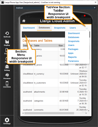
The TabBar responsive UI width breakpoint in Web/Mobile Apps.
- The TabView Section TabBar will automatically be expanded or collapsed when the breakpoint width is reached on window resizing or mobile viewport size.
- Specify the width breakpoint as the number of pixels.
- Applies to TabView Sections.
- From v5.4.1.
- See the Admin Console App (lianjacloud_admin) for an example of this.
