Difference between revisions of "QueryPicker"
Barrymavin (Talk | contribs) (Created page with "''Under construction''") |
Yvonne.milne (Talk | contribs) (→Query Picker Parameters) |
||
| (50 intermediate revisions by 2 users not shown) | |||
| Line 1: | Line 1: | ||
| − | '' | + | {{DISPLAYTITLE:Using the Query Picker}} |
| + | ==Overview== | ||
| + | To keep coding (NoCode) to a minimum there are many built-in [[Using WebViewWidgets|WebViewWidgets]] that can be used with Lianja.showDialogPanel(), Lianja.showDialog() or as the URL in a WebView section or in a custom WebView object created with createObject("webview"). | ||
| + | |||
| + | The Query Picker is a powerful WebViewWidget that incorporates the functionality of Miller columns (also known as cascading lists) and a searchable data grid. It also has integrated support for drilling down through data using the [[QueryBuilder|Query Builder]]. | ||
| + | |||
| + | A picture says a thousand words so let's look at the Query Picker then see how we can use it in our Apps. | ||
| + | |||
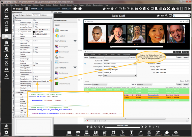
| + | You will typically want to show the Query Picker associated with a specific field in a form or canvas section. You can use the "Dialog Button" to achieve that. | ||
| + | |||
| + | [[File:querypicker-dialogbutton.png|middle|768px|link={{filepath: querypicker-dialogbutton.png}}]] | ||
| + | |||
| + | Now let's see that running as a Web App. | ||
| + | |||
| + | [[File:querypicker1.png|middle|768px|link={{filepath: querypicker1.png}}]] | ||
| + | |||
| + | |||
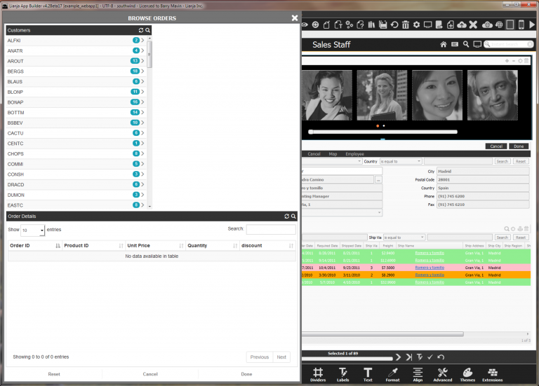
| + | Edit a record then click the Dialog Button and the Query Picker will slide in from the right. You can of course have it slide in from the left and optionally animate across the whole of the UI viewport. | ||
| + | |||
| + | |||
| + | [[File:querypicker2.png|middle|768px|link={{filepath: querypicker2.png}}]] | ||
| + | |||
| + | |||
| + | Clicking one of the "Search" icons in the column headers or the data grid header will show the [[QueryBuilder|Query Builder]] providing a powerfull means of drilling down through the data currently being queried. | ||
| + | |||
| + | |||
| + | [[File:querypicker3.png|middle|768px|link={{filepath: querypicker3.png}}]] | ||
| + | |||
| + | |||
| + | Double clicking on a row in the data grid will select the column of your choice from the grid row and return back sliding the Query Picker out off the screen. You can specify a delegate to be called with one argument which is the value selected. | ||
| + | |||
| + | Let's now look at the ways we can activate the query picker and what parameters we can specify. | ||
| + | |||
| + | ==Query Picker Parameters== | ||
| + | |||
| + | lib:/querypicker.rsp?parameter=value¶meter=value... | ||
| + | |||
| + | {| class="wikitable" width="100%" | ||
| + | ! Parameter | ||
| + | ! Description | ||
| + | ! width="30%" | Default value | ||
| + | |- | ||
| + | |valign="top"| buttons | ||
| + | | An optional comma separated list of buttons captions to be displayed in the footer | ||
| + | | | ||
| + | |- | ||
| + | |valign="top"| columncount | ||
| + | | The number of cascading list columns | ||
| + | | 2 | ||
| + | |- | ||
| + | |valign="top"| columns | ||
| + | | The column definitions. This is a | separated list of definitions separated by a comma. The first item in the list is the table, the second is the column to query on. For all columns except the first, the next item in the list is the column to query as a condition using {} to represent the value selected from the previous column. Note how the { and } should be specified using their URL encoded values %7B and %7D. If the second item in the list is a ':' separated list itself then these items will be displayed as columns in the cascading list. | ||
| + | |valign="top"| customers,customerid|orders,orderid,customerid='%7B%7D' |order_details,orderid,orderid=%7B%7D | ||
| + | |- | ||
| + | |valign="top"| columnsorderby | ||
| + | | The orderby for each column. Each item should be separated by a vertical bar | | ||
| + | | | ||
| + | |- | ||
| + | |valign="top"| columntitles | ||
| + | | A comma separated list of column titles | ||
| + | | Customers,Orders | ||
| + | |- | ||
| + | |valign="top"| database | ||
| + | | The database | ||
| + | | southwind | ||
| + | |- | ||
| + | |valign="top"| datagrid | ||
| + | | The table, column list and foreign key for the data grid. Separate each of these with a vertical bar |. Here again, specify {} as %7B%7D. | ||
| + | | | ||
| + | |- | ||
| + | |valign="top"| delegatelib | ||
| + | | The optional name of the delegate library containing the delegates. This should be written in JavaScript for Web/Mobile Apps. | ||
| + | | | ||
| + | |- | ||
| + | |valign="top"| onbuttonclick | ||
| + | | The optional delegate to be called when a custom button is clicked. The delegate is called with two arguments, the button caption and the text of the selected data column. | ||
| + | | | ||
| + | |- | ||
| + | |valign="top"| onselect | ||
| + | | The optional delegate to be called when an item in the data grid is chosen. The delegate is called with two arguments, the column name selected in the data grid and the text of the selected data column. | ||
| + | | | ||
| + | |- | ||
| + | |valign="top"| orderby | ||
| + | | The orderby for for the data grid | ||
| + | | | ||
| + | |- | ||
| + | |valign="top"| pagesize | ||
| + | | The data grid page size. From v5.0. | ||
| + | | 100 | ||
| + | |- | ||
| + | |valign="top"| picklist | ||
| + | | The table, column list and foreign key for the data grid. Separate each of these with a vertical bar |. Here again, specify {} as %7B%7D. Note that column names should be in lower case. | ||
| + | |valign="top"| order_details|*|orderid=%7B%7D | ||
| + | |- | ||
| + | |valign="top"| selectcolumn | ||
| + | | The column to select in the data grid | ||
| + | | productid | ||
| + | |- | ||
| + | |valign="top"| showbadges | ||
| + | | If set to false no badge counts are calculated in the Miller columns | ||
| + | | true | ||
| + | |- | ||
| + | |valign="top"| showbuttons | ||
| + | | If set to false no buttons are displayed in the footer | ||
| + | | true | ||
| + | |- | ||
| + | |valign="top"| showcolumns | ||
| + | | If set to false, the data grid is displayed without any cascading columns above it. From v5.0. | ||
| + | | true | ||
| + | |- | ||
| + | |valign="top"| showdatagrid | ||
| + | | If set to false, only the Miller columns are displayed, not the data grid (same as showpicklist). | ||
| + | | true | ||
| + | |- | ||
| + | |valign="top"| showpicklist | ||
| + | | If set to false, only the Miller columns are displayed, not the data grid (same as showdatagrid). | ||
| + | | true | ||
| + | |- | ||
| + | |valign="top"| table | ||
| + | | The data grid table | ||
| + | | order_details | ||
| + | |- | ||
| + | |valign="top"| tabletitle | ||
| + | | The data grid header text | ||
| + | | Order Details | ||
| + | |- | ||
| + | |} | ||
| + | |||
| + | ==Slide in a Query Picker Dialog Panel== | ||
| + | |||
| + | <code lang="javascript"> | ||
| + | function myQueryPickerCallback(key, value) | ||
| + | { | ||
| + | messageBox("You chose '"+value+"'"); | ||
| + | } | ||
| + | |||
| + | var title = "Browse Orders"; | ||
| + | var onselect = "myQueryPickerCallback()"; | ||
| + | var database = "southwind"; | ||
| + | var table = "order_details"; | ||
| + | var params = ""; // e.g. parameter=value¶meter2=value... | ||
| + | var width = 900; | ||
| + | Lianja.showQueryPickerPanel(title, onselect, database, table, params, width); | ||
| + | |||
| + | </code> | ||
| + | |||
| + | [[File:querypicker2.png|middle|768px|link={{filepath: querypicker2.png}}]] | ||
| + | |||
| + | You can have the Query Picker Dialog Panel slide in from the left by specifying a negative width e.g -900; | ||
| + | |||
| + | [[File:querypicker10.png|middle|768px|link={{filepath: querypicker10.png}}]] | ||
| + | |||
| + | You can have the Query Picker Dialog Panel slide in and occupy the whole viewport by specifying a width of "100%". | ||
| + | |||
| + | [[File:querypicker11.png|middle|768px|link={{filepath: querypicker11.png}}]] | ||
| + | |||
| + | ==Embed the Query Picker in a page== | ||
| + | |||
| + | * Create a new page | ||
| + | * Add a WebView section | ||
| + | * In the URL of the webview section specify a url that defines the WebViewWidget parameters as described above. e.g. | ||
| + | |||
| + | lib:/querypicker.rsp?dialogpanel=false&buttons=Approve,Deny,View Details&onbuttonclick=myButtonClick | ||
| + | |||
| + | Notice how you can define your own custom buttons and declare a callback to handle button clicks. | ||
| + | |||
| + | * Add a function to the custom library for the section called ''myButtonClick'' which will be called when a row is selected in the data grid and a button is clicked | ||
| + | |||
| + | <code lang="javascript"> | ||
| + | //////////////////////////////////////////////////////////////////////////////// | ||
| + | function myButtonClick(btntext, value) | ||
| + | { | ||
| + | messageBox("You clicked the '"+btntext+"' button for '"+value+"'"); | ||
| + | } | ||
| + | </code> | ||
| + | |||
| + | [[File:querypicker7.png|middle|768px|link={{filepath: querypicker7.png}}]] | ||
| + | |||
| + | Now run your App in the browser. | ||
| + | |||
| + | [[File:querypicker8.png|middle|768px|link={{filepath: querypicker8.png}}]] | ||
| + | |||
| + | Then drill down through the data and click a button. | ||
| + | |||
| + | [[File:querypicker9.png|middle|768px|link={{filepath: querypicker9.png}}]] | ||
| + | |||
| + | If required the cascading lists can have multiple columns. | ||
| + | |||
| + | [[File:querypicker20.png|middle|768px|link={{filepath: querypicker20.png}}]] | ||
| + | |||
| + | From Lianja v5.0, you can display the data grid on its own with no cascading columns above: showcolumns=false. | ||
| + | |||
| + | [[File:showcolumns_false.png|middle|768px|link={{filepath: showcolumns_false.png}}]] | ||
| + | |||
| + | So as you can see the Query Picker has a broad range of uses. | ||
| + | |||
| + | [[Category:Lianja v4.2]] | ||
Latest revision as of 12:05, 2 January 2020
Contents
Overview
To keep coding (NoCode) to a minimum there are many built-in WebViewWidgets that can be used with Lianja.showDialogPanel(), Lianja.showDialog() or as the URL in a WebView section or in a custom WebView object created with createObject("webview").
The Query Picker is a powerful WebViewWidget that incorporates the functionality of Miller columns (also known as cascading lists) and a searchable data grid. It also has integrated support for drilling down through data using the Query Builder.
A picture says a thousand words so let's look at the Query Picker then see how we can use it in our Apps.
You will typically want to show the Query Picker associated with a specific field in a form or canvas section. You can use the "Dialog Button" to achieve that.
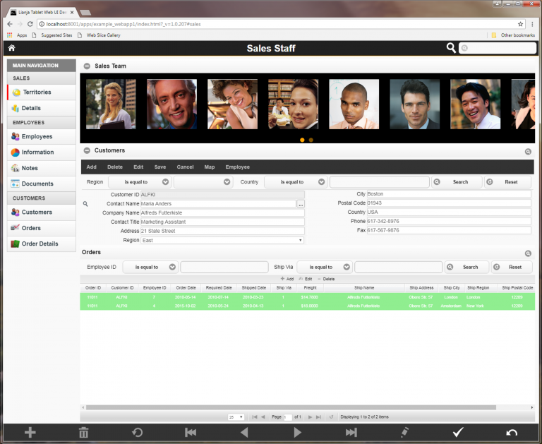
Now let's see that running as a Web App.
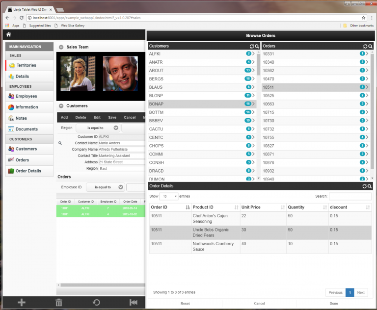
Edit a record then click the Dialog Button and the Query Picker will slide in from the right. You can of course have it slide in from the left and optionally animate across the whole of the UI viewport.
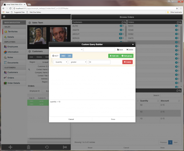
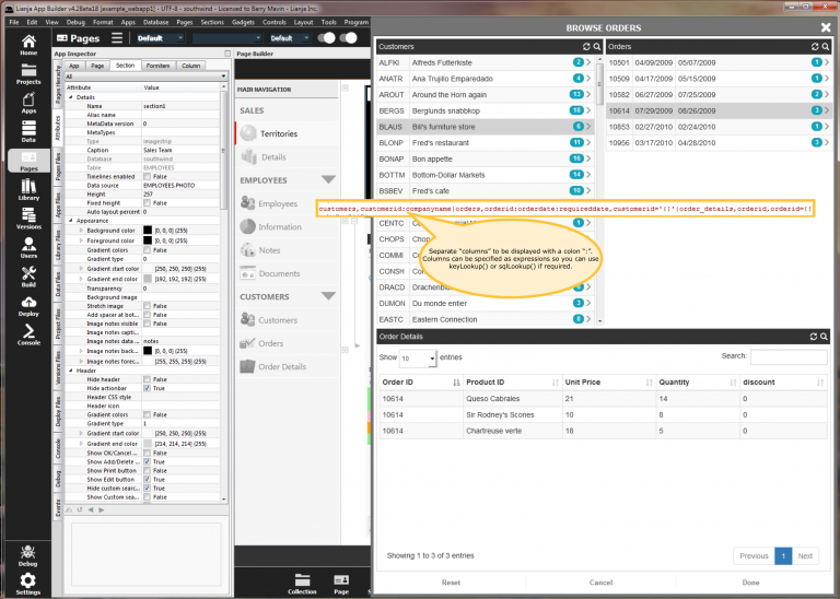
Clicking one of the "Search" icons in the column headers or the data grid header will show the Query Builder providing a powerfull means of drilling down through the data currently being queried.
Double clicking on a row in the data grid will select the column of your choice from the grid row and return back sliding the Query Picker out off the screen. You can specify a delegate to be called with one argument which is the value selected.
Let's now look at the ways we can activate the query picker and what parameters we can specify.
Query Picker Parameters
lib:/querypicker.rsp?parameter=value¶meter=value...
| Parameter | Description | Default value |
|---|---|---|
| buttons | An optional comma separated list of buttons captions to be displayed in the footer | |
| columncount | The number of cascading list columns | 2 |
| columns | The column definitions. This is a | separated list of definitions separated by a comma. The first item in the list is the table, the second is the column to query on. For all columns except the first, the next item in the list is the column to query as a condition using {} to represent the value selected from the previous column. Note how the { and } should be specified using their URL encoded values %7B and %7D. If the second item in the list is a ':' separated list itself then these items will be displayed as columns in the cascading list. | customers,customerid|orders,orderid,customerid='%7B%7D' |order_details,orderid,orderid=%7B%7D |
| columnsorderby | The orderby for each column. Each item should be separated by a vertical bar | | |
| columntitles | A comma separated list of column titles | Customers,Orders |
| database | The database | southwind |
| datagrid | The table, column list and foreign key for the data grid. Separate each of these with a vertical bar |. Here again, specify {} as %7B%7D. | |
| delegatelib | The optional name of the delegate library containing the delegates. This should be written in JavaScript for Web/Mobile Apps. | |
| onbuttonclick | The optional delegate to be called when a custom button is clicked. The delegate is called with two arguments, the button caption and the text of the selected data column. | |
| onselect | The optional delegate to be called when an item in the data grid is chosen. The delegate is called with two arguments, the column name selected in the data grid and the text of the selected data column. | |
| orderby | The orderby for for the data grid | |
| pagesize | The data grid page size. From v5.0. | 100 |
| picklist | The table, column list and foreign key for the data grid. Separate each of these with a vertical bar |. Here again, specify {} as %7B%7D. Note that column names should be in lower case. | order_details|*|orderid=%7B%7D |
| selectcolumn | The column to select in the data grid | productid |
| showbadges | If set to false no badge counts are calculated in the Miller columns | true |
| showbuttons | If set to false no buttons are displayed in the footer | true |
| showcolumns | If set to false, the data grid is displayed without any cascading columns above it. From v5.0. | true |
| showdatagrid | If set to false, only the Miller columns are displayed, not the data grid (same as showpicklist). | true |
| showpicklist | If set to false, only the Miller columns are displayed, not the data grid (same as showdatagrid). | true |
| table | The data grid table | order_details |
| tabletitle | The data grid header text | Order Details |
Slide in a Query Picker Dialog Panel
function myQueryPickerCallback(key, value) { messageBox("You chose '"+value+"'"); } var title = "Browse Orders"; var onselect = "myQueryPickerCallback()"; var database = "southwind"; var table = "order_details"; var params = ""; // e.g. parameter=value¶meter2=value... var width = 900; Lianja.showQueryPickerPanel(title, onselect, database, table, params, width);
You can have the Query Picker Dialog Panel slide in from the left by specifying a negative width e.g -900;
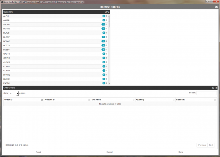
You can have the Query Picker Dialog Panel slide in and occupy the whole viewport by specifying a width of "100%".
Embed the Query Picker in a page
- Create a new page
- Add a WebView section
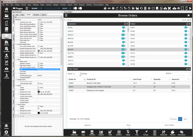
- In the URL of the webview section specify a url that defines the WebViewWidget parameters as described above. e.g.
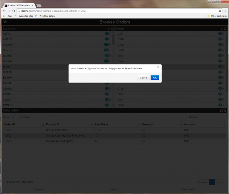
lib:/querypicker.rsp?dialogpanel=false&buttons=Approve,Deny,View Details&onbuttonclick=myButtonClick
Notice how you can define your own custom buttons and declare a callback to handle button clicks.
- Add a function to the custom library for the section called myButtonClick which will be called when a row is selected in the data grid and a button is clicked
////////////////////////////////////////////////////////////////////////////////
function myButtonClick(btntext, value)
{
    messageBox("You clicked the '"+btntext+"' button for '"+value+"'");
}
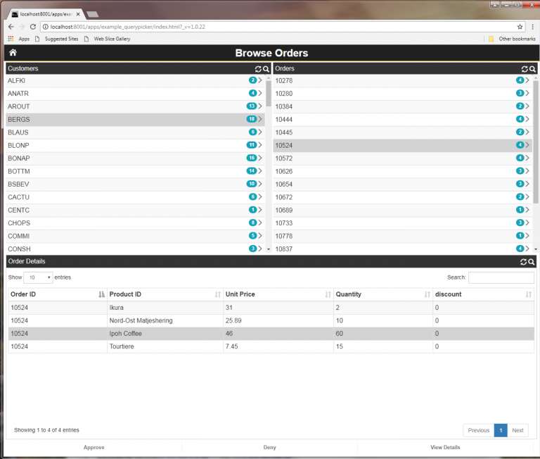
Now run your App in the browser.
Then drill down through the data and click a button.
If required the cascading lists can have multiple columns.
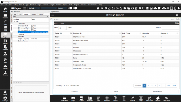
From Lianja v5.0, you can display the data grid on its own with no cascading columns above: showcolumns=false.
So as you can see the Query Picker has a broad range of uses.
